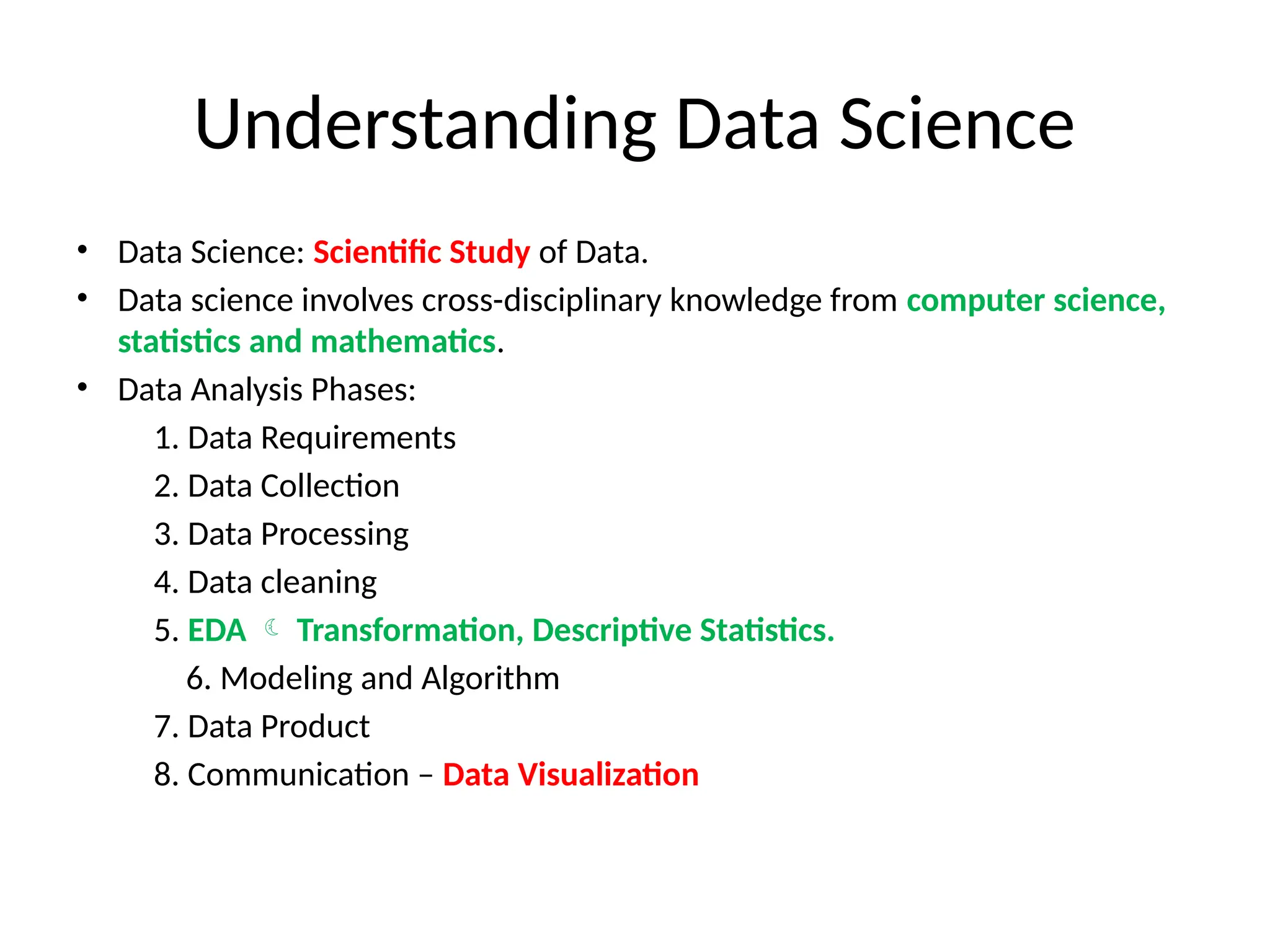
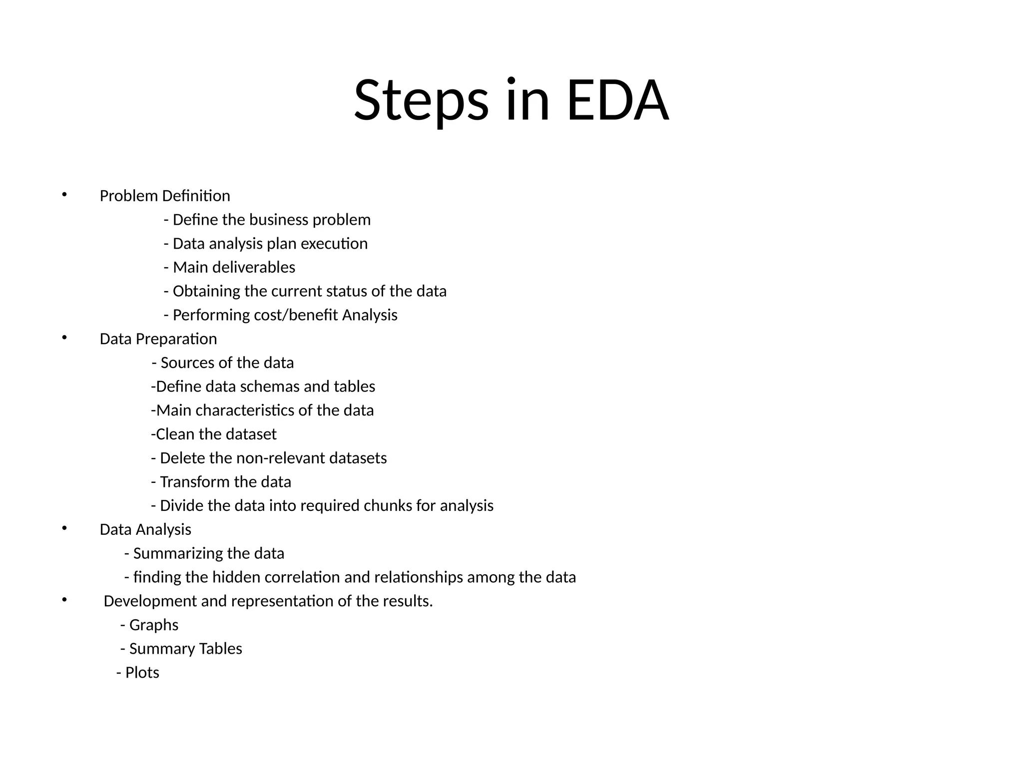
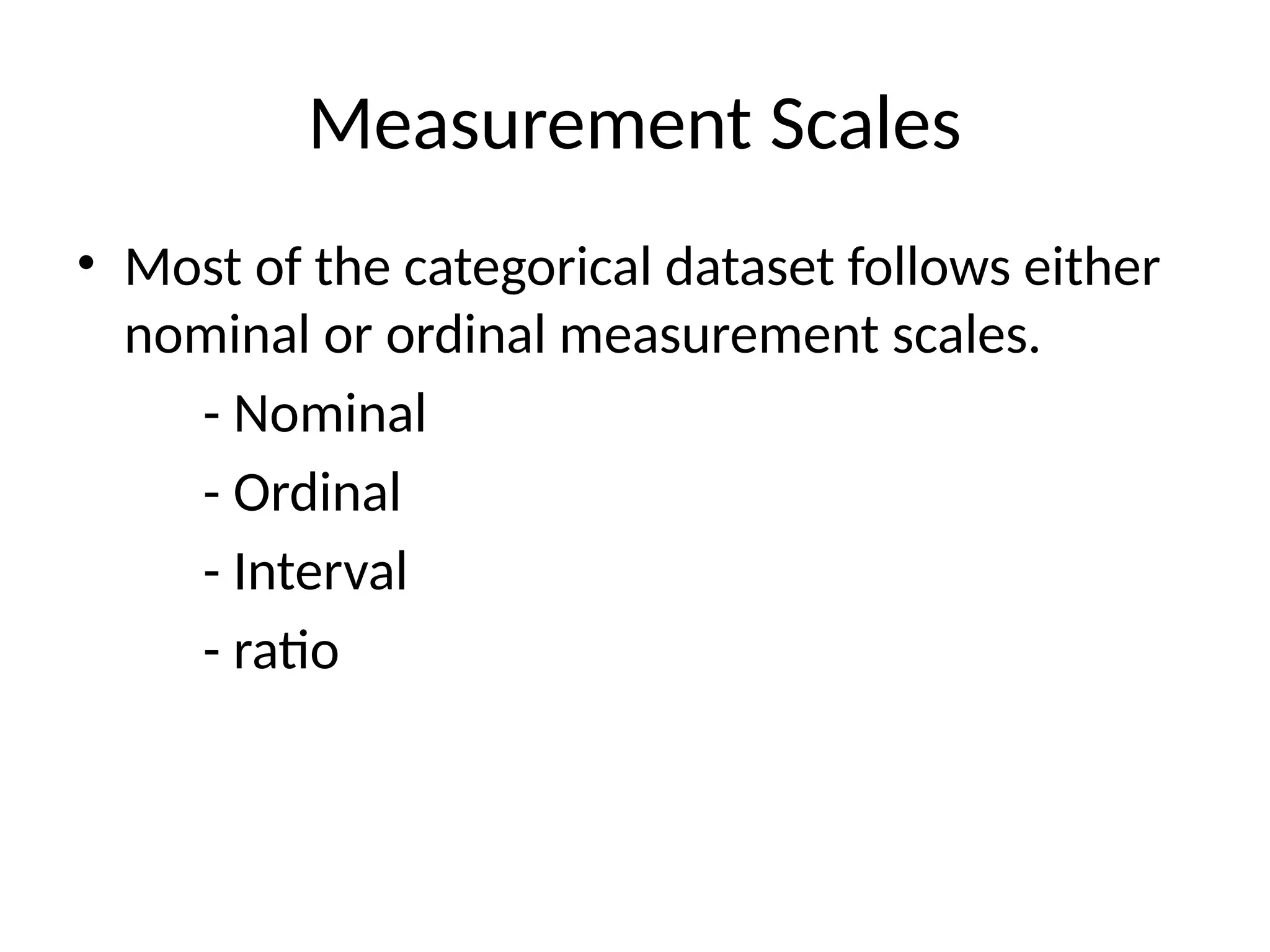
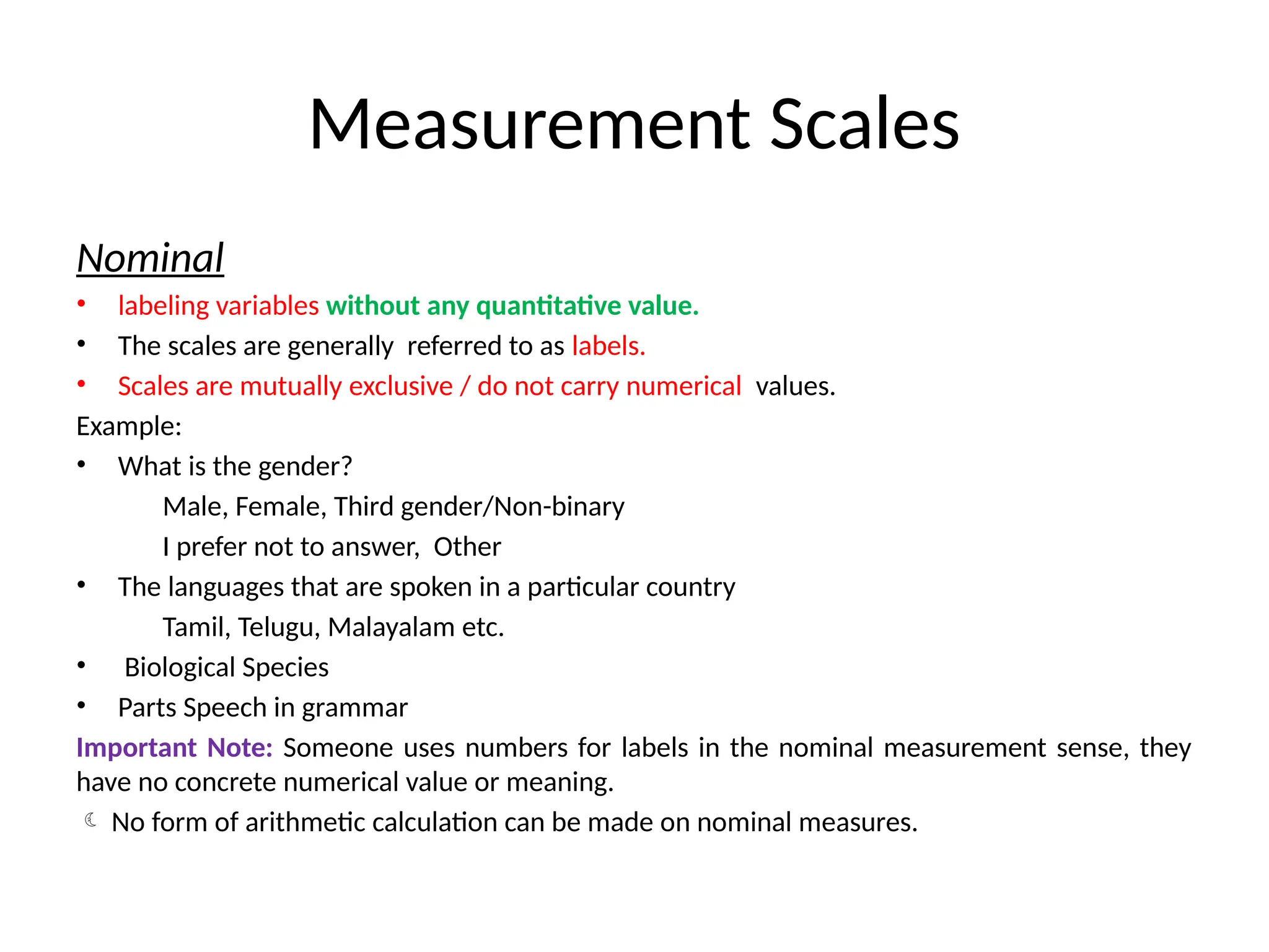
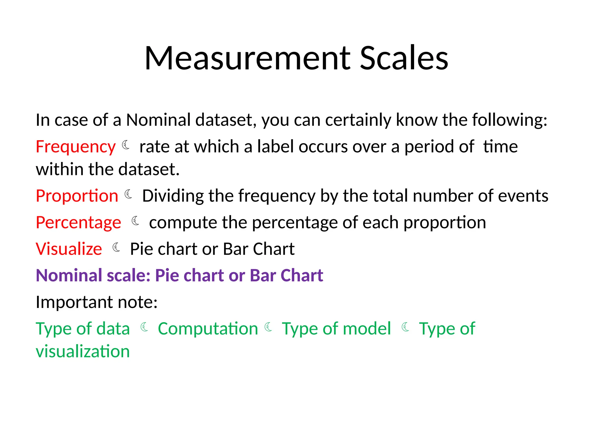
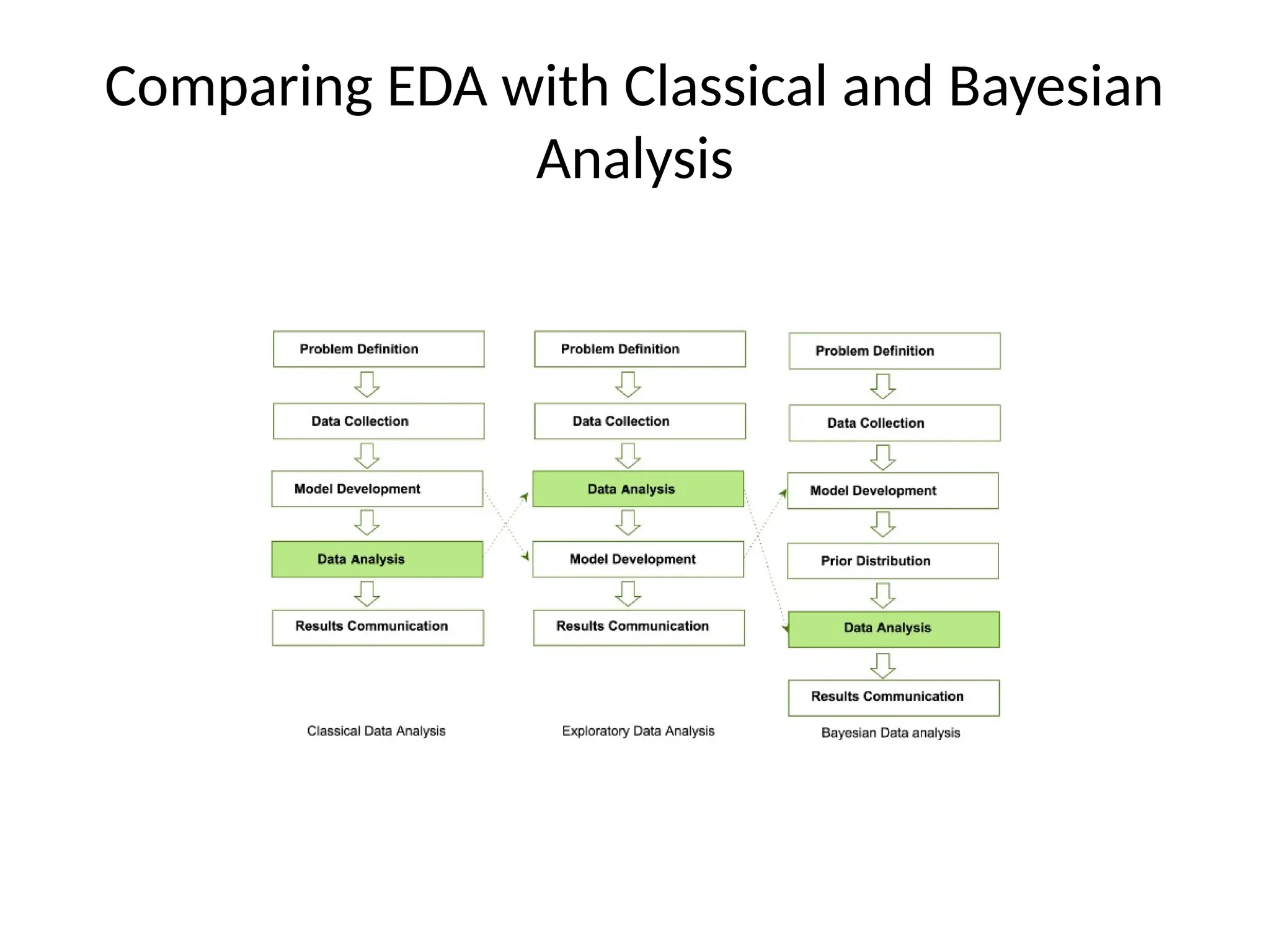
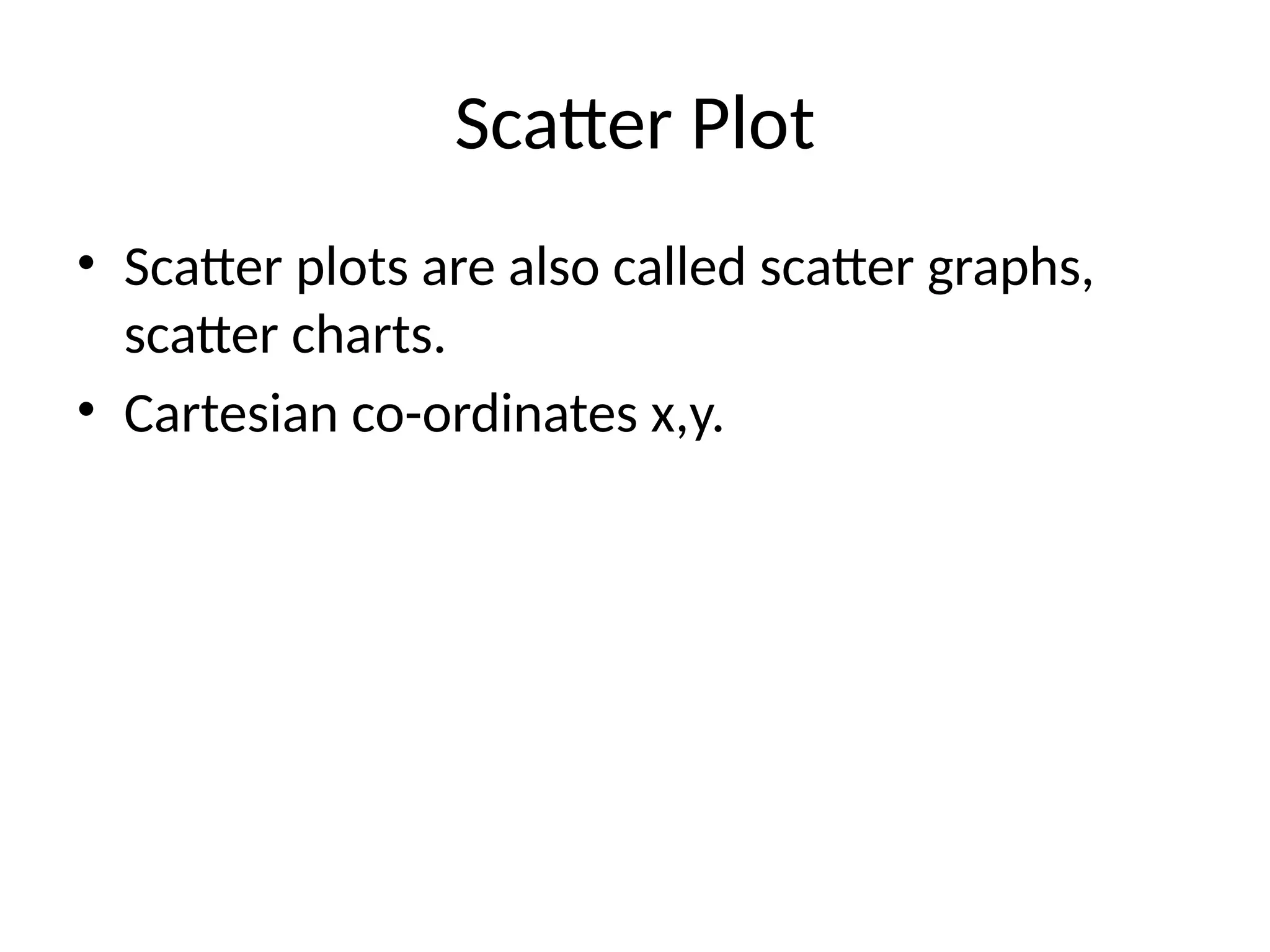
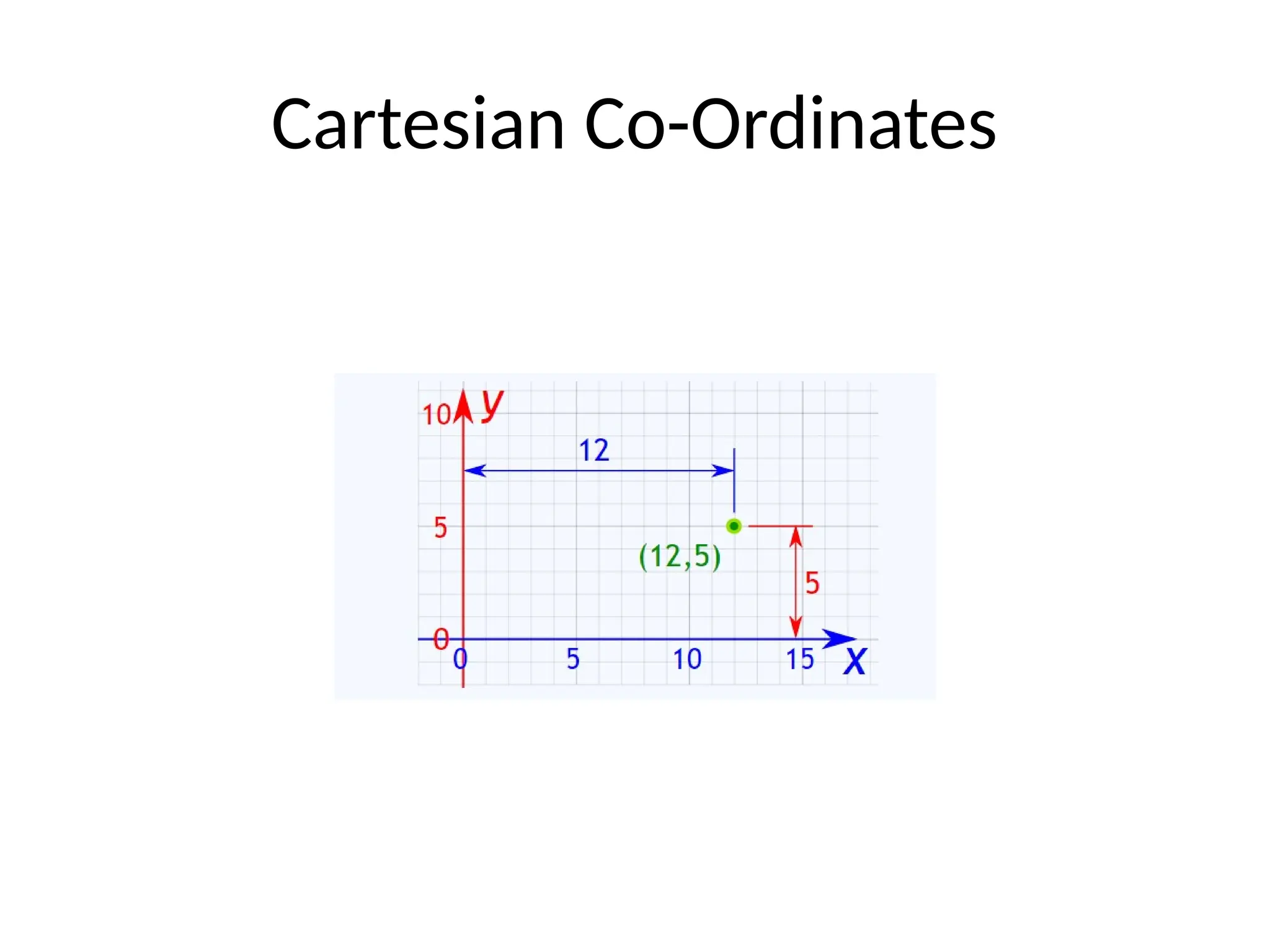
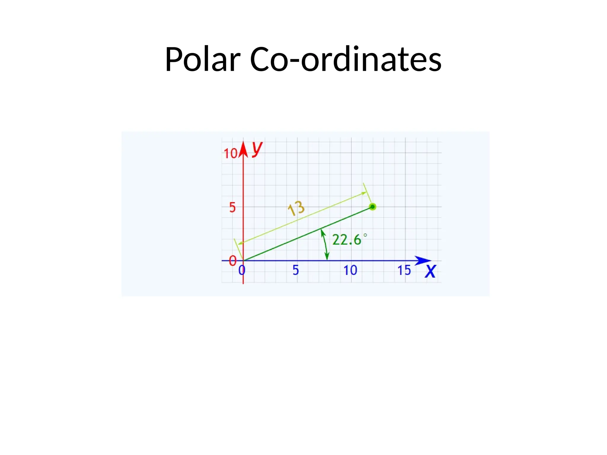
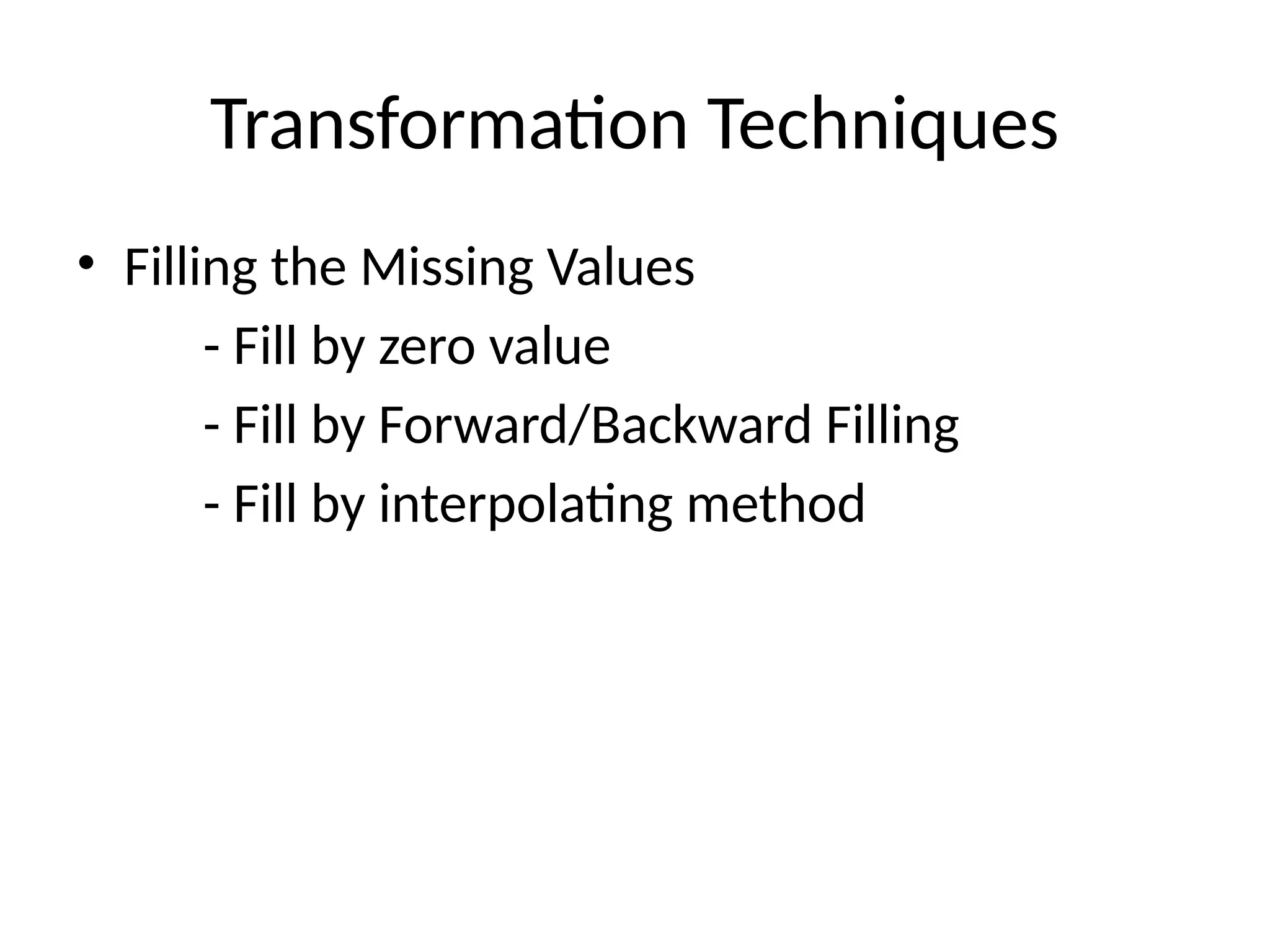
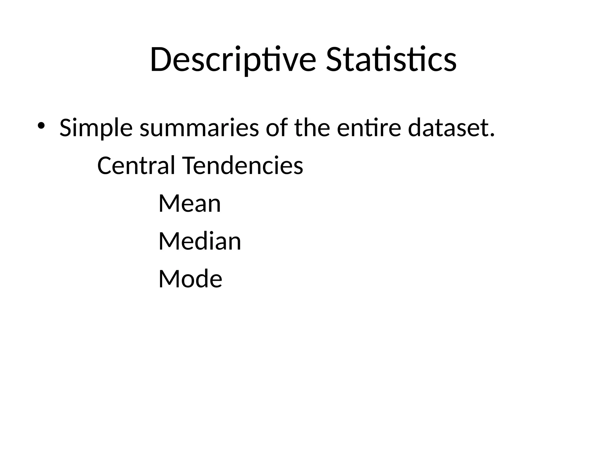
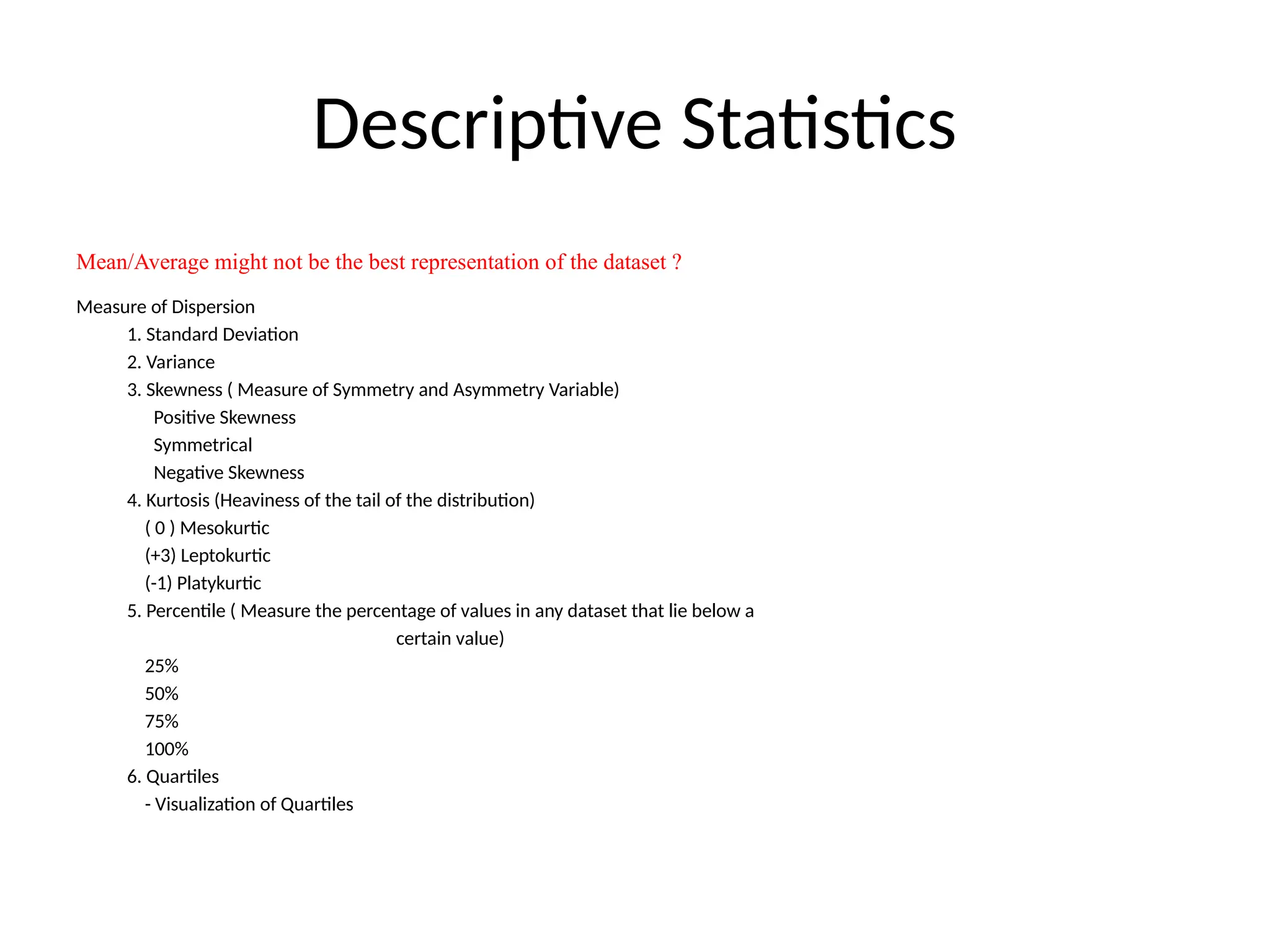
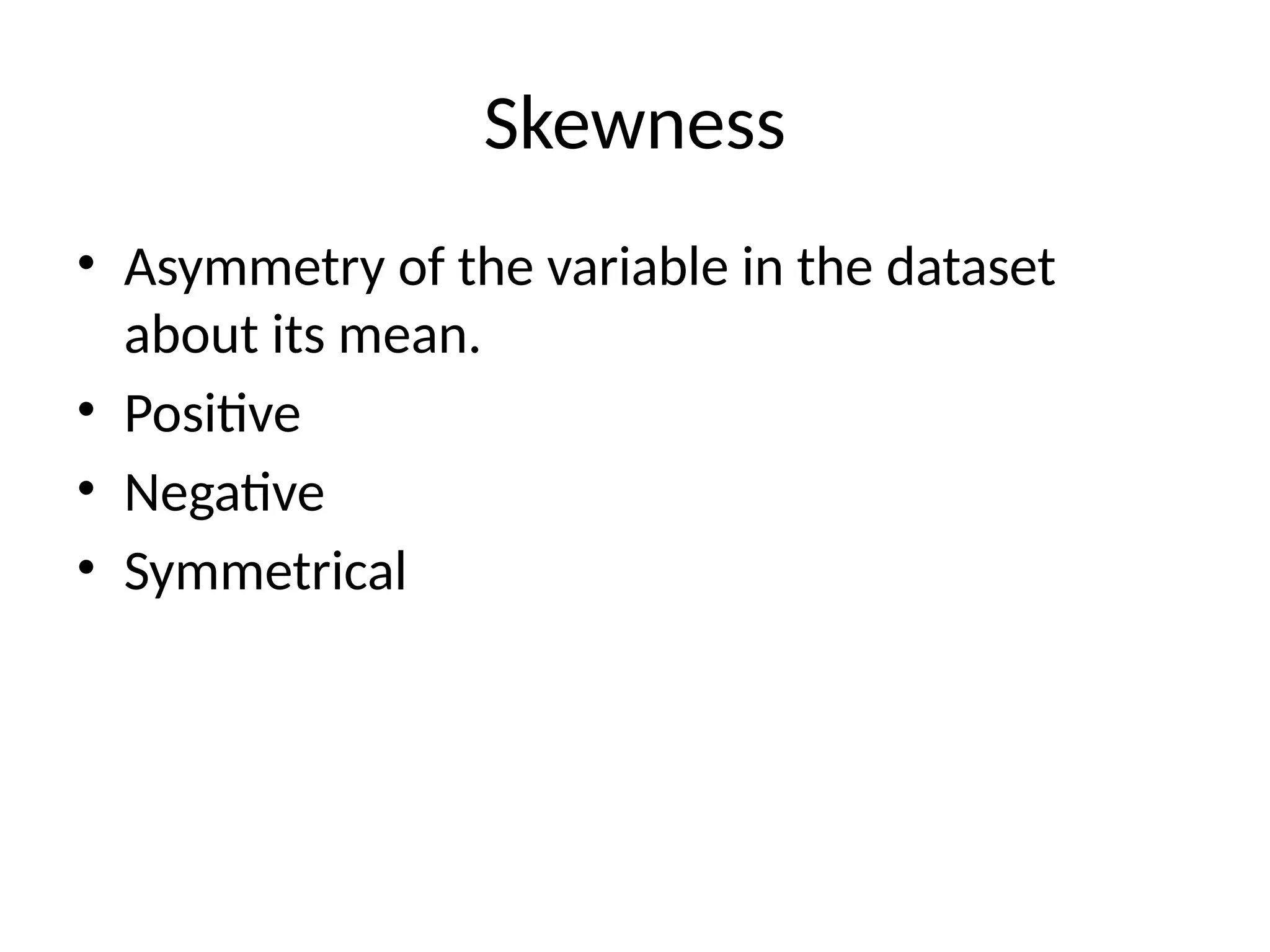
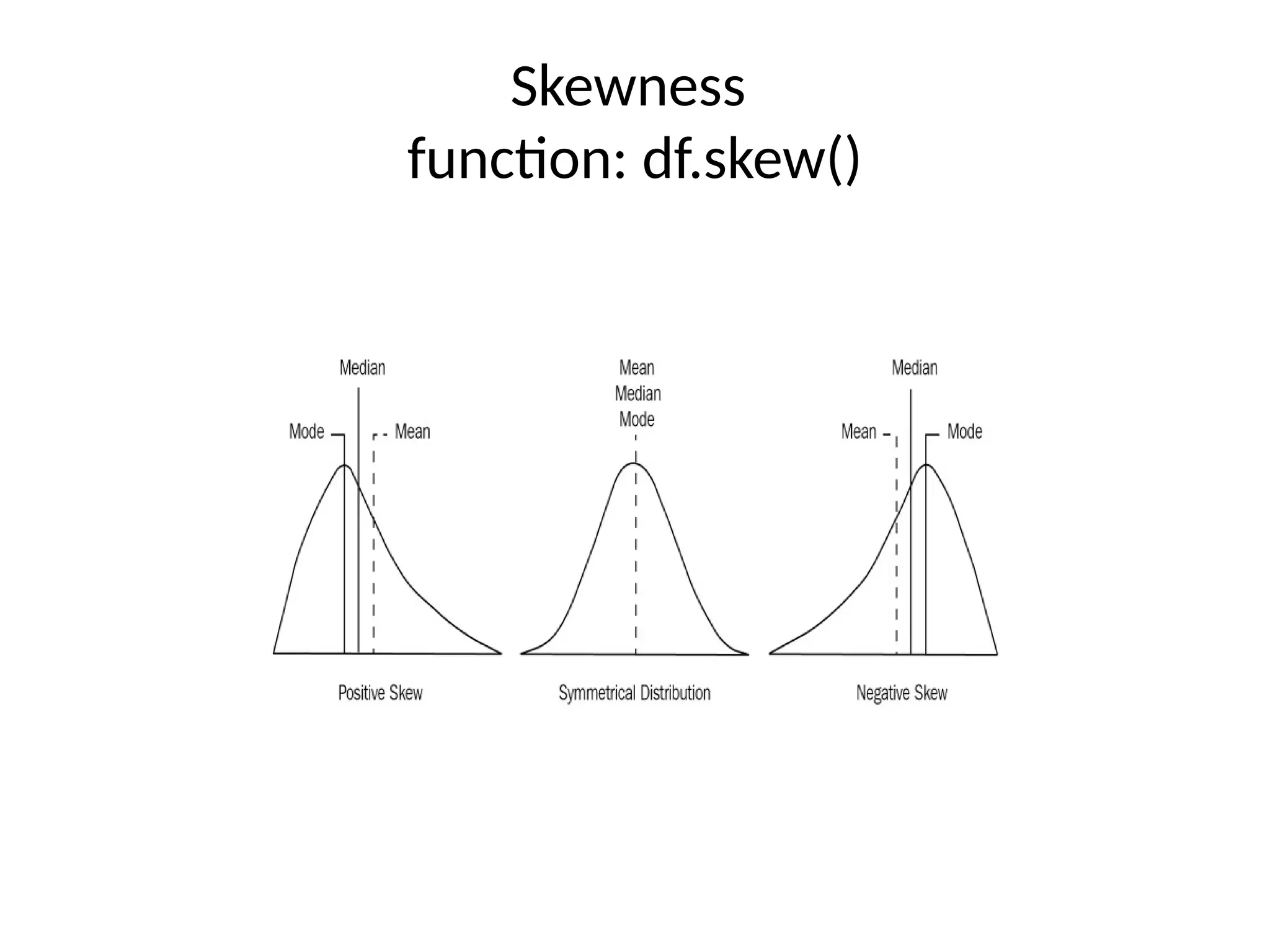
The document covers the fundamentals of exploratory data analysis (EDA) and its significance in data science, highlighting the phases of data analysis, types of data, and measurement scales. It emphasizes the importance of EDA in deriving insights from data and discusses various software tools and visualization techniques used in the process. Additionally, the document details methods for data transformation and descriptive statistics, along with different ways to visualize data effectively.
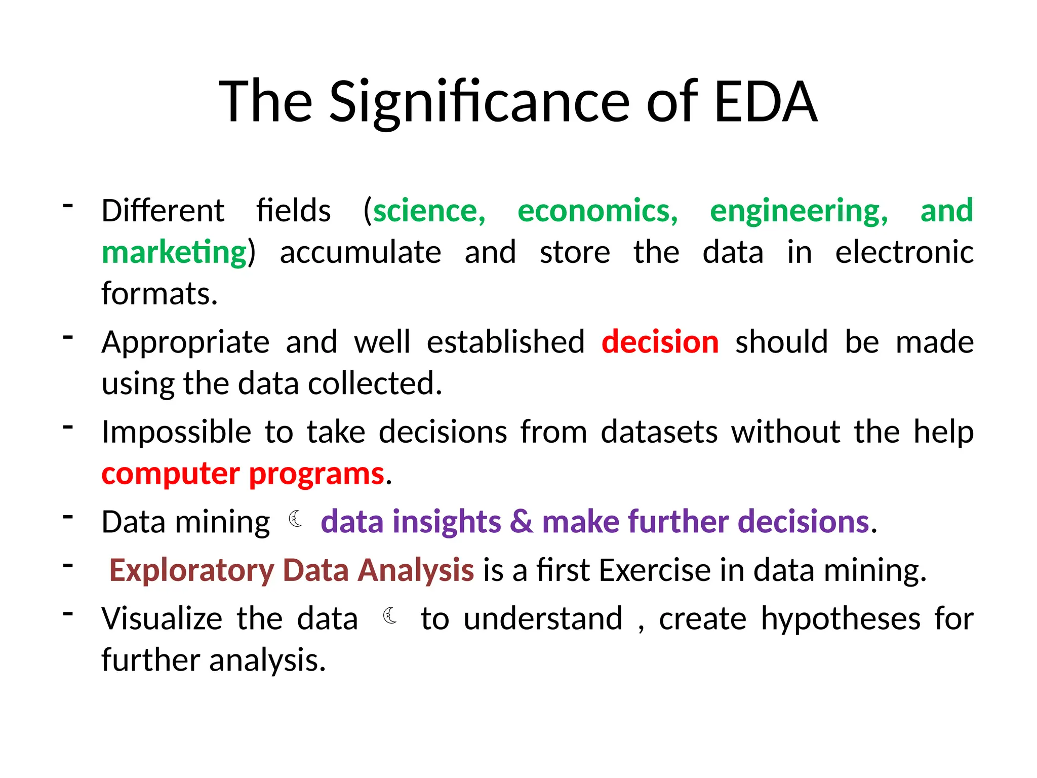
![The Significance of EDA
• EDA reveals ground truth of the content
without making any underlying assumptions.
• Scientists uses (EDA) what type of
modeling and hypothesis can be created.
• EDA
- summarizing data,[pandas]
- statistical data,[scipy]
- visualization of the data. [matplotlib]](https://image.slidesharecdn.com/unit-1-241226035027-850a4324/75/Types-of-Data-in-Machine-Learning-Number-aand-Categorical-5-2048.jpg)
![Making sense of Data
Type of data analysis?
1. Numerical data[Quantitative data]
Discrete data (fixed and distinct values)
Ex: Country code variable
Rank for students
Continuous data
Infinite number of numerical values within a
specific range](https://image.slidesharecdn.com/unit-1-241226035027-850a4324/75/Types-of-Data-in-Machine-Learning-Number-aand-Categorical-7-2048.jpg)
![Making Sense of Data
2. Categorical data[Qualitative data]
Categorical data represents the characteristics of an object.
Example:
Gender
Marital status
Movie Genres
Blood Type
Types of drugs
Types:
Binary categorical variable can take exactly two values anyone will be
selected. Dichotomous variable.
Polytomous variable can take more than two possible values. (Marital status)](https://image.slidesharecdn.com/unit-1-241226035027-850a4324/75/Types-of-Data-in-Machine-Learning-Number-aand-Categorical-8-2048.jpg)


![[DSC Europe 25] Aleksandra Dragicevic - AI-Boosted Research in Healthcare: Fr...](https://cdn.slidesharecdn.com/ss_thumbnails/iqwngszurf2r7pi1lnnj-4-aleksandra-dragicevic-ad-dsc-europe-conference-20-251208151905-37c3238a-thumbnail.jpg?width=640&height=640&fit=bounds)


![[DSC Europe 25] Bassam Maharmeh - Artificial Intelligence: Opportunities and ...](https://cdn.slidesharecdn.com/ss_thumbnails/thhfmr2fqpawzj7hsjpg-5-251211083048-2c23204f-thumbnail.jpg?width=640&height=640&fit=bounds)
![[DSC Europe 25] Milan Zdravkovic - The road less traveled in District Heating...](https://cdn.slidesharecdn.com/ss_thumbnails/nfaboniqwsz4ucyctnmy-2-milan-zdravkovic-dsc2025-the-road-less-traveled-in-district-heating-operation-251208151905-f56388a5-thumbnail.jpg?width=640&height=640&fit=bounds)

![[DSC Europe 25] Vladimir Jelic - The AI-Driven Security Shift From Reactive D...](https://cdn.slidesharecdn.com/ss_thumbnails/6g5gj25mtjwayniqem1t-6-251209104645-7a5a5fc6-thumbnail.jpg?width=640&height=640&fit=bounds)
![[DSC Europe 25] Dragana Ilic - AI for Big Data in Astronomy.pptx](https://cdn.slidesharecdn.com/ss_thumbnails/8palya86qaatvjhva1ms-2-dragana-ilic-ai-ilic-251208151906-652b819c-thumbnail.jpg?width=640&height=640&fit=bounds)
![[DSC Europe 25] Dusan Jovicic - AI Story: From on-prem to cloud and back agai...](https://cdn.slidesharecdn.com/ss_thumbnails/8kp49m6uq22ifnbwhfnk-2-251205085715-964d11a6-thumbnail.jpg?width=640&height=640&fit=bounds)
![[DSC Europe 25] Nikola Rajovic - Hardware Technologies Under the Hood: RISC-V...](https://cdn.slidesharecdn.com/ss_thumbnails/o2gptrmtoyqndgoshwgq-dsc2025-tenstorrent-rajovic-251205090438-814685f5-thumbnail.jpg?width=640&height=640&fit=bounds)

![[DSC Europe 25] Bogdan Daniel Maruneac - AI - It starts with you.pptx](https://cdn.slidesharecdn.com/ss_thumbnails/odov3snhrcqs9hx5ny2n-4-251205085715-f1daacfe-thumbnail.jpg?width=640&height=640&fit=bounds)

![[DSC Europe 25] Sara Polak - The Archaeology of Innovation: AI as the Next Cr...](https://cdn.slidesharecdn.com/ss_thumbnails/7ecbscdnt8mlcuqbd2ln-2-sara-polak-ai-creative-industries-251208152533-aa1fcf54-thumbnail.jpg?width=640&height=640&fit=bounds)

![[DSC Europe 25] Goran Obradovic - The Rise of Sovereign AI: Building the Regi...](https://cdn.slidesharecdn.com/ss_thumbnails/7nw2xxixrxqdxvrb5wca-6-251205085714-ab09a2ac-thumbnail.jpg?width=640&height=640&fit=bounds)