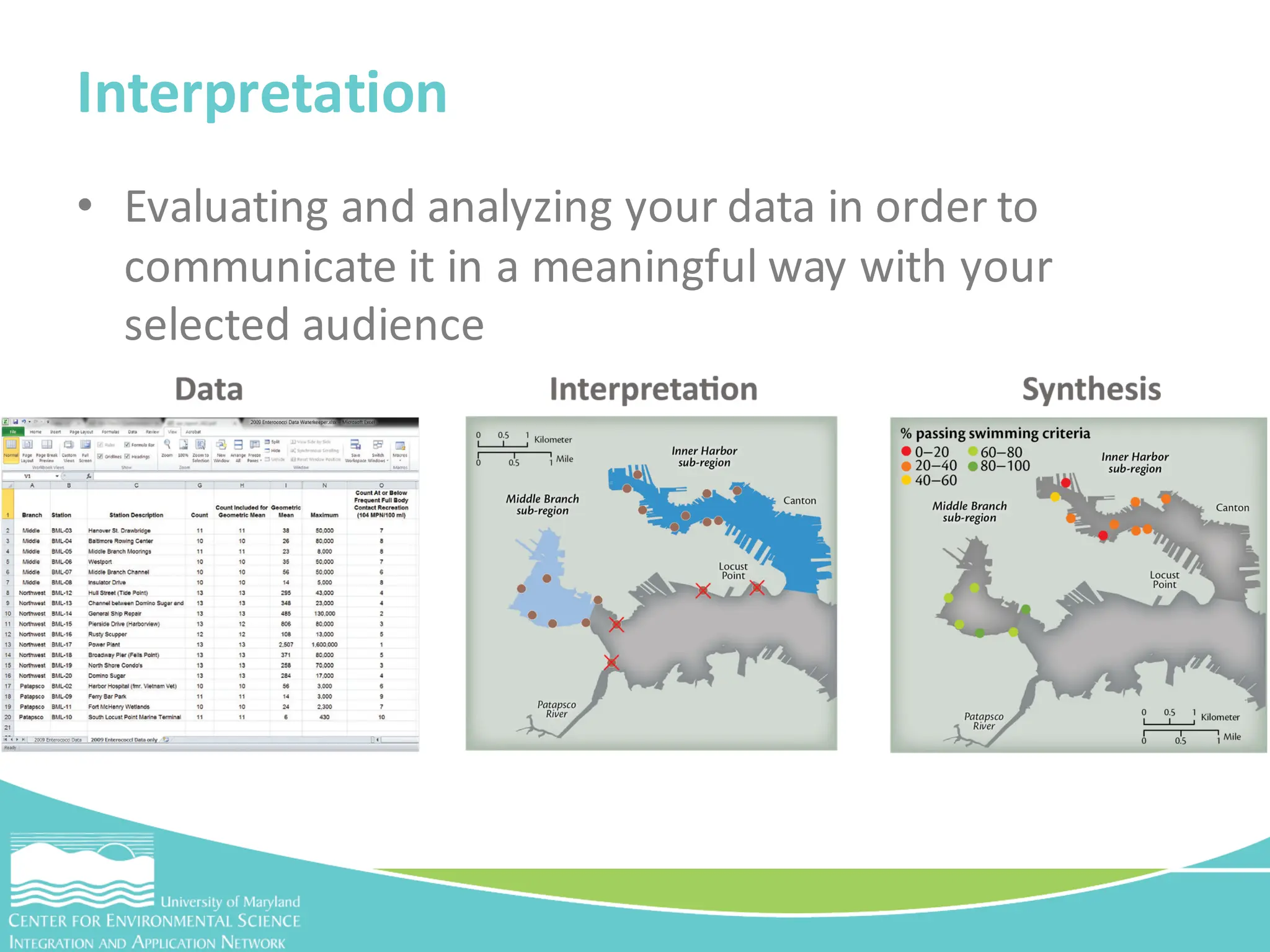
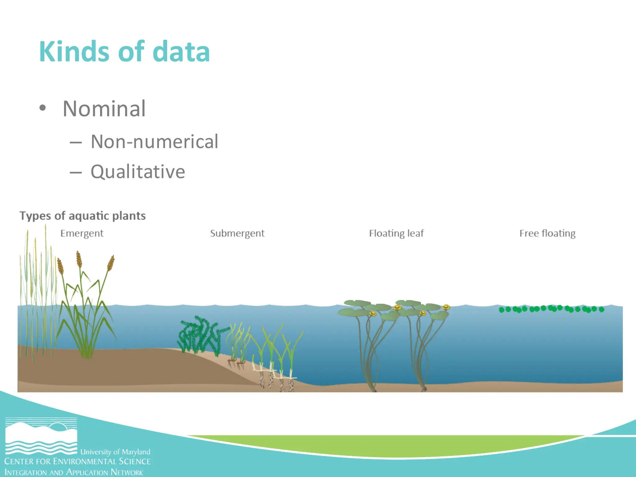
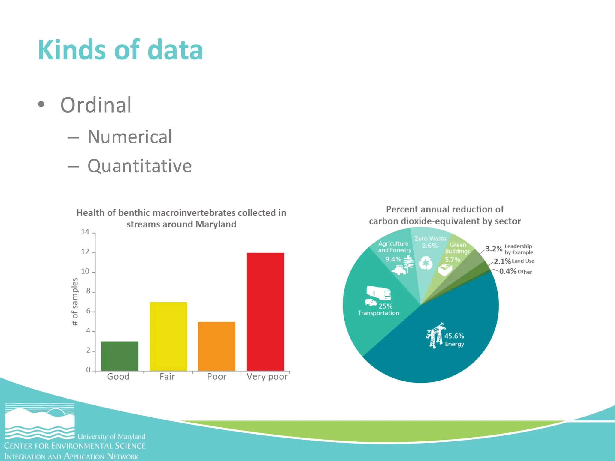
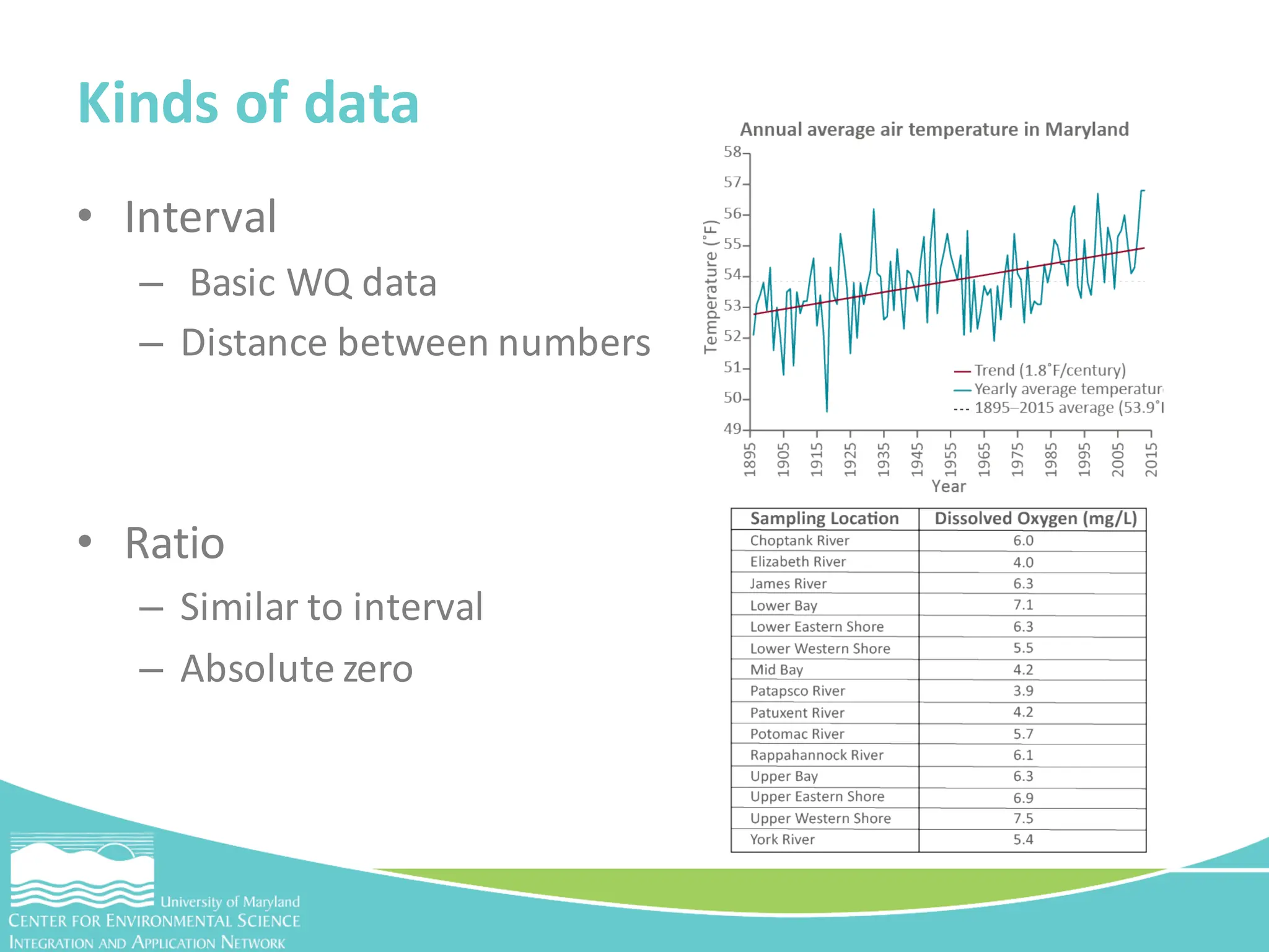
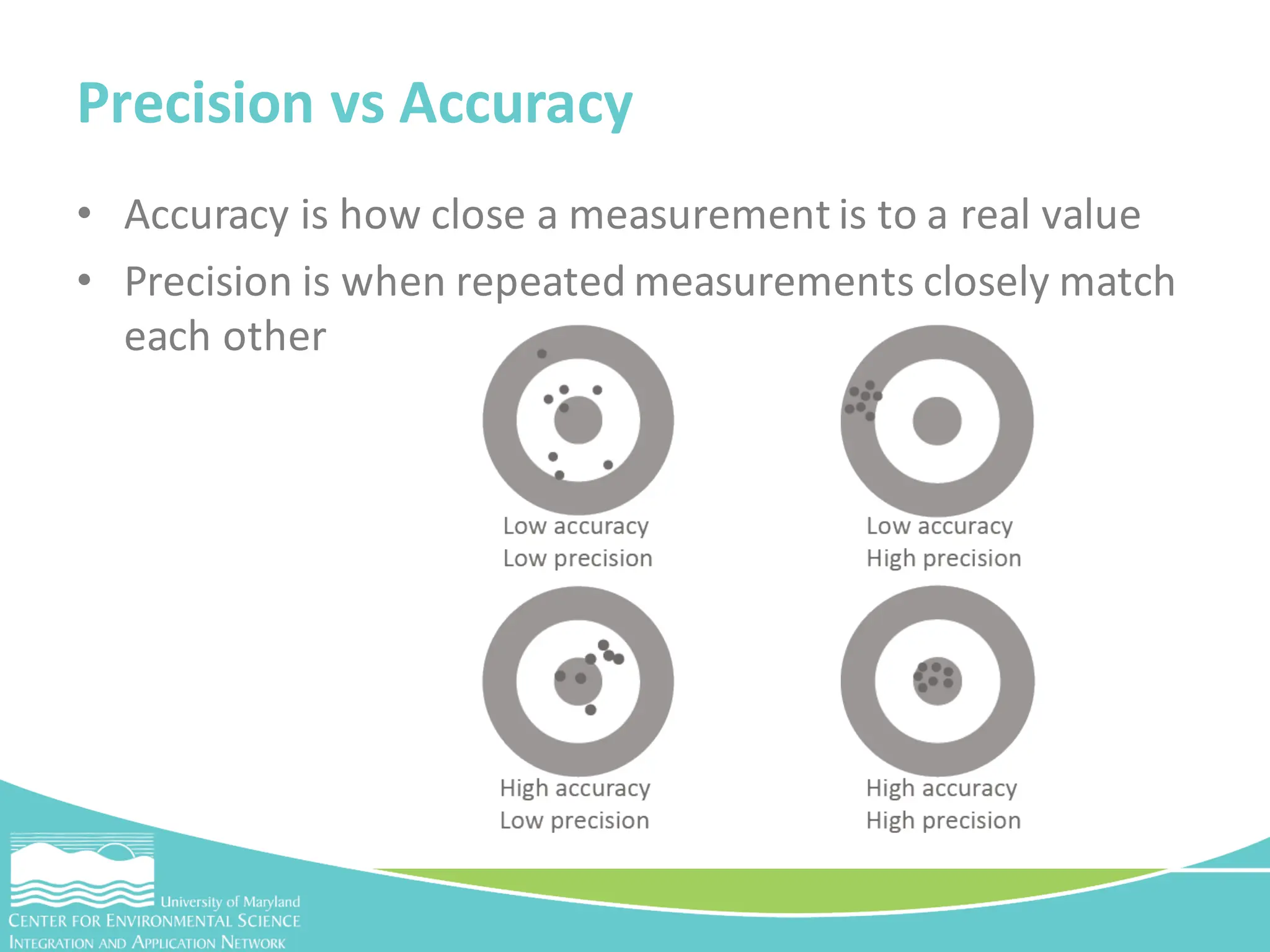
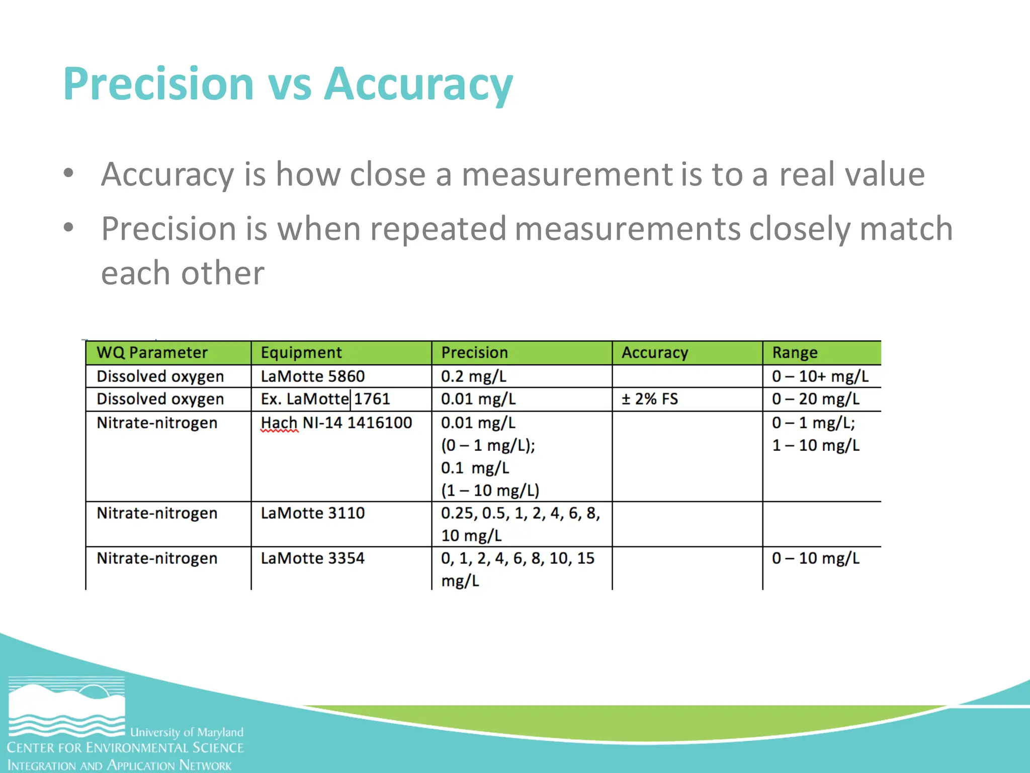
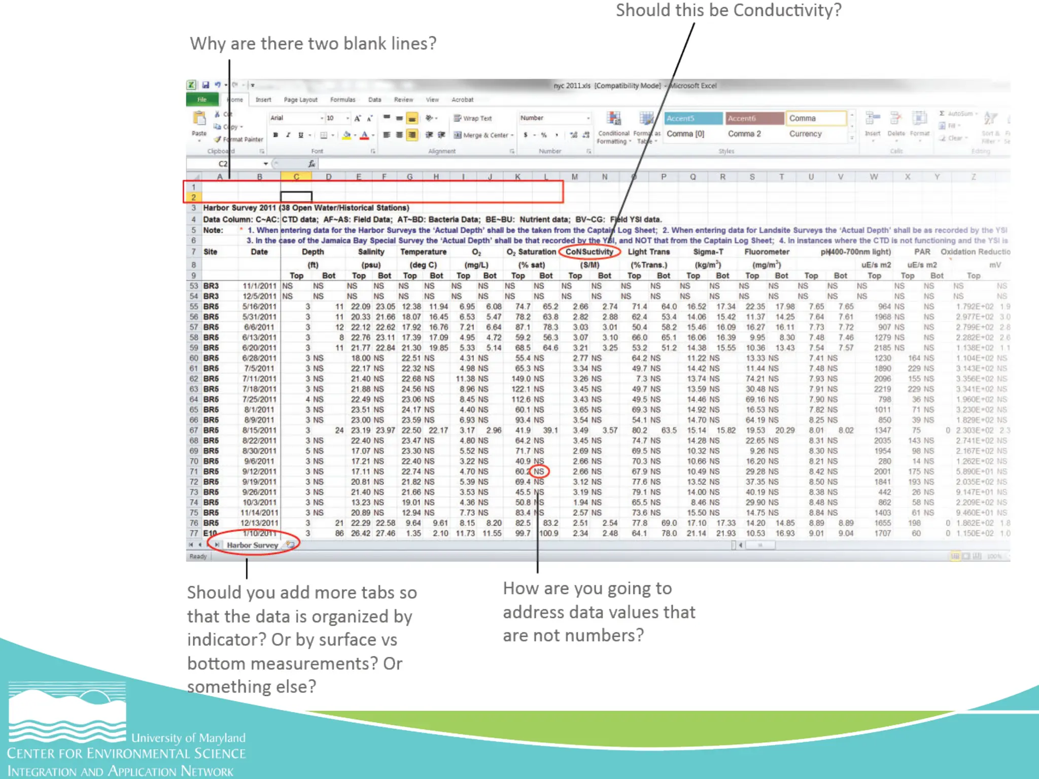
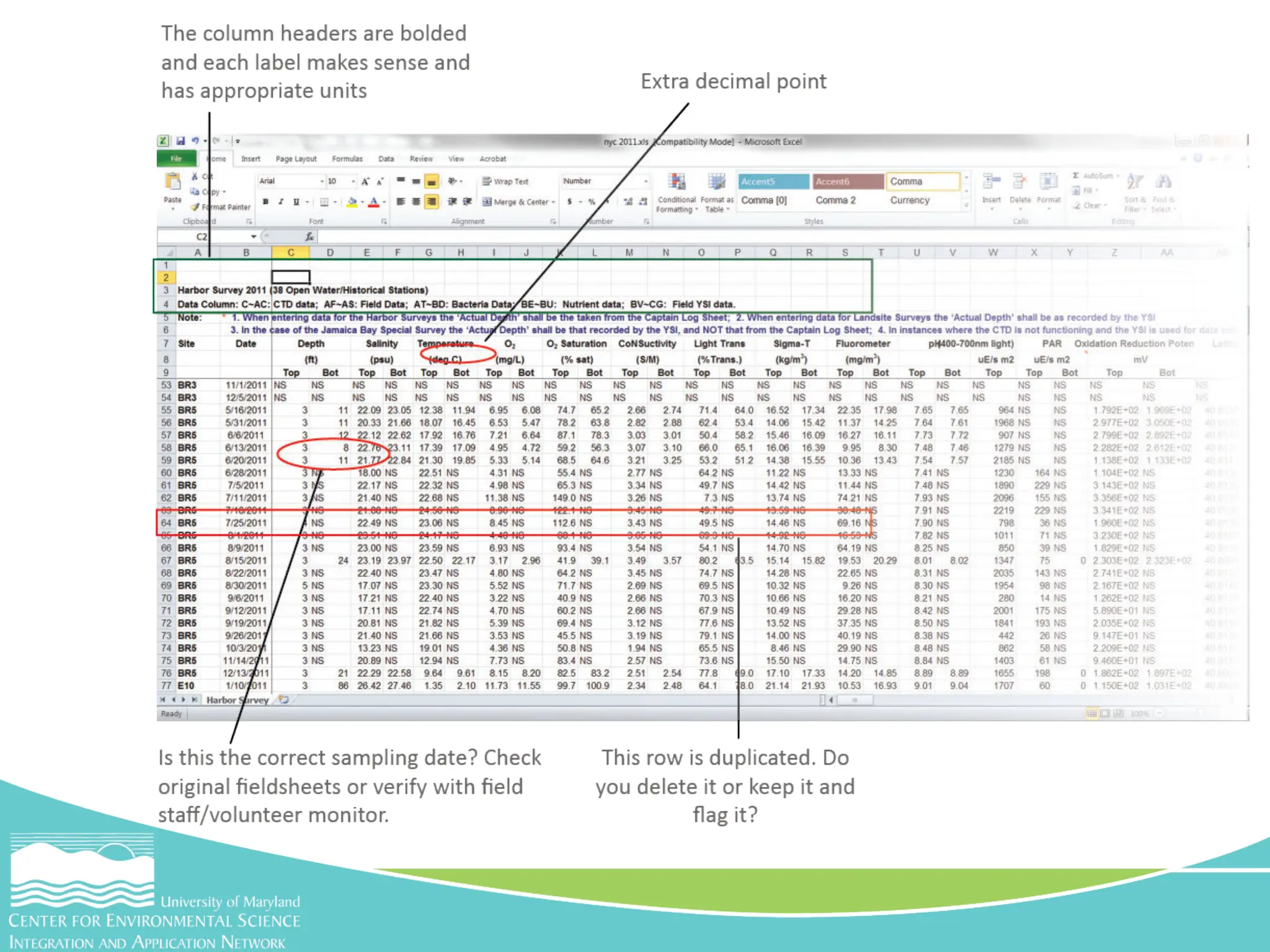
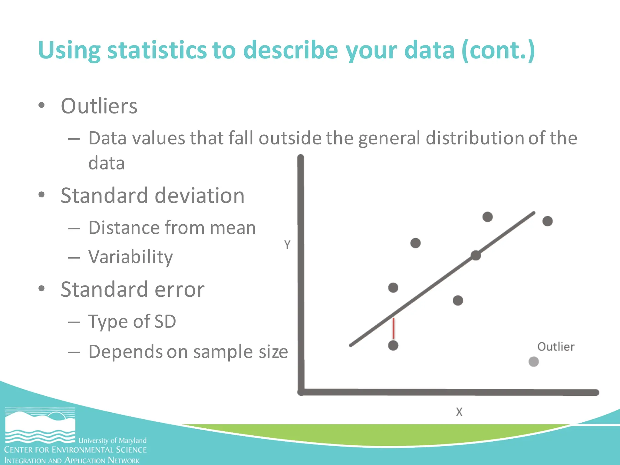
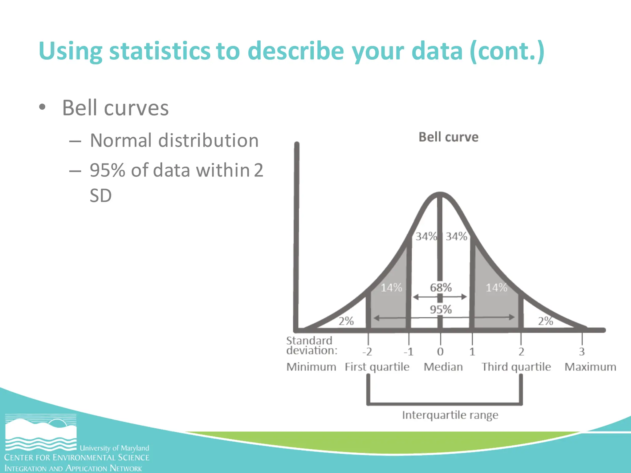
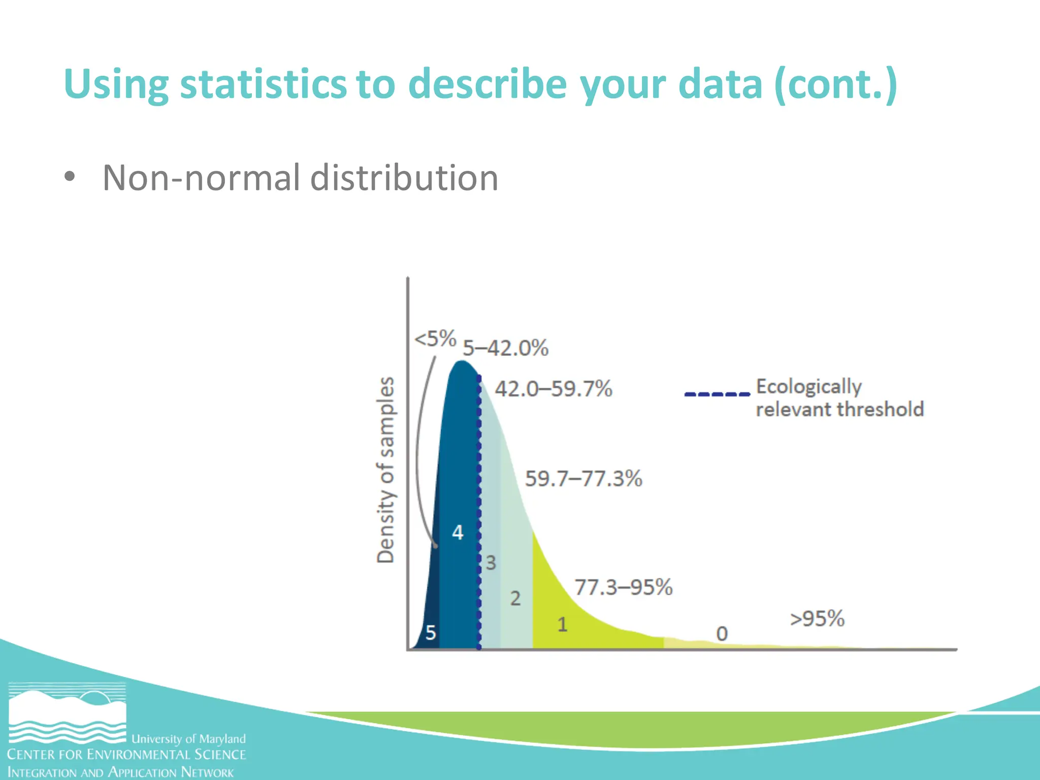
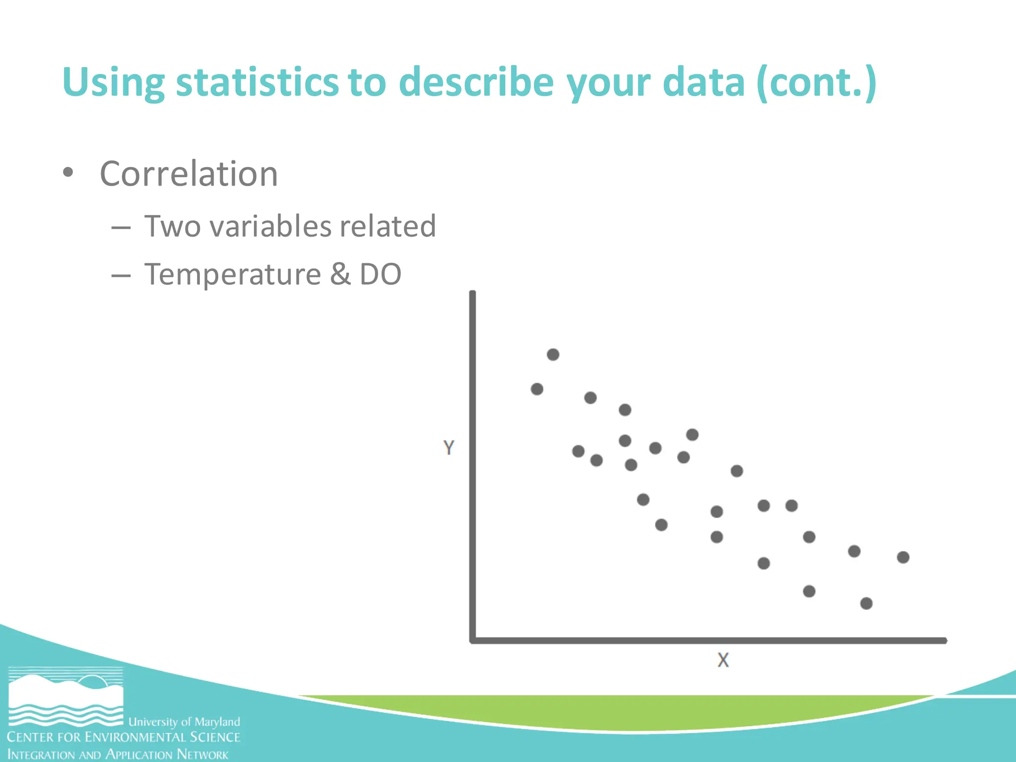
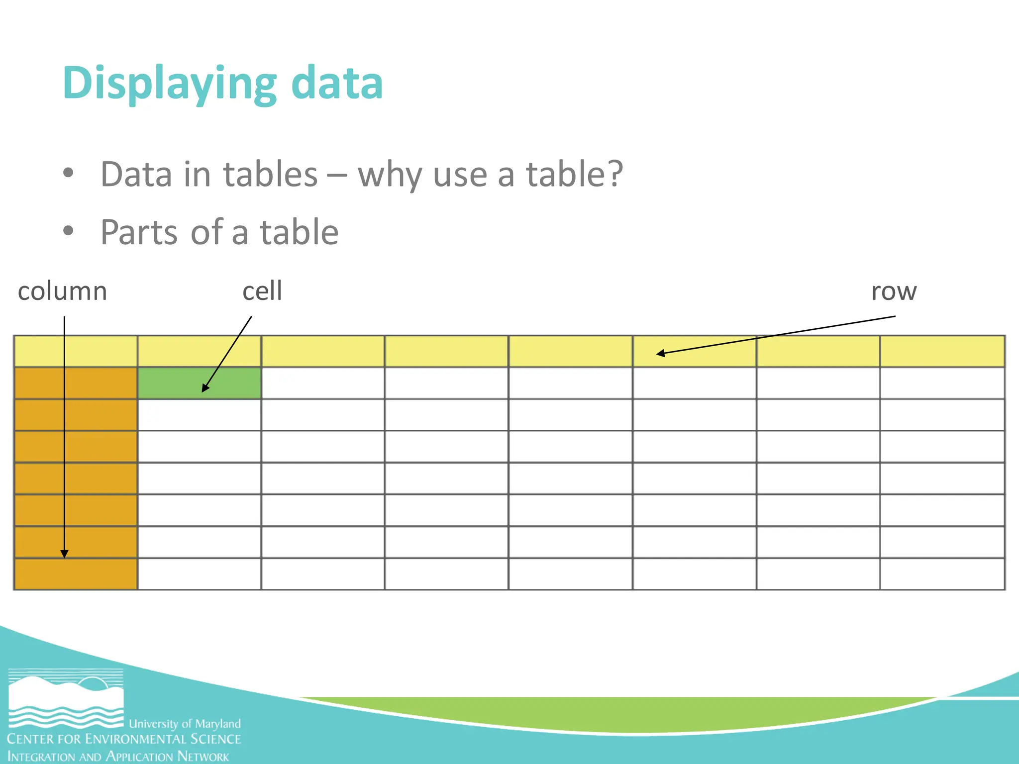
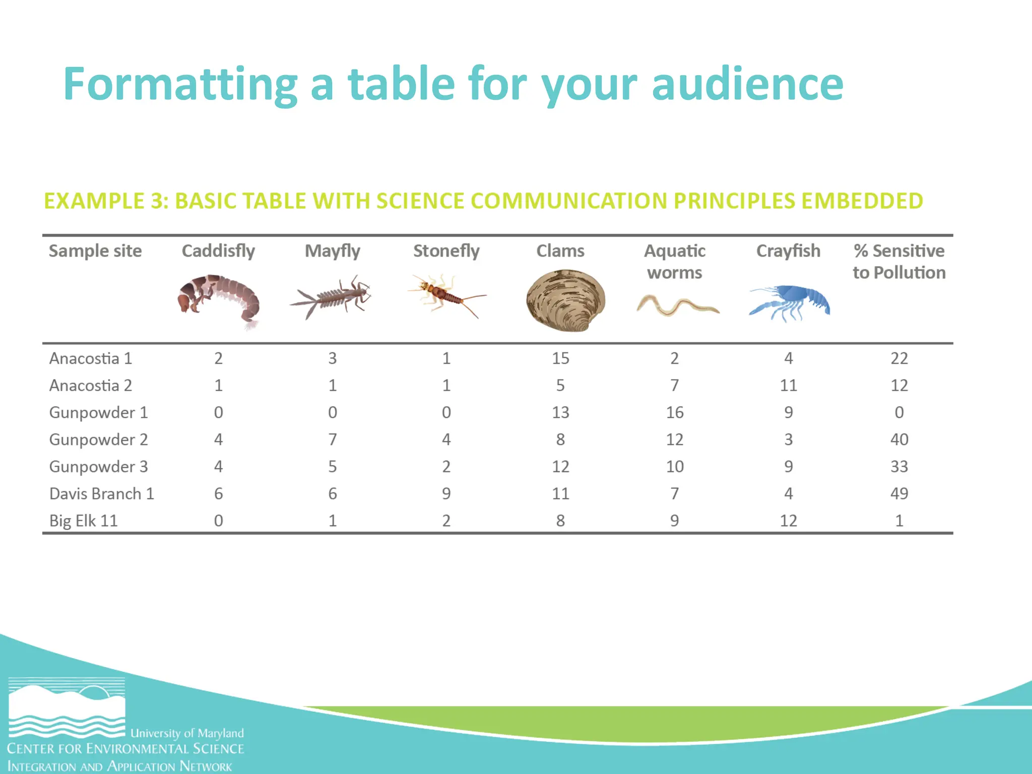
Dylan Taillie & Caroline Donovan
CMC Introductionto Data Interpretation Workshop
January 30, 2018
Tools for effective science communication
Interpreting your data
• Evaluating and analyzing your data in order to
communicate it in a meaningful way with your
selected audience
Interpretation
• Nominal
– Non-numerical
– Qualitative
Kinds of data
• Ordinal
– Numerical
– Quantitative
Kinds of data
• Interval
– Basic WQ data
– Distance between numbers
• Ratio
– Similar to interval
– Absolute zero
Kinds of data
• Accuracy is how close a measurement is to a real value
• Precision is when repeated measurements closely match
each other
Precision vs Accuracy
• Accuracy is how close a measurement is to a real value
• Precision is when repeated measurements closely match
each other
Precision vs Accuracy
• Cleaning is required before you interpret your data
• What does cleaning my data mean?
– Formatting your spreadsheet so it’s consistent
– Flagging unusual or duplicatedata
Activity - Cleaning your data in excel
• Are there headers with units associated with the
data values?
• Do the rows and columns have the right widths and
heights to view all the data or is that even needed?
• Are there any missing data that are in another
spreadsheet or on another tab that need to be
incorporated here?
Excel activity – step 1
• How are the data organized? By date or sampling
station? Which way is the best way to look at and
interpret the data?
• Are there any duplicate entries? Why? Do you delete
them altogether or save them “just in case”? How do
you organize and structure your files to do this?
• Are there any unusual data? You can sort the data
from high to low and determine if any values are
outside the expected range. This could be due to
typing errors, instrument error,or they could be
genuine outliers
Excel activity – step 2
• Are there any cells that need to be changed from
numbers to text or vice versa so that Excel can read
them correctly?
• How are your latitude and longitude written? Is it in
a format that works for you or for someone who will
be doing GIS mapping?
Excel activity – step 3
• What are descriptive statistics?
– Tools to providebasic summarized informationabout your
data
– Mean, median and mode
Using statistics to describe your data
• Range
– The total spread of all values in a dataset
Using statistics to describe your data (cont.)
• Outliers
– Data values that fall outside the general distributionof the
data
• Standard deviation
– Distance from mean
– Variability
• Standard error
– Type of SD
– Depends on sample size
Using statistics to describe your data (cont.)
• Bell curves
– Normal distribution
– 95% of data within2
SD
Using statistics to describe your data (cont.)
• Non-normal distribution
• Correlation
– Two variables related
– Temperature & DO
Using statistics to describe your data (cont.)
• Data in tables – why use a table?
• Parts of a table
Displaying data
row
column cell
Formatting a table for your audience
• Graphing data is the easiest way to visualize your
data
• Help you too:
– See relationships between different measurements in the
data
– Identify outliers
– Visualize and identify trends
Data in graphs
• Bar graph
• Line graph
• Pie graph
• Comparison bar graph
Types of graphs
Choosing a graph and formatting – bar graph
Choosing a graph and formatting – line graph
Choosing a graph and formatting – pie graph
• Help readers visually connect information
• Connect numbers from graphs to general patterns
and trends or show information on a geographic
scale
Data in figures
• Parts of a figure
– Maps
– Graphs
– Photos
– Text
– Caption
– Title
Data in figures
Figure example
Figure example
• Start small, let the data lead you
– What kind of data are you collecting?
– What is the best way to organize your data?
– What is the best graph for your data?
– Will a figure help explain your data?
• Thanks for joining us and let Caroline and I know if
you have any questions!
Summary
Now go back and choose the best display type
for your parameter!

Data-Interpretation-Workshop-Presentation.pdf

  • 1.
    Dylan Taillie &Caroline Donovan CMC Introductionto Data Interpretation Workshop January 30, 2018 Tools for effective science communication Interpreting your data
  • 2.
    • Evaluating andanalyzing your data in order to communicate it in a meaningful way with your selected audience Interpretation
  • 3.
    • Nominal – Non-numerical –Qualitative Kinds of data
  • 4.
    • Ordinal – Numerical –Quantitative Kinds of data
  • 5.
    • Interval – BasicWQ data – Distance between numbers • Ratio – Similar to interval – Absolute zero Kinds of data
  • 6.
    • Accuracy ishow close a measurement is to a real value • Precision is when repeated measurements closely match each other Precision vs Accuracy
  • 7.
    • Accuracy ishow close a measurement is to a real value • Precision is when repeated measurements closely match each other Precision vs Accuracy
  • 8.
    • Cleaning isrequired before you interpret your data • What does cleaning my data mean? – Formatting your spreadsheet so it’s consistent – Flagging unusual or duplicatedata Activity - Cleaning your data in excel
  • 9.
    • Are thereheaders with units associated with the data values? • Do the rows and columns have the right widths and heights to view all the data or is that even needed? • Are there any missing data that are in another spreadsheet or on another tab that need to be incorporated here? Excel activity – step 1
  • 11.
    • How arethe data organized? By date or sampling station? Which way is the best way to look at and interpret the data? • Are there any duplicate entries? Why? Do you delete them altogether or save them “just in case”? How do you organize and structure your files to do this? • Are there any unusual data? You can sort the data from high to low and determine if any values are outside the expected range. This could be due to typing errors, instrument error,or they could be genuine outliers Excel activity – step 2
  • 13.
    • Are thereany cells that need to be changed from numbers to text or vice versa so that Excel can read them correctly? • How are your latitude and longitude written? Is it in a format that works for you or for someone who will be doing GIS mapping? Excel activity – step 3
  • 15.
    • What aredescriptive statistics? – Tools to providebasic summarized informationabout your data – Mean, median and mode Using statistics to describe your data
  • 16.
    • Range – Thetotal spread of all values in a dataset Using statistics to describe your data (cont.)
  • 17.
    • Outliers – Datavalues that fall outside the general distributionof the data • Standard deviation – Distance from mean – Variability • Standard error – Type of SD – Depends on sample size Using statistics to describe your data (cont.)
  • 18.
    • Bell curves –Normal distribution – 95% of data within2 SD Using statistics to describe your data (cont.)
  • 19.
    Using statistics todescribe your data (cont.) • Non-normal distribution
  • 20.
    • Correlation – Twovariables related – Temperature & DO Using statistics to describe your data (cont.)
  • 21.
    • Data intables – why use a table? • Parts of a table Displaying data row column cell
  • 22.
    Formatting a tablefor your audience
  • 23.
    • Graphing datais the easiest way to visualize your data • Help you too: – See relationships between different measurements in the data – Identify outliers – Visualize and identify trends Data in graphs
  • 24.
    • Bar graph •Line graph • Pie graph • Comparison bar graph Types of graphs
  • 25.
    Choosing a graphand formatting – bar graph
  • 26.
    Choosing a graphand formatting – line graph
  • 27.
    Choosing a graphand formatting – pie graph
  • 29.
    • Help readersvisually connect information • Connect numbers from graphs to general patterns and trends or show information on a geographic scale Data in figures
  • 30.
    • Parts ofa figure – Maps – Graphs – Photos – Text – Caption – Title Data in figures
  • 31.
  • 32.
  • 33.
    • Start small,let the data lead you – What kind of data are you collecting? – What is the best way to organize your data? – What is the best graph for your data? – Will a figure help explain your data? • Thanks for joining us and let Caroline and I know if you have any questions! Summary
  • 34.
    Now go backand choose the best display type for your parameter!