The document describes the design process for a digipak created to promote a music video. Key details:
- The digipak was designed in Photoshop and assembled in InDesign for production requirements.
- The design features earth tones like grey, green and gold for a vintage, aged appearance fitting the historic nature of CDs.
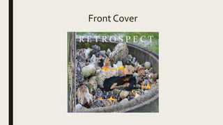
- The front cover features a burnt image from the video in natural colors with a vintage font for the title.
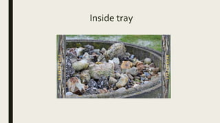
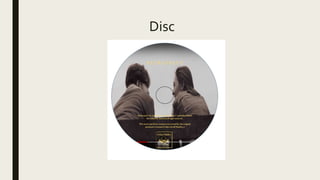
- Inside elements like the disc and tray continue the minimal front cover design.
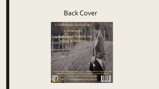
- The back lists production credits and includes a barcode for store scanning.
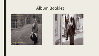
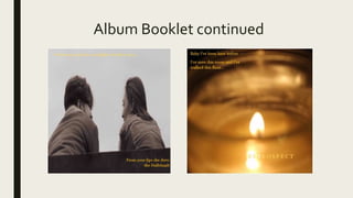
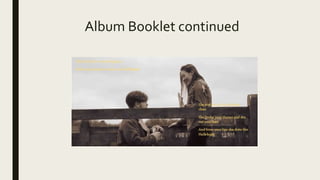
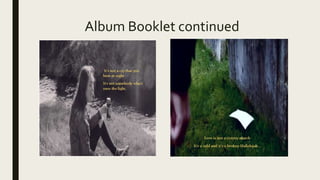
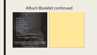
- An album booklet uses video stills and lyrics with the same font for