SlideShare a Scribd company logo
The blue box that runs around the edge of our digipak images is not part of the finished product, nor are the red lines under non-dictionary words. These will all be removed and posted alongside the final products at the end, but for the purpose of analysis, we will be using this version. Front Cover Back Cover Insert Flap
The blue box that runs around the edge of our digipak images is not part of the finished product, nor are the red lines under non-dictionary words. These will all be removed and posted alongside the final products at the end, but for the purpose of analysis, we will be using this version. Right Panel Reverse panel to Insert Flap Central Panel CD Panel Reverse panel to Back Cover Left Panel Reverse panel to Front Cover
Front Cover We shot each image in black and white, but each had to have editing changes made so it matched the others. We also edited in a soft fish-eye effect and some lighting effects to create the look of a light on the album. We decided to leave the lines between each image to continue the theme of separation, which was used in the advert too. However, we did ensure that each photo was taken from the same distance to help with sizing. The typography used on the cover is the same used throughout the advert, video and the digipak, which adds continuity. It is a serif-based font, but is soft at the same time, which  helps describe our music and create a brand. The black and white effect was something that we used throughout the advert and the video, so we chose to use it in the digipak too. We didn’t want to clutter the front cover of the album, as our research showed that artists like Christina don’t tend to have a lot on their covers, and it depends on their brand identity. For this reason, we chose to have all writing at the top, and let the image be the stand-out area of the cover. By designing the digipak with the finished article in mind, we built a template that incorporated spines that would fit the whole project together. The use of Christina’s major record label, RCA, on this spine, is something we found happens a lot through our research. With our house colours being orange, red and black, we felt that the images were more effective in B&W, so left them as that. The motif of the stool is used within the digipak, but the more prominent motif across the projects seems to be the B&W effect.
Back Cover The image of a torn-up diary behind the text relates to the album title, ‘The Diary of my Broken Heart.’ Some of the songs are written on dates, which can be seen through the text. It also acts as a good background, as it is white. We wanted a stark contrast between front cover and back, so we tried to fill the cover as best as possible whilst not obscuring the image. The typography is the same used throughout the projects, and is has a 1920’s vibe about it. This is very similar to our music and our style for the video, and it helps define our brand. By including ways to contact Christina, we have opened up the album to our target audience, who will access the website. Although we haven’t designing the website, it acts as a way of keeping in touch with her fans, and adds some intimacy, which we found during our research is very prominent. The use of two colours for the tracklist again helps display the theme of separation, and relates to the song titles. It also helps incorporate the house colour of red against the white background. The use of the record label logos above the barcode is a traditional convention of a digipak, and was also used on our magazine advert. All relevant industry information that we saw throughout our various sets of research was used on the back of the album cover.  This includes copyright information, production info and record company details.
Insert Flap We didn’t want any writing on this panel, as we felt that the image was quite important and so nothing should take away from that.  This flap shows the star image motif and the house colours. It was an image taken on a day of shooting, and as a standalone image, does not mean a lot to the viewer, however, is very significant to the project and specifically the storyline of the video. We decided to use an image of the stool having been kicked over, rather than still on four legs, as this is a defining image from the video. The woman kicking the stool over signifies that the man is out of her life, lending itself to our theme of separation again. By not showing someone on this panel, we have been able to create a brand that is not reliant on selling the music through the person, and that the identity of the artist is not necessarily compulsory. This is the only use of the house colours on the whole of the digipak, as we felt that with this being the first image you see as you open the front cover, it should stand out.
Inside the Digipak By covering the man’s face with the CD, it continues the theme of separation, as once fully opened out, you would only be able to see the two women, with a gap running through the middle. By shooting the images initially in black and white, we were able to gain the lighting effects immediately, rather than having to choose a filter once editing. We shot these images to look vaguely like police mug shots, to show that they were in the wrong, but also very upset. Right Panel Reverse panel to Insert Flap Central Panel CD Panel Reverse panel to Back Cover Left Panel Reverse panel to Front Cover We wanted to keep our genre characteristics very traditional, and we chose to keep to as many conventions as possible. For this reason, everything on the inside is simple, yet carefully thought through to ensure this happens. By using the three images used on the cover, we help unpick a puzzle and it also adds another side to each character. The slight smirk on the male’s face adds a sense of mystery around the image. Again, we used the B&W effect, which is our secondary motif. The lack of colour will make the CD stand out from the packaging, which we plan to have as one of the house colours.

More Related Content

What's hot

Digipack resultant images
Digipack resultant imagesDigipack resultant images
Digipack resultant images
ryangriffiths1999
 
Question 2
Question 2Question 2
Question 2NyashaMJ
 
Evaluation 2
Evaluation 2Evaluation 2
Evaluation 2
Jade Chopra
 
Cd inlay ideas
Cd inlay ideasCd inlay ideas
Cd inlay ideastrupti_123
 
Q1 digipack
Q1 digipackQ1 digipack
Q1 digipack
charlie_kowalik
 
Digipak and Magazine Advert improvments
Digipak and Magazine Advert improvments Digipak and Magazine Advert improvments
Digipak and Magazine Advert improvments
godsell1999
 
Planning The Contents Of My Digipak Booklet
Planning The Contents Of My Digipak BookletPlanning The Contents Of My Digipak Booklet
Planning The Contents Of My Digipak Bookletguest3d82fa
 
Proposal
ProposalProposal
Proposal
LucyBennett10
 
Digilatised cd cover official
Digilatised cd cover officialDigilatised cd cover official
Digilatised cd cover official
TPugsley
 
Digilatised cd cover official
Digilatised cd cover officialDigilatised cd cover official
Digilatised cd cover official
TPugsley
 
Digilatised cd cover official
Digilatised cd cover officialDigilatised cd cover official
Digilatised cd cover official
TPugsley
 
Cd case – de shamonix
Cd case – de shamonixCd case – de shamonix
Cd case – de shamonixjstout1
 
Q1 digipack
Q1 digipackQ1 digipack
Q1 digipack
charlie_kowalik
 
Eval 1 presentation
Eval 1 presentationEval 1 presentation
Eval 1 presentation
jaziiee
 
Q1 video
Q1 video Q1 video
Q1 video
charlie_kowalik
 
Evaluation media
Evaluation   mediaEvaluation   media
Evaluation media
evamariaa
 
Q1 poster
Q1 poster Q1 poster
Q1 poster
charlie_kowalik
 

What's hot (20)

Digipack resultant images
Digipack resultant imagesDigipack resultant images
Digipack resultant images
 
Question 2
Question 2Question 2
Question 2
 
Evaluation 2
Evaluation 2Evaluation 2
Evaluation 2
 
Cd inlay ideas
Cd inlay ideasCd inlay ideas
Cd inlay ideas
 
Q1 digipack
Q1 digipackQ1 digipack
Q1 digipack
 
Digipak and Magazine Advert improvments
Digipak and Magazine Advert improvments Digipak and Magazine Advert improvments
Digipak and Magazine Advert improvments
 
Planning The Contents Of My Digipak Booklet
Planning The Contents Of My Digipak BookletPlanning The Contents Of My Digipak Booklet
Planning The Contents Of My Digipak Booklet
 
Evaluation 2
Evaluation 2 Evaluation 2
Evaluation 2
 
Proposal
ProposalProposal
Proposal
 
Digilatised cd cover official
Digilatised cd cover officialDigilatised cd cover official
Digilatised cd cover official
 
Digilatised cd cover official
Digilatised cd cover officialDigilatised cd cover official
Digilatised cd cover official
 
Digilatised cd cover official
Digilatised cd cover officialDigilatised cd cover official
Digilatised cd cover official
 
Cd case – de shamonix
Cd case – de shamonixCd case – de shamonix
Cd case – de shamonix
 
Q1 digipack
Q1 digipackQ1 digipack
Q1 digipack
 
Eval 1 presentation
Eval 1 presentationEval 1 presentation
Eval 1 presentation
 
Q1 video
Q1 video Q1 video
Q1 video
 
Evaluation Q1
Evaluation Q1Evaluation Q1
Evaluation Q1
 
Evaluation media
Evaluation   mediaEvaluation   media
Evaluation media
 
Q1 poster
Q1 poster Q1 poster
Q1 poster
 
Evaluation q1
Evaluation q1Evaluation q1
Evaluation q1
 

Viewers also liked

Scientist[1]..
Scientist[1]..Scientist[1]..
Scientist[1]..
aasraj
 
Evaluation Part 4
Evaluation Part 4Evaluation Part 4
Evaluation Part 4
Adam9309
 
Evaluation Part 4
Evaluation Part 4Evaluation Part 4
Evaluation Part 4
Adam9309
 
Smaak & Stijl Italie Evenement 2011 - Business to Business
Smaak & Stijl Italie Evenement 2011 - Business to BusinessSmaak & Stijl Italie Evenement 2011 - Business to Business
Smaak & Stijl Italie Evenement 2011 - Business to Business
Italian Entertainment And More
 
Protestactie voor behoud Italiaanse zender Rai 1 op Ziggo-kabel.
Protestactie voor behoud Italiaanse zender Rai 1 op Ziggo-kabel.Protestactie voor behoud Italiaanse zender Rai 1 op Ziggo-kabel.
Protestactie voor behoud Italiaanse zender Rai 1 op Ziggo-kabel.
Italian Entertainment And More
 
Campionato della Pizza - Italie Evenement 2015
Campionato della Pizza - Italie Evenement 2015Campionato della Pizza - Italie Evenement 2015
Campionato della Pizza - Italie Evenement 2015
Italian Entertainment And More
 
Cataloghino Musetti Cinquecento 2016
Cataloghino Musetti Cinquecento 2016Cataloghino Musetti Cinquecento 2016
Cataloghino Musetti Cinquecento 2016
Italian Entertainment And More
 
The Fellini's Band by Italian Entertainment And More
The Fellini's Band by Italian Entertainment And MoreThe Fellini's Band by Italian Entertainment And More
The Fellini's Band by Italian Entertainment And More
Italian Entertainment And More
 

Viewers also liked (8)

Scientist[1]..
Scientist[1]..Scientist[1]..
Scientist[1]..
 
Evaluation Part 4
Evaluation Part 4Evaluation Part 4
Evaluation Part 4
 
Evaluation Part 4
Evaluation Part 4Evaluation Part 4
Evaluation Part 4
 
Smaak & Stijl Italie Evenement 2011 - Business to Business
Smaak & Stijl Italie Evenement 2011 - Business to BusinessSmaak & Stijl Italie Evenement 2011 - Business to Business
Smaak & Stijl Italie Evenement 2011 - Business to Business
 
Protestactie voor behoud Italiaanse zender Rai 1 op Ziggo-kabel.
Protestactie voor behoud Italiaanse zender Rai 1 op Ziggo-kabel.Protestactie voor behoud Italiaanse zender Rai 1 op Ziggo-kabel.
Protestactie voor behoud Italiaanse zender Rai 1 op Ziggo-kabel.
 
Campionato della Pizza - Italie Evenement 2015
Campionato della Pizza - Italie Evenement 2015Campionato della Pizza - Italie Evenement 2015
Campionato della Pizza - Italie Evenement 2015
 
Cataloghino Musetti Cinquecento 2016
Cataloghino Musetti Cinquecento 2016Cataloghino Musetti Cinquecento 2016
Cataloghino Musetti Cinquecento 2016
 
The Fellini's Band by Italian Entertainment And More
The Fellini's Band by Italian Entertainment And MoreThe Fellini's Band by Italian Entertainment And More
The Fellini's Band by Italian Entertainment And More
 

Similar to Digipak Analysis

Digipak progression and final product
Digipak progression and final productDigipak progression and final product
Digipak progression and final productKayleighSorby
 
Evaluation
EvaluationEvaluation
Evaluation
Holly Corden
 
Evaluation Question 2
Evaluation Question 2Evaluation Question 2
Evaluation Question 2
Media Work
 
Evaulation question 2 part 2
Evaulation question 2 part 2Evaulation question 2 part 2
Evaulation question 2 part 2
ChloeBatty
 
Evaluation
EvaluationEvaluation
Evaluation
Karis Hays
 
Cd analysis
Cd analysisCd analysis
Cd analysis
Zaralucille
 
Cd analysis
Cd analysisCd analysis
Cd analysis
Zaralucille
 
Q2
Q2Q2
How effective is the combination of your main product and ancillary products?...
How effective is the combination of your main product and ancillary products?...How effective is the combination of your main product and ancillary products?...
How effective is the combination of your main product and ancillary products?...
moriamtokosi
 
PRODUCTION: Ancillary Tasks
PRODUCTION: Ancillary Tasks PRODUCTION: Ancillary Tasks
PRODUCTION: Ancillary Tasks
HollyRileyA2
 
Evaluation 2
Evaluation 2Evaluation 2
Evaluation 2
Guy Pollard
 
Cd cover designs
Cd cover designsCd cover designs
Cd cover designsshahnaziee
 
In what ways does your media product use
In what ways does your media product useIn what ways does your media product use
In what ways does your media product use
Lydia Burley
 
Photography planning
Photography planningPhotography planning
Photography planning
tashaay27
 
Ancillary
Ancillary Ancillary
Ancillary
Chloe G
 
Digipak advert planning
Digipak advert planningDigipak advert planning
Digipak advert planning
Victor Chan
 
Evaluation question 3
Evaluation question 3Evaluation question 3
Evaluation question 3ormojo
 

Similar to Digipak Analysis (20)

Digipak progression and final product
Digipak progression and final productDigipak progression and final product
Digipak progression and final product
 
Evaluation
EvaluationEvaluation
Evaluation
 
Conventions
ConventionsConventions
Conventions
 
Evaluation 2
Evaluation 2Evaluation 2
Evaluation 2
 
Evaluation Question 2
Evaluation Question 2Evaluation Question 2
Evaluation Question 2
 
Evaulation question 2 part 2
Evaulation question 2 part 2Evaulation question 2 part 2
Evaulation question 2 part 2
 
Evaluation
EvaluationEvaluation
Evaluation
 
Cd analysis
Cd analysisCd analysis
Cd analysis
 
Cd analysis
Cd analysisCd analysis
Cd analysis
 
Q2
Q2Q2
Q2
 
How effective is the combination of your main product and ancillary products?...
How effective is the combination of your main product and ancillary products?...How effective is the combination of your main product and ancillary products?...
How effective is the combination of your main product and ancillary products?...
 
PRODUCTION: Ancillary Tasks
PRODUCTION: Ancillary Tasks PRODUCTION: Ancillary Tasks
PRODUCTION: Ancillary Tasks
 
Evaluation 2
Evaluation 2Evaluation 2
Evaluation 2
 
Cd cover designs
Cd cover designsCd cover designs
Cd cover designs
 
In what ways does your media product use
In what ways does your media product useIn what ways does your media product use
In what ways does your media product use
 
Photography planning
Photography planningPhotography planning
Photography planning
 
Evaluation 2
Evaluation 2 Evaluation 2
Evaluation 2
 
Ancillary
Ancillary Ancillary
Ancillary
 
Digipak advert planning
Digipak advert planningDigipak advert planning
Digipak advert planning
 
Evaluation question 3
Evaluation question 3Evaluation question 3
Evaluation question 3
 

Digipak Analysis

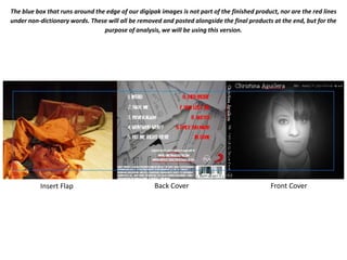
  • 1. The blue box that runs around the edge of our digipak images is not part of the finished product, nor are the red lines under non-dictionary words. These will all be removed and posted alongside the final products at the end, but for the purpose of analysis, we will be using this version. Front Cover Back Cover Insert Flap
  • 2. The blue box that runs around the edge of our digipak images is not part of the finished product, nor are the red lines under non-dictionary words. These will all be removed and posted alongside the final products at the end, but for the purpose of analysis, we will be using this version. Right Panel Reverse panel to Insert Flap Central Panel CD Panel Reverse panel to Back Cover Left Panel Reverse panel to Front Cover
  • 3. Front Cover We shot each image in black and white, but each had to have editing changes made so it matched the others. We also edited in a soft fish-eye effect and some lighting effects to create the look of a light on the album. We decided to leave the lines between each image to continue the theme of separation, which was used in the advert too. However, we did ensure that each photo was taken from the same distance to help with sizing. The typography used on the cover is the same used throughout the advert, video and the digipak, which adds continuity. It is a serif-based font, but is soft at the same time, which helps describe our music and create a brand. The black and white effect was something that we used throughout the advert and the video, so we chose to use it in the digipak too. We didn’t want to clutter the front cover of the album, as our research showed that artists like Christina don’t tend to have a lot on their covers, and it depends on their brand identity. For this reason, we chose to have all writing at the top, and let the image be the stand-out area of the cover. By designing the digipak with the finished article in mind, we built a template that incorporated spines that would fit the whole project together. The use of Christina’s major record label, RCA, on this spine, is something we found happens a lot through our research. With our house colours being orange, red and black, we felt that the images were more effective in B&W, so left them as that. The motif of the stool is used within the digipak, but the more prominent motif across the projects seems to be the B&W effect.
  • 4. Back Cover The image of a torn-up diary behind the text relates to the album title, ‘The Diary of my Broken Heart.’ Some of the songs are written on dates, which can be seen through the text. It also acts as a good background, as it is white. We wanted a stark contrast between front cover and back, so we tried to fill the cover as best as possible whilst not obscuring the image. The typography is the same used throughout the projects, and is has a 1920’s vibe about it. This is very similar to our music and our style for the video, and it helps define our brand. By including ways to contact Christina, we have opened up the album to our target audience, who will access the website. Although we haven’t designing the website, it acts as a way of keeping in touch with her fans, and adds some intimacy, which we found during our research is very prominent. The use of two colours for the tracklist again helps display the theme of separation, and relates to the song titles. It also helps incorporate the house colour of red against the white background. The use of the record label logos above the barcode is a traditional convention of a digipak, and was also used on our magazine advert. All relevant industry information that we saw throughout our various sets of research was used on the back of the album cover. This includes copyright information, production info and record company details.
  • 5. Insert Flap We didn’t want any writing on this panel, as we felt that the image was quite important and so nothing should take away from that. This flap shows the star image motif and the house colours. It was an image taken on a day of shooting, and as a standalone image, does not mean a lot to the viewer, however, is very significant to the project and specifically the storyline of the video. We decided to use an image of the stool having been kicked over, rather than still on four legs, as this is a defining image from the video. The woman kicking the stool over signifies that the man is out of her life, lending itself to our theme of separation again. By not showing someone on this panel, we have been able to create a brand that is not reliant on selling the music through the person, and that the identity of the artist is not necessarily compulsory. This is the only use of the house colours on the whole of the digipak, as we felt that with this being the first image you see as you open the front cover, it should stand out.
  • 6. Inside the Digipak By covering the man’s face with the CD, it continues the theme of separation, as once fully opened out, you would only be able to see the two women, with a gap running through the middle. By shooting the images initially in black and white, we were able to gain the lighting effects immediately, rather than having to choose a filter once editing. We shot these images to look vaguely like police mug shots, to show that they were in the wrong, but also very upset. Right Panel Reverse panel to Insert Flap Central Panel CD Panel Reverse panel to Back Cover Left Panel Reverse panel to Front Cover We wanted to keep our genre characteristics very traditional, and we chose to keep to as many conventions as possible. For this reason, everything on the inside is simple, yet carefully thought through to ensure this happens. By using the three images used on the cover, we help unpick a puzzle and it also adds another side to each character. The slight smirk on the male’s face adds a sense of mystery around the image. Again, we used the B&W effect, which is our secondary motif. The lack of colour will make the CD stand out from the packaging, which we plan to have as one of the house colours.