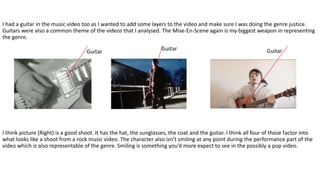
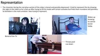
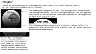
In what ways does your media product use, develop or challenge form and
conventions or real life media products?
Music Video
Importance of looking ‘cool’. In my music video analysis I found it was a common theme for the main artist to be looking cool. Oasis were
the exception though it’s clear in their music videos that I didn’t analyse like ‘Wonderwall’ and ‘Live Forever’ it’s important to them. The
Clash, The Verve and Kanye West all found importance in it too. Cool and fashionable would be the key words. I found it important to try
and replicate this with the sunglasses, the coat and the hat. The Mise-En-Scene was typical of a Rock video in my opinion.
Hat and Suit
Sunglasses
Leather
Jacket
Sunglasses
Sunglasses
I had a guitar in the music video too as I wanted to add some layers to the video and make sure I was doing the genre justice.
Guitars were also a common theme of the videos that I analysed. The Mise-En-Scene again is my biggest weapon in representing
the genre.
I think picture (Right) is a good shoot. It has the hat, the sunglasses, the coat and the guitar. I think all four of those factor into
what looks like a shoot from a rock music video. The character also isn’t smiling at any point during the performance part of the
video which is also representable of the genre. Smiling is something you’d more expect to see in the possibly a pop video.
Guitar
Lighting
• The lighting was something I spent time thinking about. It is common for music videos to be versatile with the lighting. In my
Music Video analysis, Oasis showed lots of there video in black and white, The Verve had a very realistic, gritty lighting and the
clash had a dark lighting. This was probably where I largely went against the genre when I kept the lighting natural because the
song is actually quite a sad song where the lyrics are specifically about boredom and possibly a little depression. It isn't a
grunge song and since the song is about real life everyday issues, I decided natural lighting was the best way to do the song
justice.
Bright
Black and
White
Dark
around face
Representation
• The character during the narrative section of the video is bored and possibly depressed. I tried to represent this by showing
the sighs in the video as he is fed-up after trying to lift his mode with certain activates but finds them mundane and pointless.
So boredom is the main emotion I was trying to represent.
Throws pool
cue down
Wakes up
knowing
he will be
bored
today.
Bored of the TV
Digipak
• The front cover of my digipak took a lot of thinking. I decided the cover would have the Sunglasses on top of the hat. The
reason for this is because my character in the music video feels most happy and content in the performance aspect, so if he
sees this as the best version of himself then it should feature on the front of the digipak.
• The background colour was one I spent time thinking about. I was
deciding between yellow, white and black. I used all three colours in the
end but decided the background would be black. I done this for
metaphorical reasons. As I said previously he feels most comfortable
when he’s performing in his sunglasses and hat but the video is
surrounded by sadness and boredom, so I thought black would be a
good colour to represent that.
The name od the album is ‘Badhead’ so of course that’s
what I put but I decided on the all capital letters because
I liked the boldness and even a little arrogance. The
capitals mixed with the bold font and yellow and black
letters create a very eye-catching front cover in my
opinion.
This is the name of the band. I didn’t use
capital letters for this because It isn’t the
main piece of information but matching
colours and fonts was logical.
Back Cover
• The back cover is key because it’s often where the most information is put. I kept the back background to match the front of
course but also to keep the same metaphorical message next to the guitar. The guitar itself is used because I wanted to have
to have so have something eye-catching and relevant on the back. It’s the same
guitar used in the music video. The track-list is simply logical so the audience can
see what song there are and that’s generally an exciting moment and the label at
the bottom left is obviously used for realistic purposes.
To fit the pattern of the overall digipak I kept the yellow and
white combination on the song names and. I think it’s eye
catching. The name of the band reappeared and this is just to
continue adding things to the digipak. It looks in-place above
the tack-list. I avoided going for the yellow and white
combination because although I do want people to
acknowledge it, it isn’t the main piece of information that I
want the audience to see. Also didn’t want to over-do the
colour combinations.
Fifth Panel
• The fifth panel is a thank-you to the fans for five years since the first album was released. It also contains a code which can be
activated to get 10% of the bands merchandise.
The main reason this was done is because I think it makes the digipak have a realistic feel as
something like a message to the fans is something that absolutely could be expected from a
digipak.
I wanted the title to look fun and exciting. The explanation mark contributes to this. I used a
handful of them throughout the speech. It’s simply there to draw the attention to help make sure
nobody skips over the opportunity.
The thank-you is quite long but I
wanted it to seem genuine and
obviously I wanted to take up the most
of the page. It filled with context on the
code and how to achieve activate it.
The website and the code have obviously been added to the page so
people can use it. I just made up a fake email and a fake code. This is
something I took from my digipak analysis.
Disk space
• The disk was something I spent a long time thinking about. I didn’t want it to be too bland. I also didn’t want it to
be a black CD because it would be a overkill of the colour.
I decided to go for a fading white into black. I think it looks good and combines with the
rest of the digipak quite well. I decided to add the picture from the front of my digipak of
the sunglasses and the hat as it creates a nice combination and it was something I saw to
be regular during my digipak analysis.
With the title I decided against going with the combination of yellow and white as the
background is a different colour. I decided to go with the colour black because it stands out
well against the white background.
The name of the band ‘Taking Back
January’ is on the disc as it is common on
music CD’s. I decided to keep the black
despite the CD being darker in this area
because the name of the band isn’t as
important information as the album title
so despite wanting it there, it isn’t priority,
Second and fourth panel
• The second and the fourth panels are the most basic but possibly the most effective from the audience perspective. Fans of musicians
like collectable items like this one and the pictures inside contribute to that. One of the picture is the main artist looking right at the
camera and the second is the coat he is wearing which fits the genre and is relevant to the music video.
The hat and the sunglasses are relevant to the video because that’s what he wears in the performance
aspect of it. Like the front cover it is metaphorical for the darker side in the fact that he is bored with
his current lifestyle. In the music video his most comfortable moments are playing the guitar and
signing the songs. It’s also something I imagine fans of the music artist would appreciate.
The coat is another image I imagined the fans would appreciate because it was in the music video
quite a lot. It maintains the metaphorical meaning behind the digipak and should make for a nice
collectable item for the fans.
Magazine Advertisement
I think the magazine advertisement is one of my favourite pieces of work I done. I intended for the cover to be different to that of the digipak because I felt
the advertisement needed to have the face of the artist so people looked at it, which is obviously the main objective. I think it looks like a ‘WANTED’ poster,
whilst not initially intentional, I really like that and I think a style like this is nicely suited to the Rock genre. It was also pointed out to me in my Focus Group
who agreed it was fitting.
The title was something I wanted to be really bold. To achieve this I made the letter really distant from each-other
and had them in the font ‘Berlin Sans FB Demi’ because I see it as very bold and actually quite dominating. I think
the title covers the space in way I’m happy with because it’s bold and obvious but not overwhelming.
This picture is one that is in the digipak but it works lots better in this I think. I
wanted the main image to be the of the main artist because that’s what will attract
attention in my opinion. Also the fact he’s wearing sunglasses, the big coat and the
hat really like it the gritty Rock feel I was chasing. In also really like the direct gaze
from the character as it’s eye catching for the audience and gives off the high ego
confidence I would associate with rock music.
I wanted the release date to be big. It’s
arguably the most important piece of
information on the poster. I matched the
title font of ‘Berlin Sans FB Demi’ which is
quite bold. The “release date” is written in
slightly smaller letters above it because it’s
also important information but not as
important as the release date itself. It was
how my research
This is the name of the band is it a contrast to the album and poster title. I made the letter particularly close together
and right knit. Mainly because it’s three words. The font is ‘‘‘Berlin Sans FB Demi’ which mates the rest of the
magazine. It’s centralised to look in-place with everything else.
The “Pre-Order on iTunes” works because it makes the advertisement more realistic and it’s just extra information
for anyone who wants the album.

Eq 1

  • 1.
    In what waysdoes your media product use, develop or challenge form and conventions or real life media products?
  • 2.
    Music Video Importance oflooking ‘cool’. In my music video analysis I found it was a common theme for the main artist to be looking cool. Oasis were the exception though it’s clear in their music videos that I didn’t analyse like ‘Wonderwall’ and ‘Live Forever’ it’s important to them. The Clash, The Verve and Kanye West all found importance in it too. Cool and fashionable would be the key words. I found it important to try and replicate this with the sunglasses, the coat and the hat. The Mise-En-Scene was typical of a Rock video in my opinion. Hat and Suit Sunglasses Leather Jacket Sunglasses Sunglasses
  • 3.
    I had aguitar in the music video too as I wanted to add some layers to the video and make sure I was doing the genre justice. Guitars were also a common theme of the videos that I analysed. The Mise-En-Scene again is my biggest weapon in representing the genre. I think picture (Right) is a good shoot. It has the hat, the sunglasses, the coat and the guitar. I think all four of those factor into what looks like a shoot from a rock music video. The character also isn’t smiling at any point during the performance part of the video which is also representable of the genre. Smiling is something you’d more expect to see in the possibly a pop video. Guitar
  • 4.
    Lighting • The lightingwas something I spent time thinking about. It is common for music videos to be versatile with the lighting. In my Music Video analysis, Oasis showed lots of there video in black and white, The Verve had a very realistic, gritty lighting and the clash had a dark lighting. This was probably where I largely went against the genre when I kept the lighting natural because the song is actually quite a sad song where the lyrics are specifically about boredom and possibly a little depression. It isn't a grunge song and since the song is about real life everyday issues, I decided natural lighting was the best way to do the song justice. Bright Black and White Dark around face
  • 5.
    Representation • The characterduring the narrative section of the video is bored and possibly depressed. I tried to represent this by showing the sighs in the video as he is fed-up after trying to lift his mode with certain activates but finds them mundane and pointless. So boredom is the main emotion I was trying to represent. Throws pool cue down Wakes up knowing he will be bored today. Bored of the TV
  • 6.
    Digipak • The frontcover of my digipak took a lot of thinking. I decided the cover would have the Sunglasses on top of the hat. The reason for this is because my character in the music video feels most happy and content in the performance aspect, so if he sees this as the best version of himself then it should feature on the front of the digipak. • The background colour was one I spent time thinking about. I was deciding between yellow, white and black. I used all three colours in the end but decided the background would be black. I done this for metaphorical reasons. As I said previously he feels most comfortable when he’s performing in his sunglasses and hat but the video is surrounded by sadness and boredom, so I thought black would be a good colour to represent that. The name od the album is ‘Badhead’ so of course that’s what I put but I decided on the all capital letters because I liked the boldness and even a little arrogance. The capitals mixed with the bold font and yellow and black letters create a very eye-catching front cover in my opinion. This is the name of the band. I didn’t use capital letters for this because It isn’t the main piece of information but matching colours and fonts was logical.
  • 7.
    Back Cover • Theback cover is key because it’s often where the most information is put. I kept the back background to match the front of course but also to keep the same metaphorical message next to the guitar. The guitar itself is used because I wanted to have to have so have something eye-catching and relevant on the back. It’s the same guitar used in the music video. The track-list is simply logical so the audience can see what song there are and that’s generally an exciting moment and the label at the bottom left is obviously used for realistic purposes. To fit the pattern of the overall digipak I kept the yellow and white combination on the song names and. I think it’s eye catching. The name of the band reappeared and this is just to continue adding things to the digipak. It looks in-place above the tack-list. I avoided going for the yellow and white combination because although I do want people to acknowledge it, it isn’t the main piece of information that I want the audience to see. Also didn’t want to over-do the colour combinations.
  • 8.
    Fifth Panel • Thefifth panel is a thank-you to the fans for five years since the first album was released. It also contains a code which can be activated to get 10% of the bands merchandise. The main reason this was done is because I think it makes the digipak have a realistic feel as something like a message to the fans is something that absolutely could be expected from a digipak. I wanted the title to look fun and exciting. The explanation mark contributes to this. I used a handful of them throughout the speech. It’s simply there to draw the attention to help make sure nobody skips over the opportunity. The thank-you is quite long but I wanted it to seem genuine and obviously I wanted to take up the most of the page. It filled with context on the code and how to achieve activate it. The website and the code have obviously been added to the page so people can use it. I just made up a fake email and a fake code. This is something I took from my digipak analysis.
  • 9.
    Disk space • Thedisk was something I spent a long time thinking about. I didn’t want it to be too bland. I also didn’t want it to be a black CD because it would be a overkill of the colour. I decided to go for a fading white into black. I think it looks good and combines with the rest of the digipak quite well. I decided to add the picture from the front of my digipak of the sunglasses and the hat as it creates a nice combination and it was something I saw to be regular during my digipak analysis. With the title I decided against going with the combination of yellow and white as the background is a different colour. I decided to go with the colour black because it stands out well against the white background. The name of the band ‘Taking Back January’ is on the disc as it is common on music CD’s. I decided to keep the black despite the CD being darker in this area because the name of the band isn’t as important information as the album title so despite wanting it there, it isn’t priority,
  • 10.
    Second and fourthpanel • The second and the fourth panels are the most basic but possibly the most effective from the audience perspective. Fans of musicians like collectable items like this one and the pictures inside contribute to that. One of the picture is the main artist looking right at the camera and the second is the coat he is wearing which fits the genre and is relevant to the music video. The hat and the sunglasses are relevant to the video because that’s what he wears in the performance aspect of it. Like the front cover it is metaphorical for the darker side in the fact that he is bored with his current lifestyle. In the music video his most comfortable moments are playing the guitar and signing the songs. It’s also something I imagine fans of the music artist would appreciate. The coat is another image I imagined the fans would appreciate because it was in the music video quite a lot. It maintains the metaphorical meaning behind the digipak and should make for a nice collectable item for the fans.
  • 11.
    Magazine Advertisement I thinkthe magazine advertisement is one of my favourite pieces of work I done. I intended for the cover to be different to that of the digipak because I felt the advertisement needed to have the face of the artist so people looked at it, which is obviously the main objective. I think it looks like a ‘WANTED’ poster, whilst not initially intentional, I really like that and I think a style like this is nicely suited to the Rock genre. It was also pointed out to me in my Focus Group who agreed it was fitting. The title was something I wanted to be really bold. To achieve this I made the letter really distant from each-other and had them in the font ‘Berlin Sans FB Demi’ because I see it as very bold and actually quite dominating. I think the title covers the space in way I’m happy with because it’s bold and obvious but not overwhelming. This picture is one that is in the digipak but it works lots better in this I think. I wanted the main image to be the of the main artist because that’s what will attract attention in my opinion. Also the fact he’s wearing sunglasses, the big coat and the hat really like it the gritty Rock feel I was chasing. In also really like the direct gaze from the character as it’s eye catching for the audience and gives off the high ego confidence I would associate with rock music. I wanted the release date to be big. It’s arguably the most important piece of information on the poster. I matched the title font of ‘Berlin Sans FB Demi’ which is quite bold. The “release date” is written in slightly smaller letters above it because it’s also important information but not as important as the release date itself. It was how my research This is the name of the band is it a contrast to the album and poster title. I made the letter particularly close together and right knit. Mainly because it’s three words. The font is ‘‘‘Berlin Sans FB Demi’ which mates the rest of the magazine. It’s centralised to look in-place with everything else. The “Pre-Order on iTunes” works because it makes the advertisement more realistic and it’s just extra information for anyone who wants the album.