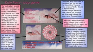
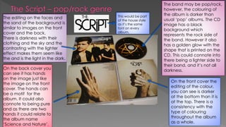
The document analyzes the cover design of Katy Perry's "Teenage Dream" album and The Script's album in terms of genre conventions. For Katy Perry's pop album, the bright colors, cloud imagery relating to the album title of "Teenage Dream", and candy-shaped letters replacing O's in song titles conform to pop conventions. The Script's album has a darker color scheme fitting for rock but also includes a golden glow, balancing the dark and light sides of being a pop/rock band. Typeface, imagery, and editing choices are discussed as contributing to the "house style" of each album.