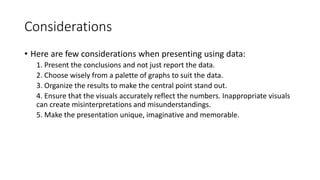
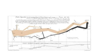
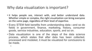
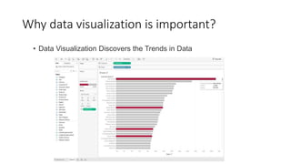
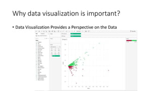
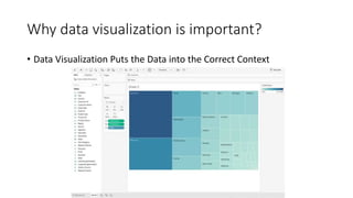
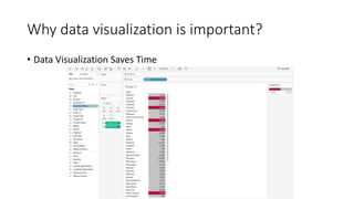
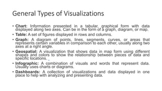
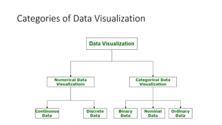
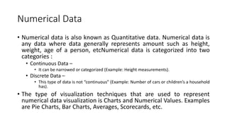
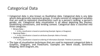
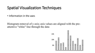
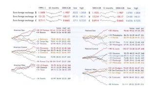
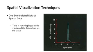
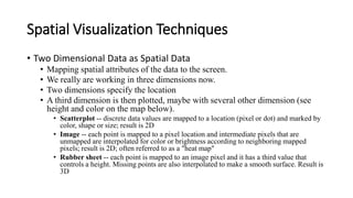
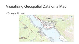
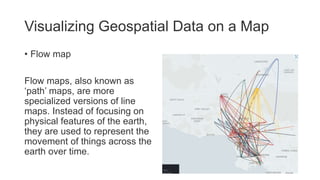
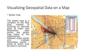
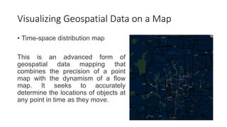
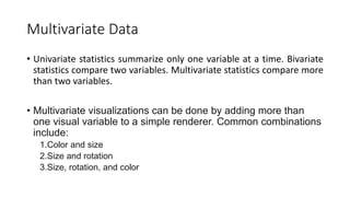
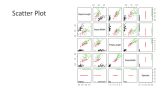
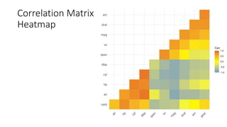
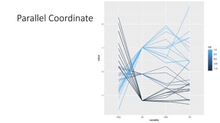
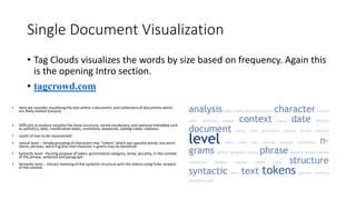
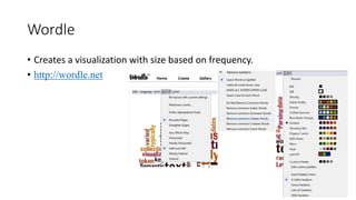
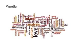
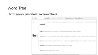
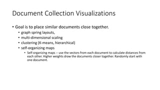
Unit III covers data visualization. It discusses how data visualization tools are needed to analyze and understand large amounts of data. Effective data visualization presents conclusions, chooses appropriate graph types, and ensures visuals accurately reflect numbers to prevent misinterpretations. History of data visualization is discussed using Napoleon's 1812 march as an example. Advantages of data visualization include easily sharing information and exploring opportunities, while disadvantages can include biased information and losing core messages.
Visualization idioms helps in making our work more presentable by adding graphs and charts to it. These helps in expressing our views and also helps the viewers to understand the text more easily.
Data visualization is the representation of data through use of common graphi...samarpeetnandanwar21
Data and information visualization (data viz/vis or info viz/vis)[2] is the practice of designing and creating easy-to-communicate and easy-to-understand graphic or visual representations of a large amount[3] of complex quantitative and qualitative data and information with the help of static, dynamic or interactive visual items. Typically based on data and information collected from a certain domain of expertise, these visualizations are intended for a broader audience to help them visually explore and discover, quickly understand, interpret and gain important insights into otherwise difficult-to-identify structures, relationships, correlations, local and global patterns, trends, variations, constancy, clusters, outliers and unusual groupings within data (exploratory visualization).[4][5][6] When intended for the general public (mass communication) to convey a concise version of known, specific information in a clear and engaging manner (presentational or explanatory visualization),[4] it is typically called information graphics.
Data visualization is concerned with visually presenting sets of primarily quantitative raw data in a schematic form. The visual formats used in data visualization include tables, charts and graphs (e.g. pie charts, bar charts, line charts, area charts, cone charts, pyramid charts, donut charts, histograms, spectrograms, cohort charts, waterfall charts, funnel charts, bullet graphs, etc.), diagrams, plots (e.g. scatter plots, distribution plots, box-and-whisker plots), geospatial maps (such as proportional symbol maps, choropleth maps, isopleth maps and heat maps), figures, correlation matrices, percentage gauges, etc., which sometimes can be combined in a dashboard.
Data visualization in data science: exploratory EDA, explanatory. Anscobe's quartet, design principles, visual encoding, design engineering and journalism, choosing the right graph, narrative structures, technology and tools.
This is a reading note I made after reading the book.
Now You See It: Simple Visualization Techniques for Quantitative Analysis teaches simple, practical means to explore and analyze quantitative data--techniques that rely primarily on using your eyes. This book features graphical techniques that can be applied to a broad range of software tools, including Microsoft Excel, because so many people have nothing else, but also more powerful visual analysis tools that can dramatically extend your analytical reach. You'll learn to make sense of quantitative data by discerning the meaningful patterns, trends, relationships, and exceptions that measure your organization's performance, identify potential problems and opportunities, and reveal what will likely happen in the future. Now You See It is not just for those with "analyst" in their titles, but for everyone who's interested in discovering the stories in their data that reveal their organization's performance and how it can be improved.
Opendatabay - Open Data Marketplace.pptxOpendatabay
Opendatabay.com unlocks the power of data for everyone. Open Data Marketplace fosters a collaborative hub for data enthusiasts to explore, share, and contribute to a vast collection of datasets.
First ever open hub for data enthusiasts to collaborate and innovate. A platform to explore, share, and contribute to a vast collection of datasets. Through robust quality control and innovative technologies like blockchain verification, opendatabay ensures the authenticity and reliability of datasets, empowering users to make data-driven decisions with confidence. Leverage cutting-edge AI technologies to enhance the data exploration, analysis, and discovery experience.
From intelligent search and recommendations to automated data productisation and quotation, Opendatabay AI-driven features streamline the data workflow. Finding the data you need shouldn't be a complex. Opendatabay simplifies the data acquisition process with an intuitive interface and robust search tools. Effortlessly explore, discover, and access the data you need, allowing you to focus on extracting valuable insights. Opendatabay breaks new ground with a dedicated, AI-generated, synthetic datasets.
Leverage these privacy-preserving datasets for training and testing AI models without compromising sensitive information. Opendatabay prioritizes transparency by providing detailed metadata, provenance information, and usage guidelines for each dataset, ensuring users have a comprehensive understanding of the data they're working with. By leveraging a powerful combination of distributed ledger technology and rigorous third-party audits Opendatabay ensures the authenticity and reliability of every dataset. Security is at the core of Opendatabay. Marketplace implements stringent security measures, including encryption, access controls, and regular vulnerability assessments, to safeguard your data and protect your privacy.
Techniques to optimize the pagerank algorithm usually fall in two categories. One is to try reducing the work per iteration, and the other is to try reducing the number of iterations. These goals are often at odds with one another. Skipping computation on vertices which have already converged has the potential to save iteration time. Skipping in-identical vertices, with the same in-links, helps reduce duplicate computations and thus could help reduce iteration time. Road networks often have chains which can be short-circuited before pagerank computation to improve performance. Final ranks of chain nodes can be easily calculated. This could reduce both the iteration time, and the number of iterations. If a graph has no dangling nodes, pagerank of each strongly connected component can be computed in topological order. This could help reduce the iteration time, no. of iterations, and also enable multi-iteration concurrency in pagerank computation. The combination of all of the above methods is the STICD algorithm. [sticd] For dynamic graphs, unchanged components whose ranks are unaffected can be skipped altogether.
Data Centers - Striving Within A Narrow Range - Research Report - MCG - May 2...pchutichetpong
M Capital Group (“MCG”) expects to see demand and the changing evolution of supply, facilitated through institutional investment rotation out of offices and into work from home (“WFH”), while the ever-expanding need for data storage as global internet usage expands, with experts predicting 5.3 billion users by 2023. These market factors will be underpinned by technological changes, such as progressing cloud services and edge sites, allowing the industry to see strong expected annual growth of 13% over the next 4 years.
Whilst competitive headwinds remain, represented through the recent second bankruptcy filing of Sungard, which blames “COVID-19 and other macroeconomic trends including delayed customer spending decisions, insourcing and reductions in IT spending, energy inflation and reduction in demand for certain services”, the industry has seen key adjustments, where MCG believes that engineering cost management and technological innovation will be paramount to success.
MCG reports that the more favorable market conditions expected over the next few years, helped by the winding down of pandemic restrictions and a hybrid working environment will be driving market momentum forward. The continuous injection of capital by alternative investment firms, as well as the growing infrastructural investment from cloud service providers and social media companies, whose revenues are expected to grow over 3.6x larger by value in 2026, will likely help propel center provision and innovation. These factors paint a promising picture for the industry players that offset rising input costs and adapt to new technologies.
According to M Capital Group: “Specifically, the long-term cost-saving opportunities available from the rise of remote managing will likely aid value growth for the industry. Through margin optimization and further availability of capital for reinvestment, strong players will maintain their competitive foothold, while weaker players exit the market to balance supply and demand.”
2. Data Visualization
• As data and insights grow in number, a new requirement is the ability
of the executives and decision makers to absorb this information in
real time.
• There is a limit to human comprehension and visualization capacity.
• That is a good reason to prioritize and manage with fewer but key
variables that relate directly to the Key Result Areas (KRAs) of a role.
3. Data Visualization
• Data visualization is the graphical representation of information and
data. By using visual elements like charts, graphs, and maps, data
visualization tools provide an accessible way to see and understand
trends, outliers, and patterns in data.
• Additionally, it provides an excellent way for employees or
business owners to present data to non-technical audiences
without confusion.
• In the world of Big Data, data visualization tools and
technologies are essential to analyze massive amounts of
information and make data-driven decisions.
4. Considerations
• Here are few considerations when presenting using data:
1. Present the conclusions and not just report the data.
2. Choose wisely from a palette of graphs to suit the data.
3. Organize the results to make the central point stand out.
4. Ensure that the visuals accurately reflect the numbers. Inappropriate visuals
can create misinterpretations and misunderstandings.
5. Make the presentation unique, imaginative and memorable.
6. History
• The classic presentation of the story of Napoleon’s march to Russia in
1812, by French cartographer Joseph Minard,
• It covers about six dimensions.
• Time is on horizontal axis. The geographical coordinates and rivers are
mapped in. The thickness of the bar shows the number of troops at
any point of time that is mapped. One color is used for the onward
march and another for the retreat. The weather temperature at each
time is shown in the line graph at the bottom.
7.
8.
9. Advantages of data visualization
• Easily sharing information.
• Interactively explore opportunities.
• Visualize patterns and relationships.
10. Disadvantages
• Biased or inaccurate information.
• Correlation doesn’t always mean causation.
• Core messages can get lost in translation.
11. Why data visualization is important?
• it helps people see, interact with, and better understand data.
Whether simple or complex, the right visualization can bring everyone
on the same page, regardless of their level of expertise.
• Every STEM field benefits from understanding data—and so do
fields in government, finance, marketing, history, consumer
goods, service industries, education, sports, and so on.
• Data visualization is one of the steps of the data science
process, which states that after data has been collected,
processed and modeled, it must be visualized for conclusions to
be made.
•
12. Data Science
• While both fields involve working with data to gain insights, data
science often involves using data to build models that can predict
future outcomes, while data analytics tends to focus more on
analyzing past data to inform decisions in the present.
• Data Science makes use of machine learning algorithms to get
insights. Data Analytics does not use machine learning to get the
insight of data.
20. General Types of Visualizations
• Chart: Information presented in a tabular, graphical form with data
displayed along two axes. Can be in the form of a graph, diagram, or map.
• Table: A set of figures displayed in rows and columns.
• Graph: A diagram of points, lines, segments, curves, or areas that
represents certain variables in comparison to each other, usually along two
axes at a right angle.
• Geospatial: A visualization that shows data in map form using different
shapes and colors to show the relationship between pieces of data and
specific locations.
• Infographic: A combination of visuals and words that represent data.
Usually uses charts or diagrams.
• Dashboards: A collection of visualizations and data displayed in one
place to help with analyzing and presenting data.
22. Numerical Data
• Numerical data is also known as Quantitative data. Numerical data is
any data where data generally represents amount such as height,
weight, age of a person, etcNumerical data is categorized into two
categories :
• Continuous Data –
• It can be narrowed or categorized (Example: Height measurements).
• Discrete Data –
• This type of data is not “continuous” (Example: Number of cars or children’s a household
has).
• The type of visualization techniques that are used to represent
numerical data visualization is Charts and Numerical Values. Examples
are Pie Charts, Bar Charts, Averages, Scorecards, etc.
23. Categorical Data
• Categorical data is also known as Qualitative data. Categorical data is any data
where data generally represents groups. It simply consists of categorical variables
that are used to represent characteristics such as a person’s ranking, a person’s
gender, etc. Categorical data visualization is all about depicting key themes,
establishing connections, and lending context. Categorical data is classified into
three categories :
• Binary Data –
• In this, classification is based on positioning (Example: Agrees or Disagrees).
• Nominal Data –
• In this, classification is based on attributes (Example: Male or Female).
• Ordinal Data –
• In this, classification is based on ordering of information (Example: Timeline or processes).
• The type of visualization techniques that are used to represent categorical data is
Graphics, Diagrams, and Flowcharts. Examples are Word clouds, Sentiment
Mapping, Venn Diagram, etc.
24. Top Data Visualization Tools
• The following are the 10 best Data Visualization Tools
• Tableau
• Looker
• Zoho Analytics
• Sisense
• IBM Cognos Analytics
• Qlik Sense
• Domo
• Microsoft Power BI
• Klipfolio
• SAP Analytics Cloud
25. Spatial Visualization Techniques
• Univariate data --1 dimension data
• A single value can be displayed
• as the number itself -- a string of digits
• as a dial (such as the altimeter, speedometer, guage)
• as a slider or thermometer
26. Spatial Visualization Techniques
• Maximization
use least amount of "ink" or non-
background pixels and leverage our
pre-attentive vision to fill in the area.
Tukey plot as typically presented on
the left and a revised minimized plot
on the right (or below):
27. Spatial Visualization Techniques
• Information in the axes
Histogram removal of y axis; axis values are aligned with the pre-
attentive "white" line through the data
28. Spatial Visualization Techniques
• Sparklines
• Sparklines are examples of high data-ink ratios. They are typically a time series
and can be used to represent visually the sequence in a very dense and compact
manner. They may be small enough to just be included in the flow of the text
rather than having to refer to a separate figure.
29.
30. Spatial Visualization Techniques
• One Dimensional Data as
Spatial Data
• Time is now displayed as the
x axis and the data values are
the y axis
31. Spatial Visualization Techniques
• Two Dimensional Data as Spatial Data
• Mapping spatial attributes of the data to the screen.
• We really are working in three dimensions now.
• Two dimensions specify the location
• A third dimension is then plotted, maybe with several other dimension (see
height and color on the map below).
• Scatterplot -- discrete data values are mapped to a location (pixel or dot) and marked by
color, shape or size; result is 2D
• Image -- each point is mapped to a pixel location and intermediate pixels that are
unmapped are interpolated for color or brightness according to neighboring mapped
pixels; result is 2D; often referred to as a "heat map"
• Rubber sheet -- each point is mapped to an image pixel and it has a third value that
controls a height. Missing points are also interpolated to make a smooth surface. Result is
3D
35. Visualizing Geospatial Data on a Map
• 1. Point map
A point map is one
of the simplest
ways to visualize
geospatial data.
Basically, you
place a point at
any location on the
map that
corresponds to the
variable you’re
trying to measure
(such as a
building, e.g. a
hospital).
36. Visualizing Geospatial Data on a Map
• Proportional symbol map
This is a variation of the point
map. It uses a circle or other
shape to represent data at a
particular location. However,
based on the point's size and/or
color, it can be used to
represent multiple other
variables at once (such as
population and/or average age).
37. Visualizing Geospatial Data on a Map
• Cluster map
This is a proportional symbol
map with a twist. It features a
similar concept of using
points of varying sizes and
colors to represent multiple
types of data at a location at
once. However, these larger
points serve as stand-ins for
smaller points, which
become visible if you
increase the map’s scale.
This gets around the main
issue of overcrowding in
point maps, but requires
special geospatial data
visualization tools such as
GIS software.
38. Visualizing Geospatial Data on a Map
• Choropleth map
It’s made by
separating the
area being
mapped, such as
by geographic or
political
boundaries, and
then filling each
resulting section
with a different
color or shade.
39. Visualizing Geospatial Data on a Map
• Cartogram map
This variation of the
choropleth map is a
hybrid of a map and a
chart. It involves taking a
land area map of a
geographic region and
dividing it into segments
in such a way that sizes
and/or distances are
proportional to the
values of the variable
being measured.
43. Visualizing Geospatial Data on a Map
• Flow map
Flow maps, also known as
‘path’ maps, are more
specialized versions of line
maps. Instead of focusing on
physical features of the earth,
they are used to represent the
movement of things across the
earth over time.
44. Visualizing Geospatial Data on a Map
• Spider map
The spider map is a
variation of the flow
map. Instead of
focusing on discrete
pairs of origin and
destination data
points, the spider
map looks at the
relationships
between origin points
and multiple
destination points –
some of which may
be held in common.
45. Visualizing Geospatial Data on a Map
• Time-space distribution map
This is an advanced form of
geospatial data mapping that
combines the precision of a point
map with the dynamism of a flow
map. It seeks to accurately
determine the locations of objects at
any point in time as they move.
46. Visualizing Geospatial Data on a Map
• Data space distribution
map
This is another variant of
the flow map that aims to
not only represent the
movement of things over
time, but also how
variables dependent on
that movement change
over time.
49. Time Oriented Visualizations
1. Scale
• How is time measured? When are the data measurements/samples
taken?
• Ordinal -- before, during, after
• Discrete -- clear intervals (seconds, minutes, hours.....)
• Continuous -- mapping to the real numbers. Discrete values can be
interpolated
50. Time Oriented Visualizations
2. Scope
• The range of time associated with a measurement/sample
• point -- the sample is from a point in time that has no duration
• interval-based -- there is a duration; a start and end
These time primitives can be anchored (absolute) or unanchored (relative)
• We can also recognize determinancy:
• determinant -- all aspects of time is known and fixed
• indeterminant -- there may be some uncertainty. Intervals are sometimes used here
to compensate.
51.
52. Time Oriented Visualizations
3. Arrangement
Time often has a cyclical nature, compared to the linear nature described
above:
• hourly cycle
• 24 hour cycle in a daily cyclc
• 7 days in a weekly cycle (Mon->Tues....Sun->Mon)
• ~30 days in a monthly cyclc
• lunar cycle
• quarterly/seasonal cycle (financial, astronomical, meteorological)
• 365 days, 52 weeks, 12 months in a yearly cycle
• Decades
The different units suggest granularity. How you might represent a
visualization may vary (interactively) by granularity (zoom in, zoom out)
56. Multivariate Data
• Univariate statistics summarize only one variable at a time. Bivariate
statistics compare two variables. Multivariate statistics compare more
than two variables.
• Multivariate visualizations can be done by adding more than
one visual variable to a simple renderer. Common combinations
include:
1.Color and size
2.Size and rotation
3.Size, rotation, and color
62. Graphs, Trees, and How to Visualize Them
• Let’s instead talk about graphs, networks, & trees in the mathematical
sense: a model for representing items and the relationships between
those items
• Social / friendship networks
• Computer networks
• Energy or transportation grids
• Organizational structures
• Etc.
63.
64.
65.
66. Node-link tree diagrams
• Nodes are distributed in space, connected by straight or curved lines
• Typical approach is to use 2D space to break apart breadth and depth
• Often, space is used to communicate hierarchical orientation
74. Text and Document Visualization
• Here we consider visualizing the text within a document, and collections of
documents which are likely related (corpus).
• Difficulty in analysis includes the loose structure, varied vocabulary, and
optional metadata such as author(s), date, modification dates, comments,
keywords, catalog codes, citations.
• Levels of text to be represented:
• Lexical level -- Simple grouping of characters into "tokens" which are typically words,
but word stems, phrases, word n-grams and character n-grams may be beneficial
• Syntactic level --Parsing purpose of token, grammatical category, tense, plurality, in
the context of the phrase, sentence and paragraph
• Semantic level -- Extract meaning of the syntactic structure with the tokens using
fuller analysis of the context.
75. Vector Space Model
• Analysis of the words in a document and determine their value in
contribution and significance to the document.
• Removal of noise words ("a", "an", "the", "that") and punctuation,
and stemming (collecting roots of words) are typical of preprocessing.
• Simple frequency counts of significant words ordered by decreasing
frequency is a simple vector.
76. Vector Space Model
• https://wordcounter.net/
• Here we consider visualizing the text within a document, and collections of documents which
are likely related (corpus).
• Difficulty in analysis includes the loose structure, varied vocabulary, and optional metadata
such as author(s), date, modification dates, comments, keywords, catalog codes, citations.
• Levels of text to be represented:
• Lexical level -- Simple grouping of characters into "tokens" which are typically words, but word
stems, phrases, word n-grams and character n-grams may be beneficial
• Syntactic level --Parsing purpose of token, grammatical category, tense, plurality, in the
context of the phrase, sentence and paragraph
• Semantic level -- Extract meaning of the syntactic structure with the tokens using fuller
analysis of the context.
80. Single Document Visualization
• Tag Clouds visualizes the words by size based on frequency. Again this
is the opening Intro section.
• tagcrowd.com
• Here we consider visualizing the text within a document, and collections of documents which
are likely related (corpus).
• Difficulty in analysis includes the loose structure, varied vocabulary, and optional metadata such
as author(s), date, modification dates, comments, keywords, catalog codes, citations.
• Levels of text to be represented:
• Lexical level -- Simple grouping of characters into "tokens" which are typically words, but word
stems, phrases, word n-grams and character n-grams may be beneficial
• Syntactic level --Parsing purpose of token, grammatical category, tense, plurality, in the context
of the phrase, sentence and paragraph
• Semantic level -- Extract meaning of the syntactic structure with the tokens using fuller analysis
of the context.
81. Wordle
• Creates a visualization with size based on frequency.
• http://wordle.net
86. Literature fingerprinting
• Here we look at n-word-grams to match patterns of the author.
• N-gram is probably the easiest concept to understand in the
whole machine learning space, I guess. An N-gram means a
sequence of N words. So for example, “Medium blog” is a 2-
gram (a bigram), “A Medium blog post” is a 4-gram, and “Write
on Medium” is a 3-gram (trigram). Well, that wasn’t very
interesting or exciting. True, but we still have to look at the
probability used with n-grams, which is quite interesting.
87.
88. Document Collection Visualizations
• Goal is to place similar documents close together.
• graph spring layouts,
• multi-dimensional scaling
• clustering (K-means, hierarchical)
• self-organizing maps
• Self-organizing maps -- use the vectors from each document to calculate distances from
each other. Higher weights draw the documents closer together. Randomly start with
one document.
93. Power Query & M Language
• Power Query is built on what was then a new query language called
M. It is a mashup language (hence the letter M) designed to create
queries that mix together data.
94. • 12 Methods for Visualizing Geospatial Data on a Map | SafeGraph
• Time Oriented Visualizations (juniata.edu)