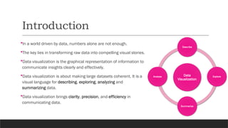
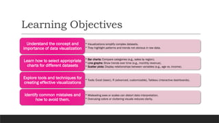
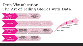
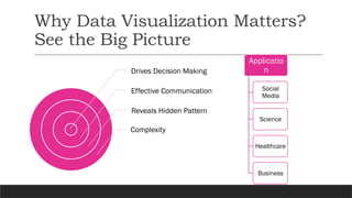
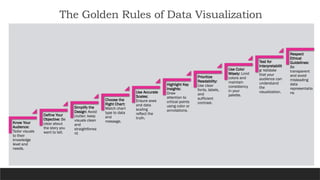
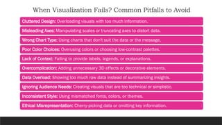
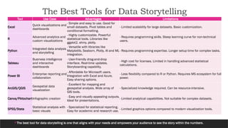
Introduction to
Data Visualization
TURNING DATA INTO INSIGHTFUL STORIES
RAVI PRAKASH JHA
BIOSTATISTICS FACULT Y
DEPARTMENT OF COMMUNIT Y MEDICINE
DR BSA MEDICAL COLLEGE AND HOSPITAL
"The greatest value of a picture is
when it forces us to notice what
we never expected to see."
- JOHN TUKEY, STATISTICIAN AND DATA VISUALIZATION PIONEER
Outline
Effective data visualization
transforms numbers into a
story, revealing patterns and
insights that words alone
cannot convey.
 Introduction
 Learning Objectives
 Data Visualization: The Art of Telling Stories with Data
 Why Data Visualization Matters? See the Big Picture
 Brief History of Data Visualization
 The Building Blocks of Great Visualizations
 Exploring Chart Types
 Choosing the Perfect Visualization
 The Golden Rules of Data Visualization
 When Visualization Fails? Common Pitfalls to Avoid
 The Best Tools for Data Storytelling
 Interactive Visuals: Bringing Data to Life
 Advanced Visualization Techniques
 Hands-On Exercise
 Key Takeaways for the Next Talk
Introduction
In a world driven by data, numbers alone are not enough.
The key lies in transforming raw data into compelling visual stories.
Data visualization is the graphical representation of information to
communicate insights clearly and effectively.
Data visualization is about making large datasets coherent. It is a
visual language for describing, exploring, analyzing and
summarizing data.
Data visualization brings clarity, precision, and efficiency in
communicating data.
Data
Visualization
Describe
Explore
Summarize
Analyse
Learning Objectives
• Visualizations simplify complex datasets.
• They highlight patterns and trends not obvious in raw data.
Understand the concept and
importance of data visualization
• Bar charts: Compare categories (e.g., sales by region).
• Line graphs: Show trends over time (e.g., monthly revenue).
• Scatter plots: Display relationships between variables (e.g., age vs. income).
Learn how to select appropriate
charts for different datasets
• Tools: Excel (basic), R (advanced, customizable), Tableau (interactive dashboards).
Explore tools and techniques for
creating effective visualizations
• Misleading axes or scales can distort data interpretation.
• Overusing colors or cluttering visuals reduces clarity.
Identify common mistakes and
how to avoid them.
Data Visualization:
The Art of Telling Stories with Data
What Makes
Data
Visualization
an Art?
Data visualization is
more than just charts
and graphs
It’s about crafting
narratives that
resonate with your
audience.
The Goal To turn numbers into
a compelling story
One that is clear,
insightful
The story that drives
action.
Key Elements
of a Data
Story:
Characters: The data
points, patterns, and
outliers that form the
core of the narrative.
Plot: The journey from
raw data to
meaningful insights.
Resolution: The
takeaway or decision
enabled by the
visualization.
New
Perspective:
"Good data
visualizations inform,
but great
visualizations inspire
action.
They bridge the gap
between analysis and
understanding,
engaging both logic
and emotion.
Raw Data
Visualization
Insight
Action
Why Data Visualization Matters?
See the Big Picture
Drives Decision Making
Effective Communication
Reveals Hidden Pattern
Complexity
Applicatio
n
Social
Media
Science
Healthcare
Business
Brief History of Data Visualization
William Playfair, in his book “The
Commercial and Political Atlas” (1786)
presented a variety of graphs. Example:
Portrayed exports from England with
imports into England from Denmark and
Norway from 1700 to 1780.
Physician John Snow (1854-55) plotted the
locations of cholera deaths on a map.
The Building Blocks of Great
Visualizations
Define the
purpose
Understand the
dataset
Choose the
chart type
Visual Encoding
and Designing
(Titles, Labels,
Axes,
Positioning,
Size, Shape,
Colour)
Interactivity
(Zooming,
Details on click,
Features of
Dashboards)
Adjust till the
desired
representation
is achieved
Exploring Some Chart Types
Bar Chart
• Use for comparing categories (e.g., Sales by region).
Line Graph
• Show trends over time (e.g., Monthly revenue growth).
Scatter Plot
• Visualize relationships between two numerical variables (e.g., Age vs. Height).
Pie Chart
• Show proportions of a whole (e.g., Market share distribution of companies in a
sector).
Heatmap
• Show intensity of values using color (e.g., Population density across regions).
Choosing the Perfect Visualization
Chart Type Suitable Data Type Advantages Limitations
Bar Chart
Categorical, Discrete
Numeric
- Easy to compare categories. Visually
simple and clear. Effective for small-to-
medium datasets.
- Not suitable for time-series data. Clutters with too many
categories.
Line Graph
Continuous Numeric,
Time-Series
- Ideal for showing trends over time. Clearly
shows upward or downward movements.
- Ineffective for categorical comparisons. Requires clear
time intervals for accuracy.
Pie Chart Categorical
- Good for showing proportions. Effective for
small datasets with few categories.
- Difficult to interpret with too many slices. Precise
comparisons are challenging.
Scatter Plot Continuous Numeric
- Highlights relationships between two
variables. Identifies outliers easily.
- Difficult to interpret with overlapping points in large
datasets. Does not show trends.
Heatmap
Continuous, Matrix-like
Data
- Visualizes density or magnitude with color
gradients. Effective for large datasets.
- Can be visually overwhelming. Requires careful choice
of color schemes.
Histogram Continuous Numeric
- Shows distribution of a single variable.
Highlights skewness and spread of data.
- Does not compare categories. Interval size can influence
interpretation.
Bubble Chart Categorical, Continuous
- Adds an extra dimension with bubble size.
Good for showing relationships and
magnitudes.
- Can become cluttered with too many bubbles. Difficult to
interpret for small values.
Box Plot Continuous Numeric
- Summarizes data distribution (median,
quartiles, outliers). Effective for group
comparisons.
- Limited to summary statistics. Does not show detailed
frequency distribution.
Pie Chart: Distribution of TB Cases in a State Year-wise Percentage of TB cases in Different Districts of Maharashtra
Gender-wise Percentage of TB Mortality in Different Districts of Maharashtra
The Golden Rules of Data Visualization
Know Your
Audience:
Tailor visuals
to their
knowledge
level and
needs.
Define Your
Objective: Be
clear about
the story you
want to tell.
Simplify the
Design: Avoid
clutter; keep
visuals clean
and
straightforwa
rd.
Choose the
Right Chart:
Match chart
type to data
and
message.
Use Accurate
Scales:
Ensure axes
and data
scaling
reflect the
truth.
Highlight Key
Insights:
Draw
attention to
critical points
using color or
annotations.
Prioritize
Readability:
Use clear
fonts, labels,
and
sufficient
contrast.
Use Color
Wisely: Limit
colors and
maintain
consistency
in your
palette.
Test for
Interpretabilit
y: Validate
that your
audience can
understand
the
visualization.
Respect
Ethical
Guidelines:
Be
transparent
and avoid
misleading
data
representatio
ns.
When Visualization Fails? Common Pitfalls to Avoid
Cluttered Design: Overloading visuals with too much information.
Misleading Axes: Manipulating scales or truncating axes to distort data.
Wrong Chart Type: Using charts that don't suit the data or the message.
Poor Color Choices: Overusing colors or choosing low-contrast palettes.
Lack of Context: Failing to provide labels, legends, or explanations.
Overcomplication: Adding unnecessary 3D effects or decorative elements.
Data Overload: Showing too much raw data instead of summarizing insights.
Ignoring Audience Needs: Creating visuals that are too technical or simplistic.
Inconsistent Style: Using mismatched fonts, colors, or themes.
Ethical Misrepresentation: Cherry-picking data or omitting key information.
The Best Tools for Data Storytelling
The best tool for data storytelling is one that aligns with your needs and empowers your audience to see the story within the numbers.
Tool Use Case Advantages Limitations
Excel
Quick visualizations and
dashboards
- Simple and easy to use. Good for
small datasets. Pivot tables and
conditional formatting.
- Limited scalability for large datasets. Basic customization.
R
Advanced analytics and
custom visualizations
- Highly customizable. Powerful
statistical tools. Libraries like
ggplot2, shiny, plotly.
- Requires programming skills. Steep learning curve for non-technical
users.
Python
Integrated data analysis
and storytelling
- Versatile with libraries like
Matplotlib, Seaborn, Plotly. AI and ML
integration.
- Requires programming expertise. Longer setup time for complex tasks.
Tableau
Business intelligence
and interactive
dashboards
- User-friendly drag-and-drop
interface. Real-time updates.
Storyboarding capability.
- High cost for licenses. Limited in handling advanced statistical
calculations.
Power BI
Enterprise reporting and
collaboration
- Affordable for Microsoft users.
Integration with Excel and Azure.
Easy sharing options.
- Less flexibility compared to R or Python. Requires MS ecosystem for full
power.
ArcGIS/QGIS
Geospatial data
visualization
- Excellent for mapping and
geospatial analysis. Wide array of
GIS tools.
- Specialized knowledge required. Can be resource-intensive.
Canva/PiktochartInfographic creation
- Easy and visually appealing outputs.
Ideal for presentations.
- Limited analytical capabilities. Not suitable for complex datasets.
SPSS/Stata
Statistical analysis with
basic visuals
- Specialized for statistical reporting.
Easy for academic and research use.
- Limited graphics options compared to modern visualization tools.
Interactive Visuals: Bringing Data to Life
• Use: Interactive scatter plots, line graphs, and
dashboards for web applications.
• Features: Highly customizable and web-ready.
Plotly
(Python/R)
• Use: Build web applications for data exploration
and interactive analysis.
• Features: Fully customizable UI with seamless R
integration.
Shiny (R)
Advanced Visualization
Techniques
"ggplot2", # Advanced visualization
"lattice", # Trellis graphics
"dplyr", # Data manipulation
"tidyr", # Data wrangling
"patchwork", # Combining ggplot objects
"ggthemes", # Themes for ggplot
"gridExtra", # Arranging multiple plots
"reshape2", # Reshape data for plotting
"corrplot", # Correlation plots
"grid", # Basic grid graphics
"scales", # Scaling in ggplot
"vioplot",# Violin plots
"ggforce", # Additional ggplot2 features
"car", # Companion to Applied Regression
"tmap", # Thematic maps
"sf", # Spatial data handling
"plotly", # Interactive plots
"ggpubr“ # Publication-ready plots
Hands-On Exercise : Datasets Used
mtcars
Description: A
dataset of fuel
consumption and
10 aspects of
automobile design
for 32 cars.
Variables: mpg
(Miles per gallon),
wt (Weight), cyl
(Cylinders), hp
(Horsepower), etc.
• Usage: Scatter
plots, correlation
matrices, and
bar charts.
mtcars_cor
Description:
Correlation matrix
derived from
mtcars.
Variables: Pairwise
correlations
between all
numeric columns
in mtcars.
• Usage:
Heatmaps,
correlation plots.
iris
Description: A
dataset of 150
observations on
iris flowers, with
measurements for
sepal and petal
length/width.
Variables:
Sepal.Length,
Sepal.Width,
Species (Setosa,
Versicolor,
Virginica).
• Usage: Trellis
plots, bar plots
with error bars.
InsectSprays
Description: Data
from an
agricultural
experiment
measuring the
effectiveness of
insecticides.
Variables: count
(Insect count),
spray (Spray type,
A-F).
• Usage: Violin
plots.
Word
Description: A
spatial dataset
containing
country-level
attributes,
including
population and life
expectancy.
Variables: name,
population,
life_exp (Life
expectancy),
geometry (Spatial
polygons).
• Usage: Thematic
maps.
Synthetic
Datasets
• Description:
simple random
or grouped data
was created
manually.
• Variables: Can be
customized.
• Usage: Quick
custom
visualization.
Key Takeaways for the Next Talk
What’s Next?
• Detailed hands-on session using ggplot2
• Building layered plots with ggplot2.
• Customizing themes and aesthetics.
• Exploring advanced visualizations (e.g., faceted plots, annotations).
Preparation for the Next Talk:
• Install R, R Studio and the ggplot2 package if not already done.
Bring a dataset you'd like to visualize for the hands-on practice.

Introduction to Data Visualization_Day 1.pptx

  • 1.
    Introduction to Data Visualization TURNINGDATA INTO INSIGHTFUL STORIES RAVI PRAKASH JHA BIOSTATISTICS FACULT Y DEPARTMENT OF COMMUNIT Y MEDICINE DR BSA MEDICAL COLLEGE AND HOSPITAL
  • 2.
    "The greatest valueof a picture is when it forces us to notice what we never expected to see." - JOHN TUKEY, STATISTICIAN AND DATA VISUALIZATION PIONEER
  • 3.
    Outline Effective data visualization transformsnumbers into a story, revealing patterns and insights that words alone cannot convey.  Introduction  Learning Objectives  Data Visualization: The Art of Telling Stories with Data  Why Data Visualization Matters? See the Big Picture  Brief History of Data Visualization  The Building Blocks of Great Visualizations  Exploring Chart Types  Choosing the Perfect Visualization  The Golden Rules of Data Visualization  When Visualization Fails? Common Pitfalls to Avoid  The Best Tools for Data Storytelling  Interactive Visuals: Bringing Data to Life  Advanced Visualization Techniques  Hands-On Exercise  Key Takeaways for the Next Talk
  • 4.
    Introduction In a worlddriven by data, numbers alone are not enough. The key lies in transforming raw data into compelling visual stories. Data visualization is the graphical representation of information to communicate insights clearly and effectively. Data visualization is about making large datasets coherent. It is a visual language for describing, exploring, analyzing and summarizing data. Data visualization brings clarity, precision, and efficiency in communicating data. Data Visualization Describe Explore Summarize Analyse
  • 5.
    Learning Objectives • Visualizationssimplify complex datasets. • They highlight patterns and trends not obvious in raw data. Understand the concept and importance of data visualization • Bar charts: Compare categories (e.g., sales by region). • Line graphs: Show trends over time (e.g., monthly revenue). • Scatter plots: Display relationships between variables (e.g., age vs. income). Learn how to select appropriate charts for different datasets • Tools: Excel (basic), R (advanced, customizable), Tableau (interactive dashboards). Explore tools and techniques for creating effective visualizations • Misleading axes or scales can distort data interpretation. • Overusing colors or cluttering visuals reduces clarity. Identify common mistakes and how to avoid them.
  • 6.
    Data Visualization: The Artof Telling Stories with Data What Makes Data Visualization an Art? Data visualization is more than just charts and graphs It’s about crafting narratives that resonate with your audience. The Goal To turn numbers into a compelling story One that is clear, insightful The story that drives action. Key Elements of a Data Story: Characters: The data points, patterns, and outliers that form the core of the narrative. Plot: The journey from raw data to meaningful insights. Resolution: The takeaway or decision enabled by the visualization. New Perspective: "Good data visualizations inform, but great visualizations inspire action. They bridge the gap between analysis and understanding, engaging both logic and emotion. Raw Data Visualization Insight Action
  • 7.
    Why Data VisualizationMatters? See the Big Picture Drives Decision Making Effective Communication Reveals Hidden Pattern Complexity Applicatio n Social Media Science Healthcare Business
  • 8.
    Brief History ofData Visualization William Playfair, in his book “The Commercial and Political Atlas” (1786) presented a variety of graphs. Example: Portrayed exports from England with imports into England from Denmark and Norway from 1700 to 1780. Physician John Snow (1854-55) plotted the locations of cholera deaths on a map.
  • 9.
    The Building Blocksof Great Visualizations Define the purpose Understand the dataset Choose the chart type Visual Encoding and Designing (Titles, Labels, Axes, Positioning, Size, Shape, Colour) Interactivity (Zooming, Details on click, Features of Dashboards) Adjust till the desired representation is achieved
  • 10.
    Exploring Some ChartTypes Bar Chart • Use for comparing categories (e.g., Sales by region). Line Graph • Show trends over time (e.g., Monthly revenue growth). Scatter Plot • Visualize relationships between two numerical variables (e.g., Age vs. Height). Pie Chart • Show proportions of a whole (e.g., Market share distribution of companies in a sector). Heatmap • Show intensity of values using color (e.g., Population density across regions).
  • 11.
    Choosing the PerfectVisualization Chart Type Suitable Data Type Advantages Limitations Bar Chart Categorical, Discrete Numeric - Easy to compare categories. Visually simple and clear. Effective for small-to- medium datasets. - Not suitable for time-series data. Clutters with too many categories. Line Graph Continuous Numeric, Time-Series - Ideal for showing trends over time. Clearly shows upward or downward movements. - Ineffective for categorical comparisons. Requires clear time intervals for accuracy. Pie Chart Categorical - Good for showing proportions. Effective for small datasets with few categories. - Difficult to interpret with too many slices. Precise comparisons are challenging. Scatter Plot Continuous Numeric - Highlights relationships between two variables. Identifies outliers easily. - Difficult to interpret with overlapping points in large datasets. Does not show trends. Heatmap Continuous, Matrix-like Data - Visualizes density or magnitude with color gradients. Effective for large datasets. - Can be visually overwhelming. Requires careful choice of color schemes. Histogram Continuous Numeric - Shows distribution of a single variable. Highlights skewness and spread of data. - Does not compare categories. Interval size can influence interpretation. Bubble Chart Categorical, Continuous - Adds an extra dimension with bubble size. Good for showing relationships and magnitudes. - Can become cluttered with too many bubbles. Difficult to interpret for small values. Box Plot Continuous Numeric - Summarizes data distribution (median, quartiles, outliers). Effective for group comparisons. - Limited to summary statistics. Does not show detailed frequency distribution.
  • 12.
    Pie Chart: Distributionof TB Cases in a State Year-wise Percentage of TB cases in Different Districts of Maharashtra Gender-wise Percentage of TB Mortality in Different Districts of Maharashtra
  • 13.
    The Golden Rulesof Data Visualization Know Your Audience: Tailor visuals to their knowledge level and needs. Define Your Objective: Be clear about the story you want to tell. Simplify the Design: Avoid clutter; keep visuals clean and straightforwa rd. Choose the Right Chart: Match chart type to data and message. Use Accurate Scales: Ensure axes and data scaling reflect the truth. Highlight Key Insights: Draw attention to critical points using color or annotations. Prioritize Readability: Use clear fonts, labels, and sufficient contrast. Use Color Wisely: Limit colors and maintain consistency in your palette. Test for Interpretabilit y: Validate that your audience can understand the visualization. Respect Ethical Guidelines: Be transparent and avoid misleading data representatio ns.
  • 14.
    When Visualization Fails?Common Pitfalls to Avoid Cluttered Design: Overloading visuals with too much information. Misleading Axes: Manipulating scales or truncating axes to distort data. Wrong Chart Type: Using charts that don't suit the data or the message. Poor Color Choices: Overusing colors or choosing low-contrast palettes. Lack of Context: Failing to provide labels, legends, or explanations. Overcomplication: Adding unnecessary 3D effects or decorative elements. Data Overload: Showing too much raw data instead of summarizing insights. Ignoring Audience Needs: Creating visuals that are too technical or simplistic. Inconsistent Style: Using mismatched fonts, colors, or themes. Ethical Misrepresentation: Cherry-picking data or omitting key information.
  • 15.
    The Best Toolsfor Data Storytelling The best tool for data storytelling is one that aligns with your needs and empowers your audience to see the story within the numbers. Tool Use Case Advantages Limitations Excel Quick visualizations and dashboards - Simple and easy to use. Good for small datasets. Pivot tables and conditional formatting. - Limited scalability for large datasets. Basic customization. R Advanced analytics and custom visualizations - Highly customizable. Powerful statistical tools. Libraries like ggplot2, shiny, plotly. - Requires programming skills. Steep learning curve for non-technical users. Python Integrated data analysis and storytelling - Versatile with libraries like Matplotlib, Seaborn, Plotly. AI and ML integration. - Requires programming expertise. Longer setup time for complex tasks. Tableau Business intelligence and interactive dashboards - User-friendly drag-and-drop interface. Real-time updates. Storyboarding capability. - High cost for licenses. Limited in handling advanced statistical calculations. Power BI Enterprise reporting and collaboration - Affordable for Microsoft users. Integration with Excel and Azure. Easy sharing options. - Less flexibility compared to R or Python. Requires MS ecosystem for full power. ArcGIS/QGIS Geospatial data visualization - Excellent for mapping and geospatial analysis. Wide array of GIS tools. - Specialized knowledge required. Can be resource-intensive. Canva/PiktochartInfographic creation - Easy and visually appealing outputs. Ideal for presentations. - Limited analytical capabilities. Not suitable for complex datasets. SPSS/Stata Statistical analysis with basic visuals - Specialized for statistical reporting. Easy for academic and research use. - Limited graphics options compared to modern visualization tools.
  • 16.
    Interactive Visuals: BringingData to Life • Use: Interactive scatter plots, line graphs, and dashboards for web applications. • Features: Highly customizable and web-ready. Plotly (Python/R) • Use: Build web applications for data exploration and interactive analysis. • Features: Fully customizable UI with seamless R integration. Shiny (R)
  • 17.
    Advanced Visualization Techniques "ggplot2", #Advanced visualization "lattice", # Trellis graphics "dplyr", # Data manipulation "tidyr", # Data wrangling "patchwork", # Combining ggplot objects "ggthemes", # Themes for ggplot "gridExtra", # Arranging multiple plots "reshape2", # Reshape data for plotting "corrplot", # Correlation plots "grid", # Basic grid graphics "scales", # Scaling in ggplot "vioplot",# Violin plots "ggforce", # Additional ggplot2 features "car", # Companion to Applied Regression "tmap", # Thematic maps "sf", # Spatial data handling "plotly", # Interactive plots "ggpubr“ # Publication-ready plots
  • 18.
    Hands-On Exercise :Datasets Used mtcars Description: A dataset of fuel consumption and 10 aspects of automobile design for 32 cars. Variables: mpg (Miles per gallon), wt (Weight), cyl (Cylinders), hp (Horsepower), etc. • Usage: Scatter plots, correlation matrices, and bar charts. mtcars_cor Description: Correlation matrix derived from mtcars. Variables: Pairwise correlations between all numeric columns in mtcars. • Usage: Heatmaps, correlation plots. iris Description: A dataset of 150 observations on iris flowers, with measurements for sepal and petal length/width. Variables: Sepal.Length, Sepal.Width, Species (Setosa, Versicolor, Virginica). • Usage: Trellis plots, bar plots with error bars. InsectSprays Description: Data from an agricultural experiment measuring the effectiveness of insecticides. Variables: count (Insect count), spray (Spray type, A-F). • Usage: Violin plots. Word Description: A spatial dataset containing country-level attributes, including population and life expectancy. Variables: name, population, life_exp (Life expectancy), geometry (Spatial polygons). • Usage: Thematic maps. Synthetic Datasets • Description: simple random or grouped data was created manually. • Variables: Can be customized. • Usage: Quick custom visualization.
  • 19.
    Key Takeaways forthe Next Talk What’s Next? • Detailed hands-on session using ggplot2 • Building layered plots with ggplot2. • Customizing themes and aesthetics. • Exploring advanced visualizations (e.g., faceted plots, annotations). Preparation for the Next Talk: • Install R, R Studio and the ggplot2 package if not already done. Bring a dataset you'd like to visualize for the hands-on practice.

Editor's Notes

  • #2 A mathematician who first coined the term “exploratory data analysis,” He was right when he suggested that the idea of visualization helps us see what we have not noticed before.