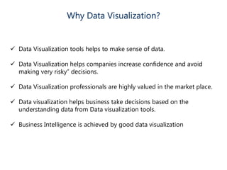
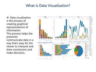
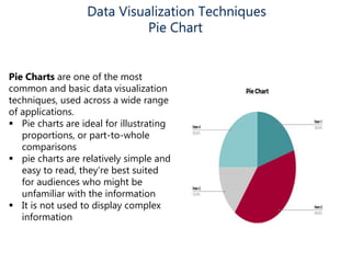
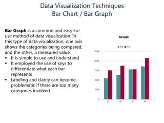
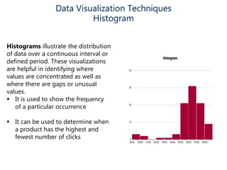
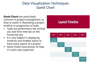
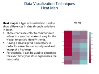
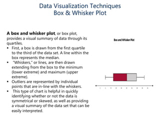
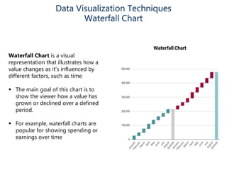
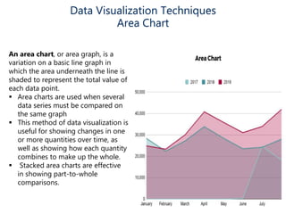
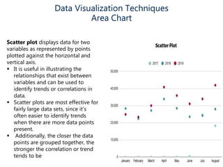
Data visualization helps make sense of data, increase confidence in decision making, and is highly valued. It involves creating graphical representations of information to easily interpret and draw conclusions. Common techniques include pie charts, bar graphs, histograms, Gantt charts, heat maps, box plots, waterfall charts, area charts, and scatter plots. Each technique has strengths for different types of data and comparisons.