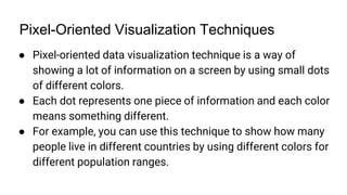
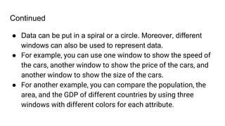
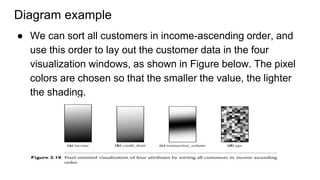
SlideShare a Scribd company logo
Data Mining
Topic: Data Visualization
Name: Shahmeer
Roll No: 133
Semester: 6th Morning
Introduction
● Data visualization aims to communicate data clearly and
effectively through graphical representation.
● Data visualization is the graphical representation of
information and data using visual elements like charts,
graphs, and maps. It helps to see and understand trends,
outliers, and patterns in data.
● Data visualization has been used extensively in many
applications—for example, at work for reporting, managing
business operations, and tracking progress of tasks.
Continued
● More popularly, we can take advantage of visualization
techniques to discover data relationships that are otherwise
not easily observable by looking at the raw data.
● Nowadays, people also use data visualization to create fun
and interesting graphics.
● There are many basic concepts of Data visualization,
ranging from different types to terminologies that are used in
the subject of data mining.
● The limbo and concepts relating to the subject are necessary
to understand.
Continued
● Some commonly studied approaches include, pixel-oriented
techniques, geometric projection techniques, icon-based
techniques, and hierarchical and graph-based techniques.
● The visualization of complex data and relations is also
deeply emphasized in the subject.
● All of these approaches will be cleared in this presentation.
Data Visualization Advantages
Faster and easier processing: Visual content is processed much
faster and easier than text by the human brain. Data visualization
helps to analyze data quickly and accurately.
Simple data sharing: Data visualization makes sharing data
simple and easy because it ensures that everyone is on the same
page when they’re viewing the visualization. It also helps to tell a
story with data and engage the audience.
Better analysis: Data visualization helps to spot trends, patterns,
outliers, and relationships in data that might otherwise be missed
Continued
Quicker decisions: Data visualization helps to make informed
decisions based on data insights. It also helps to test
hypotheses and scenarios and evaluate outcomes.
Exploration and collaboration: Data visualization helps to
explore data in an interactive and creative way. It also fosters
collaboration and communication among different stakeholders
and teams.
Data Visualization Disadvantages
● Biased or inaccurate information: Data visualization can be
misleading or distorted if the data is not accurate, complete,
or representative. It can also be influenced by the choice of
colors, scales, shapes, and labels.
● Correlation vs causation: Data visualization can show
correlations between variables, but not necessarily
causation. It can also be affected by confounding factors or
spurious relationships that are not relevant or meaningful.
Continued
● Complexity and clutter: Data visualization can be complex
and cluttered if it tries to show too much information or too
many dimensions. It can also be confusing or overwhelming
if it is not clear, consistent, or intuitive.
Data Visualization Examples - Bar Chart
● A bar chart uses horizontal or vertical bars to show the values of
different categories or groups. It is useful for comparing data across
categories or showing changes over time. For example, you can use a
bar chart to show the sales of different products in each quarter.
Line Chart
● A line chart uses points connected by lines to show the values of a
variable over time or along a scale. It is useful for showing trends,
patterns, or fluctuations in data. For example, you can use a line chart
to show the stock price of a company over a year.
Pie Chart
● A pie chart uses a circular shape divided into slices to show the
proportions of different categories or groups. It is useful for showing the
relative sizes of parts of a whole. For example, you can use a pie chart to
show the market share of different brands in a sector.
Pixel-Oriented Visualization Techniques
● Pixel-oriented data visualization technique is a way of
showing a lot of information on a screen by using small dots
of different colors.
● Each dot represents one piece of information and each color
means something different.
● For example, you can use this technique to show how many
people live in different countries by using different colors for
different population ranges.
Continued
● This technique can help users see patterns and differences
in the information more easily. Since each pixel represents a
separate set of data, it makes it easier for a lot of data to be
shown on the screen at any given moment.
● This technique uses small dots, called pixels, to show the
information. Each pixel has a color that means something.
Continued
● For example, pixels can be put in a line or a circle or a spiral. By
using this technique, a lot of information can be seen at once and
compared easily; it is possible because of the sheer amount of
pixels that can be presented on a screen at once.
● Imagine you have a lot of information about different things, like
cars, animals, or countries. You want to see this information on a
screen, but there is too much to fit in a normal way. So you use a
technique called pixel-oriented data visualization
Continued
● Data can be put in a spiral or a circle. Moreover, different
windows can also be used to represent data.
● For example, you can use one window to show the speed of
the cars, another window to show the price of the cars, and
another window to show the size of the cars.
● For another example, you can compare the population, the
area, and the GDP of different countries by using three
windows with different colors for each attribute.
Diagram example
● We can sort all customers in income-ascending order, and
use this order to lay out the customer data in the four
visualization windows, as shown in Figure below. The pixel
colors are chosen so that the smaller the value, the lighter
the shading.
How it is used in data mining?
One example of pixel-oriented visualization is the heat map,
which is commonly used in data mining and machine learning.
Heat maps use color to represent the values of a matrix or table,
with darker colors indicating higher values and lighter colors
indicating lower values. Heat maps are commonly used to
visualize correlation matrices, gene expression data, and other
types of data.

More Related Content

Similar to Datamining data visualization

Making abstract data visible
Making abstract data visibleMaking abstract data visible
Making abstract data visible
Priyanshi Jain
 
Excellencein visualization
Excellencein visualizationExcellencein visualization
Excellencein visualization
amuthadeepa
 
Beauty of visualization
Beauty of visualizationBeauty of visualization
Beauty of visualization
NarasingaMoorthy V
 
Data visualisation
Data visualisationData visualisation
Data visualisation
Divek Bhatia
 
Data Visualization: Sales forecasting
Data Visualization: Sales forecastingData Visualization: Sales forecasting
Data Visualization: Sales forecasting
AlgoAnalytics Financial Consultancy Pvt. Ltd.
 
Data Visualization: A Powerful Tool for Insightful Analysis | CyberPro Magazine
Data Visualization: A Powerful Tool for Insightful Analysis | CyberPro MagazineData Visualization: A Powerful Tool for Insightful Analysis | CyberPro Magazine
Data Visualization: A Powerful Tool for Insightful Analysis | CyberPro Magazine
cyberprosocial
 
Design for Delight
Design for DelightDesign for Delight
Design for Delight
Amanda Makulec
 
How to visualize web analytics data and choose a graph?
How to visualize web analytics data and choose a graph?How to visualize web analytics data and choose a graph?
How to visualize web analytics data and choose a graph?
Janvi Arora
 
Storytelling with data and data visualization
Storytelling with data and data visualizationStorytelling with data and data visualization
Storytelling with data and data visualization
Frehiwot Mulugeta
 
Data Visulalization
Data VisulalizationData Visulalization
Data Visulalization
Girish Khanzode
 
Data visualization of Big Data analytics
Data visualization of Big Data analytics Data visualization of Big Data analytics
Data visualization of Big Data analytics
nandini patil
 
Data visualization data sources data types- visual design
Data visualization   data sources   data types- visual designData visualization   data sources   data types- visual design
Data visualization data sources data types- visual design
ManokamnaKochar1
 
DATA VISUALIZATION
DATA VISUALIZATIONDATA VISUALIZATION
DATA VISUALIZATION
Aabhika Samantaray
 
Cancer genomics first look
Cancer genomics first lookCancer genomics first look
Cancer genomics first look
Linu George
 
Extension presentation
Extension presentationExtension presentation
Extension presentation
alkapant123
 
Data visualization data sources data types
Data visualization   data sources   data typesData visualization   data sources   data types
Data visualization data sources data types
ManokamnaKochar1
 
Storytelling with Data_2024-2-24-23-24-15.pdf
Storytelling with Data_2024-2-24-23-24-15.pdfStorytelling with Data_2024-2-24-23-24-15.pdf
Storytelling with Data_2024-2-24-23-24-15.pdf
WAIHIGA K.MUTURI
 
Data Visualization
Data VisualizationData Visualization
Data Visualization
Micah Timileyin
 
Aftros
Aftros Aftros
Aftros
Sezzar
 

Similar to Datamining data visualization (20)

Making abstract data visible
Making abstract data visibleMaking abstract data visible
Making abstract data visible
 
Excellencein visualization
Excellencein visualizationExcellencein visualization
Excellencein visualization
 
Beauty of visualization
Beauty of visualizationBeauty of visualization
Beauty of visualization
 
Data visualisation
Data visualisationData visualisation
Data visualisation
 
Data Visualization: Sales forecasting
Data Visualization: Sales forecastingData Visualization: Sales forecasting
Data Visualization: Sales forecasting
 
Data Visualization: A Powerful Tool for Insightful Analysis | CyberPro Magazine
Data Visualization: A Powerful Tool for Insightful Analysis | CyberPro MagazineData Visualization: A Powerful Tool for Insightful Analysis | CyberPro Magazine
Data Visualization: A Powerful Tool for Insightful Analysis | CyberPro Magazine
 
Design for Delight
Design for DelightDesign for Delight
Design for Delight
 
How to visualize web analytics data and choose a graph?
How to visualize web analytics data and choose a graph?How to visualize web analytics data and choose a graph?
How to visualize web analytics data and choose a graph?
 
Storytelling with data and data visualization
Storytelling with data and data visualizationStorytelling with data and data visualization
Storytelling with data and data visualization
 
Data Visulalization
Data VisulalizationData Visulalization
Data Visulalization
 
Data visualization of Big Data analytics
Data visualization of Big Data analytics Data visualization of Big Data analytics
Data visualization of Big Data analytics
 
Data visualization data sources data types- visual design
Data visualization   data sources   data types- visual designData visualization   data sources   data types- visual design
Data visualization data sources data types- visual design
 
DATA VISUALIZATION
DATA VISUALIZATIONDATA VISUALIZATION
DATA VISUALIZATION
 
Ch 8
Ch 8Ch 8
Ch 8
 
Cancer genomics first look
Cancer genomics first lookCancer genomics first look
Cancer genomics first look
 
Extension presentation
Extension presentationExtension presentation
Extension presentation
 
Data visualization data sources data types
Data visualization   data sources   data typesData visualization   data sources   data types
Data visualization data sources data types
 
Storytelling with Data_2024-2-24-23-24-15.pdf
Storytelling with Data_2024-2-24-23-24-15.pdfStorytelling with Data_2024-2-24-23-24-15.pdf
Storytelling with Data_2024-2-24-23-24-15.pdf
 
Data Visualization
Data VisualizationData Visualization
Data Visualization
 
Aftros
Aftros Aftros
Aftros
 

Recently uploaded

FP Growth Algorithm and its Applications
FP Growth Algorithm and its ApplicationsFP Growth Algorithm and its Applications
FP Growth Algorithm and its Applications
MaleehaSheikh2
 
一比一原版(CBU毕业证)不列颠海角大学毕业证成绩单
一比一原版(CBU毕业证)不列颠海角大学毕业证成绩单一比一原版(CBU毕业证)不列颠海角大学毕业证成绩单
一比一原版(CBU毕业证)不列颠海角大学毕业证成绩单
nscud
 
【社内勉強会資料_Octo: An Open-Source Generalist Robot Policy】
【社内勉強会資料_Octo: An Open-Source Generalist Robot Policy】【社内勉強会資料_Octo: An Open-Source Generalist Robot Policy】
【社内勉強会資料_Octo: An Open-Source Generalist Robot Policy】
NABLAS株式会社
 
一比一原版(IIT毕业证)伊利诺伊理工大学毕业证成绩单
一比一原版(IIT毕业证)伊利诺伊理工大学毕业证成绩单一比一原版(IIT毕业证)伊利诺伊理工大学毕业证成绩单
一比一原版(IIT毕业证)伊利诺伊理工大学毕业证成绩单
ewymefz
 
一比一原版(Bradford毕业证书)布拉德福德大学毕业证如何办理
一比一原版(Bradford毕业证书)布拉德福德大学毕业证如何办理一比一原版(Bradford毕业证书)布拉德福德大学毕业证如何办理
一比一原版(Bradford毕业证书)布拉德福德大学毕业证如何办理
mbawufebxi
 
一比一原版(YU毕业证)约克大学毕业证成绩单
一比一原版(YU毕业证)约克大学毕业证成绩单一比一原版(YU毕业证)约克大学毕业证成绩单
一比一原版(YU毕业证)约克大学毕业证成绩单
enxupq
 
Ch03-Managing the Object-Oriented Information Systems Project a.pdf
Ch03-Managing the Object-Oriented Information Systems Project a.pdfCh03-Managing the Object-Oriented Information Systems Project a.pdf
Ch03-Managing the Object-Oriented Information Systems Project a.pdf
haila53
 
哪里卖(usq毕业证书)南昆士兰大学毕业证研究生文凭证书托福证书原版一模一样
哪里卖(usq毕业证书)南昆士兰大学毕业证研究生文凭证书托福证书原版一模一样哪里卖(usq毕业证书)南昆士兰大学毕业证研究生文凭证书托福证书原版一模一样
哪里卖(usq毕业证书)南昆士兰大学毕业证研究生文凭证书托福证书原版一模一样
axoqas
 
Sample_Global Non-invasive Prenatal Testing (NIPT) Market, 2019-2030.pdf
Sample_Global Non-invasive Prenatal Testing (NIPT) Market, 2019-2030.pdfSample_Global Non-invasive Prenatal Testing (NIPT) Market, 2019-2030.pdf
Sample_Global Non-invasive Prenatal Testing (NIPT) Market, 2019-2030.pdf
Linda486226
 
Machine learning and optimization techniques for electrical drives.pptx
Machine learning and optimization techniques for electrical drives.pptxMachine learning and optimization techniques for electrical drives.pptx
Machine learning and optimization techniques for electrical drives.pptx
balafet
 
Criminal IP - Threat Hunting Webinar.pdf
Criminal IP - Threat Hunting Webinar.pdfCriminal IP - Threat Hunting Webinar.pdf
Criminal IP - Threat Hunting Webinar.pdf
Criminal IP
 
一比一原版(Adelaide毕业证书)阿德莱德大学毕业证如何办理
一比一原版(Adelaide毕业证书)阿德莱德大学毕业证如何办理一比一原版(Adelaide毕业证书)阿德莱德大学毕业证如何办理
一比一原版(Adelaide毕业证书)阿德莱德大学毕业证如何办理
slg6lamcq
 
一比一原版(UofM毕业证)明尼苏达大学毕业证成绩单
一比一原版(UofM毕业证)明尼苏达大学毕业证成绩单一比一原版(UofM毕业证)明尼苏达大学毕业证成绩单
一比一原版(UofM毕业证)明尼苏达大学毕业证成绩单
ewymefz
 
一比一原版(QU毕业证)皇后大学毕业证成绩单
一比一原版(QU毕业证)皇后大学毕业证成绩单一比一原版(QU毕业证)皇后大学毕业证成绩单
一比一原版(QU毕业证)皇后大学毕业证成绩单
enxupq
 
Empowering Data Analytics Ecosystem.pptx
Empowering Data Analytics Ecosystem.pptxEmpowering Data Analytics Ecosystem.pptx
Empowering Data Analytics Ecosystem.pptx
benishzehra469
 
一比一原版(BU毕业证)波士顿大学毕业证成绩单
一比一原版(BU毕业证)波士顿大学毕业证成绩单一比一原版(BU毕业证)波士顿大学毕业证成绩单
一比一原版(BU毕业证)波士顿大学毕业证成绩单
ewymefz
 
一比一原版(NYU毕业证)纽约大学毕业证成绩单
一比一原版(NYU毕业证)纽约大学毕业证成绩单一比一原版(NYU毕业证)纽约大学毕业证成绩单
一比一原版(NYU毕业证)纽约大学毕业证成绩单
ewymefz
 
Algorithmic optimizations for Dynamic Levelwise PageRank (from STICD) : SHORT...
Algorithmic optimizations for Dynamic Levelwise PageRank (from STICD) : SHORT...Algorithmic optimizations for Dynamic Levelwise PageRank (from STICD) : SHORT...
Algorithmic optimizations for Dynamic Levelwise PageRank (from STICD) : SHORT...
Subhajit Sahu
 
Adjusting primitives for graph : SHORT REPORT / NOTES
Adjusting primitives for graph : SHORT REPORT / NOTESAdjusting primitives for graph : SHORT REPORT / NOTES
Adjusting primitives for graph : SHORT REPORT / NOTES
Subhajit Sahu
 
一比一原版(CBU毕业证)卡普顿大学毕业证如何办理
一比一原版(CBU毕业证)卡普顿大学毕业证如何办理一比一原版(CBU毕业证)卡普顿大学毕业证如何办理
一比一原版(CBU毕业证)卡普顿大学毕业证如何办理
ahzuo
 

Recently uploaded (20)

FP Growth Algorithm and its Applications
FP Growth Algorithm and its ApplicationsFP Growth Algorithm and its Applications
FP Growth Algorithm and its Applications
 
一比一原版(CBU毕业证)不列颠海角大学毕业证成绩单
一比一原版(CBU毕业证)不列颠海角大学毕业证成绩单一比一原版(CBU毕业证)不列颠海角大学毕业证成绩单
一比一原版(CBU毕业证)不列颠海角大学毕业证成绩单
 
【社内勉強会資料_Octo: An Open-Source Generalist Robot Policy】
【社内勉強会資料_Octo: An Open-Source Generalist Robot Policy】【社内勉強会資料_Octo: An Open-Source Generalist Robot Policy】
【社内勉強会資料_Octo: An Open-Source Generalist Robot Policy】
 
一比一原版(IIT毕业证)伊利诺伊理工大学毕业证成绩单
一比一原版(IIT毕业证)伊利诺伊理工大学毕业证成绩单一比一原版(IIT毕业证)伊利诺伊理工大学毕业证成绩单
一比一原版(IIT毕业证)伊利诺伊理工大学毕业证成绩单
 
一比一原版(Bradford毕业证书)布拉德福德大学毕业证如何办理
一比一原版(Bradford毕业证书)布拉德福德大学毕业证如何办理一比一原版(Bradford毕业证书)布拉德福德大学毕业证如何办理
一比一原版(Bradford毕业证书)布拉德福德大学毕业证如何办理
 
一比一原版(YU毕业证)约克大学毕业证成绩单
一比一原版(YU毕业证)约克大学毕业证成绩单一比一原版(YU毕业证)约克大学毕业证成绩单
一比一原版(YU毕业证)约克大学毕业证成绩单
 
Ch03-Managing the Object-Oriented Information Systems Project a.pdf
Ch03-Managing the Object-Oriented Information Systems Project a.pdfCh03-Managing the Object-Oriented Information Systems Project a.pdf
Ch03-Managing the Object-Oriented Information Systems Project a.pdf
 
哪里卖(usq毕业证书)南昆士兰大学毕业证研究生文凭证书托福证书原版一模一样
哪里卖(usq毕业证书)南昆士兰大学毕业证研究生文凭证书托福证书原版一模一样哪里卖(usq毕业证书)南昆士兰大学毕业证研究生文凭证书托福证书原版一模一样
哪里卖(usq毕业证书)南昆士兰大学毕业证研究生文凭证书托福证书原版一模一样
 
Sample_Global Non-invasive Prenatal Testing (NIPT) Market, 2019-2030.pdf
Sample_Global Non-invasive Prenatal Testing (NIPT) Market, 2019-2030.pdfSample_Global Non-invasive Prenatal Testing (NIPT) Market, 2019-2030.pdf
Sample_Global Non-invasive Prenatal Testing (NIPT) Market, 2019-2030.pdf
 
Machine learning and optimization techniques for electrical drives.pptx
Machine learning and optimization techniques for electrical drives.pptxMachine learning and optimization techniques for electrical drives.pptx
Machine learning and optimization techniques for electrical drives.pptx
 
Criminal IP - Threat Hunting Webinar.pdf
Criminal IP - Threat Hunting Webinar.pdfCriminal IP - Threat Hunting Webinar.pdf
Criminal IP - Threat Hunting Webinar.pdf
 
一比一原版(Adelaide毕业证书)阿德莱德大学毕业证如何办理
一比一原版(Adelaide毕业证书)阿德莱德大学毕业证如何办理一比一原版(Adelaide毕业证书)阿德莱德大学毕业证如何办理
一比一原版(Adelaide毕业证书)阿德莱德大学毕业证如何办理
 
一比一原版(UofM毕业证)明尼苏达大学毕业证成绩单
一比一原版(UofM毕业证)明尼苏达大学毕业证成绩单一比一原版(UofM毕业证)明尼苏达大学毕业证成绩单
一比一原版(UofM毕业证)明尼苏达大学毕业证成绩单
 
一比一原版(QU毕业证)皇后大学毕业证成绩单
一比一原版(QU毕业证)皇后大学毕业证成绩单一比一原版(QU毕业证)皇后大学毕业证成绩单
一比一原版(QU毕业证)皇后大学毕业证成绩单
 
Empowering Data Analytics Ecosystem.pptx
Empowering Data Analytics Ecosystem.pptxEmpowering Data Analytics Ecosystem.pptx
Empowering Data Analytics Ecosystem.pptx
 
一比一原版(BU毕业证)波士顿大学毕业证成绩单
一比一原版(BU毕业证)波士顿大学毕业证成绩单一比一原版(BU毕业证)波士顿大学毕业证成绩单
一比一原版(BU毕业证)波士顿大学毕业证成绩单
 
一比一原版(NYU毕业证)纽约大学毕业证成绩单
一比一原版(NYU毕业证)纽约大学毕业证成绩单一比一原版(NYU毕业证)纽约大学毕业证成绩单
一比一原版(NYU毕业证)纽约大学毕业证成绩单
 
Algorithmic optimizations for Dynamic Levelwise PageRank (from STICD) : SHORT...
Algorithmic optimizations for Dynamic Levelwise PageRank (from STICD) : SHORT...Algorithmic optimizations for Dynamic Levelwise PageRank (from STICD) : SHORT...
Algorithmic optimizations for Dynamic Levelwise PageRank (from STICD) : SHORT...
 
Adjusting primitives for graph : SHORT REPORT / NOTES
Adjusting primitives for graph : SHORT REPORT / NOTESAdjusting primitives for graph : SHORT REPORT / NOTES
Adjusting primitives for graph : SHORT REPORT / NOTES
 
一比一原版(CBU毕业证)卡普顿大学毕业证如何办理
一比一原版(CBU毕业证)卡普顿大学毕业证如何办理一比一原版(CBU毕业证)卡普顿大学毕业证如何办理
一比一原版(CBU毕业证)卡普顿大学毕业证如何办理
 

Datamining data visualization

  • 1. Data Mining Topic: Data Visualization Name: Shahmeer Roll No: 133 Semester: 6th Morning
  • 2. Introduction ● Data visualization aims to communicate data clearly and effectively through graphical representation. ● Data visualization is the graphical representation of information and data using visual elements like charts, graphs, and maps. It helps to see and understand trends, outliers, and patterns in data. ● Data visualization has been used extensively in many applications—for example, at work for reporting, managing business operations, and tracking progress of tasks.
  • 3. Continued ● More popularly, we can take advantage of visualization techniques to discover data relationships that are otherwise not easily observable by looking at the raw data. ● Nowadays, people also use data visualization to create fun and interesting graphics. ● There are many basic concepts of Data visualization, ranging from different types to terminologies that are used in the subject of data mining. ● The limbo and concepts relating to the subject are necessary to understand.
  • 4. Continued ● Some commonly studied approaches include, pixel-oriented techniques, geometric projection techniques, icon-based techniques, and hierarchical and graph-based techniques. ● The visualization of complex data and relations is also deeply emphasized in the subject. ● All of these approaches will be cleared in this presentation.
  • 5. Data Visualization Advantages Faster and easier processing: Visual content is processed much faster and easier than text by the human brain. Data visualization helps to analyze data quickly and accurately. Simple data sharing: Data visualization makes sharing data simple and easy because it ensures that everyone is on the same page when they’re viewing the visualization. It also helps to tell a story with data and engage the audience. Better analysis: Data visualization helps to spot trends, patterns, outliers, and relationships in data that might otherwise be missed
  • 6. Continued Quicker decisions: Data visualization helps to make informed decisions based on data insights. It also helps to test hypotheses and scenarios and evaluate outcomes. Exploration and collaboration: Data visualization helps to explore data in an interactive and creative way. It also fosters collaboration and communication among different stakeholders and teams.
  • 7. Data Visualization Disadvantages ● Biased or inaccurate information: Data visualization can be misleading or distorted if the data is not accurate, complete, or representative. It can also be influenced by the choice of colors, scales, shapes, and labels. ● Correlation vs causation: Data visualization can show correlations between variables, but not necessarily causation. It can also be affected by confounding factors or spurious relationships that are not relevant or meaningful.
  • 8. Continued ● Complexity and clutter: Data visualization can be complex and cluttered if it tries to show too much information or too many dimensions. It can also be confusing or overwhelming if it is not clear, consistent, or intuitive.
  • 9. Data Visualization Examples - Bar Chart ● A bar chart uses horizontal or vertical bars to show the values of different categories or groups. It is useful for comparing data across categories or showing changes over time. For example, you can use a bar chart to show the sales of different products in each quarter.
  • 10. Line Chart ● A line chart uses points connected by lines to show the values of a variable over time or along a scale. It is useful for showing trends, patterns, or fluctuations in data. For example, you can use a line chart to show the stock price of a company over a year.
  • 11. Pie Chart ● A pie chart uses a circular shape divided into slices to show the proportions of different categories or groups. It is useful for showing the relative sizes of parts of a whole. For example, you can use a pie chart to show the market share of different brands in a sector.
  • 12. Pixel-Oriented Visualization Techniques ● Pixel-oriented data visualization technique is a way of showing a lot of information on a screen by using small dots of different colors. ● Each dot represents one piece of information and each color means something different. ● For example, you can use this technique to show how many people live in different countries by using different colors for different population ranges.
  • 13. Continued ● This technique can help users see patterns and differences in the information more easily. Since each pixel represents a separate set of data, it makes it easier for a lot of data to be shown on the screen at any given moment. ● This technique uses small dots, called pixels, to show the information. Each pixel has a color that means something.
  • 14. Continued ● For example, pixels can be put in a line or a circle or a spiral. By using this technique, a lot of information can be seen at once and compared easily; it is possible because of the sheer amount of pixels that can be presented on a screen at once. ● Imagine you have a lot of information about different things, like cars, animals, or countries. You want to see this information on a screen, but there is too much to fit in a normal way. So you use a technique called pixel-oriented data visualization
  • 15. Continued ● Data can be put in a spiral or a circle. Moreover, different windows can also be used to represent data. ● For example, you can use one window to show the speed of the cars, another window to show the price of the cars, and another window to show the size of the cars. ● For another example, you can compare the population, the area, and the GDP of different countries by using three windows with different colors for each attribute.
  • 16. Diagram example ● We can sort all customers in income-ascending order, and use this order to lay out the customer data in the four visualization windows, as shown in Figure below. The pixel colors are chosen so that the smaller the value, the lighter the shading.
  • 17. How it is used in data mining? One example of pixel-oriented visualization is the heat map, which is commonly used in data mining and machine learning. Heat maps use color to represent the values of a matrix or table, with darker colors indicating higher values and lighter colors indicating lower values. Heat maps are commonly used to visualize correlation matrices, gene expression data, and other types of data.