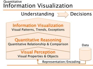
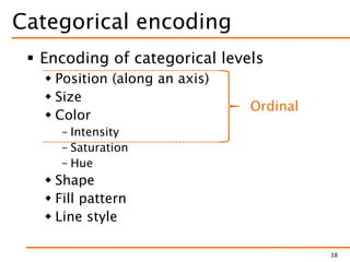
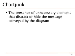
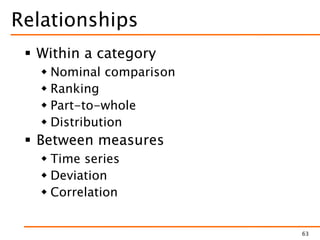
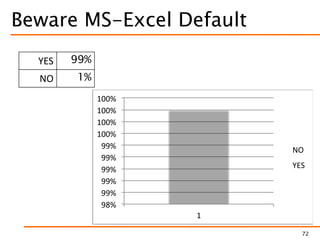
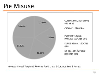
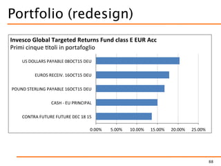
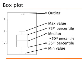
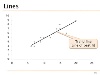
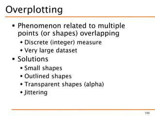
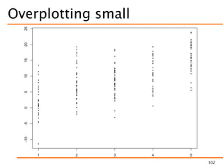
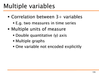
Data Visualization
February 21, 2018 – Brunel University, UK
Marco Torchiano
marco.torchiano@polito.it
Version 1.0.1
© Marco Torchiano, 2018
About me
 Marco Torchiano
 Associate Professor, Politecnico di Torino
 Senior Member IEEE
 Faculty Fellow – Nexa Center for Internet
and Society
 Member UNI CT504–Software Engineering
 Contacts:
– mailto:marco.torchiano@polito.it
– http://softeng.polito.it/torchiano/
– Twitter: @mtorchiano
3
Current Research Interests
 Mobile UI Automated Testing
 PhD student working on fragility
 (Open)Data Quality
 PhD student working on KB quality
 Software Energy Consumption
 Several collaborations
 Also: MDD, Survey methodology, code
obfuscation, SE education, …
4
Agenda
 Introduction to Data Visualization
 A little bit of history
 Visual perception
 Graphical integrity
 Visual encoding
 Visual relationships
5
WHY VISUALIZATION?
6
Density
7http://www.mamartino.com/projects/rise_of_partisanship/index.html
Context
8http://www.nytimes.com/interactive/2016/01/12/upshot/david-bowie-songs-that-fans-are-listening-most-heroes-starman-major-tom.html
DATA VISUALIZATION IN SE
10
A simple literature review
 ICSE 2017 Main Track
 Analyzed 68 papers
 118 graphs (figures with quantitative
information)
– ~ 1.7 per paper on average
 199 tables
– ~ 3 per paper on average
11
Graph type
13
Typical graph mistakes
 Severe
 Pie chart
 Non zero-based bars
 Double scale
 Major
 Grid with different axis ranges
 Unlabeled Axis
 Clarity
 Rotated labels
 Heavy Grid or Background
 Too similar colors
 Pattern fill
 Raster image
 Overplotting
14
Mistake frequency
Graphs Papers
Severity Freq Prop Freq Prop
Severe 15 15% 10 9%
Major 7 6% 5 4%
Clarity 37 31% 21 18%
any 53 45% 26 22%
15
Frequency of mistakes over all graphs
Tables general guidelines
 Never, ever use vertical rules
 Never use double rules
 Put the units in the column heading
 Not in the body of the table
 Always precede a decimal point by a
digit; thus 0.1 not just .1
 Provide all the values
 Avoid …
16
Booktabs - Publication quality tables in LaTeX
Typical table mistakes
 Formatting
 Use of avoidable rules
– Mostly vertical and also horizontal
 Misaligned numbers
 Variable number of decimals
 Table as image
17
Typical table mistakes
Tables Papers
Freq. % Freq. %
Error 131 66% 47 76%
Correct 68 34% 15 24%
18
Visualization
Usage of visual features to
encode data in order to
convey useful information
20
Information Visualization
Visual Perception
Visual Properties & Objects
Quantitative Reasoning
Quantitative Relationship & Comparison
Information Visualization
Visual Patterns, Trends, Exceptions
Understanding Decisions
Data
Representation/Encoding
Quantitative
Measurement Scales
 Nominal
 Ordinal
 Interval
 Ratio
 Absolute
23
Categories
Measures
Information Visualization
Quantitative Reasoning
Quantitative Relationship & Comparison
Information Visualization
Visual Patterns, Trends, Exceptions
Understanding
Data
Representation/Encoding
Visual Perception
Visual Properties & Objects
Quantitative
Pre-Attentive Attributes
5 7 8 4 9 8 3 1 1 0 6 8 8 2 1 1 5 2 6 6 5
9 5 1 8 4 6 8 4 9 3 0 4 5 3 4 9 2 5 8 5 8
5 0 5 4 6 2 6 5 7 3 7 8 6 5 3 7 2 6 3 1 5
5 8 6 6 8 3 7 6 5 0 9 6 3 4 6 1 9 5 6 6 4
1 6 7 3 9 9 2 8 3 4 0 3 5 1 6 3 5 3 9 3 4
8 6 9 7 5 4 2 4 7 4 9 5 8 5 3 0 7 6 0 6 7
0 3 1 5 3 2 3 5 6 7 2 8 9 8 5 3 7 8 8 2 4
5 5 3 4 8 1 5 6 2 3 5 5 1 2 1 0 8 7 2 6 3
7 4 3 8 4 8 2 6 7 9 5 6 2 3 6 7 8 0 8 3 6
4 9 5 6 7 2 2 2 8 3 1 1 0 1 8 6 2 6 2 1 4
25
Pre-Attentive Attributes
5 7 8 4 9 8 3 1 1 0 6 8 8 2 1 1 5 2 6 6 5
9 5 1 8 4 6 8 4 9 3 0 4 5 3 4 9 2 5 8 5 8
5 0 5 4 6 2 6 5 7 3 7 8 6 5 3 7 2 6 3 1 5
5 8 6 6 8 3 7 6 5 0 9 6 3 4 6 1 9 5 6 6 4
1 6 7 3 9 9 2 8 3 4 0 3 5 1 6 3 5 3 9 3 4
8 6 9 7 5 4 2 4 7 4 9 5 8 5 3 0 7 6 0 6 7
0 3 1 5 3 2 3 5 6 7 2 8 9 8 5 3 7 8 8 2 4
5 5 3 4 8 1 5 6 2 3 5 5 1 2 1 0 8 7 2 6 3
7 4 3 8 4 8 2 6 7 9 5 6 2 3 6 7 8 0 8 3 6
4 9 5 6 7 2 2 2 8 3 1 1 0 1 8 6 2 6 2 1 4
26
Attributes of form
28
Orientation
Line Length
Line Width
Size
Shape
Curvature
Added mark
Enclosure
Size / Area
29
?
1
Attributes of color
 Hue
 Saturation
 Intensity
 Luminance
 Value
31
Spatial Position
 Position along axis
 Common scale
 Distinct identical scales
– Possibly un-aligned
 Distance
35
Information Visualization
Quantitative Reasoning
Quantitative Relationship & Comparison
Information Visualization
Visual Patterns, Trends, Exceptions
Understanding
Data
Representation/Encoding
Visual Perception
Visual Properties & Objects
Quantitative
Quantitative encoding
 Points
 Position w.r.t. axis
 Lines
 Length,
 Position w.r.t. axis
 Slope
 Shapes
 Size (area)
37
Better
Categorical encoding
 Encoding of categorical levels
 Position (along an axis)
 Size
 Color
– Intensity
– Saturation
– Hue
 Shape
 Fill pattern
 Line style
38
Ordinal
Gestalt principles
 Visual features that lead the viewer to
group visual objects together
40
Similarity Connection Closure
Proximity Enclosure Continuity
Similarity in shape + color
600,000
650,000
700,000
750,000
800,000
850,000
Q1 Q2 Q3 Q4
Booking Billing
41
Still difficult to
evaluate the trend
Similarity connection
600,000
650,000
700,000
750,000
800,000
850,000
Q1 Q2 Q3 Q4
Booking Billing
42
Difficult to
evaluate the trend
Similarity+Connection+Proximity
600,000
650,000
700,000
750,000
800,000
850,000
Q1 Q2 Q3 Q4
Booking
Billing
43
Direct Labeling
Similarity × Proximity
0
100
200
300
400
500
600
Q1 Q2 Q3 Q4
k
2003 Sales
Direct Indirect
44
Similarity × Proximity & Enclosure
0
100
200
300
400
500
600
Q1 Q2 Q3 Q4
k
2003 Sales
Direct Indirect
45
Continuity replaces axis
0
100
200
300
400
500
600
Q1 Q2 Q3 Q4
k
2003 Sales
Direct Indirect
46
Principles of integrity
 Proportionality
 Representation as physical quantities
should be proportional to the represented
numbers
 Utility
 Graphical element should convey useful
information
 Clarity
 Labeling should counter graphical
distortion and ambiguity
48
Lie Factor (Proportionality)
 Overstating
 LF > 1  Log(LF) > 0
 Understating
 LF < 1  Log(LF) < 0
 Fair
 LF = 1  Log(LF) = 0
49
Lie Factor
50
18.7
2.2
= 8.5 on graphic
27.5
18
= 1.52 in data
LF = 8.5 / 1.52 = 5.59
Data-ink ratio (Utility)
 Proportion of a graphic’s ink devoted
to the non-redundant display of data
information
 1 – (proportion of a graphic that can
be erased without loss of information )
51
Data-ink
52
12
10
8
6
4
2
Data-ink
53
12
10
8
6
4
2
Data-ink
54
12
10
8
6
4
2
Data-ink
55
12
10
8
6
4
2
Tufte’s original redesign
Chartjunk
 The presence of unnecessary elements
that distract or hide the message
conveyed by the diagram
56
Chartjunk
57
Nigel Holmes:
http://nigelholmes.com
Clarity
 Textual elements should provide
effective support to understanding
 Hierarchical
– Size and position reflects importance
 Readable
– Large enough
 Horizontal
 Close to data (avoid legends)
 Always label the axes
58
Expenses Category Function
59
Ricerca
Vendite
Ges one
Contabilità
0
10
20
30
40
50
60
70
PagheA
rezzature
ViaggiConsum
abili
So
w
are
Altro
Expenses Category Function
60
Ricerca
Vendite
Ges one
Contabilità
0
10
20
30
40
50
60
70
PagheA
rezzature
ViaggiConsum
abili
So
w
are
Altro
Proportionality:
3D perspective
falsify size
Utility: shading
convey no info
Clarity: bar
overlaps prevent
identification
and assessment
Expenses (redesign)
61
Information Visualization
Visual Perception
Visual Properties & Objects
Quantitative Reasoning
Quantitative Relationship & Comparison
Information Visualization
Visual Patterns, Trends, Exceptions
Understanding
Data
Representation/Encoding
Quantitative
Relationships
 Within a category
 Nominal comparison
 Ranking
 Part-to-whole
 Distribution
 Between measures
 Time series
 Deviation
 Correlation
63
Nominal comparison
 Compare quantitative values
corresponding to categorical levels
 Small differences are difficult to see
– Non zero-based scale can emphasize
 Dot plots can be used for small
differences
– They do not require zero based scale
64
Bars
0 20 40 60 80 100
Large
Medium
Small
Micro
Number of companies
65
Bar must be zero based
68
Proportionality:Clarity:
missing axis +
angled labels
Bar are zero based
69
Horizontal let longer labels
70
11.2
11.3
11.3
11.5
11.8
12.0
12.3
12.4
12.4
12.4
12.5
12.6
12.7
12.8
12.8
12.8
13
13.4
0 2 4 6 8 10 12 14
Calabria
Sardegna
Molise
Abruzzo
Lombardia
Toscana
Lazio
Campania
Emilia
Dot plot
71
11.2
11.3
11.3
11.5
11.8
12.0
12.3
12.4
12.4
12.4
12.5
12.6
12.7
12.8
12.8
12.8
13
13.4
1111.51212.51313.5
Calabria
Basilicata
Sardegna
Firuli
Molise
Piemonte
Abruzzo
Umbria
Lombardia
Liguria
Toscana
Veneto
Lazio
Marche
Campania
Sicilia
Emilia
Puglia
Beware MS-Excel Default
72
98%
99%
99%
99%
99%
99%
100%
100%
100%
100%
1
NO
YES
YES 99%
NO 1%
Ranking
Purpose Sort order Bars orientation
Highlight the
highest value
Descending
H: highest on top
V: highest on left
Highlight the
lowest value
Ascending
H: lowest on top
V: lowest on left
74
• Same type as nominal comparison
• Pay attention to order
Part-to-whole
 Best unit: percentage
 Stacked bar graph
 Difficult to read individual values
 Area
 Perceptual limitations
75
Stacked bar graph
76
0%
10%
20%
30%
40%
50%
60%
70%
80%
90%
100%
Q1 Q2 Q3 Q4
South
West
East
North
Pareto chart
78
Treemap
79
Area of 2D Shapes – Pie Chart
Large
Medium
Small
Micro
81
+ Angle
Pie
82
Pie
83
Pie Charts
84
http://www.slideshare.net/fullscreen/grepsr/grepsr-story/7
Pie Charts
 Are a bad idea!
 But if you insist…
 Labels placed close to slices
 Labels include values (percentages)
 Only with a small number of categories
– Up to four
– Avoid rainbow pie
 When proportions are distinct enough
85
Pie Misuse
86
13.60%
15.00%
16.70%
17.80%
20.40%
CONTRA FUTURE FUTURE
DEC 18 15
CASH - EU PRINCIPAL
POUND STERLING
PAYABLE 16OCT15 DEU
EUROS RECEIV. 16OCT15
DEU
US DOLLARS PAYABLE
08OCT15 DEU
Invesco Global Targeted Returns Fund class E EUR Acc Top 5 Assets
Fund Portfolio
87
13.60%
15.00%
16.70%
17.80%
20.40%
CONTRA FUTURE FUTURE
DEC 18 15
CASH - EU PRINCIPAL
POUND STERLING
PAYABLE 16OCT15 DEU
EUROS RECEIV. 16OCT15
DEU
US DOLLARS PAYABLE
08OCT15 DEU
Invesco Global Targeted Returns Fund class E EUR Acc
Proportionality:
area graph have
perception issues
Utility: shadow and
gradient fill convey
no info
Clarity: the separate
legend with color
coding makes
identification difficult
Data: slices do not
sum to 100%
Portfolio (redesign)
88
Distribution
 Two main types
 Show distribution of single set of values
 Show and compare two or more
distributions
89
Single distribution
 Histogram
 Vertical bar graph
 Frequency for subdivision
– Quantitative ranges
– Categories
 Emphasis on number of occurrences
 Frequency polygon
 Line graphs
 Frequency density function
 Emphasis on the shape of the distribution
90
Box plot
 Outlier
 Max value
 75th percentile
 Median
 50th percentile
 25th percentile
 Min value
Box plot
92
0
500
1000
1500
2000
Income
none school vocational degree
Education
Beanplot and Violinplot
93
Peter Kampstra. Beanplot: A Boxplot Alternative for Visual Comparison of Distributions
Confidence Intervals
94
Error Bars Considered Harmful: Exploring Alternate Encodings for Mean and Error
Michael Correll, and Michael Gleicher
IEEE Transactions on Visualization and Computer Graphics, Dec. 2014
Interval may be Asymmetric
95
It is physically
impossible to
modify -6 files
Correlation
 Relationships between two paired sets
of quantitative values
 Scatter plot w/possible trend line
– Ok for educated audience
 Correlation bar graph
 Paired bar graph
96
Points
0
1
2
3
4
5
6
7
8
9
10
0 5 10 15 20 25
97
Lines
0
1
2
3
4
5
6
7
8
9
10
0 5 10 15 20 25
99
Trend line
Line of best fit
Overplotting
 Phenomenon related to multiple
points (or shapes) overlapping
 Discrete (integer) measure
 Very large dataset
 Solutions
 Small shapes
 Outlined shapes
 Transparent shapes (alpha)
 Jittering
100
Overplotting example
101
Overplotting small
102
Overplotting - Outlined
103
Overplotting - Transparent
104
Overplotting - Jittering
105
Multiple variables
 Correlation between 3+ variables
 E.g. two measures in time series
 Multiple units of measure
 Double quantitative (y) axis
 Multiple graphs
 One variable not encoded explicitly
106
Double scale
107
52
54
56
58
60
62
64
0
500
1000
1500
2000
2500
1980 1985 1990 1995 2000 2005 2010
GDP
GINI
Double scale
108
50
55
60
65
70
75
80
85
90
95
100
0
500
1000
1500
2000
1980 1985 1990 1995 2000 2005 2010
GDP
GINI
Multiple graphs
109
0
1000
2000
3000
1980 1985 1990 1995 2000 2005 2010
GDP
50
55
60
65
1980 1985 1990 1995 2000 2005 2010
GINI
110http://www.visualisingdata.com/2011/08/data-visualisation-stories-from-brazil-by-alberto-cairo/
111
485052545658606264
GINI
0 500 1000 1500 2000 2500
1981
1982
1983
1984
1985
1986
1987
1988
1989
1990
1991
1992
1993
1994
1995
1996
1997
1998
1999
2000
2001
2002
2003
2004
2005
2006
2007
2008
2009
2010
GDP
Figueiredo
Sarney
Collor
Itamar
Fernando
Henrique
Cardoso
Lula
Small multiples
 A.k.a.
 Trellis
 Lattice
 Grid
 Set of aligned graphs sharing (at least
one) scale and axis
 Enable ease of comparison among
different measures
112
Small multiples
113
FT EU unemployment tracker
http://blogs.ft.com/ftdata/2015/04/17/eu-unemployment-tracker/
Time series
 Series of relationships between
quantitative values that are associated
with categorical subdivisions of time
 Communicate change
 Time grows horizontally from left to
right
 Cultural convention
 Bars highlight individual points and hide
overall
120
Lines
0
500
1000
1500
2000
2500
3000
3500
4000
Jan Feb Mar Apr May Jun Jul Aug Sep Oct Nov Dec
121
Points and Lines
0
500
1000
1500
2000
2500
3000
3500
4000
Jan Feb Mar Apr May Jun Jul Aug Sep Oct Nov Dec
122
Points and Lines
0
500
1000
1500
2000
2500
3000
3500
4000
Jan Feb Mar Apr May Jun Jul Aug Sep Oct Nov Dec
123
Deviation
 To what degree one or more sets of
values differ in relation to primary
values.
 Often linked to time series
125
Bullet graph
126
Suggested Readings
 Stephen Few, 2004.
Show me the numbers.
Analytics Press.
 http://www.perceptualedge.com/blog/
 Edward R. Tufte, 1983.
The Visual Display of
Quantitative Information.
Graphics Press.
127
Suggested readings
 Andy Kirk, 2016
Data Visualization –
A Handbook for Data Driven Design
Sage
 Tamara Munzner, 2014
Visualization Analysis and Design
CRC Press
 Nathan Yau, 2011
Visualize This: The FlowingData Guide to
Design, Visualization, and Statistics
Wiley
128
References
 Stephanie Evergreen, 2013.
Presenting Data Effectively:
Communicating Your
Findings for Maximum
Impact, SAGE Publications.
 Alberto Cairo, 2012. The
Functional Art: An
introduction to information
graphics and visualization,
New Riders.
129
Reference
 John W. Tukey, 1977,
Exploratory Data Analysis,
Pearson
 William S. Cleveland, 1994,
The Elements of Graphing
Data, Hobart Press
130
References
 C. Ware. Information Visualization: Perception
for Design. Morgan Kaufmann Publishers,
Inc., San Francisco, California, 2000
 C. Healey, and J. Enns. Attention and Visual
Memory in Visualization and Computer
Graphics. IEEE Transactions on Visualization
and Computer Graphics, 18(7), 2012
 I. Inbar, N. Tractinsky and J.Meyer.
Minimalism in information visualization:
attitudes towards maximizing the data-ink
ratio.
 http://portal.acm.org/citation.cfm?id=1362587
131
References
 S.Few, “Practical Rules for Using Color in Charts”
 http://www.perceptualedge.com/articles/visual_busi
ness_intelligence/rules_for_using_color.pdf
 D. Borland and R. M. Taylor Ii, "Rainbow Color
Map (Still) Considered Harmful," in IEEE Computer
Graphics and Applications, vol. 27, no. 2, pp. 14-
17, March-April 2007.
 http://ieeexplore.ieee.org/xpls/abs_all.jsp?arnumber
=4118486
 http://www.color-blindness.com
 http://www.csc.ncsu.edu/faculty/healey/PP/inde
x.html
132

Data Visualization

Editor's Notes

  • #10 Visualization compares multiple values and puts the information into context. A single number means nothing.
  • #26 Try to spot the 5s and count them
  • #30 16
  • #31 7 41 8.5 2.5
  • #33 Which of the squares is darker? A or B?
  • #38 ELEMENT (Geometry, Aesthetic )
  • #41 Gestalt – pattern
  • #66 Only length does matter  require a ZERO BASED SCALE Width of bars do not encode any information
  • #69 (13.4/11.2)/(11.4/4.2) Lie factor: 2.26
  • #81  Large Medium Micro Small 80 50 30 10
  • #82 Where is the axis?
  • #87 Data: Le percentuali non sommano a 100%, come implicitamente ci si aspetta da una torta Proportionality: I diagrammi hanno problemi percettivi per quanto riguarda la proporzionalità Utility: L'ombreggiatura e il riempimento a gradiente non portano alcuna informazione Clarity: La legenda separata e legata tramite codice di colore rende difficile l'identificazione degli spicchi
  • #88 Data: Le percentuali non sommano a 100%, come implicitamente ci si aspetta da una torta Proportionality: I diagrammi hanno problemi percettivi per quanto riguarda la proporzionalità Utility: L'ombreggiatura e il riempimento a gradiente non portano alcuna informazione Clarity: La legenda separata e legata tramite codice di colore rende difficile l'identificazione degli spicchi
  • #95 We suggest the use of gradient plots (which use transparency to encode uncertainty) and violin plots (which use width) as better alternatives for inferential tasks than bar charts with error bars.
  • #114 http://blogs.ft.com/ftdata/2015/04/17/eu-unemployment-tracker/
  • #122 Used to connect individual data points, which can be omitted
  • #123 Position of points, Slope of lines Gestalt: connection
  • #124 Position of points, Slope of lines Gestalt: connection