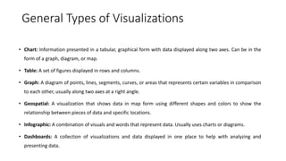
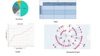
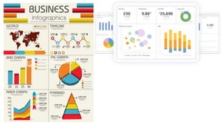
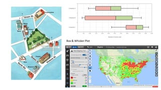
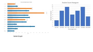
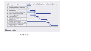
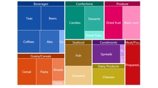
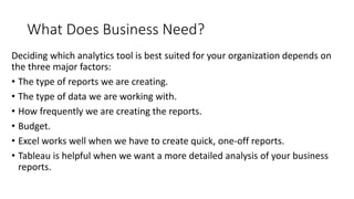
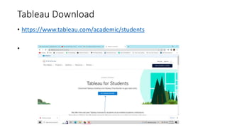
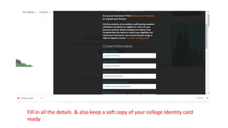
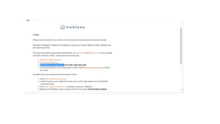
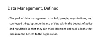
The document discusses data visualization and analytics. It defines data visualization as the graphical representation of information and data using visual elements like charts and graphs. This provides an accessible way to see trends, outliers, and patterns in data. Data visualization sits at the intersection of analysis and visual storytelling, helping make data understandable and informing decisions. The document also covers types of visualizations, examples, tools for data visualization like Tableau and Excel, and factors to consider when choosing analytics tools.
2. What is it?
• Data visualization is the graphical representation of information and data.
• By using visual elements like charts, graphs, and maps, data visualization tools
provide an accessible way to see and understand trends, outliers, and patterns in
data.
• It provides an excellent way for employees or business owners to present data to
non-technical audiences without confusion.
• Helps too make decisions and use visuals to tell stories of when data informs the
who, what, when, where, and how.
3. While traditional education typically draws a distinct line between
creative storytelling and technical analysis, the modern professional
world also values those who can cross between the two:
data visualization sits right in the middle of analysis and visual
storytelling.
4. A good visualization tells a story, removing the noise from data and
highlighting useful information.
5. General Types of Visualizations
• Chart: Information presented in a tabular, graphical form with data displayed along two axes. Can be in the
form of a graph, diagram, or map.
• Table: A set of figures displayed in rows and columns.
• Graph: A diagram of points, lines, segments, curves, or areas that represents certain variables in comparison
to each other, usually along two axes at a right angle.
• Geospatial: A visualization that shows data in map form using different shapes and colors to show the
relationship between pieces of data and specific locations.
• Infographic: A combination of visuals and words that represent data. Usually uses charts or diagrams.
• Dashboards: A collection of visualizations and data displayed in one place to help with analyzing and
presenting data.
8. Specific Examples:
• Area Map: A form of geospatial visualization, area maps are used to show specific values set over a map of a country, state, county, or any
other geographic location. Two common types of area maps are choropleths and isopleths.
• Bar Chart: Bar charts represent numerical values compared to each other. The length of the bar represents the value of each variable.
• Box-and-whisker Plots: These show a selection of ranges (the box) across a set measure (the bar).
• Bullet Graph: A bar marked against a background to show progress or performance against a goal, denoted by a line on the graph.
• Gantt Chart: Typically used in project management, Gantt charts are a bar chart depiction of timelines and tasks.
• Heat Map: A type of geospatial visualization in map form which displays specific data values as different colors (this doesn’t need to be
temperatures, but that is a common use).
• Highlight Table: A form of table that uses color to categorize similar data, allowing the viewer to read it more easily and intuitively.
• Histogram: A type of bar chart that split a continuous measure into different bins to help analyze the distribution.
• Pie Chart: A circular chart with triangular segments that shows data as a percentage of a whole.
• Treemap: A type of chart that shows different, related values in the form of rectangles nested together.
13. • The main goal of data visualization is to make it easier to identify
patterns, trends and outliers in large data sets.
• The term is often used interchangeably with others, including
information graphics, information visualization and statistical
graphics.
14. Data Importance & Relevance
• Data cleaning is the process of fixing or removing incorrect,
corrupted, incorrectly formatted, duplicate, or incomplete data
within a dataset.
• When combining multiple data sources, there are many opportunities
for data to be duplicated or mislabeled.
15. Excel VS Tableau
• Microsoft Excel is a spreadsheet application used for
calculations, statistical operations, data analysis, and reporting.
• Tableau is a business intelligence and data visualization tool to
get insights from data, find hidden trends, and make business
decisions.
16. What Does Business Need?
Deciding which analytics tool is best suited for your organization depends on
the three major factors:
• The type of reports we are creating.
• The type of data we are working with.
• How frequently we are creating the reports.
• Budget.
• Excel works well when we have to create quick, one-off reports.
• Tableau is helpful when we want a more detailed analysis of your business
reports.
22. Let Try..
• Tableau Tutorial For Beginners | Part 1 | Tableau Tutorial Part - 1 |
Tableau Training | Simplilearn
• Youtube : https://www.youtube.com/watch?v=fO7g0pnWaRA
• You must be ready see this video by Tuesday for the session.
23.
24. Creating a Data Set
• A Data Set is a container that holds the data you upload to Analytics. The Data
Set type corresponds to the specific type of data you want to import. For
example, there are Data Set types for User Data, Cost Data, Content Data, etc.
The process of creating a dataset involves three important steps:
• Data Acquisition.
• Data Cleaning.
• Data Labeling.
25. Data Management, Defined
• The goal of data management is to help people, organizations, and
connected things optimize the use of data within the bounds of policy
and regulation so that they can make decisions and take actions that
maximize the benefit to the organization.
26. 4 Types of Data Management Systems
• Customer Relationship Management System or CRM.
• Marketing technology systems.
• Data Warehouse systems.
• Analytics tools.
27. • Data management plays several roles in an organization’s data environment, making essential functions easier and less time-intensive.
These data management techniques include the following:
• Data preparation is used to clean and transform raw data into the right shape and format for analysis, including making corrections and
combining data sets.
• Data pipelines enable the automated transfer of data from one system to another.
• ETLs (Extract, Transform, Load) are built to take the data from one system, transform it, and load it into the organization’s data
warehouse.
• Data catalogs help manage metadata to create a complete picture of the data, providing a summary of its changes, locations, and quality
while also making the data easy to find.
• Data warehouses are places to consolidate various data sources, contend with the many data types businesses store, and provide a clear
route for data analysis.
• Data governance defines standards, processes, and policies to maintain data security and integrity.
• Data architecture provides a formal approach for creating and managing data flow.
• Data security protects data from unauthorized access and corruption.
• Data modeling documents the flow of data through an application or organization.