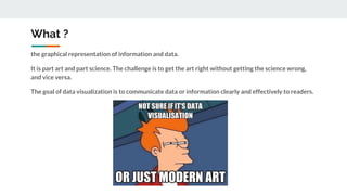
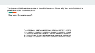
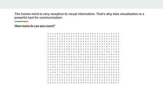
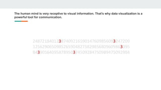
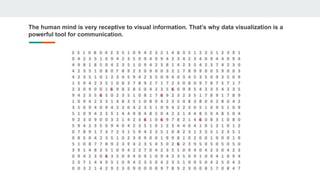
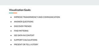
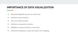
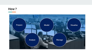
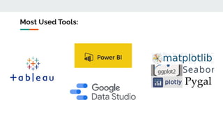
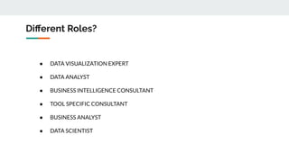
Data visualization is the graphical representation of information and data. It is used to communicate data or information clearly and effectively to readers by leveraging the human mind's receptiveness to visual information. Effective data visualization can improve transparency and communication, answer questions, discover trends, find patterns, see data in context, support calculations, and present or tell a story. Common tools for data visualization include charts, graphs, maps, and diagrams. Specialized roles involved in data visualization include data visualization experts, data analysts, business intelligence consultants, tool-specific consultants, business analysts, and data scientists.
This is a presentation I gave on Data Visualization at a General Assembly event in Singapore, on January 22, 2016. The presso provides a brief history of dataviz as well as examples of common chart and visualization formatting mistakes that you should never make.
Data visualizations make huge amounts of data more accessible and understandable. Data visualization, or "data viz," is becoming largely important as the amount of data generated is increasing and big data tools are helping to create meaning behind all of that data.
This SlideShare presentation takes you through more details around data visualization and includes examples of some great data visualization pieces.
Introduction on Data Visualization. Importance of Data Visualization. Data Representation Criteria. Groundwork for data visualization. Some Data Visualization tools to start with
Best Practices for Killer Data VisualizationQualtrics
There’s something special about simple, powerful visualizations that tell a story. In fact, 65% of people are visual learners.
Join Qualtrics and Sasha Pasulka from Tableau as we illuminate the world of data visualization and give you clear takeaways to help you tell a better story with data. Getting executive buy-in or that seat at the table may come down to who can visualize data in a way that excites and enlightens the audience.
A deep dive in data visualization covering some handful tools like Advance excel, Tableau, Qliksense etc.
You can add more content like discussing Google API, Perception and cognition theory,some more readable formats for data visualization and its framework.
Data Visualization Design Best Practices WorkshopJSI
This introduction was presented as part of a workshop at the Measurement and Accountability for Results in Health Summit at the World Bank (June 2015). The workshop focused on simple ways anyone working with data can improve their presentations, and included visualization redesign activity to put these principles in practice.
Data visualization is an interdisciplinary field that deals with the graphic representation of data. It is a particularly efficient way of communicating when the data is numerous as for example a time series.
North Raleigh Rotarian Katie Turnbull gave a great presentation at our Friday morning extension meeting about data visualization. Katie is a consultant at research and advisory firm, Gartner, Inc.
This slide deck gives a general overview of Data Visualization, with inspiring examples, the strength and weaknesses of the human visual system, a few technical frameworks that may be used for creating your own visualizations and some design concepts from the data visualization field.
Data visualization in data science: exploratory EDA, explanatory. Anscobe's quartet, design principles, visual encoding, design engineering and journalism, choosing the right graph, narrative structures, technology and tools.
Data science skills are increasingly important for research and industry projects. With complex data science projects, however, come complex needs for understanding and communicating analysis processes and results. The rise of data science has accompanied a comparable rise in business intelligence and the demand for visualizations and dashboards that can explain models, summarize results, assist with decision making, and even predict outcomes. Ultimately, an analyst’s data science toolbox is incomplete without visualization skills. This talk will explore the landscape of visualization for data science – using visualization for data exploration and communication, reproducible approaches to visualization, and how to develop better instincts for visualization choice and graphic design.
Understanding your audience and considering them in your design is essential for building great visualizations. This deck will walk you through the critical steps for identifying and understanding your audience, and developing a complex visualization storyboard to share your message.
How to start generating leads with infographicsInfogram
Infographics are a powerful way of communicating information since they combine data and visual images - left brain and right brain - thereby making it easier to digest, remember and share information.
They get shared more frequently on social media than a simple text-only post with the same information.
Creating infographics for your website can get you more traffic.
So how do we go about creating effective infographics that tell our brand story through data visualisation? And how do we promote those infographics to drive real, qualified leads for our sales team?
In this presentation we show you:
- What infographics are and why you should care
- The "dos and dont's" of Infographic creation
- How to optimise your infographic for lead generation
- How to promote your infographic
- Measure and optimise your infographic campaign
- Make your storytelling more effective through infographics
infogr.am
Data vs Hunch - Beyond Lecture at Hyper Island 2015Beyond
How do you strike a balance between data and creative hunch in a digital marketing world obsessed with metrics and ROI? Slides from a session with the Hyper Island Digital Data Strategy class of 2015, at the school's Stockholm campus.
This presentation is designed as an introduction to information visualization and aims to provide details about:
- Key ideas and techniques related to the creation and critique of visualizations
- What levers visualizations help us pull as designers
- Why visualizations are useful and how they relate to user goals
- Various motivations, trade-offs, and responsibilities surrounding visualizations
Handout for "Proven Presentation Techniques", an InfoComm approved workshop b...Thomas Zangerle
This workshop will show you how you can transform your ideas into convincing interactive presentations. The most important elements of successful presentations, training sessions and meetings are straightforward to name, but not always quite so easy to implement. It's essential for the presenter to capture and maintain the attention of the audience, to present effectively, create interest, encourage excitement and to captivate the participants. In this training session we will explore how you can increase understanding and retention in a presentation. You will receive background information based on scientific research, about improving communication techniques and about the workings of the brain. You will also see examples of best practices, effective communication, and presentation designs, all of which contribute to the creation of long-lasting impressions.
In a world of exponential information growth, we crave content that is efficient, engaging and easy to synthesize. This guide will show you why visual communication works—and how to make it work for you. In this guide you will find:
- Why our brains love visuals
- How to find the story in your data
- How to design your content
Do you create data dashboards, but don’t know how best to tell their story? Is there a gap between what you want your users to do with your dashboards and how they currently use them? Does it sometimes feel overwhelming to try to design for multiple audiences at once? In this 90-minute webinar, I shared:
-simple techniques to better understand your data audiences.
-tips on how to embed data storytelling into your dashboards
-ways to frame data to increase user engagement.
-narrative approaches to reach multiple audiences at once
This is an abbreviated version of a presentation given as part of a Residency program for graduate education students earning their Superintendent's letter.
There are three neurological factors in particular that can contribute to the ultimate success—or failure—of a presentation. The first is the important role that vision plays in our understanding of the world. Between 80 and 90% of the information that our brain processes comes in through our eyes, and almost incredibly, two-thirds of the brain’s electrical activity is dedicated to vision when the eyes are open. We are hardwired to consume visuals, and our brains have evolved
powerful storage capacity for visual information. The second factor is our biological predilection for stories. According to The Scientific American, personal stories make up 65% of our conversations—a fact that is rooted in the ways that stories engage our brains. Lastly, our brains respond powerfully to two-way conversations. When you have a conversation with somebody, your brain activity actually begins to mirror theirs—a process known as neural coupling.
Data visualization has become increasingly more important and sits at the center of how people learn about and experience the world. We process information about politics, business insights and every day decisions through “visual soundbites”. As data journalists, we have incredible power to both positively influence as well as misguide conversations with the choices that we make when presenting graphical results.
In this presentation, we will share some of the best practices that help deliver stories that matter and avoid creating those that mislead.
PLOTCON NYC: The Future of Business Intelligence: Data VisualizationPlotly
How can data visualization be used as a platform to reveal intelligent insights and help business analysts make timely decisions? In this talk, Kristen Sosulski will discuss the opportunities for personalized, location aware, context relevant, and platform independent information visualizations as a toolkit for business analysts.
The Future of Business Intelligence: Data VisualizationKristen Sosulski
Kristen Sosulski
The future of business intelligence: Data Visualization
How can data visualization be used as a platform to reveal intelligent insights and help business analysts make timely decisions? In this talk, Kristen Sosulski will discuss the opportunities for personalized, location aware, context relevant, and platform independent information visualizations as a toolkit for business analysts.
Knowing how to use Tableau doesn’t mean you'll be able to design effective dashboards. If you want to create dashboards that deliver valuable insight, perform well, and have visual impact, you'll need to apply Data Visualization Best Practices.
In this webinar, you'll learn the science behind Data Visualization Best Practices. Cognitive psychology helps us understand how the human brain perceives information in a dashboard, and we'll teach you how to use this knowledge to optimize your designs.
Techniques to optimize the pagerank algorithm usually fall in two categories. One is to try reducing the work per iteration, and the other is to try reducing the number of iterations. These goals are often at odds with one another. Skipping computation on vertices which have already converged has the potential to save iteration time. Skipping in-identical vertices, with the same in-links, helps reduce duplicate computations and thus could help reduce iteration time. Road networks often have chains which can be short-circuited before pagerank computation to improve performance. Final ranks of chain nodes can be easily calculated. This could reduce both the iteration time, and the number of iterations. If a graph has no dangling nodes, pagerank of each strongly connected component can be computed in topological order. This could help reduce the iteration time, no. of iterations, and also enable multi-iteration concurrency in pagerank computation. The combination of all of the above methods is the STICD algorithm. [sticd] For dynamic graphs, unchanged components whose ranks are unaffected can be skipped altogether.
Chatty Kathy - UNC Bootcamp Final Project Presentation - Final Version - 5.23...John Andrews
SlideShare Description for "Chatty Kathy - UNC Bootcamp Final Project Presentation"
Title: Chatty Kathy: Enhancing Physical Activity Among Older Adults
Description:
Discover how Chatty Kathy, an innovative project developed at the UNC Bootcamp, aims to tackle the challenge of low physical activity among older adults. Our AI-driven solution uses peer interaction to boost and sustain exercise levels, significantly improving health outcomes. This presentation covers our problem statement, the rationale behind Chatty Kathy, synthetic data and persona creation, model performance metrics, a visual demonstration of the project, and potential future developments. Join us for an insightful Q&A session to explore the potential of this groundbreaking project.
Project Team: Jay Requarth, Jana Avery, John Andrews, Dr. Dick Davis II, Nee Buntoum, Nam Yeongjin & Mat Nicholas
4. What ?
the graphical representation of information and data.
It is part art and part science. The challenge is to get the art right without getting the science wrong,
and vice versa.
The goal of data visualization is to communicate data or information clearly and effectively to readers.
5. The human mind is very receptive to visual information. That’s why data visualization is a
powerful tool for communication.
How many 3s can you count?
6. The human mind is very receptive to visual information. That’s why data visualization is a
powerful tool for communication.
How many 6s can you count?
7. The human mind is very receptive to visual information. That’s why data visualization is a
powerful tool for communication.
8. The human mind is very receptive to visual information. That’s why data visualization is a
powerful tool for communication.
10. Visualization Goals:
● IMPROVE TRANSPARENCY AND COMMUNICATION
● ANSWER QUESTIONS
● DISCOVER TRENDS
● FIND PATTERNS
● SEE DATA IN CONTEXT
● SUPPORT CALCULATIONS
● PRESENT OR TELL A STORY
11. Visual data helps us to think and communicate. A picture tells a story better than a
thousand words could.
12. Visual data helps us to think and communicate. A picture tells a story better than a
thousand words could.
13. IMPORTANCE OF DATA VISUALIZATION
1) Make data digestible and easy to understand.
2) Identify trends and outliers.
3) Tell a story within the data.
4) Reinforce an argument or opinion.
5) Highlight an important point in a set of data.
6) Make books, blog posts, reports and videos more engaging.
18. Different Roles?
● DATA VISUALIZATION EXPERT
● DATA ANALYST
● BUSINESS INTELLIGENCE CONSULTANT
● TOOL SPECIFIC CONSULTANT
● BUSINESS ANALYST
● DATA SCIENTIST