Data Visualization
A (Very) Brief Overview
What’s your graphic IQ?
O http://www.perceptualedge.com/files/Grap
hDesignIQ.html
What is data viz?
O Data visualization helps us translate numbers
into a picture that we can interpret more
easily.
O Two of the biggest reasons to use data
visualization are to…
O Make sense of data (i.e., help you see patterns)
O Communicate data to others (i.e., executive
presentations)
O Good visualizations allow our eyes to do
some of the heavy lifting in data processing
What is data viz?
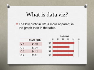
O The low profit in Q2 is more apparent in
the graph than in the table.
Profit ($M)
Q 1 $4.18
Q 2 $3.24
Q 3 $4.12
Q 4 $3.91
$0 $1 $2 $3 $4 $5
Q1
Q2
Q3
Q4
Profit ($M)
Audience matters!
O Visualizations can
be useful, even if
you’re the only one
to see them.
O For presentations,
consider if everyone
will have a printed
copy, or if they need
to be able to see
fine details on a
screen.
Q1 Q2 Q3
Group 1 4.19 4.25 4.50
Group 2 4.00 4.32 4.31
Group 3 4.22 4.18 4.54
Group 4 4.35 4.41 4.62
Q1 Q2 Q3
Group 1 4.19 4.25 4.50
Group 2 4.00 4.32 4.31
Group 3 4.22 4.18 4.54
Group 4 4.35 4.41 4.62
Purpose matters!
O Presentations are often expected to
function as both the visual aid during the
meeting, and a reference for those unable
to attend.
O Alternatives:
O 2 documents with difference purposes
O Use “speaker notes”
Content matters!
O Different chart types have different
strengths and weaknesses.
O Of the two options below, which do you
think is easier to interpret? Why?
0% 20% 40% 60% 80%
White/Caucasian
Hispanic
Black/African American
Asian
Two or More Races
Prefer not to answer
% of Population% of Population
White/Caucasian
Hispanic
Black/African
American
Asian
Two or More
Races
Prefer not to
answer
Types of Data: Comparisons
O Column charts are
likely the best option
if you have few
groups (< 8), but title
length can be a
problem
O Bar charts work
better if you have
more groups or
longer titles
O Heat maps are good
if you’re comparing
more than one group
on more than one
metric
Types of Data: Comparisons,
continued
O Bullet graphs have
become popular in
dashboards, since
they’re a compact
option to show a
value against a
specific metric as
well as a showing
what’s considered
good, fair, and bad.
4.18
3.24
4.12
3.91
Q1
Q2
Q3
Q4
Poor Fair Good
2016 2015
Types of Data: Composition
75%
67%
82%
73%
13%
11%
12%
18%
12%
22%
Question 1
Question 2
Question 3
Question 4
Fav Neu Unf
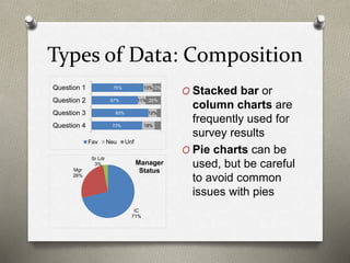
O Stacked bar or
column charts are
frequently used for
survey results
O Pie charts can be
used, but be careful
to avoid common
issues with pies
IC
71%
Mgr
26%
Sr Ldr
3% Manager
Status
Types of Data: Trend
O Line charts are commonly used to
display long-term trend data.
55%
60%
65%
70%
75%
2014 2015 2016 2017
Group 1
Group 2
Group 3
Types of Data: Relationship
O Scatterplots are the
most common graphic to
show relationship data,
but bubble charts can be
used if you need to look
at a third variable
O You can also use line
charts to see
relationships by
comparing the shape of
the graphs
O Network graphs can be
used to show
relationships between
individuals
60%
70%
80%
90%
60% 70% 80% 90%
2017
2016
Tips for Useful Charts &
Graphs
O Use the full axis, particularly on column and bar
charts
O Highlight the most important information
O Consider if legends and labels detract from your
point
O This isn’t to say you shouldn’t label your data, but
sometimes it’s redundant or could be placed in a
better way
O Consider the “data-to-ink” ratio
O Pass the “squint” test
O Think about sort order
O Ask for a second opinion
Common Problems in
Presentations
O Too much information
O Poor color choices
O Variety for the sake of variety
O Inconsistent axes from one slide to the
next
O Neglecting to label charts
O Not following common conventions
Making Bad Charts Better
Pretty vs. Useful
Example from: http://viz.wtf/post/147196565281/alphabet-on-the-x-axis-for-reals#notes
O While this chart is pretty and at least
labeled, it’s hard to read quickly. Using an
alphabetic scale on the x-axis doesn’t do
anything to enhance interpretation.
Pretty vs. Useful, continued
O This bar chart is a better option for
conveying the same data.
Example from: http://viz.wtf/post/147196565281/alphabet-on-the-x-axis-for-reals#notes
Poor Axis Choice
Example from: http://junkcharts.typepad.com/junk_charts/2016/06/what-doesnt-help-readers-on-the-chart-and-what-does-help-off-the-chart.html
The graph below uses a line to show
trend (a common convention), but the
upside-down, truncated y-axis makes it
hard to read. A bar chart version would
be easier to follow, but you could just fix
the y-axis.
Republicans are bad at
graphs…
O Media sources with a clear bias are
notorious for using a truncated axis to
their advantage.
6
7.066
0
2
4
6
8
As of 3/27 3/31 Goal
Millions
Obamacare
Enrollment
… but so are Democrats
O In addition to
truncating the
axis, this one
also fails to
show that the
upward trend
started before
Obama took
office.
Example from: https://qz.com/580859/the-most-misleading-charts-of-2015-fixed/
Yet Another Poor Axis Choice
Example from: https://qz.com/580859/the-most-misleading-charts-of-2015-fixed/
O This is one of those times that it doesn’t
make sense to start the y-axis at 0.
Yet Another Poor Axis Choice,
continued
Example from: https://qz.com/580859/the-most-misleading-charts-of-2015-fixed/
O The trend is more apparent when we use
a more realistic axis.
How Not to Make a Pie Chart
O Pie charts should never be
used to show values on a
multiple-select item. Use a
bar or column chart instead.
Example from: http://viz.wtf/post/162169270900/what-is-the-recidivism-rate-for-pie-chart
Overall
0%
20%
40%
60%
80%
RecidivismRate
Offense Type
How Not to Make a Pie Chart,
continued
O While this pie does add
up to 100%, the design
of the graphic makes it
nearly impossible to
read.
Example from: http://viz.wtf/post/60203066686/the-spiral-staircase-courtesy-of-janwillemtulp
0%
10%
20%
30%
40%
50%
60%
ContrarianThesis
PersonalFailure
SnappyRefrain
Statementof
UtterCertainty
Spontaneous
Moment
OpeningJoke
Sophisticated
VisualAids
Telling Your Story
O The headline to go with this chart was “Price has
declined for all products on the market since the
launch of Product C in 2010.”
Example from: http://www.storytellingwithdata.com/blog/2014/05/the-story-you-want-to-telland-one-your
Telling Your Story, continued
O Since we’re looking at trend data, a line chart
would make it easier to see where the points are
for each year/product.
Example from: http://www.storytellingwithdata.com/blog/2014/05/the-story-you-want-to-telland-one-your
Telling Your Story, continued
O Alternate headline: “As of 2014, retail prices
have converged across products, with an
average retail price of $223, ranging from a low
of $180 (Product C) to a high of $260 (Product
A).
Example from: http://www.storytellingwithdata.com/blog/2014/05/the-story-you-want-to-telland-one-your
Use of Color & Number of
Groups
1
1.5
2
2.5
3
3.5
4
4.5
5
Use of Color & Number of
Groups, continued
1
1.5
2
2.5
3
3.5
4
4.5
5
1
1.5
2
2.5
3
3.5
4
4.5
5
Appendix
Chart Chooser
Chart Chooser from: http://extremepresentation.typepad.com/blog/2006/09/choosing_a_good.html
Why Are Pie Charts Disliked?
O In each of these charts, can you identify
the largest slice? How does it compare to
the second largest?
Example from: http://prsync.com/oracle/pie-charts-just-dont-work-when-comparing-data---number--of-top--reasons-to-never-ever-use-a-pie-chart--23294/
Why Are Pie Charts Disliked?
O Here’s the same data as column charts-
it’s much easier to see differences
between groups.
Example from: http://prsync.com/oracle/pie-charts-just-dont-work-when-comparing-data---number--of-top--reasons-to-never-ever-use-a-pie-chart--23294/
If You Really Need to Use a Pie
Chart…
O There are some do’s and don’t’s that are specific
to pies if you really feel you need to use them.
O Arrange the slices in a way that makes sense.
O Don’t use them for more than 2-3 categories.
O Don’t use 3D. Ever.
O Add numeric values as labels so that the end user
doesn’t have to guess. It’s also usually helpful to
put the category in the label instead of using a
legend.
O Don’t “explode” your pies.
O Don’t use pies for questions that allow more than
one response.
Excel Tricks
O Trying to get Excel to do something it’s not
really designed to do? Check the Peltier
Tech site.
O https://peltiertech.com/Excel/Charts/ChartI
ndex.html
More on Color Choices
O Semantically resonant colors
O https://hbr.org/2014/04/the-right-colors-
make-data-easier-to-read
More on Color Choices
O If you know someone in the audience is
color-blind or will be printing the
presentation, there are specific palettes
that are “friendly”.
O http://www.vischeck.com has examples of
what various images look like to individuals
with color-blindness
O http://colorbrewer2.org gives sample
“friendly” palettes
Other Resources
There are several great data viz practitioners with
excellent books and websites. Some to look for:
O Stephen Few
O Edward Tufte
O Nathan Yau
O Albert Cairo
O Cole Nussbaumer
Knaflic
O Junk Charts
http://junkcharts.typepad.com/
O WTF Visualizations
http://viz.wtf/

Data Visualization - A Brief Overview

  • 1.
  • 2.
    What’s your graphicIQ? O http://www.perceptualedge.com/files/Grap hDesignIQ.html
  • 3.
    What is dataviz? O Data visualization helps us translate numbers into a picture that we can interpret more easily. O Two of the biggest reasons to use data visualization are to… O Make sense of data (i.e., help you see patterns) O Communicate data to others (i.e., executive presentations) O Good visualizations allow our eyes to do some of the heavy lifting in data processing
  • 4.
    What is dataviz? O The low profit in Q2 is more apparent in the graph than in the table. Profit ($M) Q 1 $4.18 Q 2 $3.24 Q 3 $4.12 Q 4 $3.91 $0 $1 $2 $3 $4 $5 Q1 Q2 Q3 Q4 Profit ($M)
  • 5.
    Audience matters! O Visualizationscan be useful, even if you’re the only one to see them. O For presentations, consider if everyone will have a printed copy, or if they need to be able to see fine details on a screen. Q1 Q2 Q3 Group 1 4.19 4.25 4.50 Group 2 4.00 4.32 4.31 Group 3 4.22 4.18 4.54 Group 4 4.35 4.41 4.62 Q1 Q2 Q3 Group 1 4.19 4.25 4.50 Group 2 4.00 4.32 4.31 Group 3 4.22 4.18 4.54 Group 4 4.35 4.41 4.62
  • 6.
    Purpose matters! O Presentationsare often expected to function as both the visual aid during the meeting, and a reference for those unable to attend. O Alternatives: O 2 documents with difference purposes O Use “speaker notes”
  • 7.
    Content matters! O Differentchart types have different strengths and weaknesses. O Of the two options below, which do you think is easier to interpret? Why? 0% 20% 40% 60% 80% White/Caucasian Hispanic Black/African American Asian Two or More Races Prefer not to answer % of Population% of Population White/Caucasian Hispanic Black/African American Asian Two or More Races Prefer not to answer
  • 8.
    Types of Data:Comparisons O Column charts are likely the best option if you have few groups (< 8), but title length can be a problem O Bar charts work better if you have more groups or longer titles O Heat maps are good if you’re comparing more than one group on more than one metric
  • 9.
    Types of Data:Comparisons, continued O Bullet graphs have become popular in dashboards, since they’re a compact option to show a value against a specific metric as well as a showing what’s considered good, fair, and bad. 4.18 3.24 4.12 3.91 Q1 Q2 Q3 Q4 Poor Fair Good 2016 2015
  • 10.
    Types of Data:Composition 75% 67% 82% 73% 13% 11% 12% 18% 12% 22% Question 1 Question 2 Question 3 Question 4 Fav Neu Unf O Stacked bar or column charts are frequently used for survey results O Pie charts can be used, but be careful to avoid common issues with pies IC 71% Mgr 26% Sr Ldr 3% Manager Status
  • 11.
    Types of Data:Trend O Line charts are commonly used to display long-term trend data. 55% 60% 65% 70% 75% 2014 2015 2016 2017 Group 1 Group 2 Group 3
  • 12.
    Types of Data:Relationship O Scatterplots are the most common graphic to show relationship data, but bubble charts can be used if you need to look at a third variable O You can also use line charts to see relationships by comparing the shape of the graphs O Network graphs can be used to show relationships between individuals 60% 70% 80% 90% 60% 70% 80% 90% 2017 2016
  • 13.
    Tips for UsefulCharts & Graphs O Use the full axis, particularly on column and bar charts O Highlight the most important information O Consider if legends and labels detract from your point O This isn’t to say you shouldn’t label your data, but sometimes it’s redundant or could be placed in a better way O Consider the “data-to-ink” ratio O Pass the “squint” test O Think about sort order O Ask for a second opinion
  • 14.
    Common Problems in Presentations OToo much information O Poor color choices O Variety for the sake of variety O Inconsistent axes from one slide to the next O Neglecting to label charts O Not following common conventions
  • 15.
  • 16.
    Pretty vs. Useful Examplefrom: http://viz.wtf/post/147196565281/alphabet-on-the-x-axis-for-reals#notes O While this chart is pretty and at least labeled, it’s hard to read quickly. Using an alphabetic scale on the x-axis doesn’t do anything to enhance interpretation.
  • 17.
    Pretty vs. Useful,continued O This bar chart is a better option for conveying the same data. Example from: http://viz.wtf/post/147196565281/alphabet-on-the-x-axis-for-reals#notes
  • 18.
    Poor Axis Choice Examplefrom: http://junkcharts.typepad.com/junk_charts/2016/06/what-doesnt-help-readers-on-the-chart-and-what-does-help-off-the-chart.html The graph below uses a line to show trend (a common convention), but the upside-down, truncated y-axis makes it hard to read. A bar chart version would be easier to follow, but you could just fix the y-axis.
  • 19.
    Republicans are badat graphs… O Media sources with a clear bias are notorious for using a truncated axis to their advantage. 6 7.066 0 2 4 6 8 As of 3/27 3/31 Goal Millions Obamacare Enrollment
  • 20.
    … but soare Democrats O In addition to truncating the axis, this one also fails to show that the upward trend started before Obama took office. Example from: https://qz.com/580859/the-most-misleading-charts-of-2015-fixed/
  • 21.
    Yet Another PoorAxis Choice Example from: https://qz.com/580859/the-most-misleading-charts-of-2015-fixed/ O This is one of those times that it doesn’t make sense to start the y-axis at 0.
  • 22.
    Yet Another PoorAxis Choice, continued Example from: https://qz.com/580859/the-most-misleading-charts-of-2015-fixed/ O The trend is more apparent when we use a more realistic axis.
  • 23.
    How Not toMake a Pie Chart O Pie charts should never be used to show values on a multiple-select item. Use a bar or column chart instead. Example from: http://viz.wtf/post/162169270900/what-is-the-recidivism-rate-for-pie-chart Overall 0% 20% 40% 60% 80% RecidivismRate Offense Type
  • 24.
    How Not toMake a Pie Chart, continued O While this pie does add up to 100%, the design of the graphic makes it nearly impossible to read. Example from: http://viz.wtf/post/60203066686/the-spiral-staircase-courtesy-of-janwillemtulp 0% 10% 20% 30% 40% 50% 60% ContrarianThesis PersonalFailure SnappyRefrain Statementof UtterCertainty Spontaneous Moment OpeningJoke Sophisticated VisualAids
  • 25.
    Telling Your Story OThe headline to go with this chart was “Price has declined for all products on the market since the launch of Product C in 2010.” Example from: http://www.storytellingwithdata.com/blog/2014/05/the-story-you-want-to-telland-one-your
  • 26.
    Telling Your Story,continued O Since we’re looking at trend data, a line chart would make it easier to see where the points are for each year/product. Example from: http://www.storytellingwithdata.com/blog/2014/05/the-story-you-want-to-telland-one-your
  • 27.
    Telling Your Story,continued O Alternate headline: “As of 2014, retail prices have converged across products, with an average retail price of $223, ranging from a low of $180 (Product C) to a high of $260 (Product A). Example from: http://www.storytellingwithdata.com/blog/2014/05/the-story-you-want-to-telland-one-your
  • 28.
    Use of Color& Number of Groups 1 1.5 2 2.5 3 3.5 4 4.5 5
  • 29.
    Use of Color& Number of Groups, continued 1 1.5 2 2.5 3 3.5 4 4.5 5 1 1.5 2 2.5 3 3.5 4 4.5 5
  • 30.
  • 31.
    Chart Chooser Chart Chooserfrom: http://extremepresentation.typepad.com/blog/2006/09/choosing_a_good.html
  • 32.
    Why Are PieCharts Disliked? O In each of these charts, can you identify the largest slice? How does it compare to the second largest? Example from: http://prsync.com/oracle/pie-charts-just-dont-work-when-comparing-data---number--of-top--reasons-to-never-ever-use-a-pie-chart--23294/
  • 33.
    Why Are PieCharts Disliked? O Here’s the same data as column charts- it’s much easier to see differences between groups. Example from: http://prsync.com/oracle/pie-charts-just-dont-work-when-comparing-data---number--of-top--reasons-to-never-ever-use-a-pie-chart--23294/
  • 34.
    If You ReallyNeed to Use a Pie Chart… O There are some do’s and don’t’s that are specific to pies if you really feel you need to use them. O Arrange the slices in a way that makes sense. O Don’t use them for more than 2-3 categories. O Don’t use 3D. Ever. O Add numeric values as labels so that the end user doesn’t have to guess. It’s also usually helpful to put the category in the label instead of using a legend. O Don’t “explode” your pies. O Don’t use pies for questions that allow more than one response.
  • 35.
    Excel Tricks O Tryingto get Excel to do something it’s not really designed to do? Check the Peltier Tech site. O https://peltiertech.com/Excel/Charts/ChartI ndex.html
  • 36.
    More on ColorChoices O Semantically resonant colors O https://hbr.org/2014/04/the-right-colors- make-data-easier-to-read
  • 37.
    More on ColorChoices O If you know someone in the audience is color-blind or will be printing the presentation, there are specific palettes that are “friendly”. O http://www.vischeck.com has examples of what various images look like to individuals with color-blindness O http://colorbrewer2.org gives sample “friendly” palettes
  • 38.
    Other Resources There areseveral great data viz practitioners with excellent books and websites. Some to look for: O Stephen Few O Edward Tufte O Nathan Yau O Albert Cairo O Cole Nussbaumer Knaflic O Junk Charts http://junkcharts.typepad.com/ O WTF Visualizations http://viz.wtf/

Editor's Notes

  • #3 (We didn’t look at this link on Friday due to time constraints, but it’s worth checking out as a quick intro to data viz!)
  • #6 If you’re dealing with a lot of numbers in a table and a graph would be too “busy”, you can use a heatmap to make patterns more apparent. Conditional formatting in Excel is a simple tool that can be used to help you see patterns in large data sets. (Ask me if you’re unfamiliar with conditional formatting!) When adding conditional formatting, think about what matters. Do you want to know which items are the highest and lowest for each group? Do you want to know which groups are the highest and lowest for each item? Sometimes you can get away with doing conditional formatting on a whole block at once (as shown here), other times you may want to do each row or each column individually. Another visualization that’s useful for exploring data is to use the pivot chart option in Excel, where you can swap quickly between groups or items to see if there’s anything interesting worth showing in an executive presentation. I generally do most of my work in Excel because graphs are easy to move over to PPT when needed, but there are better programs available (such as R) that have a steeper learning curve.
  • #7 When you change slides, people read/examine graphics instead of listening. Visual cues vs auditory- visual wins. If you have a lot of info on screen, the audience isn’t going to be listening for most of the time.
  • #8 While experienced data viz practitioners may not agree on the “best” type of chart for a given situation, there are usually at least some rules of thumb on what might make the list. I picked a pie chart here for a couple of reasons. For one, most data viz people hate them- the human eye is much better at judging length than angles. People tend to be pretty good at determining quarters of a pie, especially when they line up with the exact top, bottom, left, and right, but if you’re looking at the pie above, can you tell what percentage of people are white/caucasian? One thing that pie charts can do better than bars is quickly compare combined groups (that are next to each other) without doing math. For example, we can immediately see there are more white/caucasian people in this population than all other groups combined. While you can get the same data from the bar chart, you need to look at the axis and then do some quick addition. If you really need to use a pie, there are some guidelines on best practices in the appendix.
  • #9 One thing to watch out for on column charts is the length of group titles. Rotating titles can make them hard to read, and if you rotate to 45 degrees, they can get cut off if you aren’t careful. Heat maps rely on color as the visual rather than length to highlight differences. (That can be problematic if you have someone who is colorblind in the audience or if people are printing the presentation in grayscale.) You may want to consider using a plain table and then only highlighting significant differences (practical or statistical significance). You can potentially use line charts in these cases, but line charts are often used to display trends, and some audiences may not want to go against that convention.
  • #10 Stephen Few came up with bullet graphs, but they’ve been discussed by several other data scientists. Peltier Tech’s website has tutorials on creating them in Excel.
  • #11 Stacked columns/bars can be better for comparing composition of groups, but note that it can be hard to accurately compare the portions other than the ones at the ends.
  • #12 One thing to consider is whether you should leave the default axis. Consider if the viewer’s interpretation would change if I had used a 0-100% axis. Group 3 here looks like they had a significant improvement from 2014 to 2017, but how big is the group (statistical significance depends partly on group size)? Showing this graph and then saying there were no sig diffs would be confusing. Using the full axis is more important in column and bar charts, since we’re relying on length to tell the story there.
  • #13 While scatterplots are good for quickly seeing patterns and outliers, it is difficult to label the legibly, making it hard to determine the exact items that are outliers. Scatterplots can also be misleading when there are a large number of data points and a limited number of values, because you can’t see how many data points are overlapping. When using bubble charts, pay attention to how the 3rd variable is used. It should determine the area of the bubble, not the diameter/radius.
  • #14 Note that these are guidelines, not hard and fast rules. However, if you’re do decide to break them, you should have a good reason for doing so. -Use the full axis. Using a partial axis can make your data appear skewed. For percentages, your axis should go from 0-100%. For mean scores from Likert scale items (5 bucket, such as Strongly Disagree to Strongly Agree), the axis should go from 1 to 5. -Highlight the most important information, for example color only significant differences and leave the rest grey. -Legends & labels- Label your chart in a way that allows the chart to remain the focus. For legends, if you’re only showing one metric, it’s probably unnecessary. -Data-to-ink ratio. This goes to the point above; you need to strike a balance. Avoid “busy” graphics. People often add more elements than necessary to a chart. Charts do not need background colors, 3D, shading, etc., which can make them harder to read. You don’t need a chart title if your slide title is saying the same thing. If you label every point in a bar graph, you don’t really need to label the axis as well. Alternately, if you use axis labels and gridlines, you probably don’t need to label every point. (Note I left a lot of labels out for this presentation just so that it’s not specific to one industry.) -”Squint” test- do you still get something out of it if you squint? Cluttered slides don’t make the cut. -Sort order- is it more important for groups or specific metrics to be in the same order on every slide, or would it be more useful to sort by the value itself (e.g., most to least favorable)? -Ask for a second opinion- you may be surprised what others find confusing
  • #15 Some of these aren’t data viz problems so much as presentation problems! -Too much info- are you trying to create one document to serve as both presentation and handout? Also, avoid graphs that are so crowded they’re hard to read. -Poor color choices- Data can be easier to read if you choose colors that are intuitive to the audience, such as red for “bad” results and green for “good” ones. This can vary by audience, though! Consider if you were making a presentation to Coca-Cola- red might be good and blue might be bad there! Be careful to choose colors that are easy to distinguish. For example, using both navy and black could be problematic. You should also use colors consistently throughout your presentation. -Variety- while it isn’t exciting, using the same types of graphs throughout your presentation can make them easier to interpret, because the audience doesn’t need to learn a new display on each page. However (!), don’t maintain poor choices (e.g., from previous presentations) just for consistency. -Inconsistent axes- having axes that jump around from one slide to the next can make comparisons difficult. Similarly, you should use the same size and placement of graphics. -Neglecting to label charts- this can be especially problematic in consulting industries, where you’re used to looking at the same metrics and scales. It may be implied for you, but not for your audience. -Following common conventions- For example, a line chart showing trend is expected to have the most recent data on the right, and people expect if you display something like profit, they would want to see the line go up from left to right, while if you’re showing expenses, it would be “good” for the line to go down, showing a reduction.
  • #18 This bar chart is a better option for conveying the same data.
  • #26 Note that this example is written up in much more detail and with more interim graphics at the link.
  • #27 The line chart makes it apparent that really the only two products we should comment on vs the introduction of C are A and B. Note that you could have all grey lines in this graph- color isn’t necessary because they’re labeled well, so we can use color to highlight specific points.
  • #29 Too many groups make this chart impossible to read. Note I’ve removed the legend on purpose, but there are 15 groups.
  • #30 If we just focus on the target group, we’re still able to “get something” from the graphic- that the group tends to score poorly relative to others.
  • #32 Note these are suggestions, not required graphs! The same website also recently added a “slide chooser”.