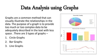
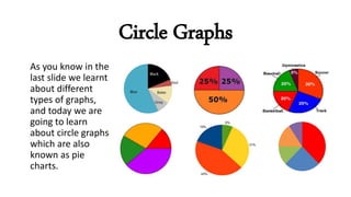
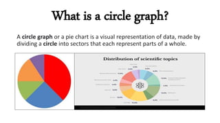
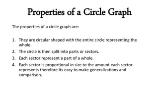
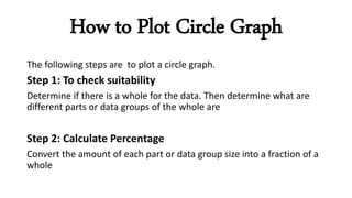
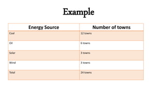
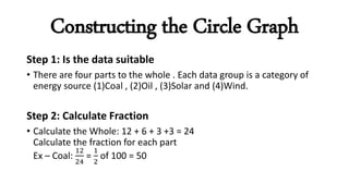
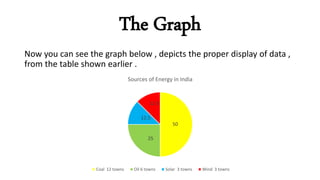
Handling Data
CIRCLE GRAPHS
MADE BY
ANANYA JAIN
Data Analysis using Graphs
Graphs are a common method that can
visually illustrate the relationships in the
data. The purpose of a graph is to provide
too much or too complex data to be
adequately described in the text with less
space . There are 3 types of graphs –
1. Circle Graphs
2. Bar Graphs
3. Line Graphs
Circle Graphs
As you know in the
last slide we learnt
about different
types of graphs,
and today we are
going to learn
about circle graphs
which are also
known as pie
charts.
What is a circle graph?
A circle graph or a pie chart is a visual representation of data, made by
dividing a circle into sectors that each represent parts of a whole.
Properties of a Circle Graph
The properties of a circle graph are:
1. They are circular shaped with the entire circle representing the
whole.
2. The circle is then split into parts or sectors.
3. Each sector represent a part of a whole.
4. Each sector is proportional in size to the amount each sector
represents therefore its easy to make generalizations and
comparison.
How to Plot Circle Graph
The following steps are to plot a circle graph.
Step 1: To check suitability
Determine if there is a whole for the data. Then determine what are
different parts or data groups of the whole are
Step 2: Calculate Percentage
Convert the amount of each part or data group size into a fraction of a
whole
Continued……
Step 3: Draw the graph
Draw a circle and draw in a part (using a protractor) for each group
Step 4: Title and label the graph
Label the parts with the data group name and , percentage or
fraction . Then add a title to the graph.
Example
Energy Source Number of towns
Coal 12 towns
Oil 6 towns
Solar 3 towns
Wind 3 towns
Total 24 towns
Constructing the Circle Graph
Step 1: Is the data suitable
• There are four parts to the whole . Each data group is a category of
energy source (1)Coal , (2)Oil , (3)Solar and (4)Wind.
Step 2: Calculate Fraction
• Calculate the Whole: 12 + 6 + 3 +3 = 24
Calculate the fraction for each part
Ex – Coal:
12
24
=
1
2
of 100 = 50
Continued
Step 3: Draw the graph
• First, draw a circle. Then, draw in the sectors of the circle using a
protractor to calculate the size of the sector.
• The fraction has to be converted to degrees
Ex –
1
2
of 360o =180o
Step 4: Title and label the graph
The Graph
Now you can see the graph below , depicts the proper display of data ,
from the table shown earlier .
50
25
12.5
12.5
Sources of Energy in India
Coal 12 towns Oil 6 towns Solar 3 towns Wind 3 towns
An Educational PPT on Handling data

An Educational PPT on Handling data

  • 1.
  • 2.
    Data Analysis usingGraphs Graphs are a common method that can visually illustrate the relationships in the data. The purpose of a graph is to provide too much or too complex data to be adequately described in the text with less space . There are 3 types of graphs – 1. Circle Graphs 2. Bar Graphs 3. Line Graphs
  • 3.
    Circle Graphs As youknow in the last slide we learnt about different types of graphs, and today we are going to learn about circle graphs which are also known as pie charts.
  • 4.
    What is acircle graph? A circle graph or a pie chart is a visual representation of data, made by dividing a circle into sectors that each represent parts of a whole.
  • 5.
    Properties of aCircle Graph The properties of a circle graph are: 1. They are circular shaped with the entire circle representing the whole. 2. The circle is then split into parts or sectors. 3. Each sector represent a part of a whole. 4. Each sector is proportional in size to the amount each sector represents therefore its easy to make generalizations and comparison.
  • 6.
    How to PlotCircle Graph The following steps are to plot a circle graph. Step 1: To check suitability Determine if there is a whole for the data. Then determine what are different parts or data groups of the whole are Step 2: Calculate Percentage Convert the amount of each part or data group size into a fraction of a whole
  • 7.
    Continued…… Step 3: Drawthe graph Draw a circle and draw in a part (using a protractor) for each group Step 4: Title and label the graph Label the parts with the data group name and , percentage or fraction . Then add a title to the graph.
  • 8.
    Example Energy Source Numberof towns Coal 12 towns Oil 6 towns Solar 3 towns Wind 3 towns Total 24 towns
  • 9.
    Constructing the CircleGraph Step 1: Is the data suitable • There are four parts to the whole . Each data group is a category of energy source (1)Coal , (2)Oil , (3)Solar and (4)Wind. Step 2: Calculate Fraction • Calculate the Whole: 12 + 6 + 3 +3 = 24 Calculate the fraction for each part Ex – Coal: 12 24 = 1 2 of 100 = 50
  • 10.
    Continued Step 3: Drawthe graph • First, draw a circle. Then, draw in the sectors of the circle using a protractor to calculate the size of the sector. • The fraction has to be converted to degrees Ex – 1 2 of 360o =180o Step 4: Title and label the graph
  • 11.
    The Graph Now youcan see the graph below , depicts the proper display of data , from the table shown earlier . 50 25 12.5 12.5 Sources of Energy in India Coal 12 towns Oil 6 towns Solar 3 towns Wind 3 towns