Downloaded 155 times


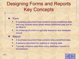
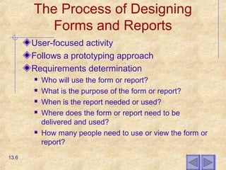
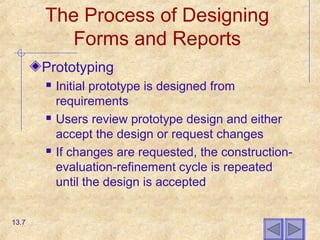


This chapter discusses the process of designing forms and reports. It outlines general guidelines for formatting forms and reports, including highlighting, color usage, displaying text, and designing tables and lists. It also covers assessing usability through factors like speed, accuracy and satisfaction. Specific guidelines are provided for designing interfaces for electronic commerce systems on the Internet, including using lightweight graphics, ensuring data integrity on forms, and implementing template-based HTML. The overall goal is to design forms and reports that are easy to use and understand.