Designing Digital Forms
•
0 likes•727 views

Overview of the visual principles for designing better digital forms, as well as practical dos and don'ts from real-(web)-life examples. Presented at the front-end meetup in Skopje @ Hacklab KIKA on 09.02.2016.

Recommended
More Related Content
Viewers also liked
Similar to Designing Digital Forms
Similar to Designing Digital Forms (20)
More from Netcetera
More from Netcetera (20)
Recently uploaded
Recently uploaded (20)
Designing Digital Forms
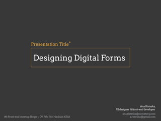
- 1. Designing Digital Forms *Presentation Title ana.risteska@netcetera.com AnaRisteska, UIdesigner &front-enddeveloper a.risteska@gmail.com#6Front-end meetupSkopje /09.Feb.‘16/HacklabKIKA
- 2. Designing Digital Forms - boring?
- 3. Digital forms... are the medium for the most direct contact between the customers / users and a digital system. may contribute in gaining or losing trust in our site and (not) push users go to our competition. often are examples of bad UX and usage possibilities and can influence the image of the offeror of the service.
- 4. So,not that boring,but rather a big deal.
- 5. The fundamental problems Media switch: paper forms vs. digital (web) forms Lack of consistent visual guidance for the users Not enough transparency of the filling form process (opposed to the paper forms).
- 6. Goals Successfully and simple filling of the form (no one wants to fill forms) Being transparent Be failure and format tolerant Suggest default values that make sense Pay attention to the context (familiar vs. unfamiliar,often filled vs. rarely filled forms) Consistent style (design and wording)
- 7. By the way forms look,they establish a relationship and a conversation. A form should represent a conversation, not an interrogation Where to put the label? Mind the visual relationships.
- 8. Increased vertical space Label on top Proximity to input Simple forms which should be quickly scanned Rapid processing Increased vertical space Proximity to input Simple forms which should be quickly scanned Rapid processing Source: gmail.com
- 9. Label on top Source: gmail.com Visually more cohesive relationship between input and label. Single-column perception
- 10. Proximity to input Reduced readability Less simple forms, but rather familiar forms Reduced vertical space Label on right Source: yahoo.com
- 11. Proximity to input Easy to scan labels Complex forms, quick scannability of what is needed Reduced vertical space Label on left Source: barnes and noble (older example)
- 12. Label on left Source: barnes and noble (older example) Visually less cohesive 2-column perception
- 13. Clearly distinguish which input fields cannot be left blank by the user. Mandatory fields
- 14. This means the form doesn't get cluttered with asterisks. Good thinking as the label speaks for itself. Mandatory fields - optional stuff in (brackets) Source: UX Movement Why Users Fill Out Less If You Mark Required Fields
- 15. If you need to restrict the format of data inputted by users, then at least do so in a way that won’t irritate users. For example,instead of displaying DD/MM/YYYY next to a text field for a date,consider using three drop-down fields or, better yet,a calendar control. Being format tolerant DD/MM/YYYY D-M-YY DD.MM.YYYY
- 16. Use smart defaults to make the user’s completion of the form faster and more accurate. Suggest default values and visual cues that make sense. Smart defaults Source: twitter.comSource: twitter.com
- 17. Dismissible feedback Animated status indicator After completion Source: directpoll.com
- 18. o/ An Extensive Guide To Web Form Usability - Justin Mifsud (Smashing Magazine) Web Form Design: Filling in the Blanks - Luke Wroblewski References for the presentation and for further reading