Download as PDF, PPTX
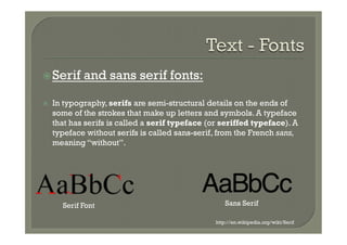
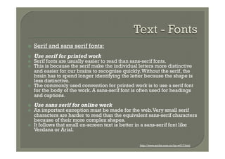
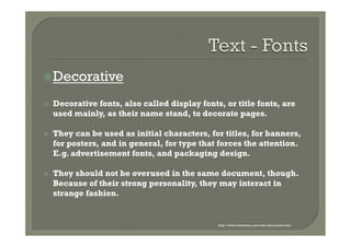
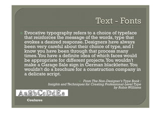
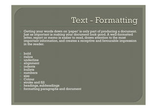
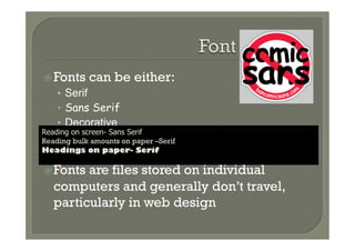
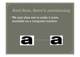

The document discusses different types of fonts including serif, sans serif, and decorative fonts. Serif fonts are generally easier to read in print due to the extra details that make letters more distinctive, while sans serif fonts are better for online reading of small text. Decorative fonts are used mainly for titles and headings rather than body text. The document also covers other typography topics like formatting text, pagination, and anti-aliasing text for readability on screens.