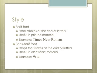
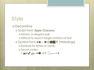
The Elements
of Design
Texture and Typography
Lesson Overview
 In   this lesson, you will:
      Explore the use of texture in Web design
      Explore the use of typography in Web
       design
Guiding Question
 Does
     the style of text used in a publication
 convey emotion?
Texture
 Texture is the use of certain design
  techniques to create the illusion of depth
  or three dimensions on a flat surface
 Can be achieved through the use of:
     Lines
     Shadows
     Color to highlight
Using Lines for Texture
 Lines
      can be used to create texture by
  showing details in objects.
 Examples:
     Detail lines in hand-drawn images
     Veins on leaves
     Grain lines on a piece of wood
     Hair or fur on an animal
     Illusion that object is not flat
Using Shadows to Create
Texture
 Make    an object appear to be raised off
  the surface
 By adding a shadow to text or other
  object, the designer is trying to create an
  illusion.
 Can be added to:
     Text
     Buttons
     Image outlines
Using Texture as a Background
 Texture
       can also be added to the
 background of a Web site
     Can add visual appeal
     Can be distracting if used incorrectly
 When  using a textured background,
 designers should place elements, such as
 text and objects, inside a solid colored
 shape
Typography
 Refers   to the design of the fonts used on a
  page
 Involves choices of:
     Style
     Emphasis
     Size
     Color
Style
 Font  style is a description of how the
  letters in the font are shaped
 The commonly used styles are:
     Serif, and
     Sans-Serif
Style
 Serif   font
     Small strokes at the end of letters
     Useful in printed material
     Example: Times    New Roman
 Sans-serif     font
     Drops the strokes at the end of letters
     Useful in electronic material
     Example: Arial
Style
 Decorative
    Script Font: Apple Chancery
      Historic or elegant look
      Difficult to read in longer portions of text

    Symbol Font: Webdings (Webdings)
      Symbols for letters or words
      Secret codes
         Mr. Hahn is cool!
Emphasis
A  way to call attention to a word or a
  portion of your text is by using emphasis
 You need to be consistent in your use
  within the site.
 Examples:
     Bold
     Italics
     Color
Size
    Measured by points
                                    8 pt
                                  12 pt

       Point = 1/72 inch         20 pt
    Sizes for Web design

       12 points or 14 points
                                 36 pt
        10 points or lower:
                                 48 pt
    
        hard to read
       16 points or higher:

                                 60pt
        used for headings
Typography Sends a Message
 Some  styles communicate an emotion or
 a feeling
    Decorative – historic or elegant
    Capital Letters – ANGER OR SHOUTING
Lesson Review
 Howdoes the use of texture and
 typography apply to Web design?

The Elements of Design - Texture and Typography

  • 1.
  • 2.
    Lesson Overview  In this lesson, you will:  Explore the use of texture in Web design  Explore the use of typography in Web design
  • 3.
    Guiding Question  Does the style of text used in a publication convey emotion?
  • 4.
    Texture  Texture isthe use of certain design techniques to create the illusion of depth or three dimensions on a flat surface  Can be achieved through the use of:  Lines  Shadows  Color to highlight
  • 5.
    Using Lines forTexture  Lines can be used to create texture by showing details in objects.  Examples:  Detail lines in hand-drawn images  Veins on leaves  Grain lines on a piece of wood  Hair or fur on an animal  Illusion that object is not flat
  • 6.
    Using Shadows toCreate Texture  Make an object appear to be raised off the surface  By adding a shadow to text or other object, the designer is trying to create an illusion.  Can be added to:  Text  Buttons  Image outlines
  • 7.
    Using Texture asa Background  Texture can also be added to the background of a Web site  Can add visual appeal  Can be distracting if used incorrectly  When using a textured background, designers should place elements, such as text and objects, inside a solid colored shape
  • 8.
    Typography  Refers to the design of the fonts used on a page  Involves choices of:  Style  Emphasis  Size  Color
  • 9.
    Style  Font style is a description of how the letters in the font are shaped  The commonly used styles are:  Serif, and  Sans-Serif
  • 10.
    Style  Serif font  Small strokes at the end of letters  Useful in printed material  Example: Times New Roman  Sans-serif font  Drops the strokes at the end of letters  Useful in electronic material  Example: Arial
  • 11.
    Style  Decorative  Script Font: Apple Chancery  Historic or elegant look  Difficult to read in longer portions of text  Symbol Font: Webdings (Webdings)  Symbols for letters or words  Secret codes  Mr. Hahn is cool!
  • 12.
    Emphasis A wayto call attention to a word or a portion of your text is by using emphasis  You need to be consistent in your use within the site.  Examples:  Bold  Italics  Color
  • 13.
    Size Measured by points 8 pt  12 pt  Point = 1/72 inch 20 pt Sizes for Web design   12 points or 14 points 36 pt 10 points or lower: 48 pt  hard to read  16 points or higher: 60pt used for headings
  • 14.
    Typography Sends aMessage  Some styles communicate an emotion or a feeling  Decorative – historic or elegant  Capital Letters – ANGER OR SHOUTING
  • 15.
    Lesson Review  Howdoesthe use of texture and typography apply to Web design?

Editor's Notes

  • #9 Typography refers to the design of the fonts. Typography involves choices concerning font style, emphasis, size, and color.
  • #14 Size is another dimension of typography. In typography, size is measured by a method called a point. A point is 1/72 of an inch. In Web design, it is customary to use font sizes of 12 pt or 14 pt. Font sizes below 10 pt are difficult to read and font sizes above 14 pt should be reserved for headings. The use of larger font sizes for headings is another way a Web designer can organize the site. When looking at a Web site, the viewer is sometimes looking for a specific piece of information. By using headings to organize a site, the designer makes this method of quickly finding information much easier.
  • #16 This is the last slide of the presentation.