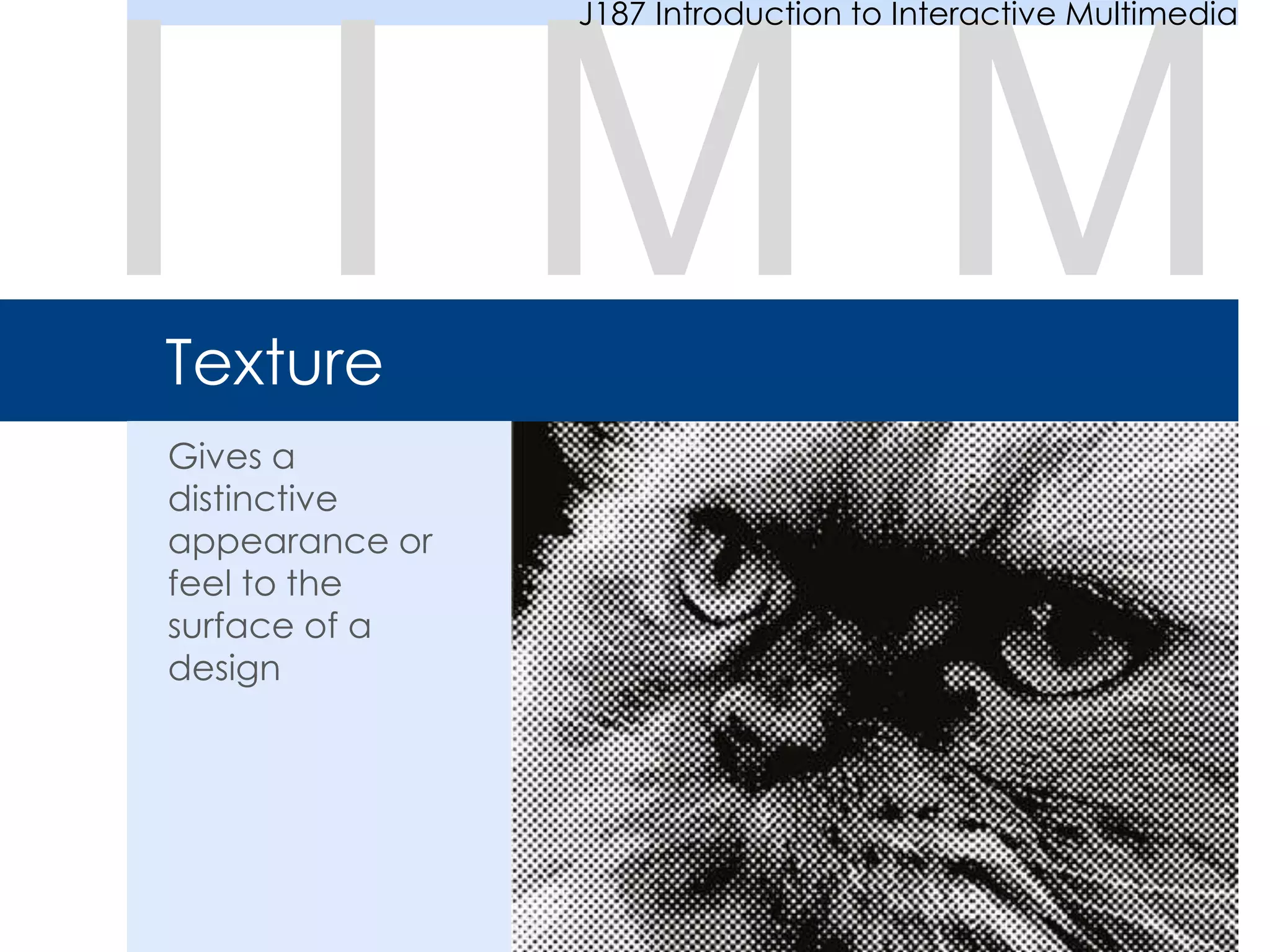
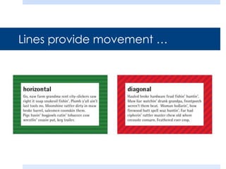
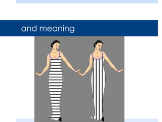
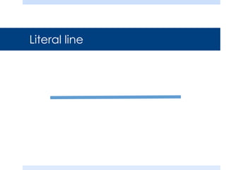
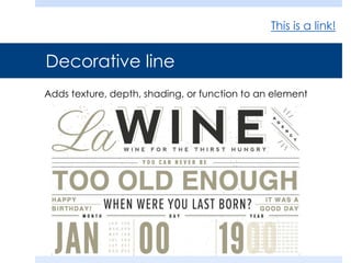
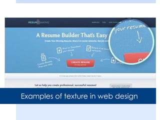
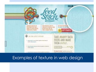
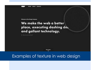
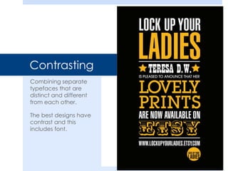
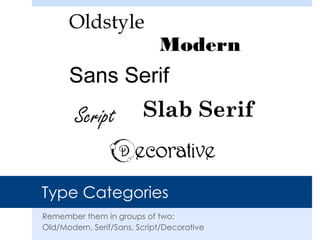
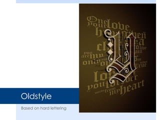
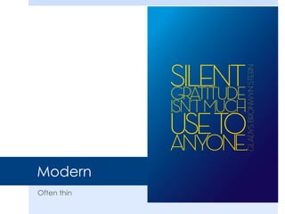
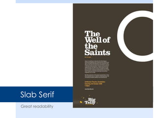
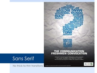
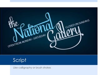
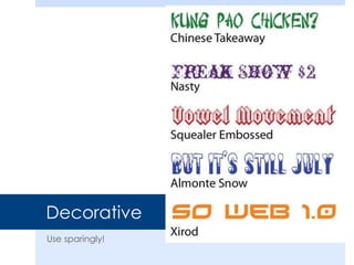
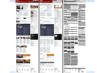
This document discusses different types of lines used in design including literal, implied, imaginary, psychic, and contour lines. It also provides examples of how texture can be added to web design through the use of lines. The document then shifts to discussing typography, including readability, type categories (oldstyle, modern, serif, sans serif, script, decorative), type relationships (concordant, conflicting, contrasting), and rules for choosing fonts. It concludes by assigning a type exercise and assigning reading on layout for an upcoming project to redesign a website.


![Things I Know About Type [Field Guide]](https://cdn.slidesharecdn.com/ss_thumbnails/thingsiknowabouttype-fieldguide-121030022134-phpapp02-thumbnail.jpg?width=640&height=640&fit=bounds)


