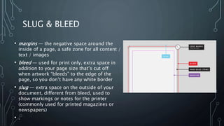
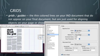
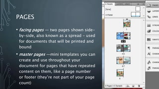
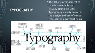
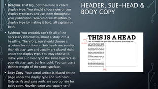
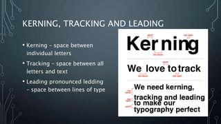
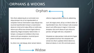
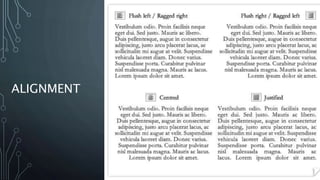
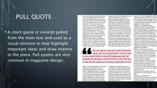
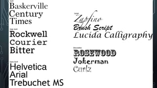
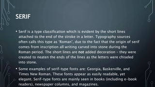
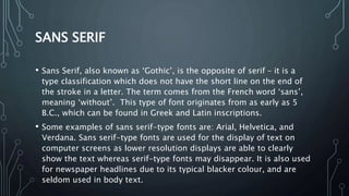
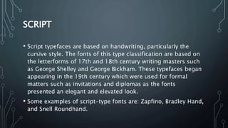
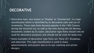
This document defines and explains various design and typography terms including:
- Margins, bleed, and slug which refer to the space around pages and how content is cut.
- Grids and guides which are used to align objects.
- Facing pages and master pages used in print layout.
- Character and paragraph styles for applying formatting.
- Justification, kerning, tracking, and leading which refer to text spacing and alignment.
- Orphans and widows which refer to paragraph breaks.
- Pull quotes used to highlight ideas.
- Serif, sans serif, script, and decorative classifications of typefaces.
Typography is an imperative, yet sometimes overlooked aspect of the design process. Educating yourself on the basics of type with the help of this SlideShare will give you some insight into the intricate world of typography, and give you some actionable tips on how to make your business stand out from the competition.
Yesterday the 11th of June 2015, the User Experience department took us down the exciting path of fonts and typography.
Facilitated by Crystal Chijindu, we came to realize the importance of Typography as an intricate element of design and idea development.
Have a good read and don't forget to share.
Here we are giving an comprehensive presentation on typography. the presentation will be help full for both the beginner and professional graphic designer.
The term “Typography” comes from Greek words: “typos” (form) & “graphe” (writing). Easily the nemesis for most people - as a subject of understanding and application as well. This is my feeble attempt at explaining the very basics of "typography", its history, characteristics, terminology and best-practices.
The typography by Fady El-Masry
Typography (from the Greek words τύπος (typos) = form and γραφή
(graphe) = writing) is the art and technique of arranging type in order to make
language visible. The arrangement of type involves the selection of typefaces,
point size, line length, leading (line spacing), adjusting the spaces between
groups of letters (tracking) and adjusting the space between pairs of letters
(kerning). Type design is a closely related craft, which some consider distinct
and others a part of typography; most typographers do not design typefaces,
and some type designers do not consider themselves typographers. In modern
times, typography has been put into motion — in film, television and online
broadcasts — to add emotion to mass communication.
Typography is performed by typesetters, compositors, typographers, graphic
designers, art directors, comic book artists, graffiti artists, clerical workers,
and anyone else who arranges type for a product. Until the Digital Age,
typography was a specialized occupation. Digitization opened up typography
to new generations of visual designers and lay users, and it has been said that
“typography is now something everybody does.
Do you want to learn about typography art technique? Then come to Graphic Designing Institute in Delhi which allows you to write content in various ways.
Emerging designers, solopreneurs and small businesses, this is for you. It's just about everything you need to know when working with type in your designs and presentations to make sure your words have the right message, evoke the right emotion or action, and speak to the right audience. Good typography is subtle, yet stylish.
Presented Live Online July 21, 2014 on Google Hangouts and YouTube. Go to the SignWriting YouTube Channel: http://www.YouTube.com/SignWriting. Visit the SignWriting Symposium Presentation 3 web page to read abstracts and papers, and watch videos and slides by Adam Frost: signwriting.org/symposium/presentation0003.html
ABSTRACT
“Ways to Write Sign Languages by Hand with SignWriting”
SignWriting has been written by hand since the very beginning. With the introduction of computers, writing by hand has gone into disfavor even to the point that many have believed that writing by hand takes too long and is impractical. There have been many ways of writing by hand that have been almost forgotten. I have been fortunate enough to have the need to write by hand at times, and to have close workings with Valerie to recall many of those methods and how to incorporate them into modern use. This paper will explore some of those ways as well as some of my own that I have developed in the process.First, we will cover the ways of writing to match the way computers print, but we will not stop there like most people would assume. We will go through various levels of simplification making it less cumbersome to write by hand. By the time we have gone through several layers, we will arrive to what I personally use when jotting down notes. We will not get into shorthand as it was introduced in the 1980's or after, since shorthand is not a one-to-one correlation with print making it useful for other purposes.
Newspaper Make - Up
Describing about newspaper layout.
Information on Front Page of a newspaper
Defining the important page of a newspaper-The Editorial Page
This is a small introduction that deals with Fonts and Typefaces. It is released as a companion to an Open Talk event which took place in late December, 2010 in Syros island, by students of the University of the Aegean, Greece.
Basic to Mastering Typography.In this Slide i tried to share some tips and inspiration and some major discuss about Basic to Mastering Typography.I hope you enjoy it all.
Explore the multifaceted world of Muntadher Saleh, an Iraqi polymath renowned for his expertise in visual art, writing, design, and pharmacy. This SlideShare delves into his innovative contributions across various disciplines, showcasing his unique ability to blend traditional themes with modern aesthetics. Learn about his impactful artworks, thought-provoking literary pieces, and his vision as a Neo-Pop artist dedicated to raising awareness about Iraq's cultural heritage. Discover why Muntadher Saleh is celebrated as "The Last Polymath" and how his multidisciplinary talents continue to inspire and influence.
2137ad - Characters that live in Merindol and are at the center of main storiesluforfor
Kurgan is a russian expatriate that is secretly in love with Sonia Contado. Henry is a british soldier that took refuge in Merindol Colony in 2137ad. He is the lover of Sonia Contado.
2137ad Merindol Colony Interiors where refugee try to build a seemengly norm...luforfor
This are the interiors of the Merindol Colony in 2137ad after the Climate Change Collapse and the Apocalipse Wars. Merindol is a small Colony in the Italian Alps where there are around 4000 humans. The Colony values mainly around meritocracy and selection by effort.
Hadj Ounis's most notable work is his sculpture titled "Metamorphosis." This piece showcases Ounis's mastery of form and texture, as he seamlessly combines metal and wood to create a dynamic and visually striking composition. The juxtaposition of the two materials creates a sense of tension and harmony, inviting viewers to contemplate the relationship between nature and industry.
2. SLUG & BLEED
• margins — the negative space around the
inside of a page, a safe zone for all content /
text / images
• bleed — used for print only, extra space in
addition to your page size that’s cut off
when artwork “bleeds” to the edge of the
page, so you don’t have any white border
• slug — extra space on the outside of your
document, different from bleed, used to
show markings or notes for the printer
(commonly used for printed magazines or
newspapers)
• .
3. GRIDS
• grids / guides — the thin colored lines on your IND document that do
not appear on your final document, but are just used for aligning
objects on your page or showing where the margins are placed
4. PAGES
• facing pages — two pages shown side-
by-side, also known as a spread – used
for documents that will be printed and
bound
• master pages —mini templates you can
create and use throughout your
document for pages that have repeated
content on them, like a page number
or footer (they’re not part of your page
count)
5. TYPE SET UP
• character / paragraph styles
— a pre-set of settings and
formatting that can be
applied to a word, a line of
text, or an entire paragraph
in one click
• justification — alignment of
either one or both edges of
your text to either left,
right, center, left justify,
right justify, center justify,
or full justify
6. TYPOGRAPHY
• The artistic arrangement of
type in a readable and
visually appealing way.
Typography usually concerns
the design and use of various
typefaces in a way that helps
to better visually
communicate ideas.
7. HEADER, SUB-HEAD &
BODY COPY
• Headline That big, bold headline is called
display type. You should choose one or two
display typefaces and use them throughout
your publication. You can draw attention to
display type by making it bold, all capitals or
both.
• Subhead You probably can’t fit all of the
necessary information about a story into a
headline. Therefore, you should choose a
typeface for sub heads. Sub heads are smaller
than display type and usually are placed right
under the display type. You may choose to
make your sub head type the same typeface as
your display type, but less bold. You can use a
thinner weight of the same typeface.
• Body Copy Your actual article is placed on the
page under the display type and sub head.
Only serifs and sans serifs are appropriate for
body copy. Novelty, script and square serif
8. KERNING, TRACKING AND LEADING
• Kerning – space between
individual letters
• Tracking – space between all
letters and text
• Leading pronounced ledding
– space between lines of type
11. PULL QUOTE
• A short quote or excerpt pulled
from the main text and used as a
visual element to help highlight
important ideas and draw interest
to the piece. Pull quotes are very
common in magazine design.
12.
13. SERIF
• Serif is a type classification which is evident by the short lines
attached to the end of the stroke in a letter. Typography sources
often calls this type as ‘Roman’, due to the fact that the origin of serif
comes from inscription all writing carved into stone during the
Roman period. The short lines are not added decoration – they were
created to neaten the ends of the lines as the letters were chiseled
into stone.
• Some examples of serif-type fonts are: Georgia, Baskerville, and
Times New Roman. These fonts appear as easily readable, yet
elegant. Serif-type fonts are mainly seen in books (including e-book
readers), newspaper columns, and magazines.
14. SANS SERIF
• Sans Serif, also known as ‘Gothic’, is the opposite of serif – it is a
type classification which does not have the short line on the end of
the stroke in a letter. The term comes from the French word ‘sans’,
meaning ‘without’. This type of font originates from as early as 5
B.C., which can be found in Greek and Latin inscriptions.
• Some examples of sans serif-type fonts are: Arial, Helvetica, and
Verdana. Sans serif-type fonts are used for the display of text on
computer screens as lower resolution displays are able to clearly
show the text whereas serif-type fonts may disappear. It is also used
for newspaper headlines due to its typical blacker colour, and are
seldom used in body text.
15. SCRIPT
• Script typefaces are based on handwriting, particularly the
cursive style. The fonts of this type classification are based on
the letterforms of 17th and 18th century writing masters such
as George Shelley and George Bickham. These typefaces began
appearing in the 19th century which were used for formal
matters such as invitations and diplomas as the fonts
presented an elegant and elevated look.
• Some examples of script-type fonts are: Zapfino, Bradley Hand,
and Snell Roundhand.
16. DECORATIVE
• Decorative type, also known as ‘Display’ or ‘Ornamental’, is a type
classification which is identified by its decorative style and use of
ornaments. These type fonts became popular in the 19th Century
during the Victorian era, as well as the time during the Art Noveau
movement. Evident by its name, decorative-type fonts should only be
used for decorative purposes and should not be used for body text.
• Some examples of decorative-type fonts are: Party LET, Broadway,
and Jokerman. This type classification is used in many
advertisements and posters due to its eye-catching and artistic
designs.
17. CHOOSE YOUR FAVORITE 3 SONG LYRICS AND
PRODUCE A TYPOGRAPHIC DESIGN USING
INDESIGN