Download as PDF, PPTX
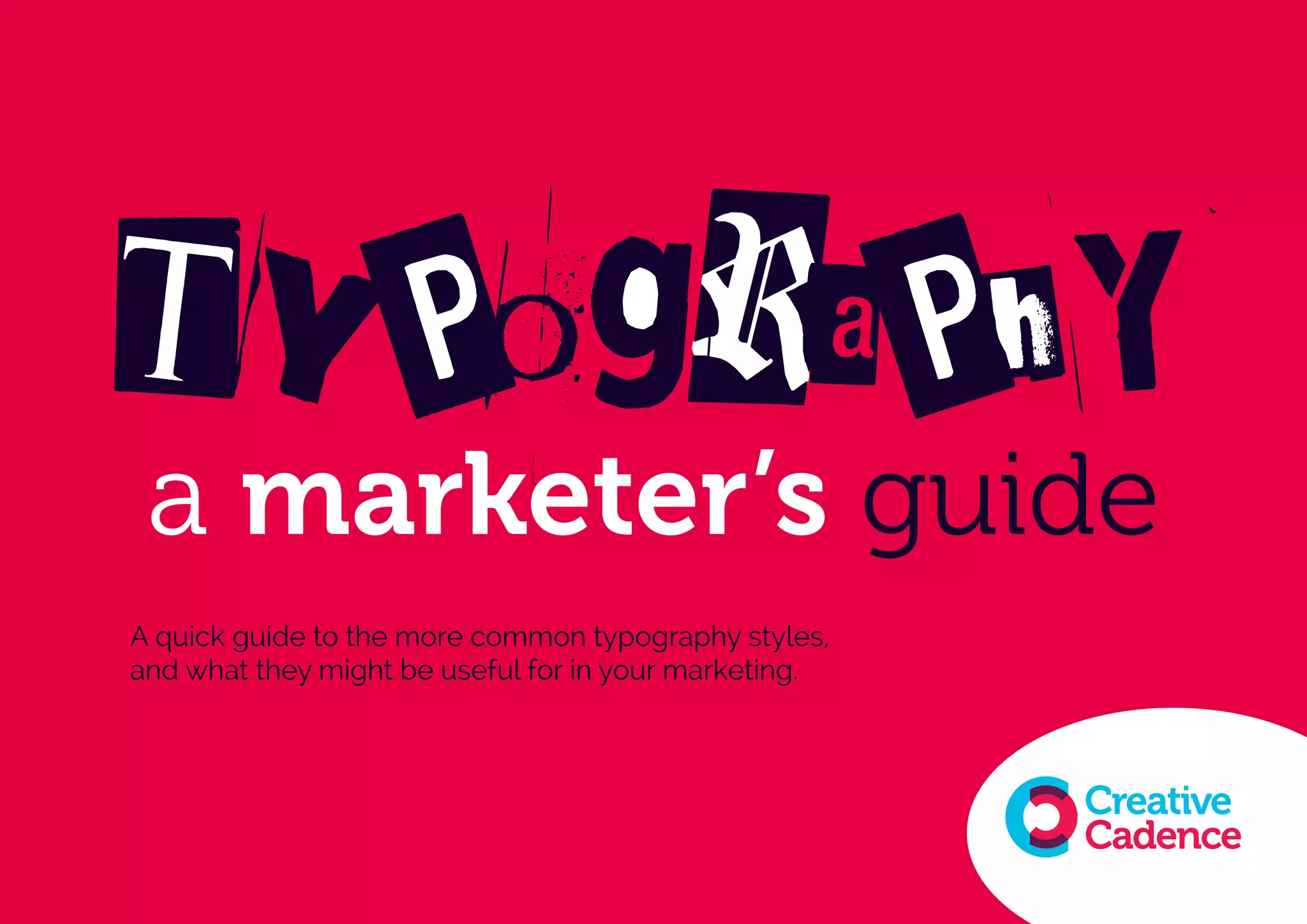
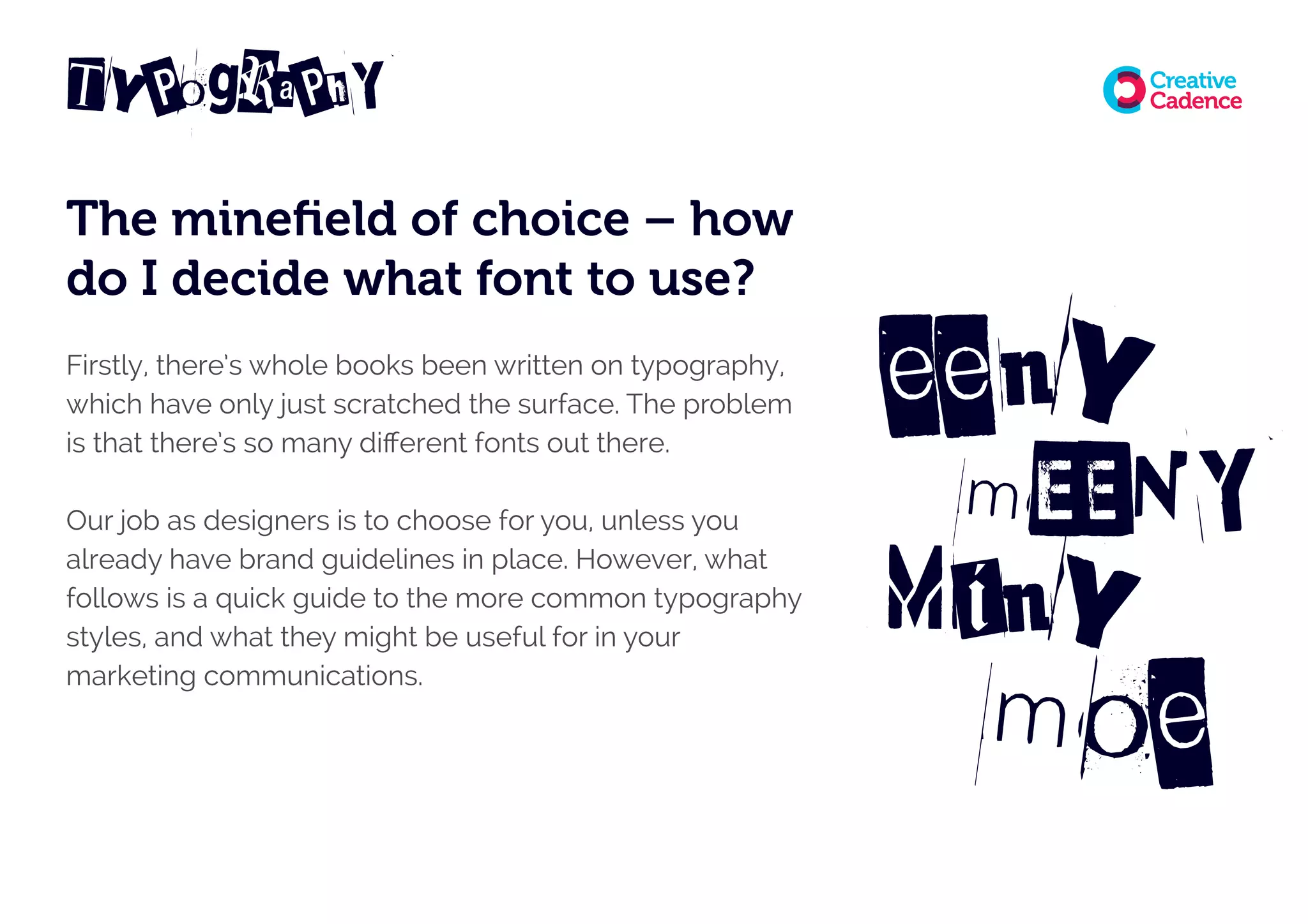


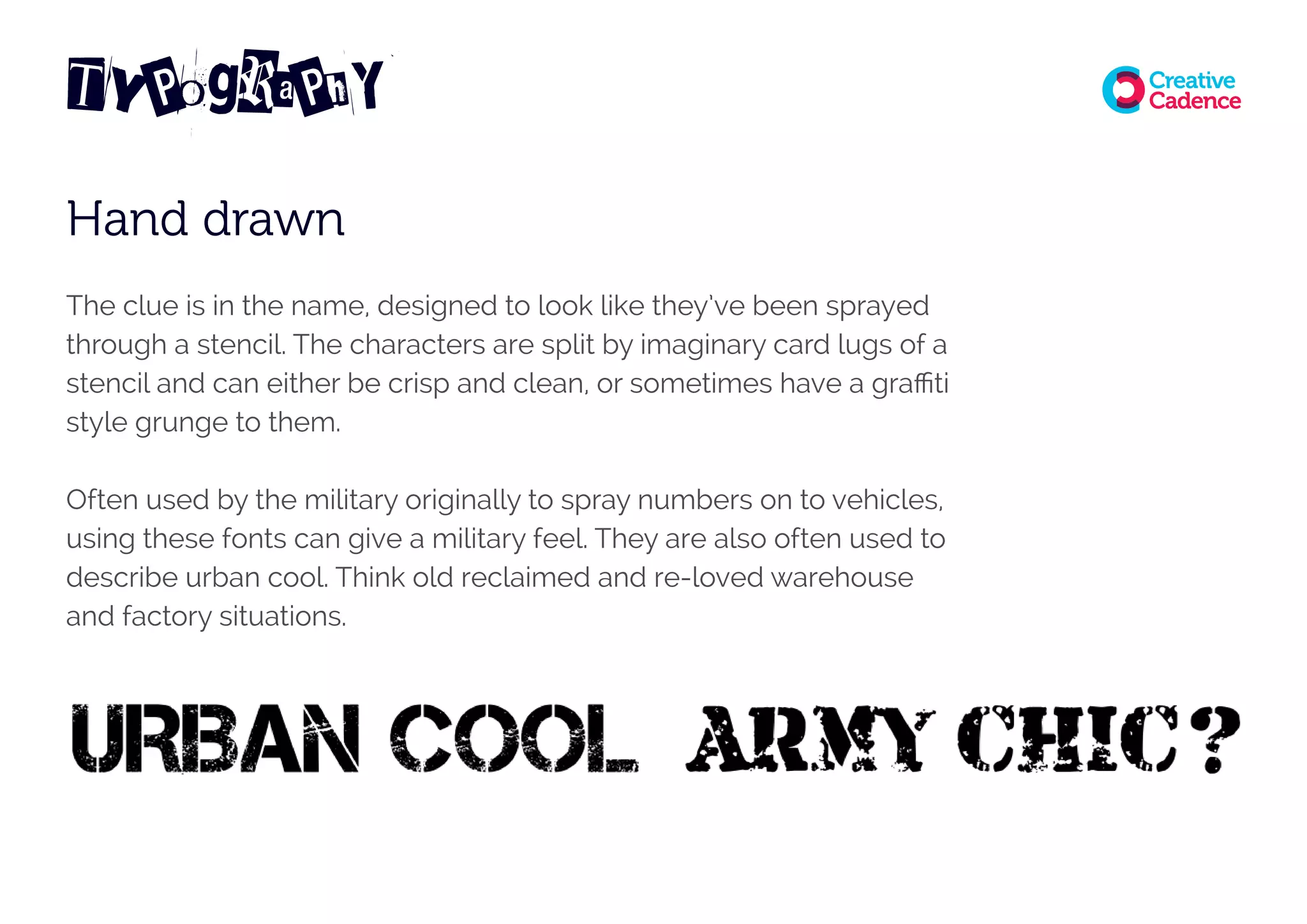


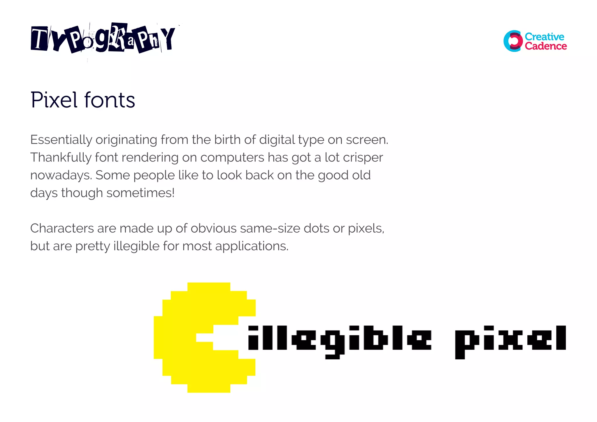


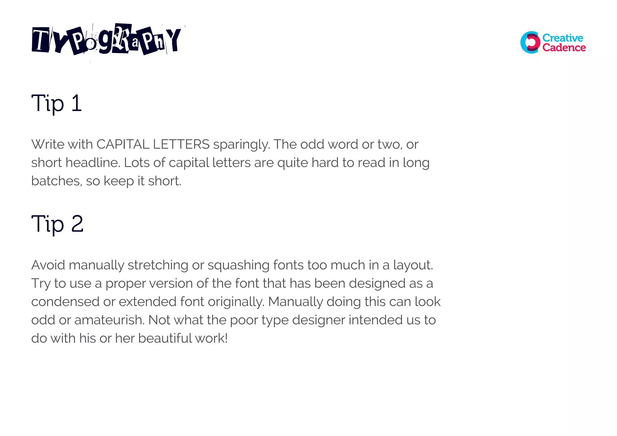


This document provides a guide to common typography styles and their uses in marketing. It discusses sans serif, serif, slab serif, handwritten, blackletter, typewriter, pixel, calligraphic, and script fonts. For each style it provides an example, brief description, and suggestions for effective usage. The document concludes with tips on font licensing, using fonts for web versus print, and design best practices like using capital letters sparingly and avoiding too many different fonts.


![Things I Know About Type [Field Guide]](https://cdn.slidesharecdn.com/ss_thumbnails/thingsiknowabouttype-fieldguide-121030022134-phpapp02-thumbnail.jpg?width=640&height=640&fit=bounds)

![[DevDay2019] Spacing and Typography, keys to a professional UI design - By Ng...](https://cdn.slidesharecdn.com/ss_thumbnails/duongnguyen-typographyspacing-190408082945-thumbnail.jpg?width=640&height=640&fit=bounds)


