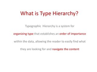
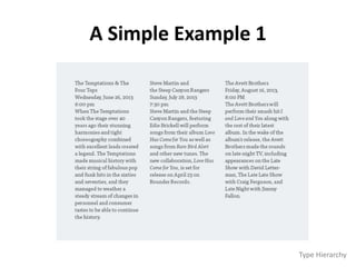
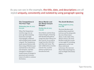
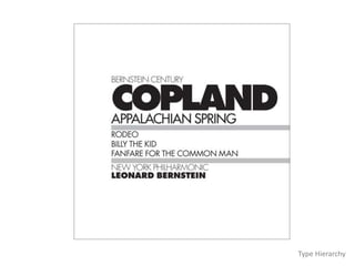
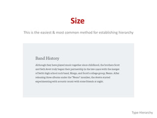
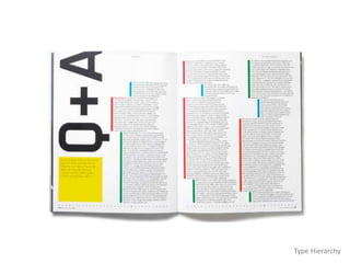
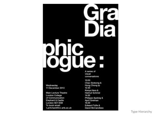
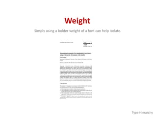
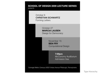
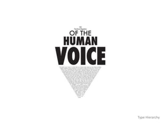
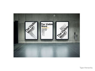
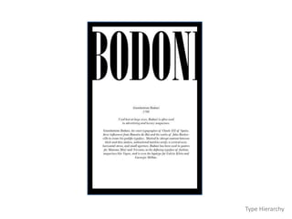
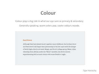
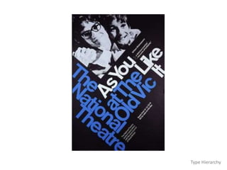
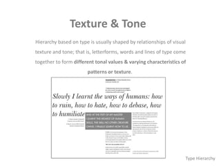
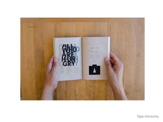
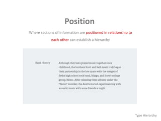
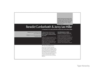
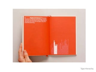
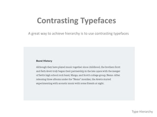
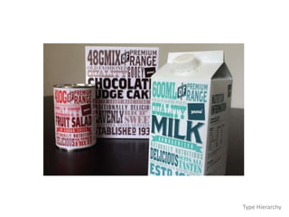
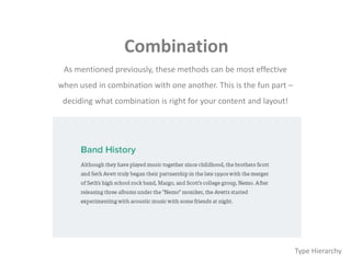
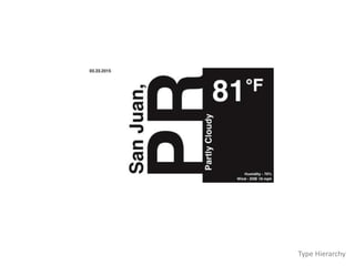
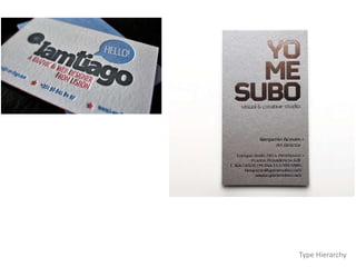
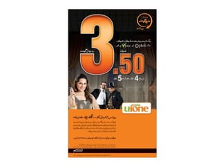
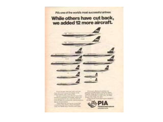
Basics of Typography
Anatomy of Type
Historic Families of Type and Classification
Type / Typeface / Font / Families of Type
Studying a Typeface
Kerning, Leading, Tracking, Measuring Type
Type Hierarchy
What is Type Hierarchy?
Typographic Hierarchy is a system for
organizing type that establishes an order of importance
within the data, allowing the reader to easily find what
they are looking for and navigate the content
It helps guide the reader’s eye to where a section
begins and ends, whilst enabling the user to
isolate certain information based on the
consistent use of style throughout a body of text
Type Hierarchy
A Simple Example 1
Type Hierarchy
As you can see in the example, the title, date, and descriptions are all
styled uniquely, consistently and isolated by using paragraph spacing
Type Hierarchy
Type Hierarchy
Type Hierarchy
Type Hierarchy
Type Hierarchy
Type Hierarchy
Type Hierarchy
Styling Techniques
There are a few basic methods for establishing
a visual typographic hierarchy
Size
Weight
Color
Position
Type Contrast
Type Hierarchy
Size
This is the easiest & most common method for establishing hierarchy
Type Hierarchy
Type Hierarchy
Type Hierarchy
Type Hierarchy
Weight
Simply using a bolder weight of a font can help isolate.
Type Hierarchy
Type Hierarchy
Type Hierarchy
Type Hierarchy
Type Hierarchy
Type Hierarchy
Colour
Colour plays a big role in what our eye sees as primary & secondary.
Generally speaking; warm colors pop, cooler colours recede.
Type Hierarchy
Type Hierarchy
Type Hierarchy
Type Hierarchy
Texture & Tone
Hierarchy based on type is usually shaped by relationships of visual
texture and tone; that is, letterforms, words and lines of type come
together to form different tonal values & varying characteristics of
patterns or texture.
Type Hierarchy
Type Hierarchy
Position
Where sections of information are positioned in relationship to
each other can establish a hierarchy
Type Hierarchy
Type Hierarchy
Type Hierarchy
Contrasting Typefaces
A great way to achieve hierarchy is to use contrasting typefaces
Type Hierarchy
Type Hierarchy
Combination
As mentioned previously, these methods can be most effective
when used in combination with one another. This is the fun part –
deciding what combination is right for your content and layout!
Type Hierarchy
Spacing Matters
One of the most important concepts in type design is spacing. It’s
one of the most difficult concepts to grasp for beginning designers,
yet it is also one of the most visually obvious.
Proper typographic spacing is critical in establishing hierarchy; it can
make the difference between confusion and clarity.
Type Hierarchy
Spacing Matters
The rule of proximity in design generally states that related items should
appear closer to each other than items that are not related.
However, proper spacing involves more than just a hard return between
sections of type. Generally, a hard return creates too much space between
content in the context of a paragraph.
Paragraph spacing – either before or after – should be used. This typically
allows the group of content to hold together while providing an adequate
division of content within it.
Type Hierarchy
Type Hierarchy
Type Hierarchy
Basics of typography hierarchy

Basics of typography hierarchy