Download as PDF, PPTX
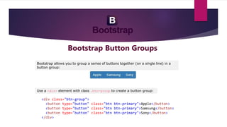
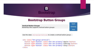
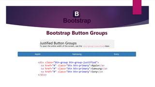
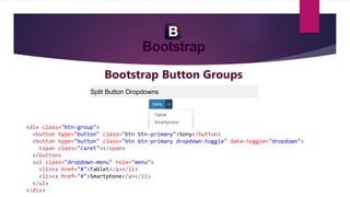
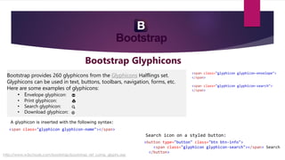
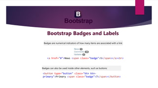
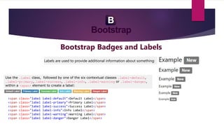
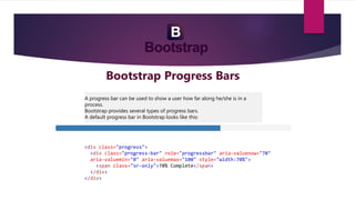
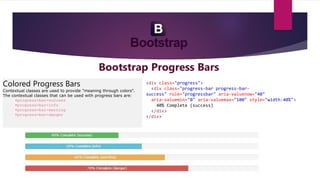
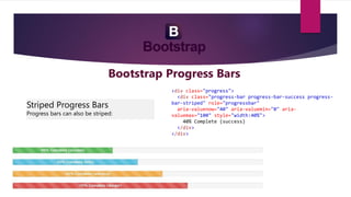
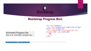

The document discusses different types of buttons that can be created using Bootstrap including button groups, vertical button groups, justified button groups, and split button dropdowns. It also covers badges, labels, and progress bars in Bootstrap and provides examples of how to implement each component using HTML and CSS classes.


![Bootstrap [part 1]](https://cdn.slidesharecdn.com/ss_thumbnails/bootstrappart-11-170208154053-thumbnail.jpg?width=640&height=640&fit=bounds)


![Bootstrap [part 2]](https://cdn.slidesharecdn.com/ss_thumbnails/javanik-170208155331-thumbnail.jpg?width=640&height=640&fit=bounds)