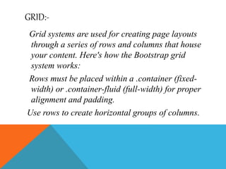
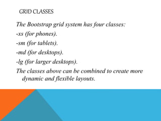
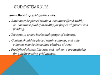
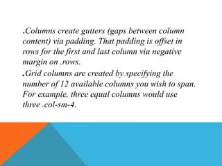
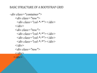
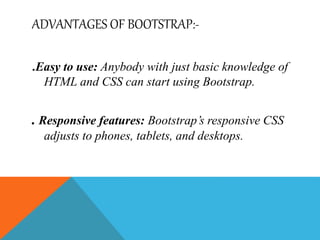
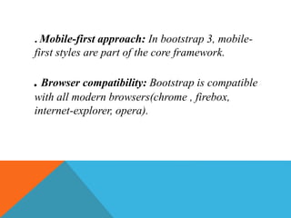
INTRODUCTION OF BOOTSTRAP:-
Bootstrap is launched by “29 august 2015” in
INDIA. It is open source framework. It is used in
mobile and it is used in grid. It is used in
reasponsive design. Bootstrap is an updated
version of CSS.
Bootstrap is the world’s most popular framework
for building responsive, mobile-first sites and
applications. Inside you’ll find high quality
HTML, CSS, and JavaScript to make starting
any project easier than ever.
BOOTSTRAP DISTRIBUTION
. The bootstrap does not replace or add to the
original data.
. We use bootstrap distribution as a way to
estimate the variation in a statistic based on the
original data.
GRID:-
Grid systems are used for creating page layouts
through a series of rows and columns that house
your content. Here's how the Bootstrap grid
system works:
Rows must be placed within a .container (fixed-
width) or .container-fluid (full-width) for proper
alignment and padding.
Use rows to create horizontal groups of columns.
GRID CLASSES
The Bootstrap grid system has four classes:
-xs (for phones).
-sm (for tablets).
-md (for desktops).
-lg (for larger desktops).
The classes above can be combined to create more
dynamic and flexible layouts.
GRID SYSTEM RULES
Some Bootstrap grid system rules:
. Rows must be placed within a .container (fixed-width)
or .container-fluid (full-width) for proper alignment and
padding.
.Use rows to create horizontal groups of columns.
. Content should be placed within columns, and only
columns may be immediate children of rows.
. Predefined classes like .row and .col-sm-4 are available
for quickly making grid layouts.
.Columns create gutters (gaps between column
content) via padding. That padding is offset in
rows for the first and last column via negative
margin on .rows.
.Grid columns are created by specifying the
number of 12 available columns you wish to span.
For example, three equal columns would use
three .col-sm-4.
BASIC STRUCTURE OF A BOOTSTRAP GRID
<div class="container">
<div class="row">
<div class="col-*-*"></div>
</div>
<div class="row">
<div class="col-*-*"></div>
</div>
<div class="row">
</div>
</div>
ADVANTAGES OF BOOTSTRAP:-
.Easy to use: Anybody with just basic knowledge of
HTML and CSS can start using Bootstrap.
. Responsive features: Bootstrap’s responsive CSS
adjusts to phones, tablets, and desktops.
. Mobile-first approach: In bootstrap 3, mobile-
first styles are part of the core framework.
. Browser compatibility: Bootstrap is compatible
with all modern browsers(chrome , firebox,
internet-explorer, opera).
THANK YOU

Bootstrap ppt

  • 2.
    INTRODUCTION OF BOOTSTRAP:- Bootstrapis launched by “29 august 2015” in INDIA. It is open source framework. It is used in mobile and it is used in grid. It is used in reasponsive design. Bootstrap is an updated version of CSS. Bootstrap is the world’s most popular framework for building responsive, mobile-first sites and applications. Inside you’ll find high quality HTML, CSS, and JavaScript to make starting any project easier than ever.
  • 3.
    BOOTSTRAP DISTRIBUTION . Thebootstrap does not replace or add to the original data. . We use bootstrap distribution as a way to estimate the variation in a statistic based on the original data.
  • 4.
    GRID:- Grid systems areused for creating page layouts through a series of rows and columns that house your content. Here's how the Bootstrap grid system works: Rows must be placed within a .container (fixed- width) or .container-fluid (full-width) for proper alignment and padding. Use rows to create horizontal groups of columns.
  • 5.
    GRID CLASSES The Bootstrapgrid system has four classes: -xs (for phones). -sm (for tablets). -md (for desktops). -lg (for larger desktops). The classes above can be combined to create more dynamic and flexible layouts.
  • 6.
    GRID SYSTEM RULES SomeBootstrap grid system rules: . Rows must be placed within a .container (fixed-width) or .container-fluid (full-width) for proper alignment and padding. .Use rows to create horizontal groups of columns. . Content should be placed within columns, and only columns may be immediate children of rows. . Predefined classes like .row and .col-sm-4 are available for quickly making grid layouts.
  • 7.
    .Columns create gutters(gaps between column content) via padding. That padding is offset in rows for the first and last column via negative margin on .rows. .Grid columns are created by specifying the number of 12 available columns you wish to span. For example, three equal columns would use three .col-sm-4.
  • 8.
    BASIC STRUCTURE OFA BOOTSTRAP GRID <div class="container"> <div class="row"> <div class="col-*-*"></div> </div> <div class="row"> <div class="col-*-*"></div> <div class="col-*-*"></div> <div class="col-*-*"></div> </div> <div class="row"> </div> </div>
  • 9.
    ADVANTAGES OF BOOTSTRAP:- .Easyto use: Anybody with just basic knowledge of HTML and CSS can start using Bootstrap. . Responsive features: Bootstrap’s responsive CSS adjusts to phones, tablets, and desktops.
  • 10.
    . Mobile-first approach:In bootstrap 3, mobile- first styles are part of the core framework. . Browser compatibility: Bootstrap is compatible with all modern browsers(chrome , firebox, internet-explorer, opera).
  • 11.