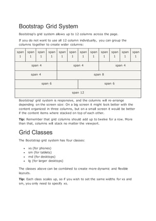
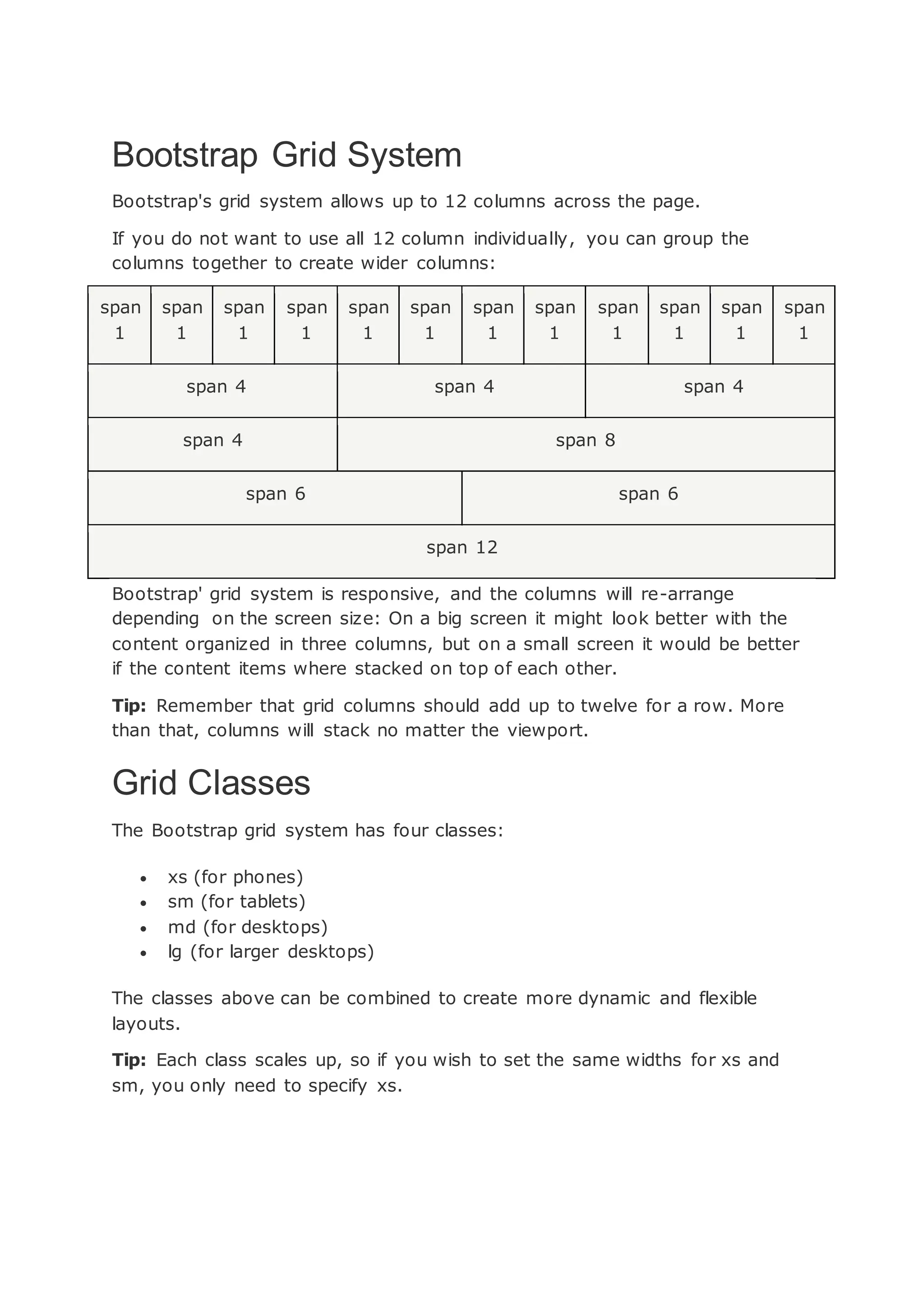
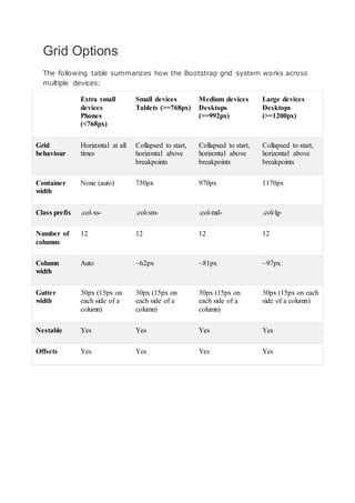
Downloaded 16 times


The Bootstrap grid system allows for laying out content across 12 columns. Columns can be grouped together to create wider column layouts that are responsive across different screen sizes. The grid uses a combination of rows and columns with breakpoint-specific column classes like col-sm-4 to create layouts that automatically re-arrange depending on screen width.


![Bootstrap [part 1]](https://cdn.slidesharecdn.com/ss_thumbnails/bootstrappart-11-170208154053-thumbnail.jpg?width=640&height=640&fit=bounds)


