Downloaded 269 times
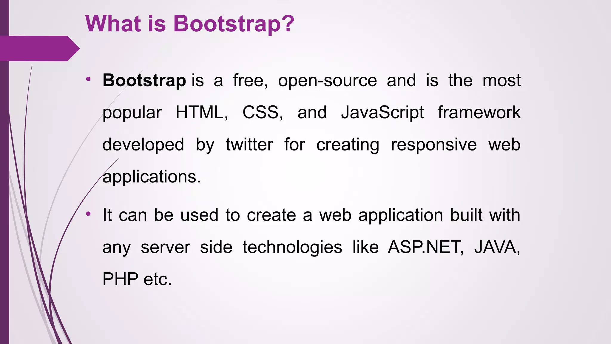
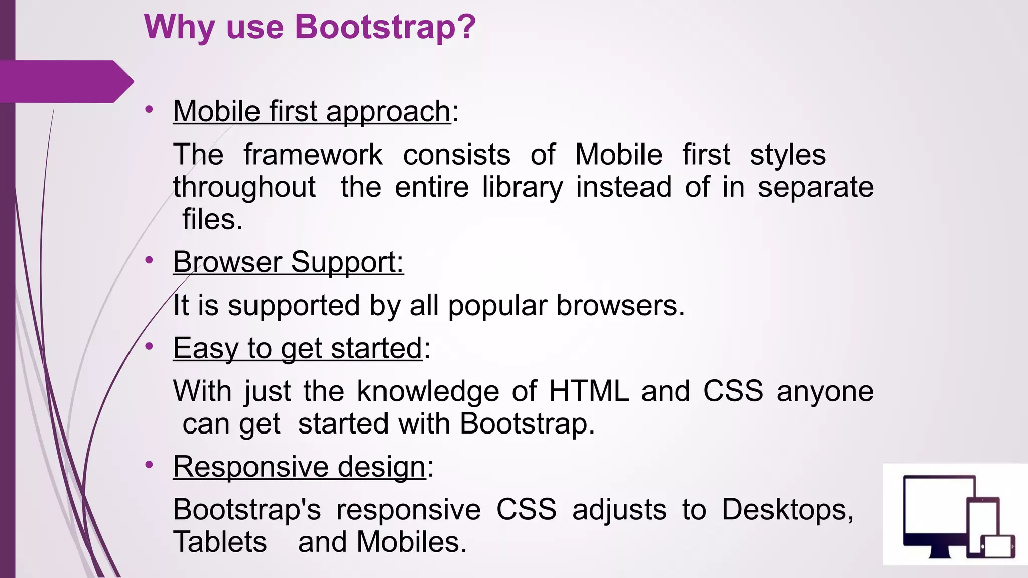
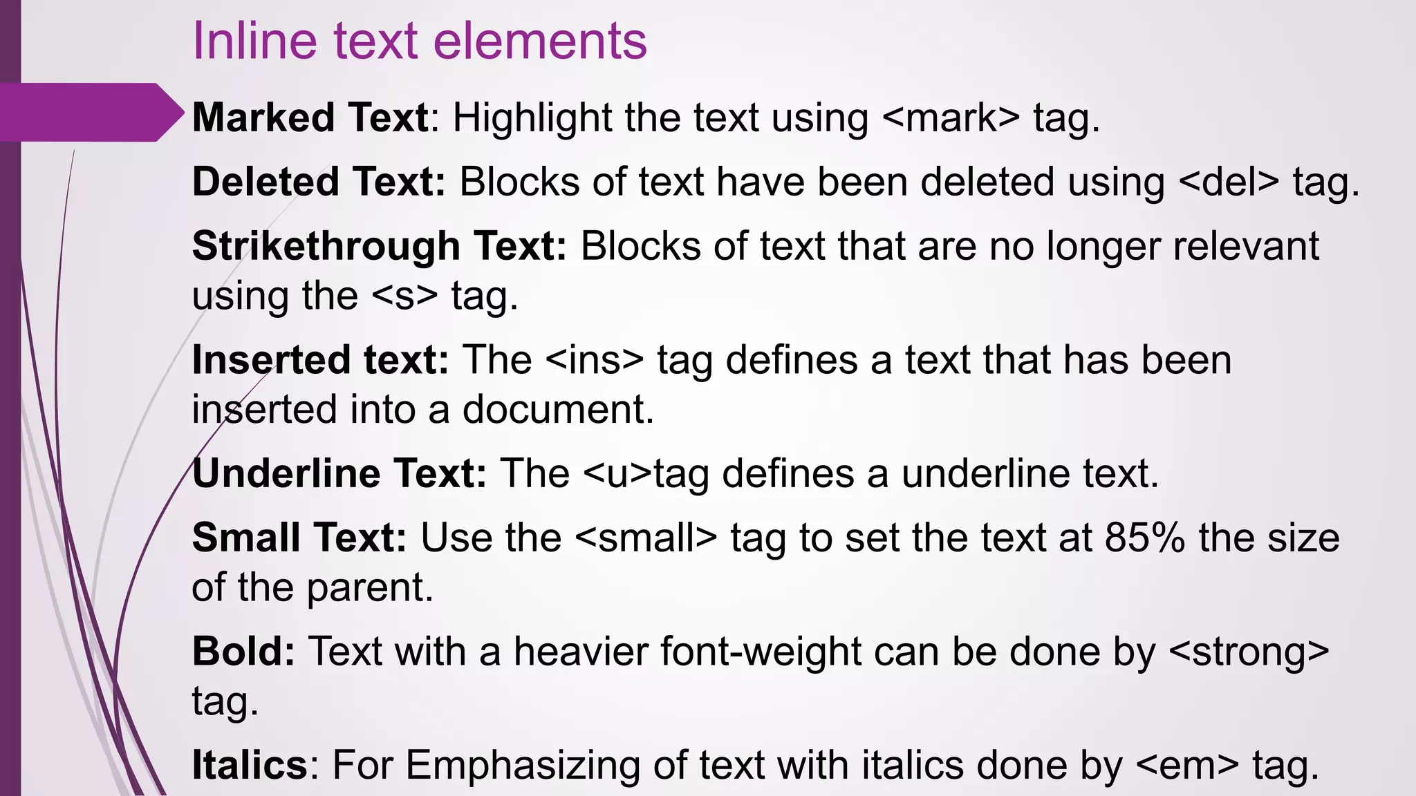
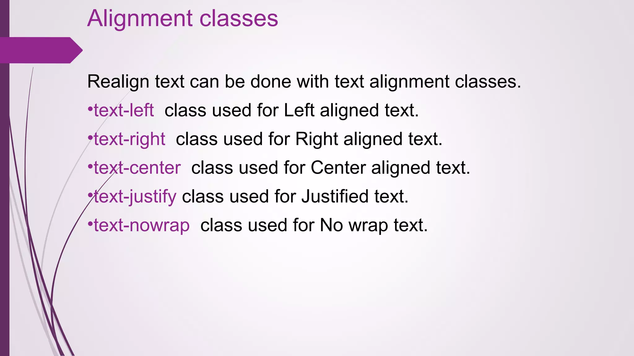
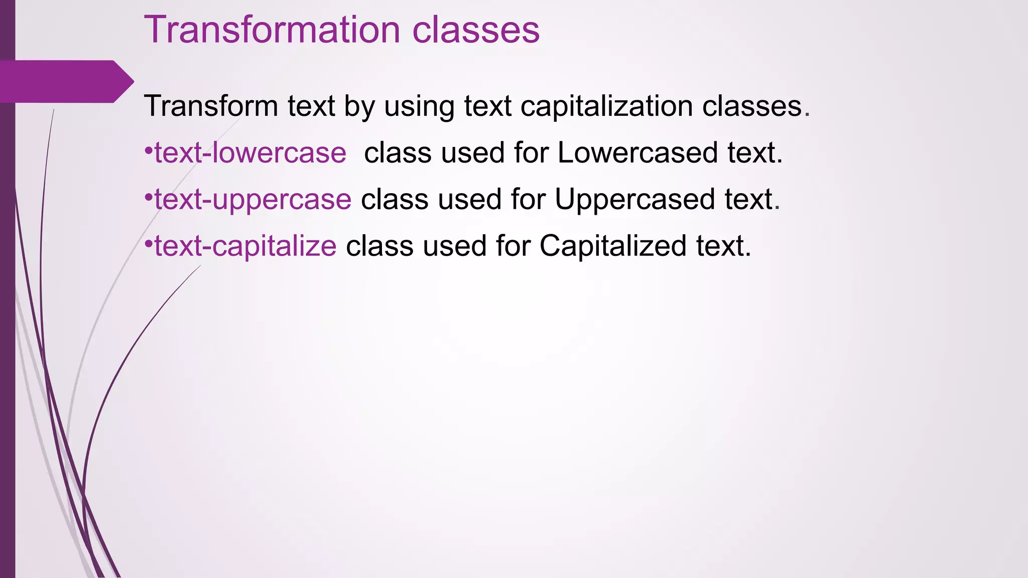
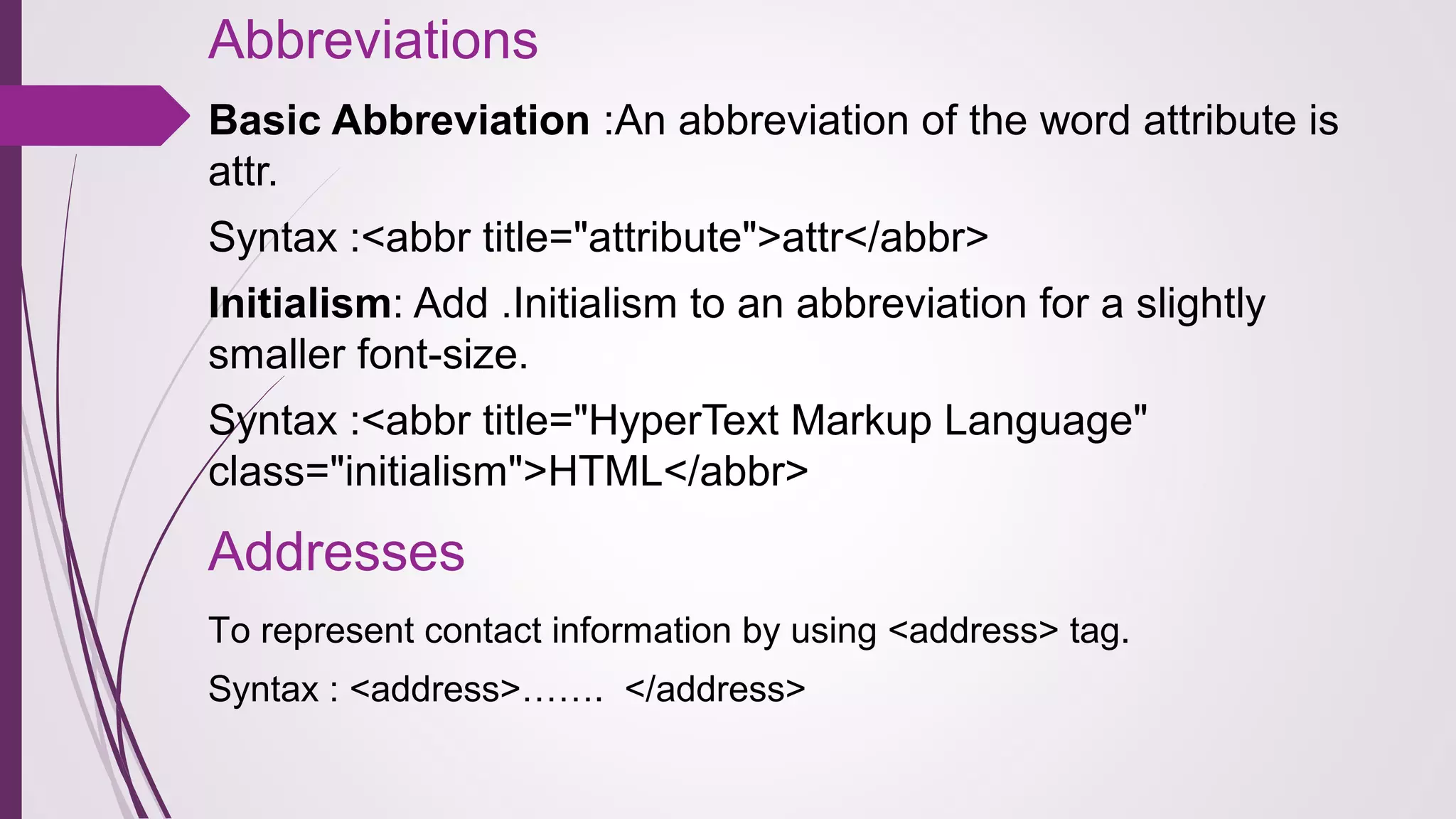
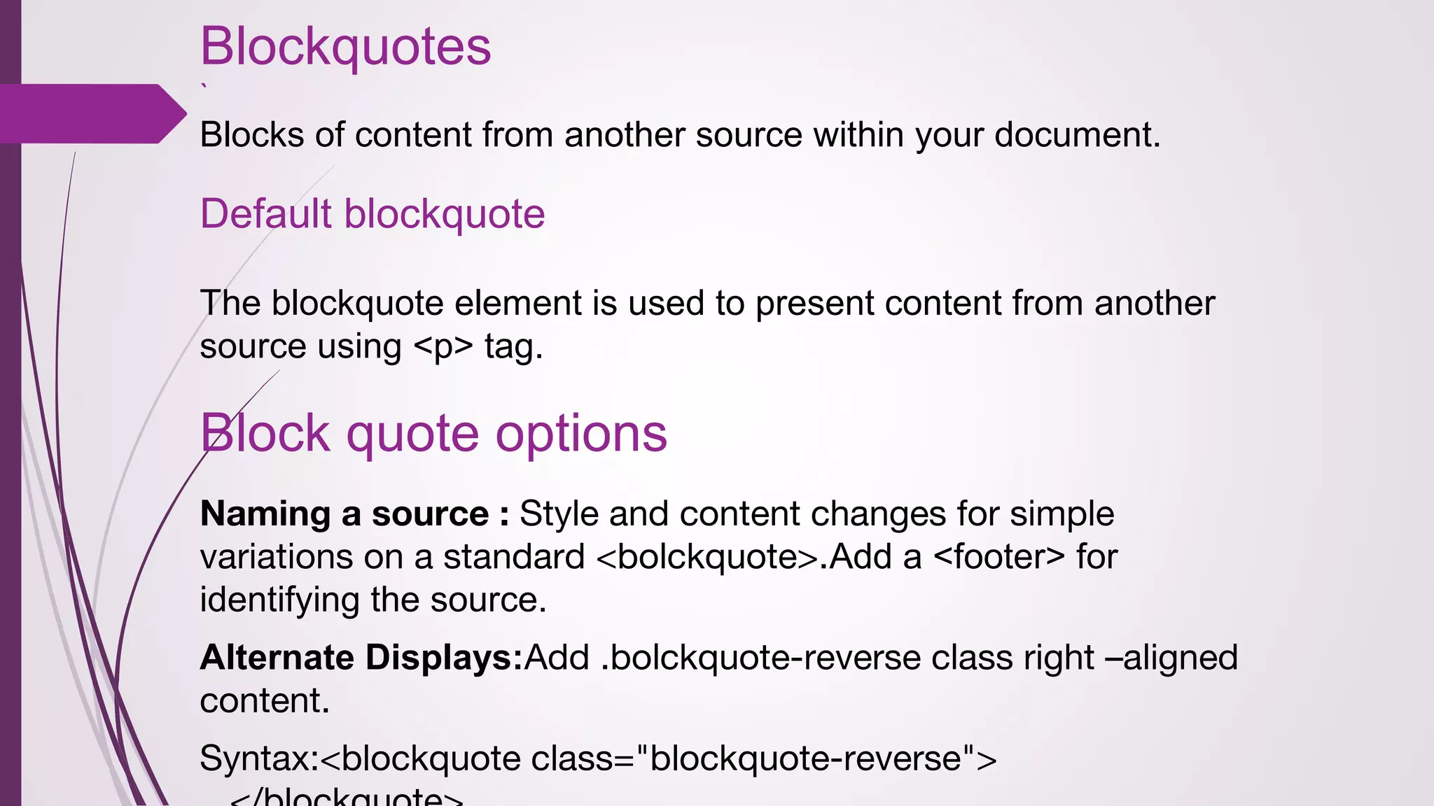
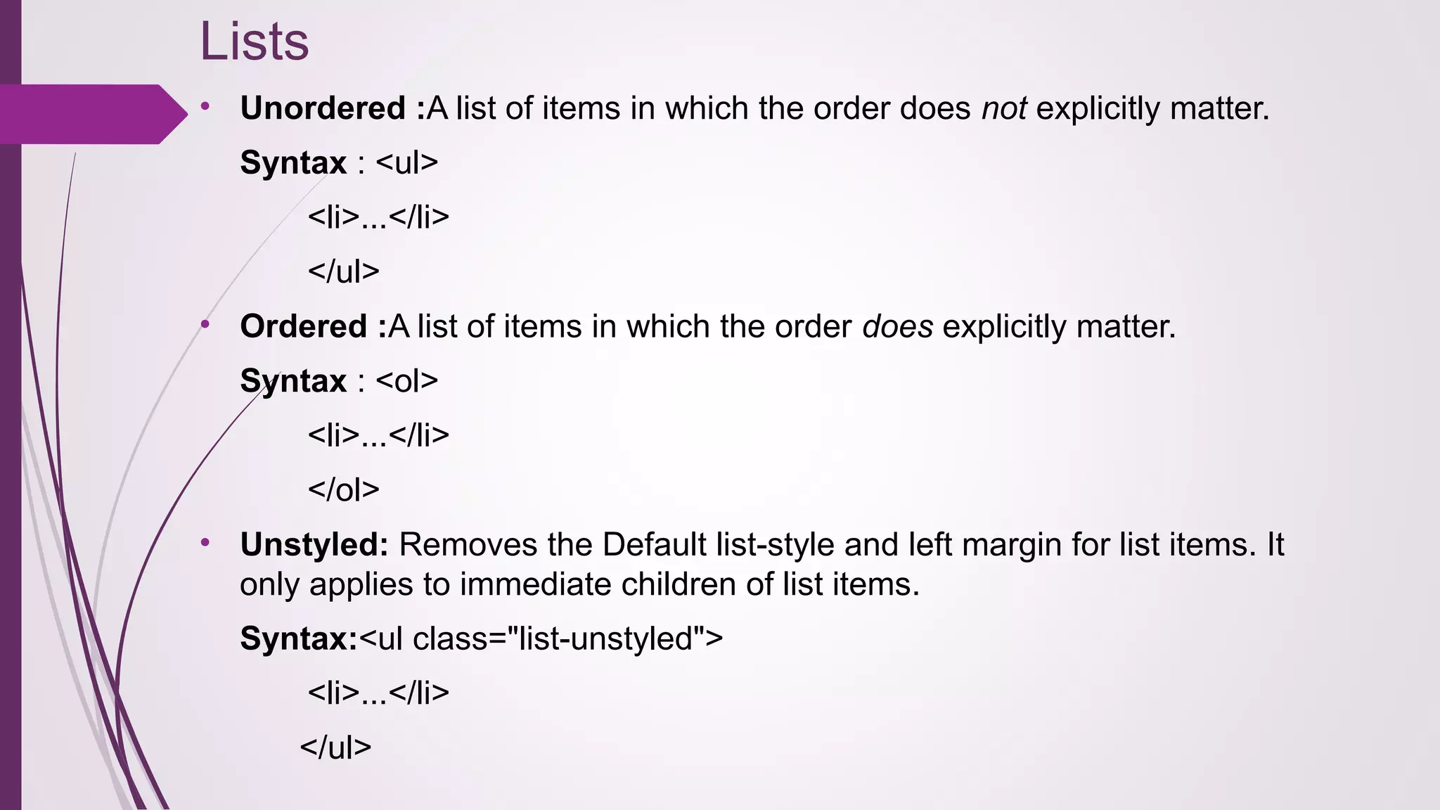
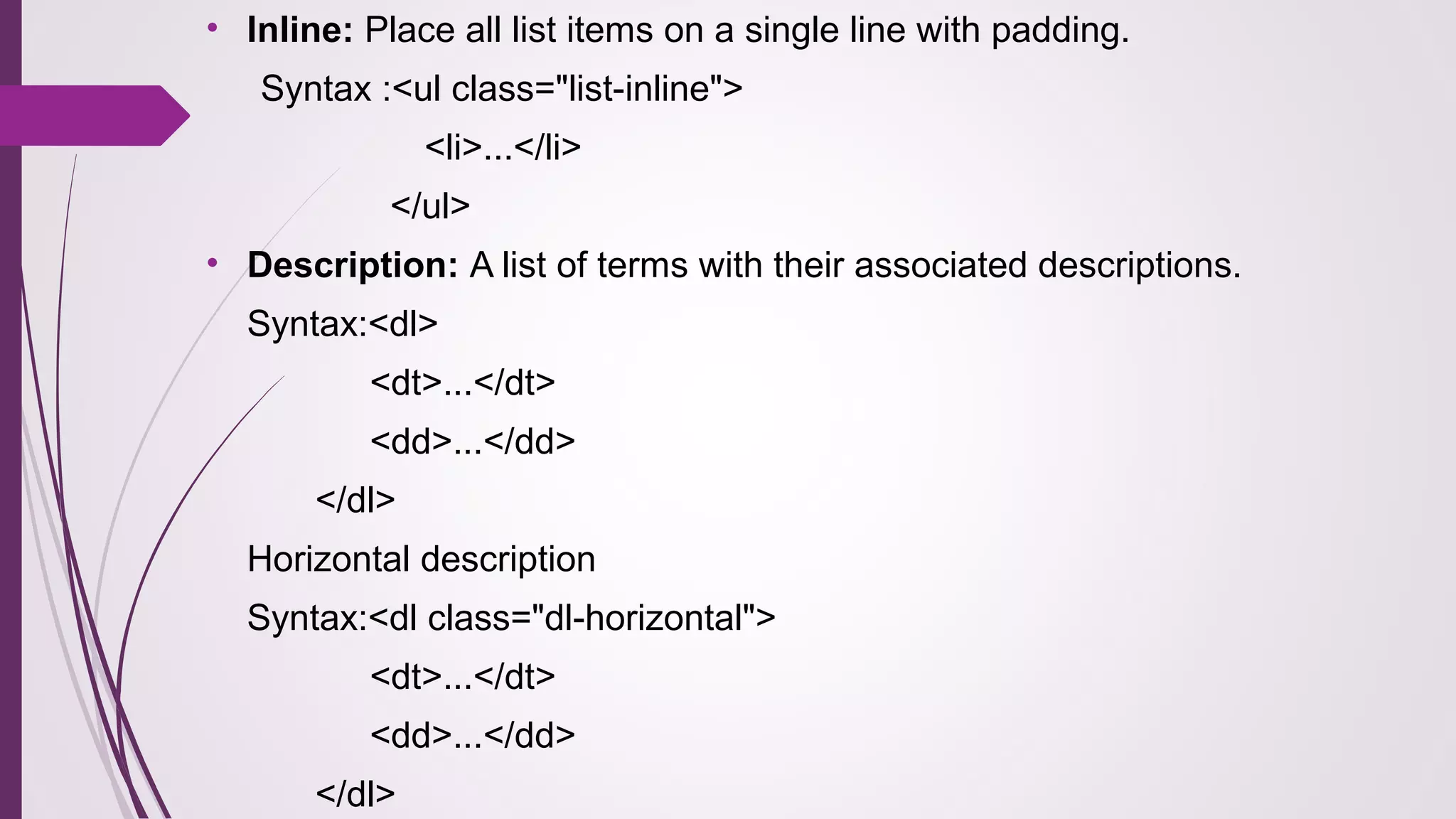
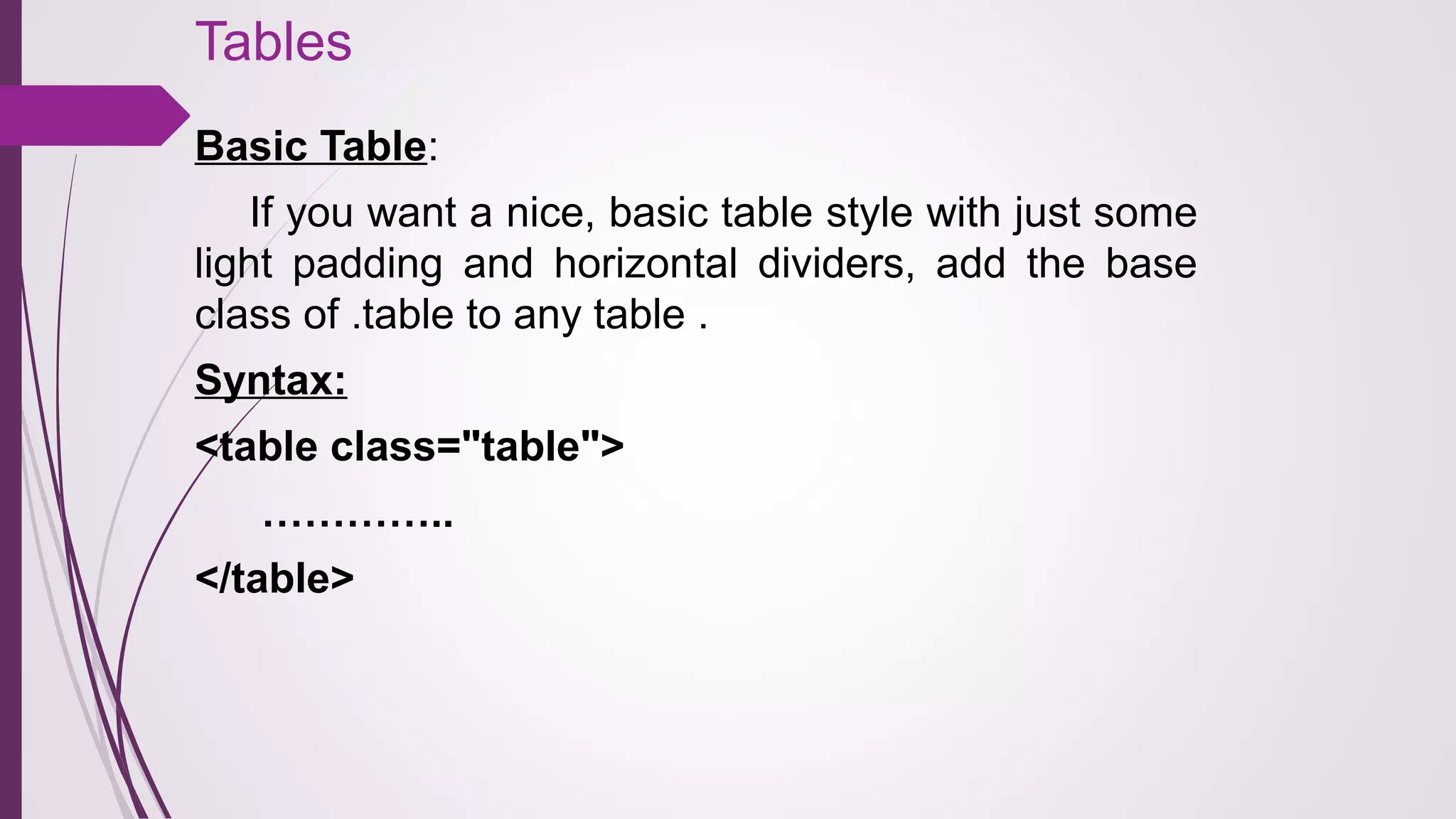

Bootstrap is a popular open-source framework developed by Twitter for creating responsive web applications using HTML, CSS, and JavaScript. It offers features such as a mobile-first approach, a responsive grid system, and extensive customization options, allowing easy integration with various server-side technologies. The framework includes a variety of components, plugins, and styles, making it accessible for developers regardless of their skill level.


![Bootstrap [part 1]](https://cdn.slidesharecdn.com/ss_thumbnails/bootstrappart-11-170208154053-thumbnail.jpg?width=640&height=640&fit=bounds)


![Vibe Coding vs. Spec-Driven Development [Free Meetup]](https://cdn.slidesharecdn.com/ss_thumbnails/vibecodingvsspecdrivendevelopment-251209105622-43f455e7-thumbnail.jpg?width=640&height=640&fit=bounds)


![Coded Agents – with UiPath SDK + LangGraph [Virtual Hands-on Workshop]](https://cdn.slidesharecdn.com/ss_thumbnails/codedagentsdeck-251215155422-5497c599-thumbnail.jpg?width=640&height=640&fit=bounds)


