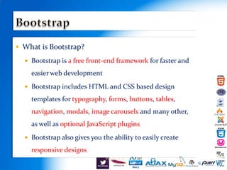
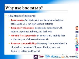
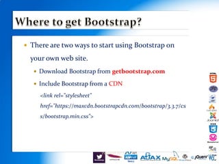
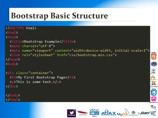
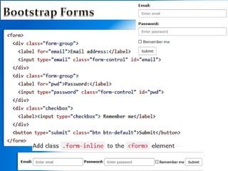
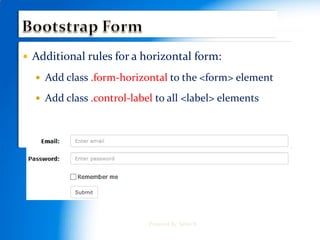
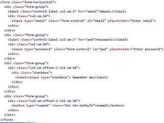
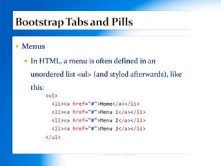

Bootstrap is a free front-end framework that provides HTML and CSS templates for typography, forms, buttons, navigation, and other interface components to help speed up and simplify web development. It is mobile-first, responsive, and compatible across browsers. Developers can include Bootstrap via direct download or CDN link, and it features a grid system, contextual classes, buttons, tables, images, forms, and menus to build user interfaces.