Download to read offline
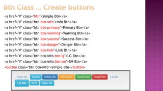

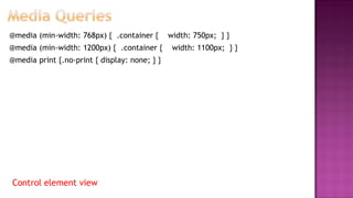
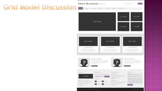

This document summarizes a lecture on Bootstrap, an open-source front-end framework. It discusses Bootstrap's grid system, components like buttons, images, tables and dropdowns, and how to make sites responsive. Key aspects covered include using containers, rows and columns to layout content, different types of buttons and icons, responsive tables, image styling classes and media queries to control elements based on screen width. The document encourages exploring Bootstrap's documentation to learn about other components like forms, carousels and converting previous assignments to use Bootstrap for layout.


![Bootstrap [part 1]](https://cdn.slidesharecdn.com/ss_thumbnails/bootstrappart-11-170208154053-thumbnail.jpg?width=640&height=640&fit=bounds)