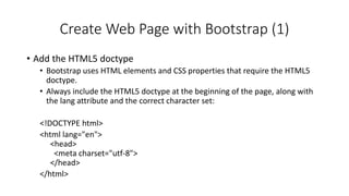
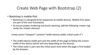
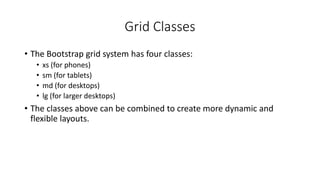
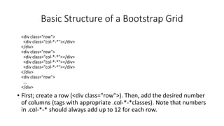
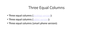
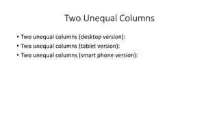
What is Responsive Web Design?
• Responsive web design is about creating web sites which
automatically adjust themselves to look good on all devices, from
small phones to large desktops.
• Bootstrap is the most popular HTML, CSS, and JavaScript framework
for developing responsive web sites.
• Bootstrap is completely free to download and use!
What is Bootstrap?
• Bootstrap is a free front-end framework for faster and easier web
development
• Bootstrap includes HTML and CSS based design templates for forms,
buttons, tables, navigation and many other..
• Bootstrap also gives you the ability to easily create responsive designs
Advantages
• Advantages of Bootstrap:
• Easy to use: Anybody with just basic knowledge of HTML and CSS can start
using Bootstrap
• Responsive features: Bootstrap's responsive CSS adjusts to phones, tablets,
and desktops
• Browser compatibility: Bootstrap is compatible with all modern browsers
(Chrome, Firefox, Internet Explorer, Safari, and Opera)
Where to Get Bootstrap?
• There are two ways to start using Bootstrap on your own web site.
• Download Bootstrap from getbootstrap.com
• If you want to download and host Bootstrap yourself, go to getbootstrap.com, and follow
the instructions there.
• Include Bootstrap from a CDN
• If you don't want to download and host Bootstrap yourself, you can include it from a CDN
(Content Delivery Network).
• MaxCDN provides CDN support for Bootstrap's CSS and JavaScript. You must also include
jQuery.
Bootstrap CDN
• You must include the following Bootstrap’s CSS, JavaScript, and jQuery from MaxCDN into your web page.
<!-- Latest compiled and minified Bootstrap CSS -->
<link rel="stylesheet"href="https://maxcdn.bootstrapcdn.com/bootstrap/3.3.7/css/bootstrap.min.css">
<!-- Latest compiled Bootstrap JavaScript -->
<script src="https://maxcdn.bootstrapcdn.com/bootstrap/3.3.7/js/bootstrap.min.js"></script>
<!-- latest jQuery library -->
<script src="https://code.jquery.com/jquery-latest.js"></script>
• Advantage of using the Bootstrap CDN:
• Many users already have downloaded Bootstrap from MaxCDN when visiting another site. As a result, it
will be loaded from cache when they visit your site, which leads to faster loading time. Also, most CDN's
will make sure that once a user requests a file from it, it will be served from the server closest to them,
which also leads to faster loading time.
Create Web Page with Bootstrap (1)
• Add the HTML5 doctype
• Bootstrap uses HTML elements and CSS properties that require the HTML5
doctype.
• Always include the HTML5 doctype at the beginning of the page, along with
the lang attribute and the correct character set:
<!DOCTYPE html>
<html lang="en">
<head>
<meta charset="utf-8">
</head>
</html>
Create Web Page with Bootstrap (2)
• Bootstrap is mobile-first
• Bootstrap 3 is designed to be responsive to mobile devices. Mobile-first styles
are part of the core framework.
• To ensure proper rendering and touch zooming, add the following <meta> tag
inside the <head> element:
<meta name="viewport" content="width=device-width, initial-scale=1">
• The width=device-width part sets the width of the page to follow the screen-
width of the device (which will vary depending on the device).
• The initial-scale=1 part sets the initial zoom level when the page is first loaded
by the browser.
Create Web Page with Bootstrap (3)
• Containers
• Bootstrap also requires a containing element to wrap site contents.
• There are two container classes to choose from:
• The .container class provides a responsive fixed width container. (See Sample)
• The .container-fluid class provides a full width container, spanning the entire width of
the viewport. (See Sample)
• Note: Containers are not nestable (you cannot put a container inside
another container).
Bootstrap Grids
• Bootstrap’s grid system allows up to 12 columns across the page.
• If you do not want to use all 12 columns individually, you can group
the columns together to create wider columns:
<div class="col-md-12">Span 12 columns</div>
<div class="col-md-6">Span 6</div><div class="col-md-6">Span 6</div>
<div class="col-md-4">Span 4</div><div class="col-md-8">Span 8</div>
<div class="col-md-4">Span 4</div><div class="col-md-4">Span 4</div> <div class="col-md-
4">Span 4</div>
• Bootstrap's grid system is responsive, and the columns will re-arrange
automatically depending on the screen size.
Grid Classes
• The Bootstrap grid system has four classes:
• xs (for phones)
• sm (for tablets)
• md (for desktops)
• lg (for larger desktops)
• The classes above can be combined to create more dynamic and
flexible layouts.
Basic Structure of a Bootstrap Grid
<div class="row">
<div class="col-*-*"></div>
</div>
<div class="row">
<div class="col-*-*"></div>
</div>
<div class="row">
...
</div>
• First; create a row (<div class="row">). Then, add the desired number
of columns (tags with appropriate .col-*-*classes). Note that numbers
in .col-*-* should always add up to 12 for each row.
Three Equal Columns
• Three equal columns (desktop version):
• Three equal columns (tablet version):
• Three equal columns (smart phone version):
Two Unequal Columns
• Two unequal columns (desktop version):
• Two unequal columns (tablet version):
• Two unequal columns (smart phone version):
Bootstrap Tables
• A basic Bootstrap table has a light padding and only horizontal dividers.
• The .table class adds basic styling to a table:
• Striped Rows
• The .table-striped class adds zebra-stripes to a table:
• Bordered Table
• The .table-bordered class adds borders on all sides of the table and cells:
• Hover Rows
• The .table-hover class enables a hover state on table rows:
• Responsive Tables
• The .table-responsive class creates a responsive table. The table will then scroll horizontally
on small devices (under 768px). When viewing on anything larger than 768px wide, there is
no difference:
Bootstrap Images
• Rounded Corners
• The .img-rounded class adds rounded corners to an image (IE8 does not support rounded
corners):
• Circle
• The .img-circle class shapes the image to a circle (IE8 does not support rounded corners):
• Thumbnail
• The .img-thumbnail class shapes the image to a thumbnail:
• Responsive Images
• Images comes in all sizes. So do screens. Responsive images automatically adjust to fit the
size of the screen.
• Create responsive images by adding an .img-responsive class to the <img> tag. The image will
then scale nicely to the parent element.
• The .img-responsive class applies display: block; and max-width: 100%; and height: auto; to
the image:
Bootstrap Buttons
• Button Styles
• Bootstrap provides seven styles of buttons with the following classes:
.btn-default
.btn-primary
.btn-success
.btn-info
.btn-warning
.btn-danger
.btn-link
Bootstrap Button Elements
• The button classes can be used on the following elements:
• <a>
• <button>
• <input>
Button Sizes
• Bootstrap provides four button sizes with the following classes:
.btn-lg
.btn-md
.btn-sm
.btn-xs
Block Level Buttons
• A block level button spans the entire width of the parent element.
• Add class .btn-block to create a block level button:
Active/Disabled Buttons
• A button can be set to an active (appear pressed) or a disabled
(unclickable) state:
• The class .active makes a button appear pressed, and the class .disabled
makes a button unclickable:
E Example
<!DOCTYPE html>
<html lang="en">
<head>
<title>Bootstrap Example</title>
<meta charset="utf-8">
<meta name="viewport" content="width=device-width, initial-scale=1">
<link rel="stylesheet" href="https://maxcdn.bootstrapcdn.com/bootstrap/3.4.1/css/bootstrap.min.css">
<script src="https://ajax.googleapis.com/ajax/libs/jquery/3.6.3/jquery.min.js"></script>
<script src="https://maxcdn.bootstrapcdn.com/bootstrap/3.4.1/js/bootstrap.min.js"></script>
</head>
<body>
<div class="container">
<h2>Button Styles</h2>
<button type="button" class="btn">Basic</button>
<button type="button" class="btn btn-default">Default</button>
<button type="button" class="btn btn-primary">Primary</button>
<button type="button" class="btn btn-success">Success</button>
<button type="button" class="btn btn-info">Info</button>
<button type="button" class="btn btn-warning">Warning</button>
<button type="button" class="btn btn-danger">Danger</button>
<button type="button" class="btn btn-link">Link</button>
</div>
</body>
</html>

Bootstrap for webtechnology_data science.pdf

  • 1.
    What is ResponsiveWeb Design? • Responsive web design is about creating web sites which automatically adjust themselves to look good on all devices, from small phones to large desktops. • Bootstrap is the most popular HTML, CSS, and JavaScript framework for developing responsive web sites. • Bootstrap is completely free to download and use!
  • 2.
    What is Bootstrap? •Bootstrap is a free front-end framework for faster and easier web development • Bootstrap includes HTML and CSS based design templates for forms, buttons, tables, navigation and many other.. • Bootstrap also gives you the ability to easily create responsive designs
  • 3.
    Advantages • Advantages ofBootstrap: • Easy to use: Anybody with just basic knowledge of HTML and CSS can start using Bootstrap • Responsive features: Bootstrap's responsive CSS adjusts to phones, tablets, and desktops • Browser compatibility: Bootstrap is compatible with all modern browsers (Chrome, Firefox, Internet Explorer, Safari, and Opera)
  • 4.
    Where to GetBootstrap? • There are two ways to start using Bootstrap on your own web site. • Download Bootstrap from getbootstrap.com • If you want to download and host Bootstrap yourself, go to getbootstrap.com, and follow the instructions there. • Include Bootstrap from a CDN • If you don't want to download and host Bootstrap yourself, you can include it from a CDN (Content Delivery Network). • MaxCDN provides CDN support for Bootstrap's CSS and JavaScript. You must also include jQuery.
  • 5.
    Bootstrap CDN • Youmust include the following Bootstrap’s CSS, JavaScript, and jQuery from MaxCDN into your web page. <!-- Latest compiled and minified Bootstrap CSS --> <link rel="stylesheet"href="https://maxcdn.bootstrapcdn.com/bootstrap/3.3.7/css/bootstrap.min.css"> <!-- Latest compiled Bootstrap JavaScript --> <script src="https://maxcdn.bootstrapcdn.com/bootstrap/3.3.7/js/bootstrap.min.js"></script> <!-- latest jQuery library --> <script src="https://code.jquery.com/jquery-latest.js"></script> • Advantage of using the Bootstrap CDN: • Many users already have downloaded Bootstrap from MaxCDN when visiting another site. As a result, it will be loaded from cache when they visit your site, which leads to faster loading time. Also, most CDN's will make sure that once a user requests a file from it, it will be served from the server closest to them, which also leads to faster loading time.
  • 6.
    Create Web Pagewith Bootstrap (1) • Add the HTML5 doctype • Bootstrap uses HTML elements and CSS properties that require the HTML5 doctype. • Always include the HTML5 doctype at the beginning of the page, along with the lang attribute and the correct character set: <!DOCTYPE html> <html lang="en"> <head> <meta charset="utf-8"> </head> </html>
  • 7.
    Create Web Pagewith Bootstrap (2) • Bootstrap is mobile-first • Bootstrap 3 is designed to be responsive to mobile devices. Mobile-first styles are part of the core framework. • To ensure proper rendering and touch zooming, add the following <meta> tag inside the <head> element: <meta name="viewport" content="width=device-width, initial-scale=1"> • The width=device-width part sets the width of the page to follow the screen- width of the device (which will vary depending on the device). • The initial-scale=1 part sets the initial zoom level when the page is first loaded by the browser.
  • 8.
    Create Web Pagewith Bootstrap (3) • Containers • Bootstrap also requires a containing element to wrap site contents. • There are two container classes to choose from: • The .container class provides a responsive fixed width container. (See Sample) • The .container-fluid class provides a full width container, spanning the entire width of the viewport. (See Sample) • Note: Containers are not nestable (you cannot put a container inside another container).
  • 9.
    Bootstrap Grids • Bootstrap’sgrid system allows up to 12 columns across the page. • If you do not want to use all 12 columns individually, you can group the columns together to create wider columns: <div class="col-md-12">Span 12 columns</div> <div class="col-md-6">Span 6</div><div class="col-md-6">Span 6</div> <div class="col-md-4">Span 4</div><div class="col-md-8">Span 8</div> <div class="col-md-4">Span 4</div><div class="col-md-4">Span 4</div> <div class="col-md- 4">Span 4</div> • Bootstrap's grid system is responsive, and the columns will re-arrange automatically depending on the screen size.
  • 10.
    Grid Classes • TheBootstrap grid system has four classes: • xs (for phones) • sm (for tablets) • md (for desktops) • lg (for larger desktops) • The classes above can be combined to create more dynamic and flexible layouts.
  • 11.
    Basic Structure ofa Bootstrap Grid <div class="row"> <div class="col-*-*"></div> </div> <div class="row"> <div class="col-*-*"></div> <div class="col-*-*"></div> <div class="col-*-*"></div> </div> <div class="row"> ... </div> • First; create a row (<div class="row">). Then, add the desired number of columns (tags with appropriate .col-*-*classes). Note that numbers in .col-*-* should always add up to 12 for each row.
  • 12.
    Three Equal Columns •Three equal columns (desktop version): • Three equal columns (tablet version): • Three equal columns (smart phone version):
  • 13.
    Two Unequal Columns •Two unequal columns (desktop version): • Two unequal columns (tablet version): • Two unequal columns (smart phone version):
  • 14.
    Bootstrap Tables • Abasic Bootstrap table has a light padding and only horizontal dividers. • The .table class adds basic styling to a table: • Striped Rows • The .table-striped class adds zebra-stripes to a table: • Bordered Table • The .table-bordered class adds borders on all sides of the table and cells: • Hover Rows • The .table-hover class enables a hover state on table rows: • Responsive Tables • The .table-responsive class creates a responsive table. The table will then scroll horizontally on small devices (under 768px). When viewing on anything larger than 768px wide, there is no difference:
  • 15.
    Bootstrap Images • RoundedCorners • The .img-rounded class adds rounded corners to an image (IE8 does not support rounded corners): • Circle • The .img-circle class shapes the image to a circle (IE8 does not support rounded corners): • Thumbnail • The .img-thumbnail class shapes the image to a thumbnail: • Responsive Images • Images comes in all sizes. So do screens. Responsive images automatically adjust to fit the size of the screen. • Create responsive images by adding an .img-responsive class to the <img> tag. The image will then scale nicely to the parent element. • The .img-responsive class applies display: block; and max-width: 100%; and height: auto; to the image:
  • 16.
    Bootstrap Buttons • ButtonStyles • Bootstrap provides seven styles of buttons with the following classes: .btn-default .btn-primary .btn-success .btn-info .btn-warning .btn-danger .btn-link
  • 17.
    Bootstrap Button Elements •The button classes can be used on the following elements: • <a> • <button> • <input>
  • 18.
    Button Sizes • Bootstrapprovides four button sizes with the following classes: .btn-lg .btn-md .btn-sm .btn-xs
  • 19.
    Block Level Buttons •A block level button spans the entire width of the parent element. • Add class .btn-block to create a block level button:
  • 20.
    Active/Disabled Buttons • Abutton can be set to an active (appear pressed) or a disabled (unclickable) state: • The class .active makes a button appear pressed, and the class .disabled makes a button unclickable:
  • 21.
    E Example <!DOCTYPE html> <htmllang="en"> <head> <title>Bootstrap Example</title> <meta charset="utf-8"> <meta name="viewport" content="width=device-width, initial-scale=1"> <link rel="stylesheet" href="https://maxcdn.bootstrapcdn.com/bootstrap/3.4.1/css/bootstrap.min.css"> <script src="https://ajax.googleapis.com/ajax/libs/jquery/3.6.3/jquery.min.js"></script> <script src="https://maxcdn.bootstrapcdn.com/bootstrap/3.4.1/js/bootstrap.min.js"></script> </head> <body> <div class="container"> <h2>Button Styles</h2> <button type="button" class="btn">Basic</button> <button type="button" class="btn btn-default">Default</button> <button type="button" class="btn btn-primary">Primary</button> <button type="button" class="btn btn-success">Success</button> <button type="button" class="btn btn-info">Info</button> <button type="button" class="btn btn-warning">Warning</button> <button type="button" class="btn btn-danger">Danger</button> <button type="button" class="btn btn-link">Link</button> </div> </body> </html>