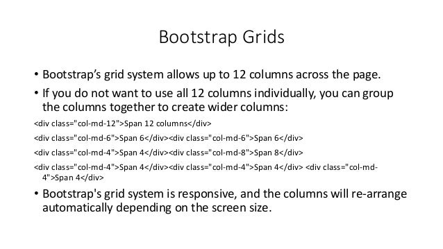
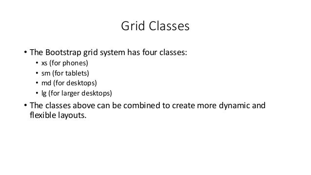
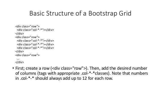
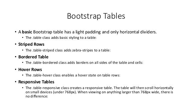
Responsive web design allows websites to automatically adjust to different screen sizes using flexible layouts and CSS media queries. Bootstrap is a popular free and open-source framework for responsive web design. It contains HTML and CSS templates for common elements like buttons, navigation bars, grids and more. Bootstrap uses a mobile-first approach and its responsive 12-column grid system allows elements to re-arrange depending on screen size. Basic components like images, tables, buttons and forms can be styled using Bootstrap classes.
Bootstrap is a free front-end framework for faster and easier web development.
Bootstrap includes HTML and CSS based design templates for typography, forms, buttons, tables, navigation, modals, image carousels and many other, as well as optional JavaScript plugins.
Bootstrap also gives we the ability to easily create responsive designs.
Responsive web design is about creating web sites which automatically adjust themselves to look good on all devices, from small phones to large desktops.
Advantages of Bootstrap:
Easy to use: Anybody with just basic knowledge of HTML and CSS can start using Bootstrap
Responsive features: Bootstrap's responsive CSS adjusts to phones, tablets, and desktops
Mobile-first approach: In Bootstrap, mobile-first styles are part of the core framework
Browser compatibility: Bootstrap 4 is compatible with all modern browsers (Chrome, Firefox, Internet Explorer 10+, Edge, Safari, and Opera)
OVERVIEW
Twitter Bootstrap is a wildly popular HTML and CSS framework for building websites and web applications. It is the number 1 project on GitHub. Bootstrap supports responsive web design, allowing the layout of your page to adapt to the device (desktop, tablet, mobile). This talk will introduce you to the basics of using Bootstrap and show you how to build responsive web layouts to build your own app.
TARGET AUDIENCE
Beginner web developers
ASSUMED AUDIENCE KNOWLEDGE
Working knowledge of HTML5 and CSS3.
OBJECTIVE
Learn how to use Twitter Bootstrap to quickly build a beautiful, responsive web app.
FIVE THINGS AUDIENCE MEMBERS WILL LEARN
Twitter Bootstrap basics
Bootstrap CSS basics
Bootstrap responsive layouts
Bootstrap components
JavaScript Bootstrap plugins
Node.js 101
with Rami Sayar
Presented by FITC at Web Unleashed 2014 in Toronto
on September 18 2014, 10:30 - 11:15am
Node.js is a runtime environment and library for running JavaScript applications outside the browser. Node.js is mostly used to run real-time server applications and shines through its performance using non-blocking I/O and asynchronous events. This talk will introduce you to Node.js by showcasing the environment and its two most popular libraries: express and socket.io.
TARGET AUDIENCE
Beginner web developers
ASSUMED AUDIENCE KNOWLEDGE
Working knowledge of JavaScript and HTML5.
OBJECTIVE
Learn how to build a chat engine using Node.js and WebSockets.
FIVE THINGS AUDIENCE MEMBERS WILL LEARN
Node.js environment and basics
Node Package Manager overview
Web Framework, express, basics
WebSockets and Socket.io basics
Building a chat engine using Node.js
With great power, comes great responsive-ability web design.
Responsive web design (RWD) will be demystified. Believe it or not, it's more than just media queries, although those will be discussed. It starts with proper UI design and application architecture, and then the dive into CSS - but not too deep! You don't have to be an expert to do RWD, but it helps to have some idea of what you are doing.
Bootstrap is the most popular HTML, CSS, and JS framework for developing responsive, mobile first projects on the web
These Slides Given by My Teacher : Mr Sher Afgun who is the teacher and Developer of WebBaseApplicationDevelopment in International Islamic University Islamabad
Instructions for Submissions thorugh G- Classroom.pptxJheel Barad
This presentation provides a briefing on how to upload submissions and documents in Google Classroom. It was prepared as part of an orientation for new Sainik School in-service teacher trainees. As a training officer, my goal is to ensure that you are comfortable and proficient with this essential tool for managing assignments and fostering student engagement.
Honest Reviews of Tim Han LMA Course Program.pptxtimhan337
Personal development courses are widely available today, with each one promising life-changing outcomes. Tim Han’s Life Mastery Achievers (LMA) Course has drawn a lot of interest. In addition to offering my frank assessment of Success Insider’s LMA Course, this piece examines the course’s effects via a variety of Tim Han LMA course reviews and Success Insider comments.
Acetabularia Information For Class 9 .docxvaibhavrinwa19
Acetabularia acetabulum is a single-celled green alga that in its vegetative state is morphologically differentiated into a basal rhizoid and an axially elongated stalk, which bears whorls of branching hairs. The single diploid nucleus resides in the rhizoid.
Francesca Gottschalk - How can education support child empowerment.pptxEduSkills OECD
Francesca Gottschalk from the OECD’s Centre for Educational Research and Innovation presents at the Ask an Expert Webinar: How can education support child empowerment?
The French Revolution, which began in 1789, was a period of radical social and political upheaval in France. It marked the decline of absolute monarchies, the rise of secular and democratic republics, and the eventual rise of Napoleon Bonaparte. This revolutionary period is crucial in understanding the transition from feudalism to modernity in Europe.
For more information, visit-www.vavaclasses.com
Embracing GenAI - A Strategic ImperativePeter Windle
Artificial Intelligence (AI) technologies such as Generative AI, Image Generators and Large Language Models have had a dramatic impact on teaching, learning and assessment over the past 18 months. The most immediate threat AI posed was to Academic Integrity with Higher Education Institutes (HEIs) focusing their efforts on combating the use of GenAI in assessment. Guidelines were developed for staff and students, policies put in place too. Innovative educators have forged paths in the use of Generative AI for teaching, learning and assessments leading to pockets of transformation springing up across HEIs, often with little or no top-down guidance, support or direction.
This Gasta posits a strategic approach to integrating AI into HEIs to prepare staff, students and the curriculum for an evolving world and workplace. We will highlight the advantages of working with these technologies beyond the realm of teaching, learning and assessment by considering prompt engineering skills, industry impact, curriculum changes, and the need for staff upskilling. In contrast, not engaging strategically with Generative AI poses risks, including falling behind peers, missed opportunities and failing to ensure our graduates remain employable. The rapid evolution of AI technologies necessitates a proactive and strategic approach if we are to remain relevant.
Introduction to AI for Nonprofits with Tapp NetworkTechSoup
Dive into the world of AI! Experts Jon Hill and Tareq Monaur will guide you through AI's role in enhancing nonprofit websites and basic marketing strategies, making it easy to understand and apply.
Read| The latest issue of The Challenger is here! We are thrilled to announce that our school paper has qualified for the NATIONAL SCHOOLS PRESS CONFERENCE (NSPC) 2024. Thank you for your unwavering support and trust. Dive into the stories that made us stand out!
The Roman Empire A Historical Colossus.pdfkaushalkr1407
The Roman Empire, a vast and enduring power, stands as one of history's most remarkable civilizations, leaving an indelible imprint on the world. It emerged from the Roman Republic, transitioning into an imperial powerhouse under the leadership of Augustus Caesar in 27 BCE. This transformation marked the beginning of an era defined by unprecedented territorial expansion, architectural marvels, and profound cultural influence.
The empire's roots lie in the city of Rome, founded, according to legend, by Romulus in 753 BCE. Over centuries, Rome evolved from a small settlement to a formidable republic, characterized by a complex political system with elected officials and checks on power. However, internal strife, class conflicts, and military ambitions paved the way for the end of the Republic. Julius Caesar’s dictatorship and subsequent assassination in 44 BCE created a power vacuum, leading to a civil war. Octavian, later Augustus, emerged victorious, heralding the Roman Empire’s birth.
Under Augustus, the empire experienced the Pax Romana, a 200-year period of relative peace and stability. Augustus reformed the military, established efficient administrative systems, and initiated grand construction projects. The empire's borders expanded, encompassing territories from Britain to Egypt and from Spain to the Euphrates. Roman legions, renowned for their discipline and engineering prowess, secured and maintained these vast territories, building roads, fortifications, and cities that facilitated control and integration.
The Roman Empire’s society was hierarchical, with a rigid class system. At the top were the patricians, wealthy elites who held significant political power. Below them were the plebeians, free citizens with limited political influence, and the vast numbers of slaves who formed the backbone of the economy. The family unit was central, governed by the paterfamilias, the male head who held absolute authority.
Culturally, the Romans were eclectic, absorbing and adapting elements from the civilizations they encountered, particularly the Greeks. Roman art, literature, and philosophy reflected this synthesis, creating a rich cultural tapestry. Latin, the Roman language, became the lingua franca of the Western world, influencing numerous modern languages.
Roman architecture and engineering achievements were monumental. They perfected the arch, vault, and dome, constructing enduring structures like the Colosseum, Pantheon, and aqueducts. These engineering marvels not only showcased Roman ingenuity but also served practical purposes, from public entertainment to water supply.
Biological screening of herbal drugs: Introduction and Need for
Phyto-Pharmacological Screening, New Strategies for evaluating
Natural Products, In vitro evaluation techniques for Antioxidants, Antimicrobial and Anticancer drugs. In vivo evaluation techniques
for Anti-inflammatory, Antiulcer, Anticancer, Wound healing, Antidiabetic, Hepatoprotective, Cardio protective, Diuretics and
Antifertility, Toxicity studies as per OECD guidelines
BÀI TẬP BỔ TRỢ TIẾNG ANH GLOBAL SUCCESS LỚP 3 - CẢ NĂM (CÓ FILE NGHE VÀ ĐÁP Á...
Responsive web design
1. CNIT131 Internet Basics &
Beginning HTML
Week 11 – Responsive Web Design
http://fog.ccsf.edu/~hyip
2. What is Responsive Web Design?
• Responsive web design is about creating web sites which
automatically adjust themselves to look good on all devices, from
small phones to large desktops.
• Bootstrap is the most popular HTML, CSS, and JavaScript framework
for developing responsive, mobile-first web sites.
• Bootstrap is completely free to download and use!
3. What is Bootstrap?
• Bootstrap is a free front-end framework for faster and easier web
development
• Bootstrap includes HTML and CSS based design templates for
typography, forms, buttons, tables, navigation, modals, image
carousels and many other, as well as optional JavaScript plugins
• Bootstrap also gives you the ability to easily create responsive designs
4. Bootstrap History
• Bootstrap was developed by Mark Otto and Jacob Thornton at
Twitter, and released as an open source product in August 2011 on
GitHub.
• Advantages of Bootstrap:
• Easy to use: Anybody with just basic knowledge of HTML and CSS can start
using Bootstrap
• Responsive features: Bootstrap's responsive CSS adjusts to phones, tablets,
and desktops
• Mobile-first approach: In Bootstrap 3, mobile-first styles are part of the core
framework
• Browser compatibility: Bootstrap is compatible with all modern browsers
(Chrome, Firefox, Internet Explorer, Safari, and Opera)
5. Where to Get Bootstrap?
• There are two ways to start using Bootstrap on your own web site.
• Download Bootstrap from getbootstrap.com
• If you want to download and host Bootstrap yourself, go to getbootstrap.com, and follow
the instructions there.
• Include Bootstrap from a CDN
• If you don't want to download and host Bootstrap yourself, you can include it from a CDN
(Content Delivery Network).
• MaxCDN provides CDN support for Bootstrap's CSS and JavaScript. You must also include
jQuery.
6. Bootstrap CDN
• You must include the following Bootstrap’s CSS, JavaScript, and jQuery from MaxCDN into your web page.
<!-- Latest compiled and minified Bootstrap CSS -->
<link rel="stylesheet"href="https://maxcdn.bootstrapcdn.com/bootstrap/3.3.7/css/bootstrap.min.css">
<!-- Latest compiled Bootstrap JavaScript -->
<script src="https://maxcdn.bootstrapcdn.com/bootstrap/3.3.7/js/bootstrap.min.js"></script>
<!-- latest jQuery library -->
<script src="https://code.jquery.com/jquery-latest.js"></script>
• Advantage of using the Bootstrap CDN:
• Many users already have downloaded Bootstrap from MaxCDN when visiting another site. As a result, it
will be loaded from cache when they visit your site, which leads to faster loading time. Also, most CDN's
will make sure that once a user requests a file from it, it will be served from the server closest to them,
which also leads to faster loading time.
7. Create Web Page with Bootstrap (1)
• Add the HTML5 doctype
• Bootstrap uses HTML elements and CSS properties that require the HTML5
doctype.
• Always include the HTML5 doctype at the beginning of the page, along with
the lang attribute and the correct character set:
<!DOCTYPE html>
<html lang="en">
<head>
<meta charset="utf-8">
</head>
</html>
8. Create Web Page with Bootstrap (2)
• Bootstrap is mobile-first
• Bootstrap 3 is designed to be responsive to mobile devices. Mobile-first styles
are part of the core framework.
• To ensure proper rendering and touch zooming, add the following <meta> tag
inside the <head> element:
<meta name="viewport" content="width=device-width, initial-scale=1">
• The width=device-width part sets the width of the page to follow the screen-
width of the device (which will vary depending on the device).
• The initial-scale=1 part sets the initial zoom level when the page is first loaded
by the browser.
9. Create Web Page with Bootstrap (3)
• Containers
• Bootstrap also requires a containing element to wrap site contents.
• There are two container classes to choose from:
• The .container class provides a responsive fixed width container. (See Sample)
• The .container-fluid class provides a full width container, spanning the entire width of
the viewport. (See Sample)
• Note: Containers are not nestable (you cannot put a container inside
another container).
10. Bootstrap Grids
• Bootstrap’s grid system allows up to 12 columns across the page.
• If you do not want to use all 12 columns individually, you can group
the columns together to create wider columns:
<div class="col-md-12">Span 12 columns</div>
<div class="col-md-6">Span 6</div><div class="col-md-6">Span 6</div>
<div class="col-md-4">Span 4</div><div class="col-md-8">Span 8</div>
<div class="col-md-4">Span 4</div><div class="col-md-4">Span 4</div> <div class="col-md-
4">Span 4</div>
• Bootstrap's grid system is responsive, and the columns will re-arrange
automatically depending on the screen size.
11. Grid Classes
• The Bootstrap grid system has four classes:
• xs (for phones)
• sm (for tablets)
• md (for desktops)
• lg (for larger desktops)
• The classes above can be combined to create more dynamic and
flexible layouts.
12. Basic Structure of a Bootstrap Grid
<div class="row">
<div class="col-*-*"></div>
</div>
<div class="row">
<div class="col-*-*"></div>
</div>
<div class="row">
...
</div>
• First; create a row (<div class="row">). Then, add the desired number
of columns (tags with appropriate .col-*-*classes). Note that numbers
in .col-*-* should always add up to 12 for each row.
13. Three Equal Columns
• Three equal columns (desktop version):
• Three equal columns (tablet version):
• Three equal columns (smart phone version):
14. Two Unequal Columns
• Two unequal columns (desktop version):
• Two unequal columns (tablet version):
• Two unequal columns (smart phone version):
15. Bootstrap Tables
• A basic Bootstrap table has a light padding and only horizontal dividers.
• The .table class adds basic styling to a table:
• Striped Rows
• The .table-striped class adds zebra-stripes to a table:
• Bordered Table
• The .table-bordered class adds borders on all sides of the table and cells:
• Hover Rows
• The .table-hover class enables a hover state on table rows:
• Responsive Tables
• The .table-responsive class creates a responsive table. The table will then scroll horizontally
on small devices (under 768px). When viewing on anything larger than 768px wide, there is
no difference:
16. Bootstrap Images
• Rounded Corners
• The .img-rounded class adds rounded corners to an image (IE8 does not support rounded
corners):
• Circle
• The .img-circle class shapes the image to a circle (IE8 does not support rounded corners):
• Thumbnail
• The .img-thumbnail class shapes the image to a thumbnail:
• Responsive Images
• Images comes in all sizes. So do screens. Responsive images automatically adjust to fit the
size of the screen.
• Create responsive images by adding an .img-responsive class to the <img> tag. The image will
then scale nicely to the parent element.
• The .img-responsive class applies display: block; and max-width: 100%; and height: auto; to
the image:
17. Bootstrap Buttons
• Button Styles
• Bootstrap provides seven styles of buttons with the following classes:
.btn-default
.btn-primary
.btn-success
.btn-info
.btn-warning
.btn-danger
.btn-link
18. Bootstrap Button Elements
• The button classes can be used on the following elements:
• <a>
• <button>
• <input>
19. Button Sizes
• Bootstrap provides four button sizes with the following classes:
.btn-lg
.btn-md
.btn-sm
.btn-xs
20. Block Level Buttons
• A block level button spans the entire width of the parent element.
• Add class .btn-block to create a block level button:
21. Active/Disabled Buttons
• A button can be set to an active (appear pressed) or a disabled
(unclickable) state:
• The class .active makes a button appear pressed, and the class .disabled
makes a button unclickable:
22. References
• Discovering the Internet: Complete, Jennifer Campbell, Course
Technology, Cengage Learning, 5th Edition-2015, ISBN 978-1-285-
84540-1.
• Basics of Web Design HTML5 & CSS3, Second Edition, by Terry Felke-
Morris, Peason, ISBN 978-0-13-312891-8.
• W3schools.com