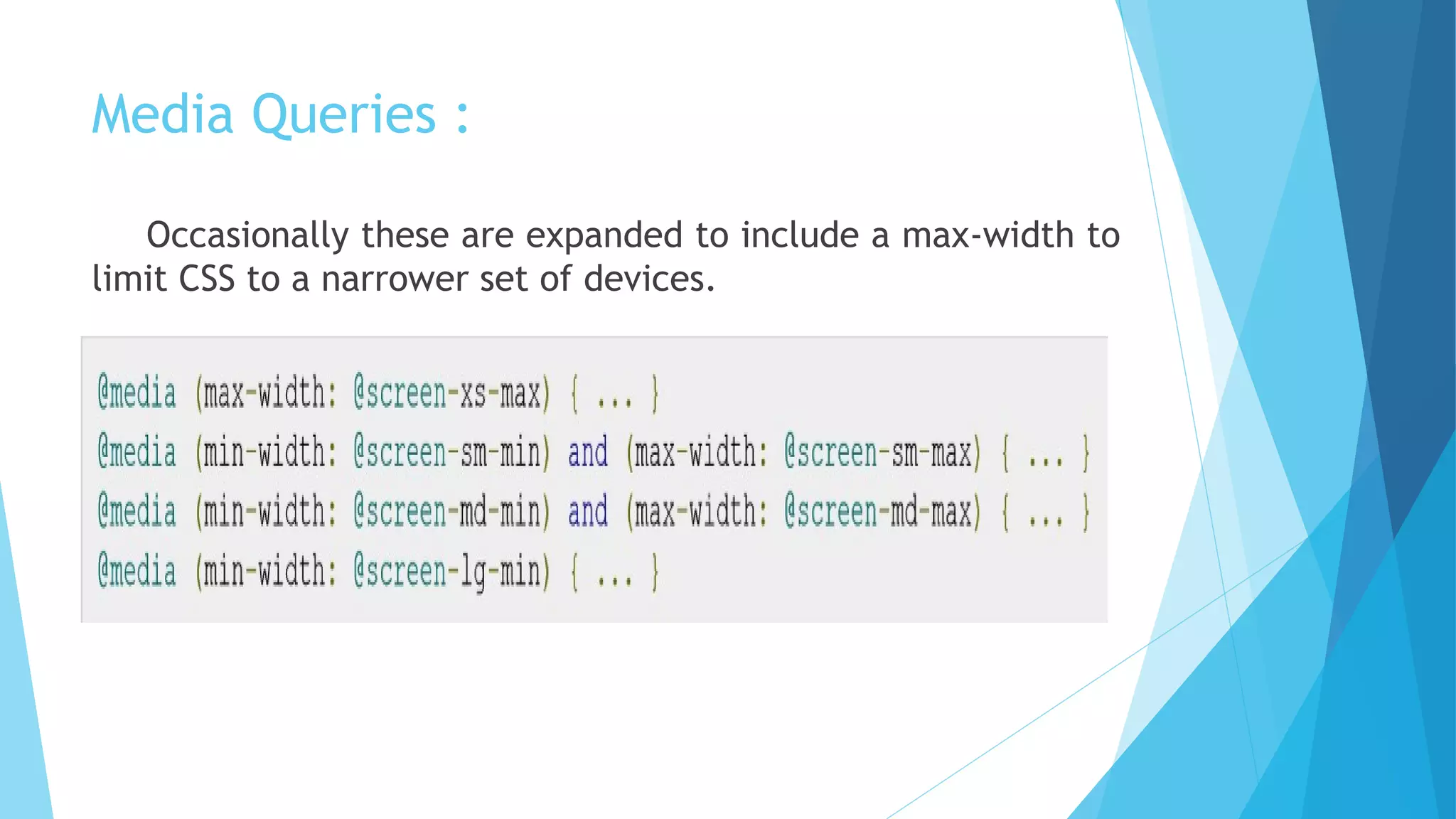
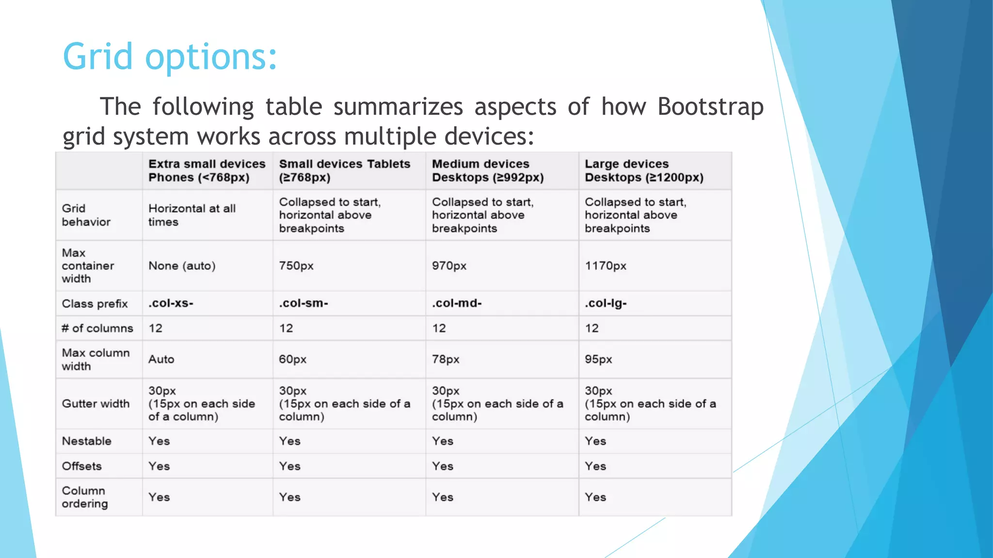
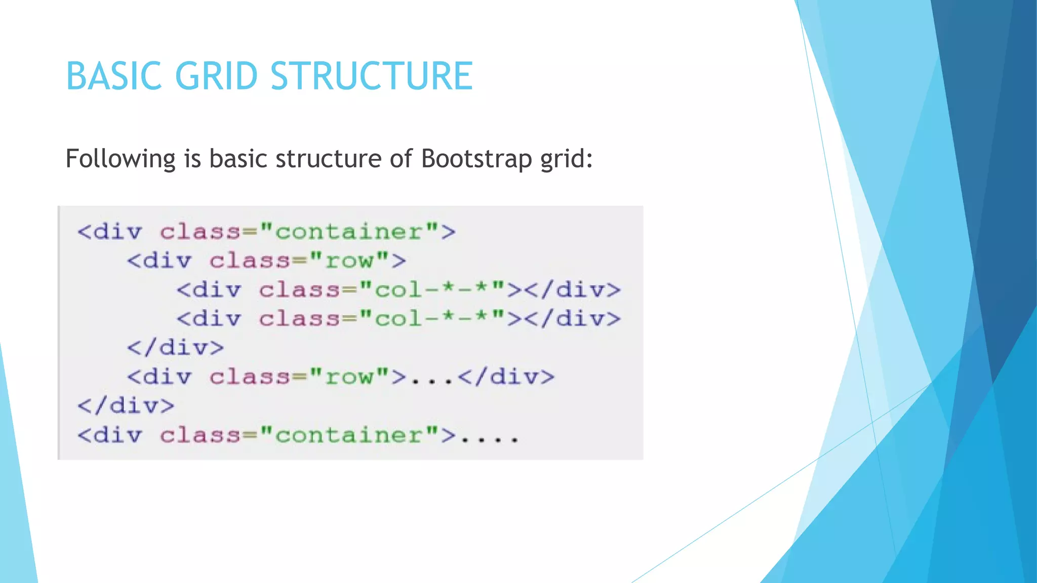
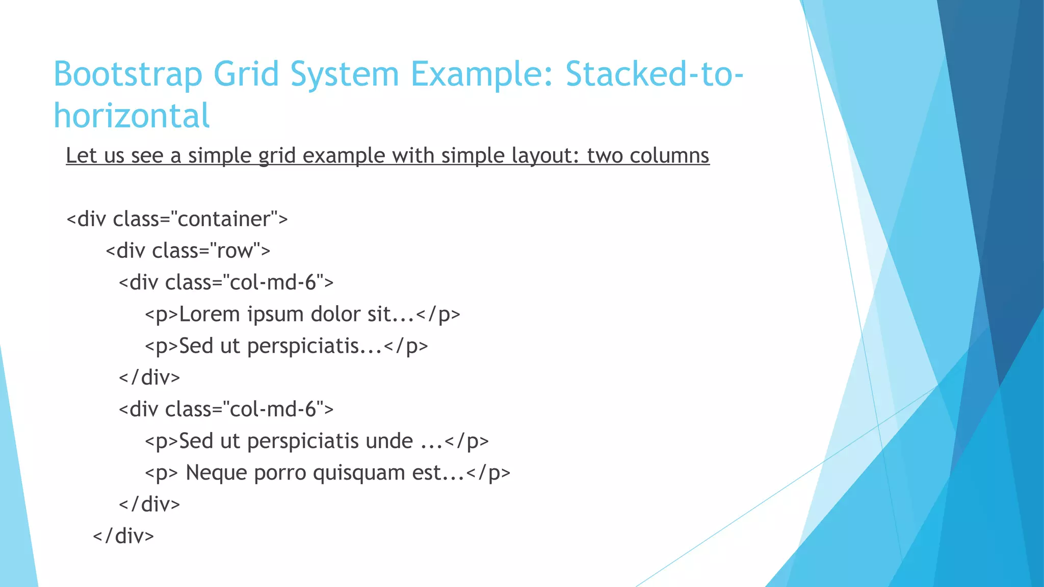
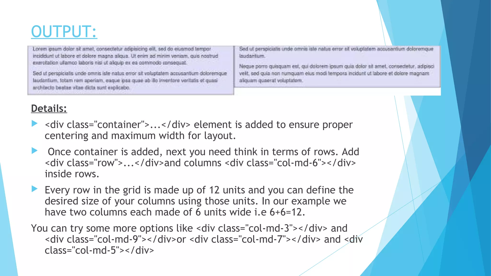
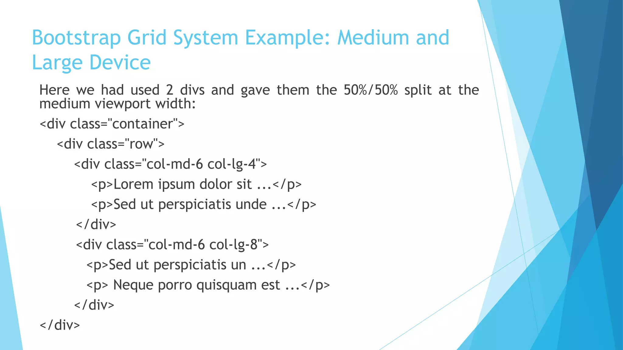
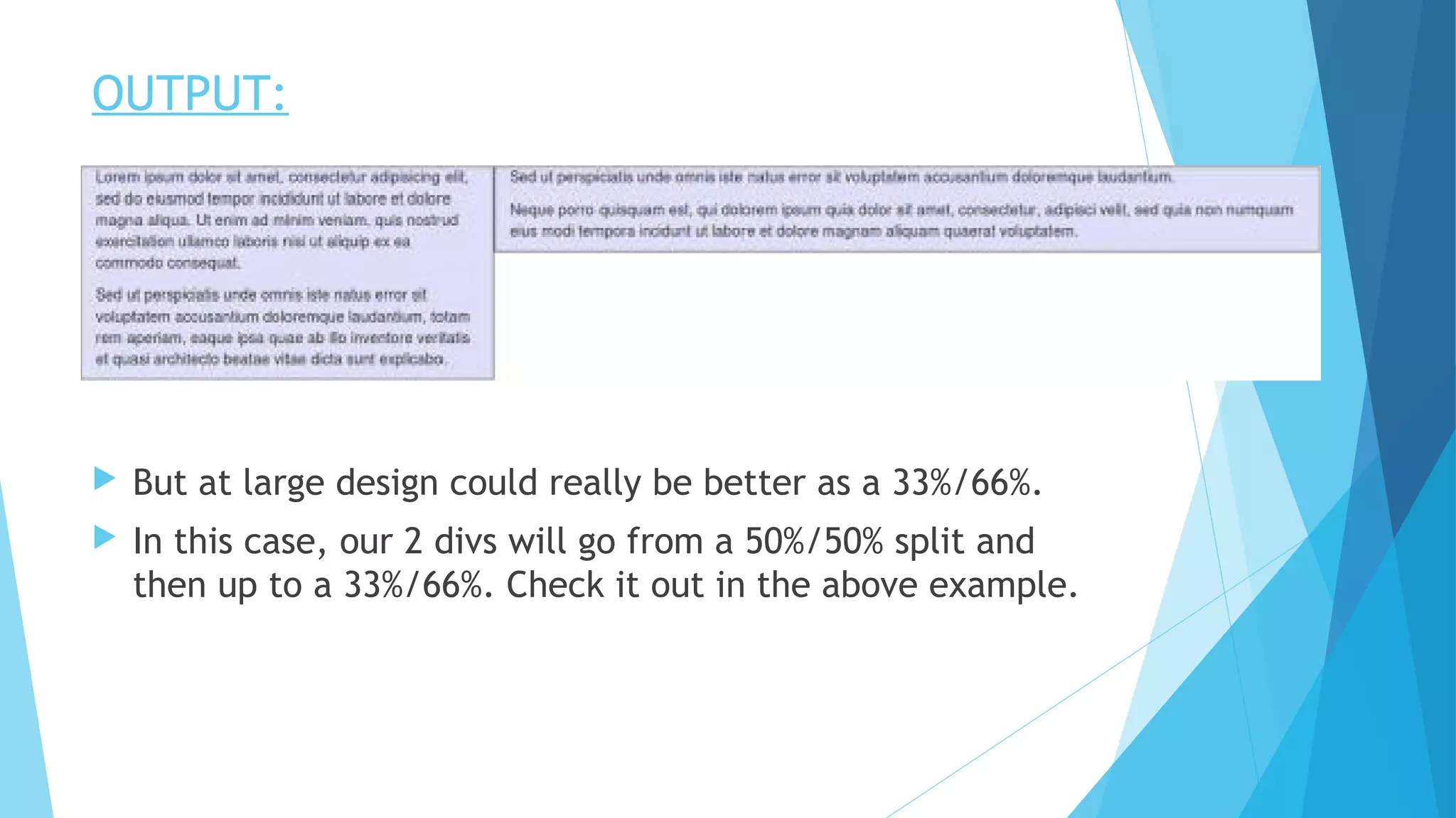
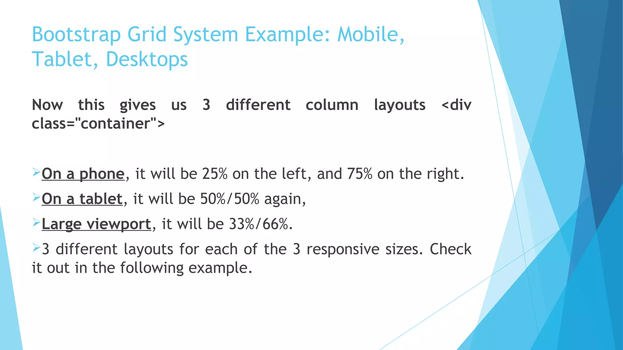
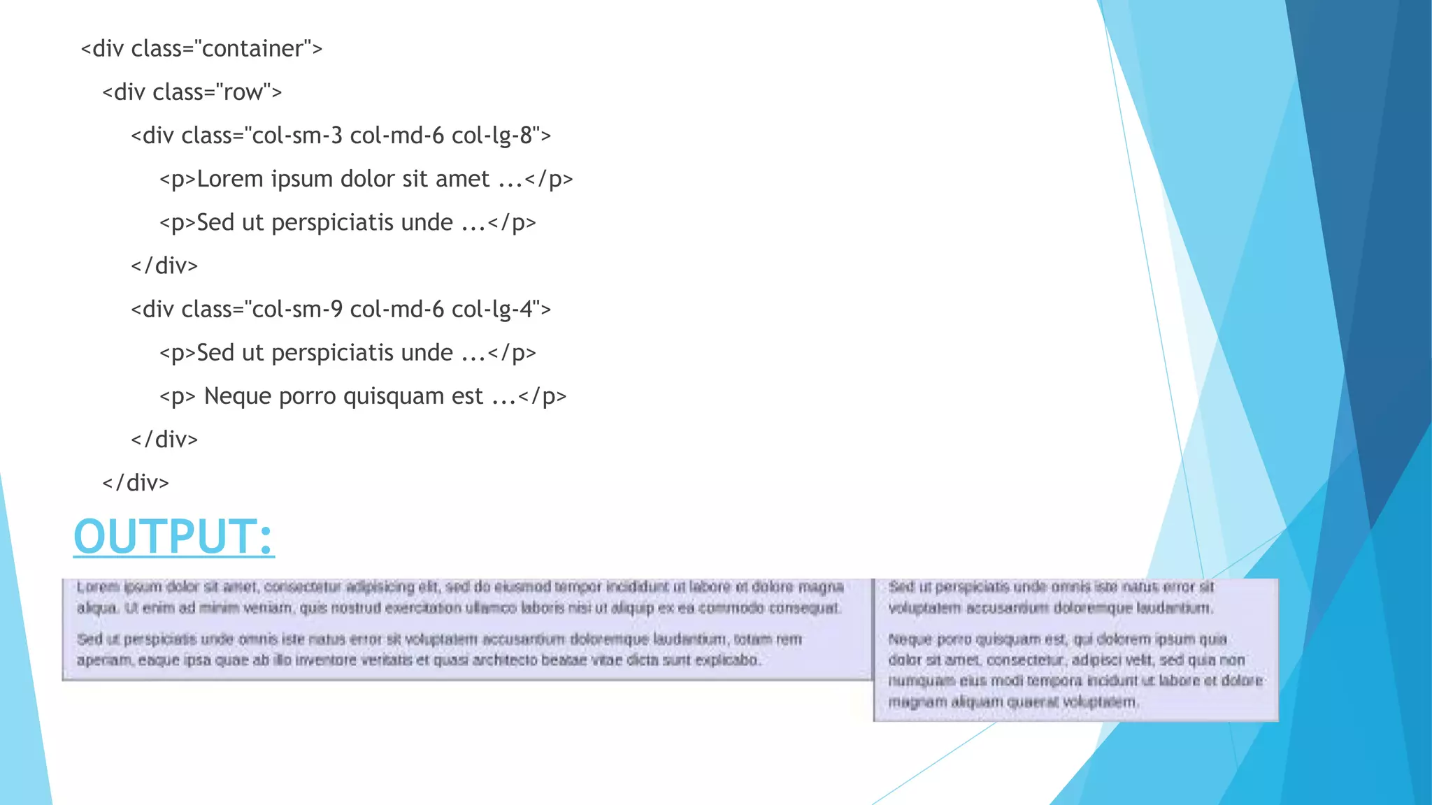
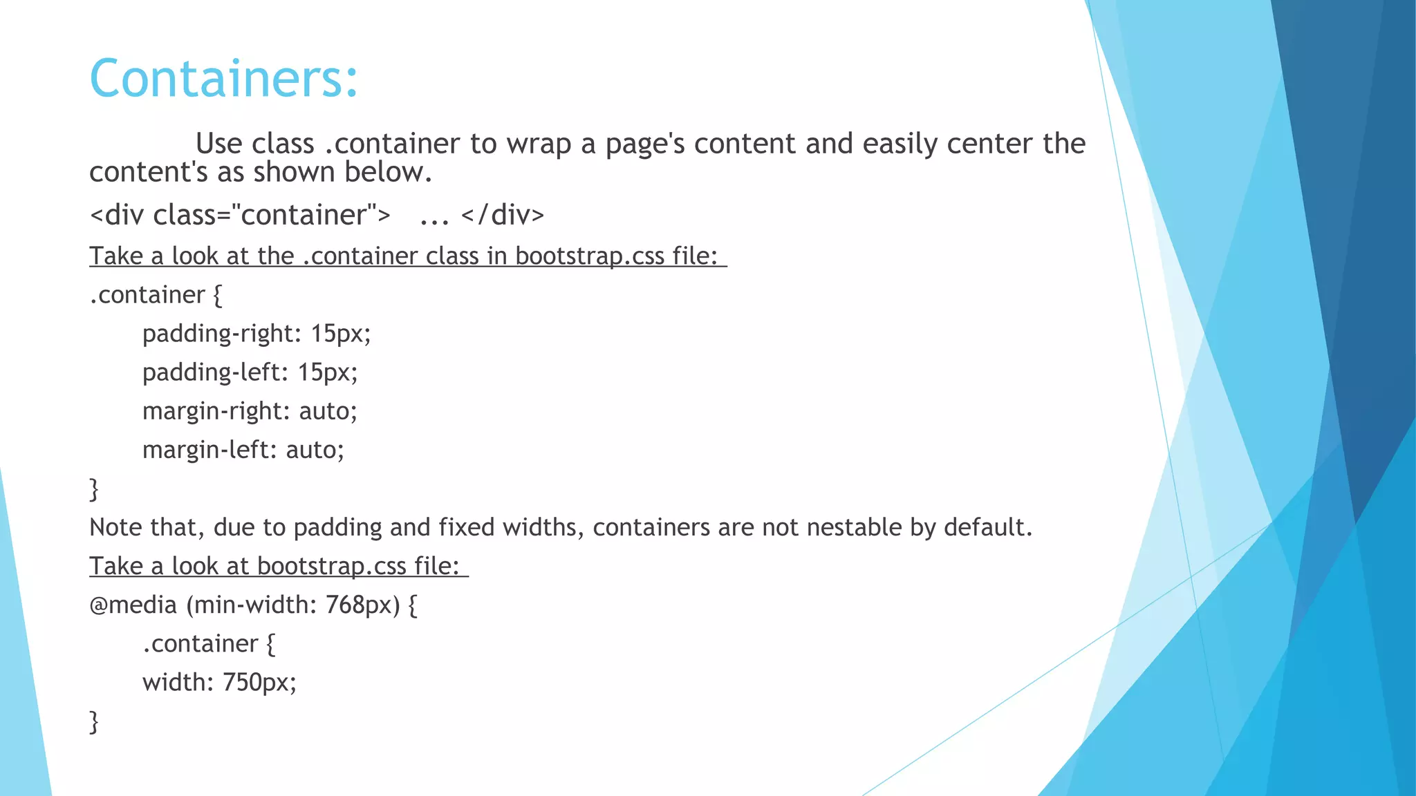
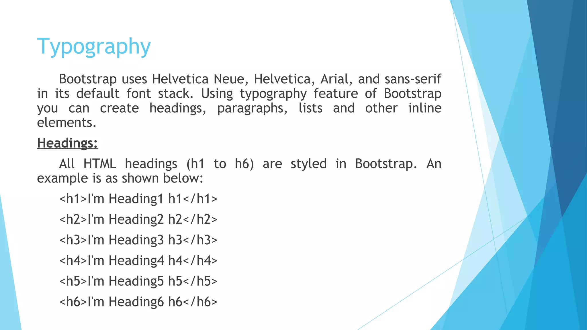
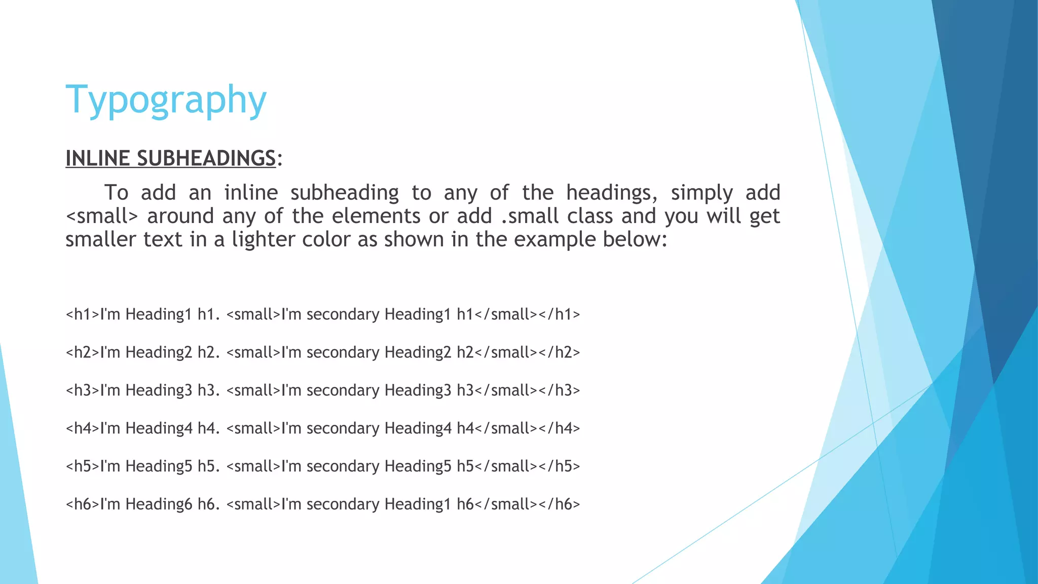
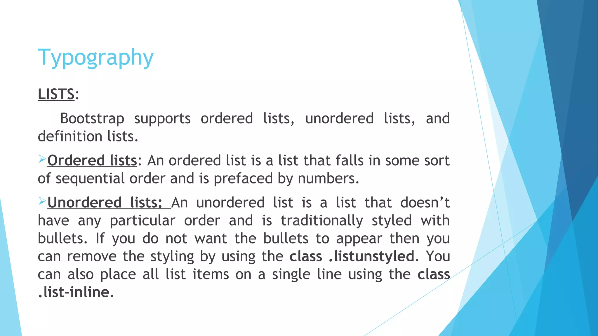
Bootstrap is a popular front-end framework that provides responsive grid system, prebuilt components, and plugins for developing responsive mobile-first websites and web applications. It includes HTML and CSS templates for typography, forms, buttons, navigation and other interface components as well as optional JavaScript plugins. The document discusses Bootstrap's grid system which uses rows and columns to build layouts responsive across devices, and provides examples of basic grid structures for stacking columns horizontally and creating different layouts for mobile, tablet and desktop screens.

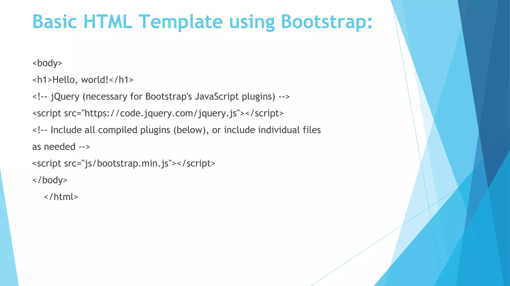
![Basic HTML Template using Bootstrap:
<!DOCTYPE html>
<html>
<head>
<title>Bootstrap 101 Template</title>
<meta name="viewport" content="width=device-width, initial-scale=1.0">
<!-- Bootstrap -->
<link href="css/bootstrap.min.css" rel="stylesheet">
<!-- HTML5 Shim and Respond.js IE8 support of HTML5 elements and media
queries -->
<!-- WARNING: Respond.js doesn't work if you view the page
TUTORIALS POINT
Simply Easy Learningvia file:// -->
<!--[if lt IE 9]>
<script src="https://oss.maxcdn.com/libs/html5shiv/3.7.0/
html5shiv.js"></script>
<script src="https://oss.maxcdn.com/libs/respond.js/1.3.0/
respond.min.js"></script>
<![endif]-->
</head>](https://image.slidesharecdn.com/introduction-to-bootstrap-170713030030/75/Introduction-to-BOOTSTRAP-10-2048.jpg)


![Bootstrap [part 1]](https://cdn.slidesharecdn.com/ss_thumbnails/bootstrappart-11-170208154053-thumbnail.jpg?width=640&height=640&fit=bounds)


