Bootstrap
Front-end framework
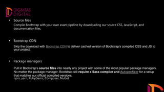
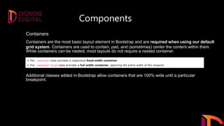
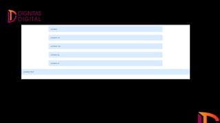
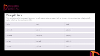
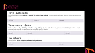
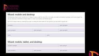
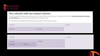
Bootstrap is a free and open-source CSS framework directed at responsive, mobile-first front-end web
development. It contains CSS- and JavaScript-based design templates for typography, forms, buttons,
navigation, and other interface components.
Bootstrap was developed by Mark Otto and Jacob Thornton at Twitter, and released as an open
source product in August 2011 on
Bootstrap 3 vs. Bootstrap 4
Bootstrap 4 is the newest version of Bootstrap; with new components, faster stylesheet and more
responsiveness.
Bootstrap 4 supports the latest, stable releases of all major browsers and platforms. However,
Internet Explorer 9 and down is not supported.
If you require IE8-9 support, use Bootstrap 3. It is the most stable version of Bootstrap, and it is still
supported by the team for critical bugfixes and documentation changes. However, no new features will be
added to it.
Droppped icon support: Bootstrap 4 does not support BS3 Glyphicons. Use Font-Awesome or other icon
libraries instead.
The way of uses.
• Source files
• Bootstrap CDN
• Package managers
• Source files
• Bootstrap CDN
• Package managers
Compile Bootstrap with your own asset pipeline by downloading our source CSS, JavaScript, and
documentation files.
Skip the download with Bootstrap CDN to deliver cached version of Bootstrap’s compiled CSS and JS to
your project.
Pull in Bootstrap’s source files into nearly any project with some of the most popular package managers.
No matter the package manager, Bootstrap will require a Sass compiler and Autoprefixer for a setup
that matches our official compiled versions.
npm, yarn, RubyGems, Composer, NuGet
Components
Containers
Containers are the most basic layout element in Bootstrap and are required when using our default
grid system. Containers are used to contain, pad, and (sometimes) center the content within them.
While containers can be nested, most layouts do not require a nested container.
1.The .container class provides a responsive fixed width container
2.The .container-fluid class provides a full width container, spanning the entire width of the viewport
Additional classes added in Bootstrap allow containers that are 100% wide until a particular
breakpoint.
THANK YOU!

Bootstrap By Shafeeq

  • 1.
  • 2.
    Bootstrap is afree and open-source CSS framework directed at responsive, mobile-first front-end web development. It contains CSS- and JavaScript-based design templates for typography, forms, buttons, navigation, and other interface components. Bootstrap was developed by Mark Otto and Jacob Thornton at Twitter, and released as an open source product in August 2011 on
  • 3.
    Bootstrap 3 vs.Bootstrap 4 Bootstrap 4 is the newest version of Bootstrap; with new components, faster stylesheet and more responsiveness. Bootstrap 4 supports the latest, stable releases of all major browsers and platforms. However, Internet Explorer 9 and down is not supported. If you require IE8-9 support, use Bootstrap 3. It is the most stable version of Bootstrap, and it is still supported by the team for critical bugfixes and documentation changes. However, no new features will be added to it. Droppped icon support: Bootstrap 4 does not support BS3 Glyphicons. Use Font-Awesome or other icon libraries instead.
  • 4.
    The way ofuses. • Source files • Bootstrap CDN • Package managers
  • 5.
    • Source files •Bootstrap CDN • Package managers Compile Bootstrap with your own asset pipeline by downloading our source CSS, JavaScript, and documentation files. Skip the download with Bootstrap CDN to deliver cached version of Bootstrap’s compiled CSS and JS to your project. Pull in Bootstrap’s source files into nearly any project with some of the most popular package managers. No matter the package manager, Bootstrap will require a Sass compiler and Autoprefixer for a setup that matches our official compiled versions. npm, yarn, RubyGems, Composer, NuGet
  • 6.
    Components Containers Containers are themost basic layout element in Bootstrap and are required when using our default grid system. Containers are used to contain, pad, and (sometimes) center the content within them. While containers can be nested, most layouts do not require a nested container. 1.The .container class provides a responsive fixed width container 2.The .container-fluid class provides a full width container, spanning the entire width of the viewport Additional classes added in Bootstrap allow containers that are 100% wide until a particular breakpoint.
  • 13.