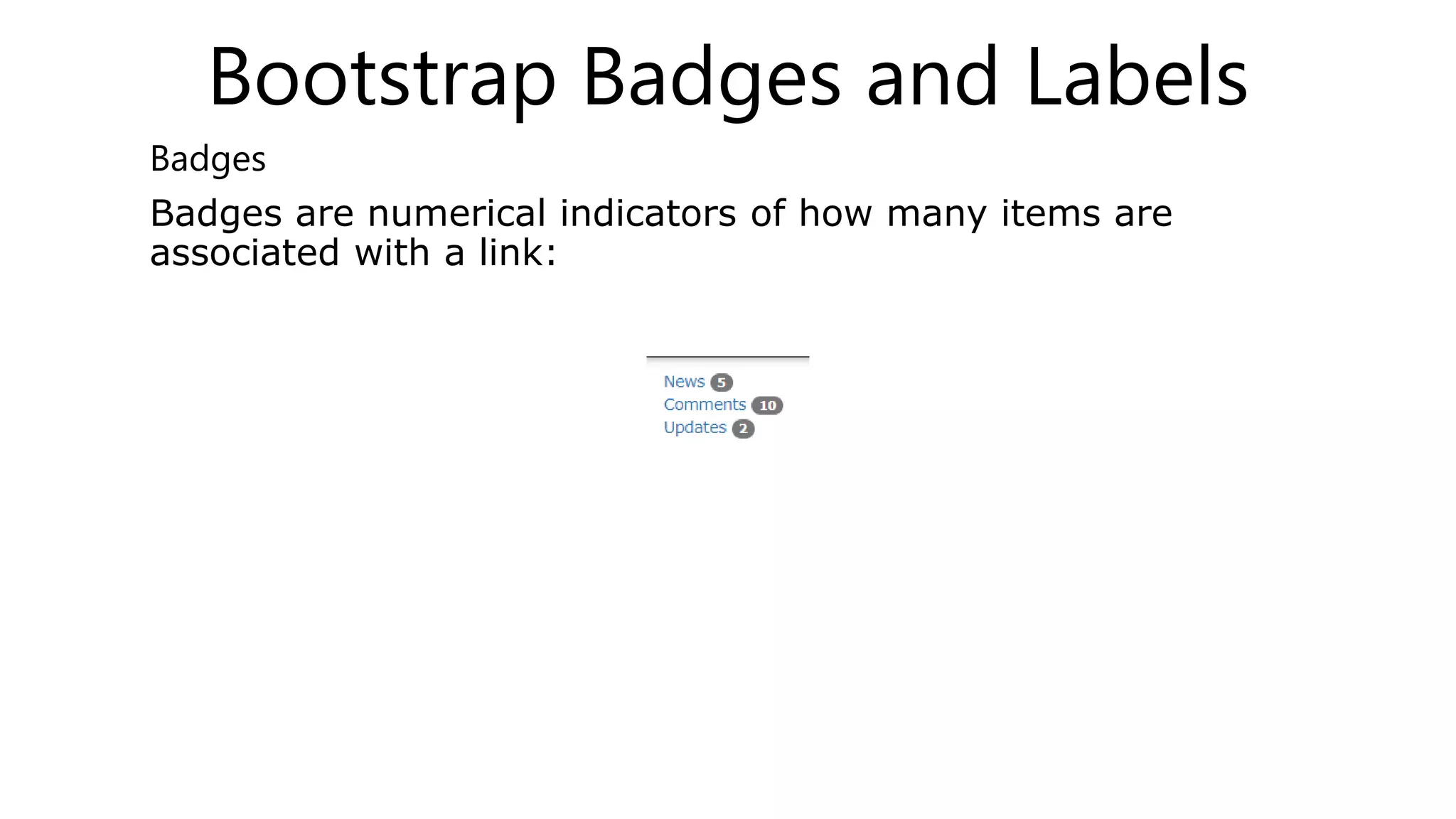
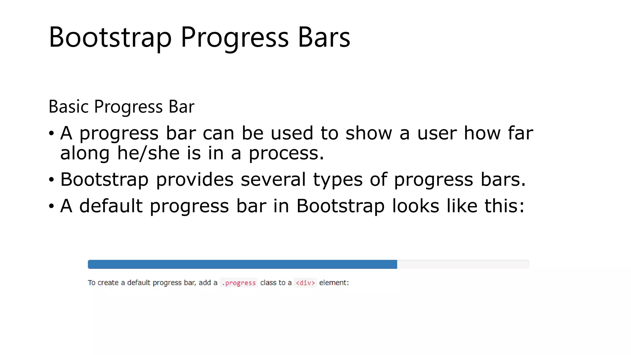
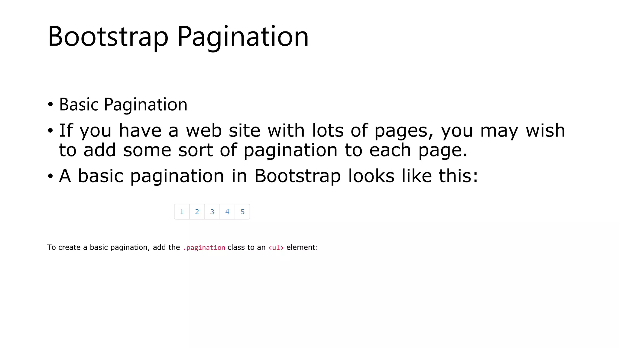
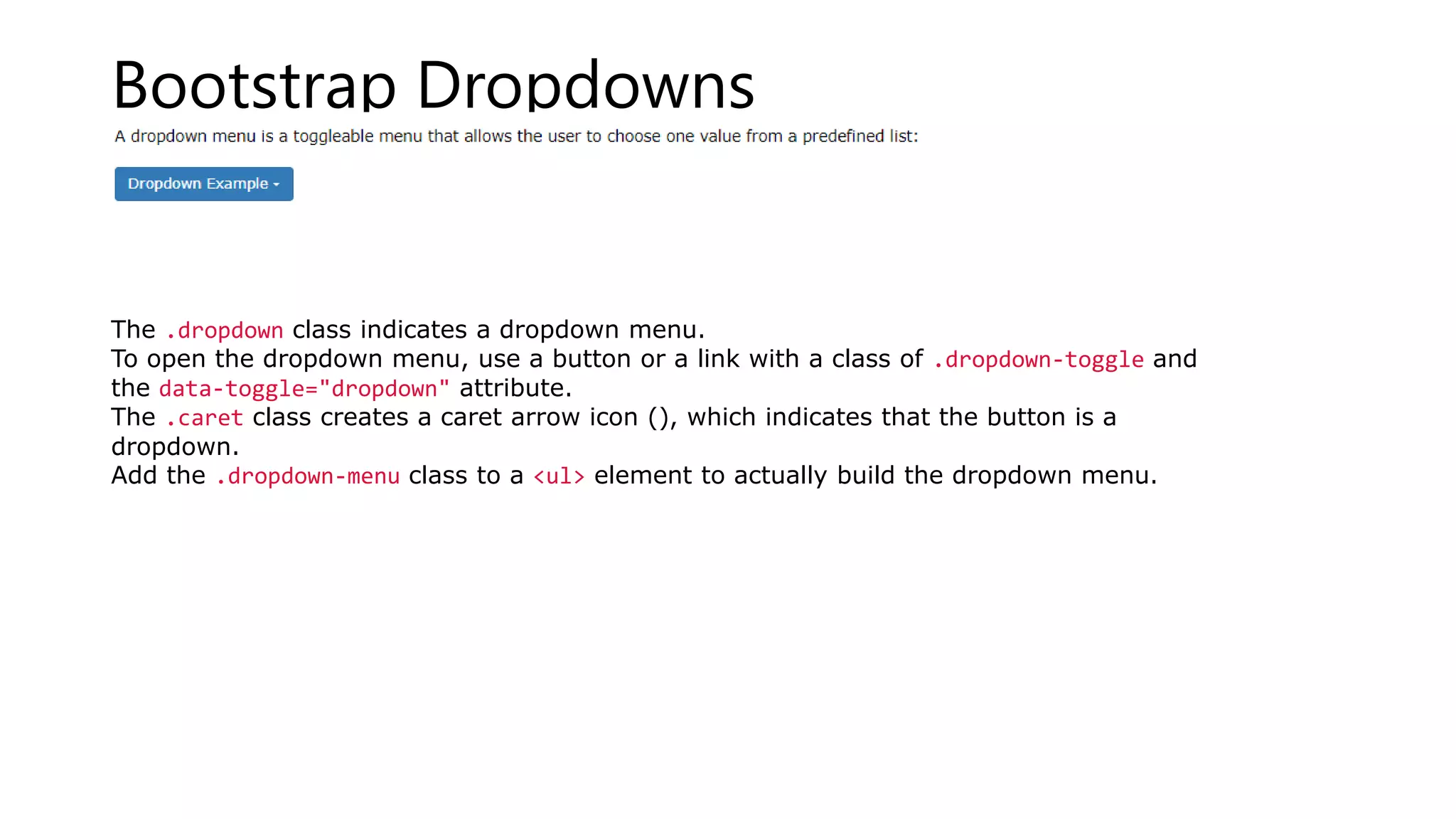
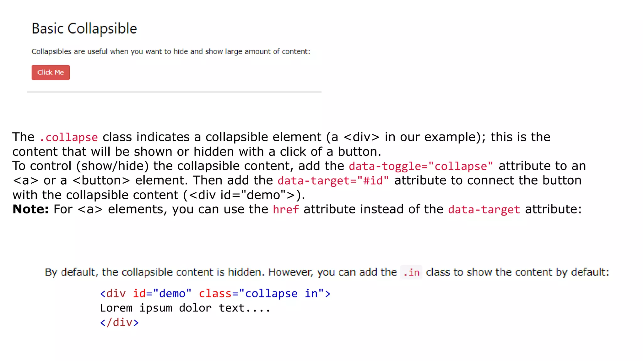
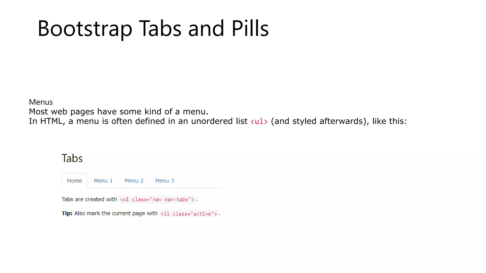
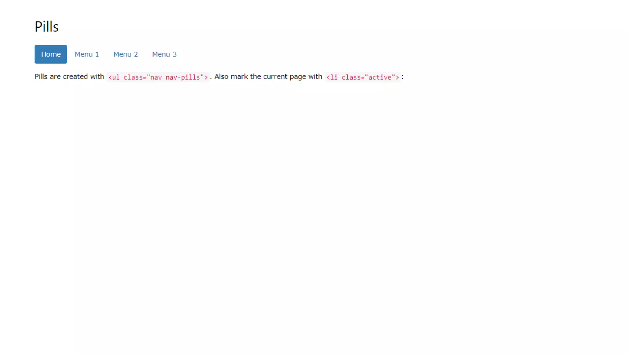
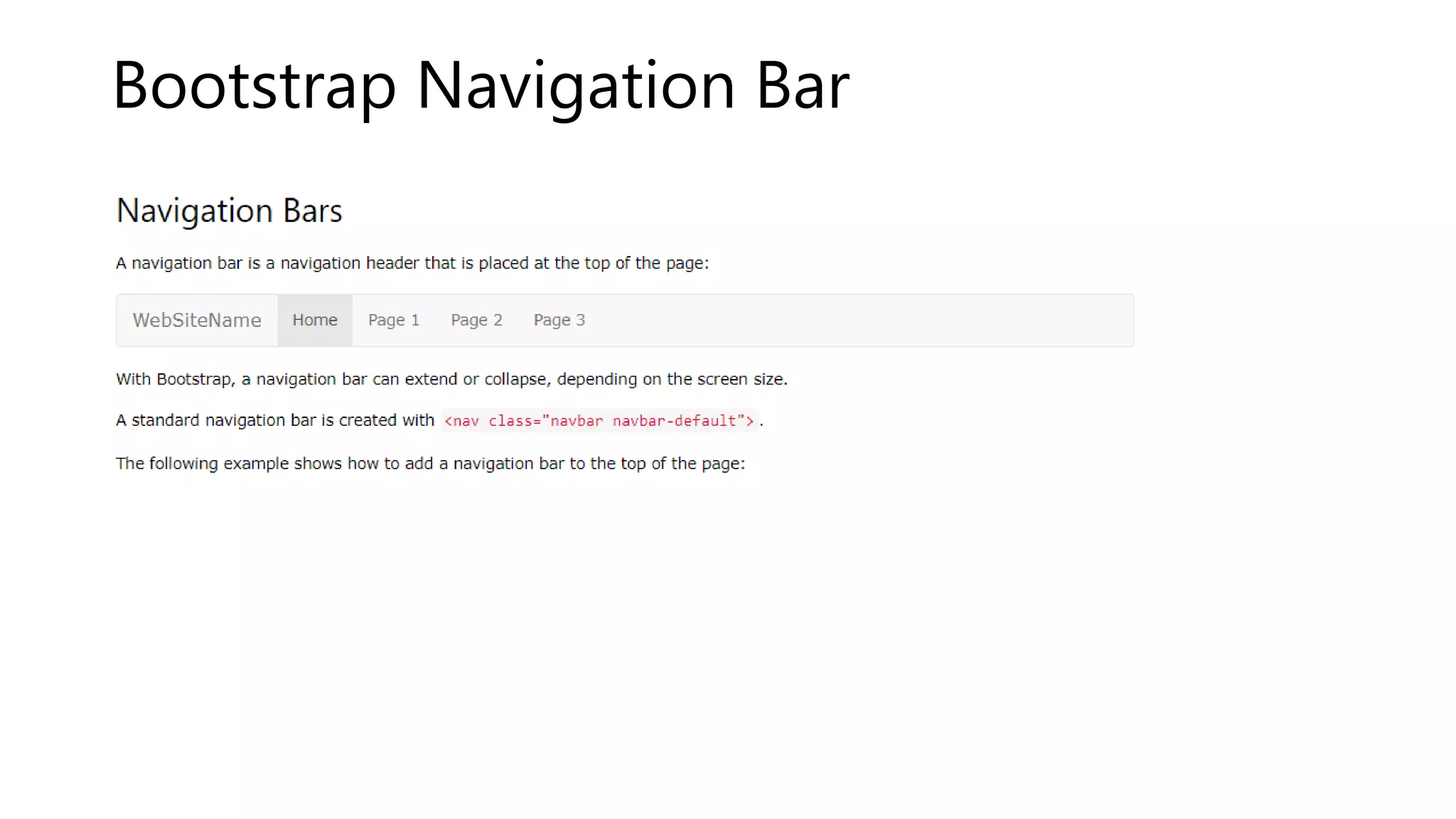
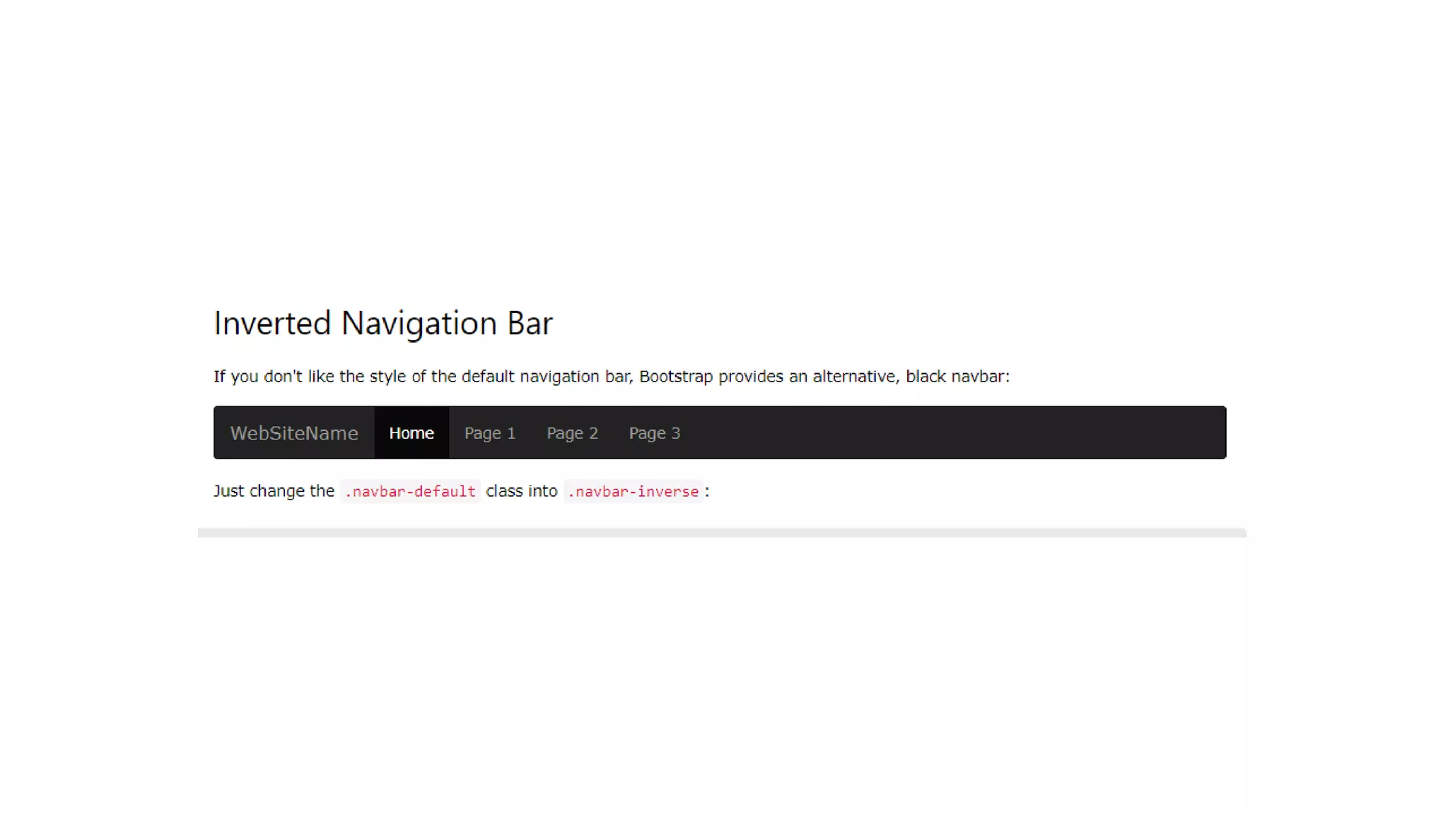
Bootstrap Badges and Labels
Badges
Badges are numerical indicators of how many items are
associated with a link:
Bootstrap Progress Bars
Basic Progress Bar
• A progress bar can be used to show a user how far
along he/she is in a process.
• Bootstrap provides several types of progress bars.
• A default progress bar in Bootstrap looks like this:
•
• Progress Bar With Label
• A progress bar with a label looks like this:
Bootstrap Pagination
• Basic Pagination
• If you have a web site with lots of pages, you may wish
to add some sort of pagination to each page.
• A basic pagination in Bootstrap looks like this:
To create a basic pagination, add the .pagination class to an <ul> element:
Bootstrap Pager
Pager is also a form of pagination (as described in
the previous chapter).
Pager provides previous and next buttons (links).
To create previous/next buttons, add the .pager class
to an <ul> element:
Bootstrap Dropdowns
The .dropdown class indicates a dropdown menu.
To open the dropdown menu, use a button or a link with a class of .dropdown-toggle and
the data-toggle="dropdown" attribute.
The .caret class creates a caret arrow icon (), which indicates that the button is a
dropdown.
Add the .dropdown-menu class to a <ul> element to actually build the dropdown menu.
The .collapse class indicates a collapsible element (a <div> in our example); this is the
content that will be shown or hidden with a click of a button.
To control (show/hide) the collapsible content, add the data-toggle="collapse" attribute to an
<a> or a <button> element. Then add the data-target="#id" attribute to connect the button
with the collapsible content (<div id="demo">).
Note: For <a> elements, you can use the href attribute instead of the data-target attribute:
<div id="demo" class="collapse in">
Lorem ipsum dolor text....
</div>
Bootstrap Tabs and Pills
Menus
Most web pages have some kind of a menu.
In HTML, a menu is often defined in an unordered list <ul> (and styled afterwards), like this:
Bootstrap Navigation Bar
Bootstrap Badges and Labels.pptx

Bootstrap Badges and Labels.pptx

  • 1.
    Bootstrap Badges andLabels Badges Badges are numerical indicators of how many items are associated with a link:
  • 3.
    Bootstrap Progress Bars BasicProgress Bar • A progress bar can be used to show a user how far along he/she is in a process. • Bootstrap provides several types of progress bars. • A default progress bar in Bootstrap looks like this: •
  • 4.
    • Progress BarWith Label • A progress bar with a label looks like this:
  • 5.
    Bootstrap Pagination • BasicPagination • If you have a web site with lots of pages, you may wish to add some sort of pagination to each page. • A basic pagination in Bootstrap looks like this: To create a basic pagination, add the .pagination class to an <ul> element:
  • 6.
    Bootstrap Pager Pager isalso a form of pagination (as described in the previous chapter). Pager provides previous and next buttons (links). To create previous/next buttons, add the .pager class to an <ul> element:
  • 7.
    Bootstrap Dropdowns The .dropdownclass indicates a dropdown menu. To open the dropdown menu, use a button or a link with a class of .dropdown-toggle and the data-toggle="dropdown" attribute. The .caret class creates a caret arrow icon (), which indicates that the button is a dropdown. Add the .dropdown-menu class to a <ul> element to actually build the dropdown menu.
  • 8.
    The .collapse classindicates a collapsible element (a <div> in our example); this is the content that will be shown or hidden with a click of a button. To control (show/hide) the collapsible content, add the data-toggle="collapse" attribute to an <a> or a <button> element. Then add the data-target="#id" attribute to connect the button with the collapsible content (<div id="demo">). Note: For <a> elements, you can use the href attribute instead of the data-target attribute: <div id="demo" class="collapse in"> Lorem ipsum dolor text.... </div>
  • 9.
    Bootstrap Tabs andPills Menus Most web pages have some kind of a menu. In HTML, a menu is often defined in an unordered list <ul> (and styled afterwards), like this:
  • 11.