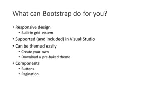
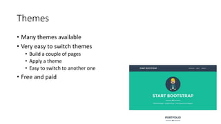
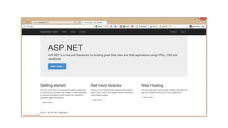
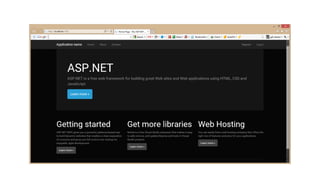
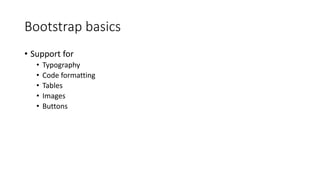
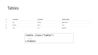
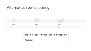
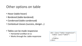
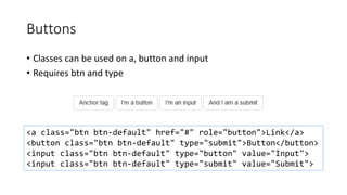
Bootstrap: The Full Overview
Gill Cleeren - @gillcleeren
Hi, I’m Gill!
Gill Cleeren
MVP and Regional Director
.NET Practice Manager @ Ordina
Trainer & speaker
@gillcleeren
gill@snowball.be
I’m a Pluralsight author!
• Courses on Windows 8, social and HTML5
• http://gicl.me/mypscourses
Agenda
Hello Bootstrap – the 30.000 feet overview
The Grid system
Bootstrap basics
Components
Bootstrap and Forms
Bootstrap and Visual Studio
A little bit of JavaScript
Hello Bootstrap
The 30.000 feet overview
A word about design
• Developers aren’t designers
• Often, we don’t have a designer in the project team
• This can be the result…
Looking at sites…
Header
Content
Footer
However…
• Writing CSS isn’t always easy
• Cross-browser can be a challenge
• Developers want to focus on the non-visual part
• Developers loved tables…
What is Bootstrap?
• Open source
• Composed of CSS
• And some JavaScript
• Most of the common needs are covered
Demo
GetBootstrap.com
What can Bootstrap do for you?
• Responsive design
• Built-in grid system
• Supported (and included) in Visual Studio
• Can be themed easily
• Create your own
• Download a pre-baked theme
• Components
• Buttons
• Pagination
Responsive Layout
Responsive Layout
Visual Studio – Class IntelliSense
Visual Studio – Missing Class Detection
Demo
Visual Studio & Bootstrap
Themes
• Many themes available
• Very easy to switch themes
• Build a couple of pages
• Apply a theme
• Easy to switch to another one
• Free and paid
Demo
Getting themes in Bootstrap
The Bootstrap Grid System
It all starts with a container…
• Bootstrap requires a containing element to contain site contents
• Grid system will be built from there
• Can be .container or .container-fluid
<div class="container">
...
</div>
The Bootstrap Grid system
• Bootstrap does its layout based on a Grid
• Grid always has 12 columns – always
• In fact, you can change it… But why would you?
• Bootstrap comes with 4 grids
• Each grid targets a different screen size
• Available grids
• Extra small (less than 768px)
• Small (768px-991px)
• Medium (991px-1200px)
• Large (1200px and higher)
Available grids in Bootstrap
Extra Small
Small
Large
Medium
Grid concepts
• Row & col
• Row
• Horizontal container (of 12 cols)
• Columns are named
• col-<grid size>-<content size>
• Example:
• col-lg-8: large, use 8 columns
• col-sm-4: small, use 4 columns
• Different classes can be combined
• Rows can be nested
<div class="row">
<div class="col-md-6">
</div>
</div>
<div class="row">
<div class="col-lg-4">
</div>
</div>
<div class="row">
<div class="col-xs-6">
</div>
</div>
<div class="row">
<div class="col-sm-6">
</div>
</div>
The Grid in action
col-xx-6 col-xx-6
col-xx-4 col-xx-4 col-xx-4
col-xx-3 col-xx-3 col-xx-6
col-xx-2 col-xx-2 col-xx-2 col-xx-2 col-xx-2 col-xx-2
col-xx-10 col-xx-2
Defining columns for 1 grid
<div class="row">
<div class="col-md-8">
<h2>Hello, I want 8 columns please!</h2>
</div>
<div class="col-md-4">
<h2>I'll take 4 if that's OK...</h2>
</div>
</div>
Combining grids
col-lg-6 col-lg-6
col-lg-4 col-md-4 col-sm-4 col-lg-4 col-md-4 col-sm-4 col-lg-4 col-md-4 col-sm-4
col-md-8 col-md-4
Combining grids
<div class="row">
<div class="col-md-8 col-xs-8">
<h2>Hello, I want 8 columns please!</h2>
</div>
<div class="col-md-4 col-xs-4">
<h2>I'll take 4 if that's OK...</h2>
</div>
</div>
Demo
The Grid system
Offsets in rows
• Offset
• Used to leave some cells blank
• Pull
• Allows to move an item to the left (pull to left)
• Push
• Allows to move an item to the right (push to right)
Grid offsets
col-lg-6 col-lg-6
col-xx-4 col-xx-offset-4
col-md-8 col-md-4
Grid offsets
<div class="row">
<div class="col-md-4 col-xs-8 col-md-offset-4">
<h2>Hello, I want 8 columns please!</h2>
</div>
<div class="col-md-4 col-xs-4">
<h2>
I'll take 4 if that's OK...
</h2>
</div>
</div>
Push and pull
<div class="row">
<div class="col-md-8 col-xs-8 col-md-push-4">
<h2>Hello, I'm on the left but want to go to the right!</h2>
</div>
<div class="col-md-4 col-xs-4 col-md-pull-8">
<h2>I'm on the right but would like to go to the left</h2>
</div>
</div>
Demo
Working with offsets, push & pull
Playing with visibility
• 2 options
• Hidden
• Visible by default
• Visible
• Hidden by default
Visible and hidden
<div class="row">
<div class="col-md-4 hidden-xs">
<h2>Hello, you can see me!</h2>
</div>
<div class="col-md-4 col-xs-4 col-md-offset-4">
<h2>I'll always be here...</h2>
</div>
</div>
Demo
Playing with visibility
Bootstrap basics
Bootstrap basics
• Support for
• Typography
• Code formatting
• Tables
• Images
• Buttons
Typography
• Bootstrap uses built-in font
• Can be customized
• Headings are supported via <h1>  <h6> (or .h1 classes)
<h1>h1. A heading</h1>
<h2>h2. A smaller heading</h2>
Typography
• Also supported
• Marked text
• Deleted text
• Strikethrough text
• Inserted text
• Underlined text
• Alignment of text
• text-left
• text-center
• text-right
Hi I’m <mark>Mark</mark>.
<del>I’m sadly deleted</del>
<s>Strike!!!</s>
<u>Look, there’s a line below me!</u>
<p class="text-left">Left text.</p>
<p class="text-center">Center text.</p>
<p class="text-right">Right text.</p>
Typography
• Casing
• text-lowercase
• text-capitalize
• Lists (ul and ol)
• And more…
<p class="text-lowercase">lower.</p>
<p class="text-uppercase">Upper.</p>
<p class="text-capitalize">Caps!!!!!.</p>
Demo
Typography
Tables
• Table support (data, not layout)
• Available through the .table class
• Typically used for calendars, data tables
• List of actors in a movie
• Multiple rows and columns
<table class="table">...</table>
Tables
<table class="table">
...
</table>
Alternative row colouring
<table class="table table-striped">
...
</table>
Other options on table
• Hover (table-hover)
• Bordered (table-bordered)
• Condensed (table-condensed)
• Contextual classes (success, danger…)
• Tables can be made responsive
• Horizontal scrollbar on xs
• Works through the .table-responsive
<div class="table-responsive">
<table class="table">
...
</table>
</div>
DEMO
Working with tables
Buttons
• Classes can be used on a, button and input
• Requires btn and type
<a class="btn btn-default" href="#" role="button">Link</a>
<button class="btn btn-default" type="submit">Button</button>
<input class="btn btn-default" type="button" value="Input">
<input class="btn btn-default" type="submit" value="Submit">
Buttons
• More options exist
<button type="button" class="btn btn-success">Success</button>
<button type="button" class="btn btn-primary">Primary</button>
Buttons
• Can be sized as well
<button type="button" class="btn btn-default btn-lg">Large</button>
<button type="button" class="btn btn-primary btn-sm">Small</button>
Demo
Buttons
DEMO
Responsive images
• Images can be made responsive using .img-responsive
• Applies max-width: 100%;, height: auto; and display: block; to the image
• Images can also be shaped
<img src="..." class="img-responsive" alt="Responsive image">
<img src="..." alt="..." class="img-rounded">
<img src="..." alt="..." class="img-circle">
<img src="..." alt="..." class="img-thumbnail">
Demo
Images
Bootstrap components
Why would we use Bootstrap components?
• Looking good by default
• They are “themeable”
• Can be replacement for many server-controls
Available components
• Glyphicons
• Dropdowns
• Button groups
• Button dropdowns
• Input groups
• Navs
• Tabs
• Pills
• Navbar
• Breadcrumbs
• Pagination
• Labels
• Badges
• Jumbotron
• Page header
• Thumbnails
• Alerts
• Progress bars
• List group
• Panels
• And a couple more
Glyphicons
• Over 250 glyphs in font
format
• Resolution-independent
<span
class="glyphicon glyphicon-search" >
</span>
Glyphicons
<button type="button" class="btn btn-default" >
<span class="glyphicon glyphicon-align-right" ></span>
</button>
<button type="button" class="btn btn-default btn-lg">
<span class="glyphicon glyphicon-bell"></span> Bell
</button>
Dropdowns
<div class="dropdown">
<button class="btn btn-default dropdown-toggle" type="button" id="dropdownMenu1"
data-toggle="dropdown">
Select a value
<span class="caret"></span>
</button>
<ul class="dropdown-menu" role="menu">
<li role="presentation"><a role="menuitem" tabindex="-1" href="#">1</a></li>
<li role="presentation"><a role="menuitem" tabindex="-1" href="#">2</a></li>
...
</ul>
</div>
Button groups
<div class="btn-group" role="group">
<button type="button" class="btn btn-default">Option 1</button>
<button type="button" class="btn btn-default">Option 2</button>
<button type="button" class="btn btn-default">Option 3</button>
</div>
Nav
<ul class="nav nav-tabs">
<li role="presentation" class="active"><a href="#">Home</a></li>
<li role="presentation"><a href="#">Profile</a></li>
<li role="presentation"><a href="#">Messages</a></li>
</ul>
Pagination <nav>
<ul class="pagination">
<li class="disabled">
<a href="#">
<span>&laquo;</span>
</a>
</li>
<li><a href="#">1</a></li>
<li><a href="#">2</a></li>
...
<li>
<a href="#" >
<span>&raquo;</span>
</a>
</li>
</ul>
</nav>
Jumbotron
Jumbotron
<div class="jumbotron">
<h1>Welcome to Joe's Coffee Store</h1>
<p><a class="btn btn-primary btn-lg"
href="#" role="button">See all our coffees</a></p>
</div>
Panels
<div class="panel panel-default">
<div class="panel-heading">Your shopping basket</div>
<div class="panel-body">
Basket content goes here
</div>
</div>
DEMO: Bootstrap components
Bootstrap and Forms
Working with forms in Bootstrap
• HTML5 has added more functionality
• Many new inputs
• Placeholders
• Extra arguments
• Bootstrap can be used to enhance functionality
• Display forms vertically
• Main classes
• form-group
• form-control
Form example
<form>
<div class="form-group">
<label for="exampleInputEmail1">Email address</label>
<input type="email" class="form-control" id="exampleInputEmail1" ></div>
<div class="form-group">
<label for="exampleInputPassword1">Password</label>
<input type="password" class="form-control" id="exampleInputPassword1" >
</div>
<div class="form-group">
<label for="exampleInputFile">File input</label>
<input type="file" id="exampleInputFile">
<p class="help-block">All files should be less than 1Mb.</p>
</div>
<div class="checkbox">
<label>
<input type="checkbox"> Public image
</label>
</div>
<button type="submit" class="btn btn-default">Submit</button>
</form>
Result: vertical form
Horizontal forms
<form class="form-horizontal">
<div class="form-group">
<label for="inputEmail3" class="col-sm-2 control-label">Email</label>
<div class="col-sm-10">
<input type="email" class="form-control" id="inputEmail3">
</div>
</div>
<div class="form-group">
<label for="inputPassword3" class="col-sm-2 control-label">Password</label>
<div class="col-sm-10">
<input type="password" class="form-control" id="inputPassword3" >
</div>
</div>
<div class="form-group">
<div class="col-sm-offset-2 col-sm-10">
<button type="submit" class="btn btn-default">Sign in</button>
</div>
</div>
</form>
Result: horizontal form
Available controls in a form
• Regular input types
• Text area
• Checkboxes
• Radio buttons
• Selects
• Support for validation states
and icons
Demo
Bootstrap and forms
Bootstrap and Visual Studio
Bootstrap comes with every web project
• WebForms and MVC
• CSS
• Glyphicons
• JavaScript files
• Referenced from layout/master files
Demo
Templates in Visual Studio
VS <3 Bootstrap
• IntelliSense on classes
• Missing class detection: enabled via Web Essentials plugin
• Bootstrap Snippet pack: extension
• Bootstrap bundle (template pack): extension
Demo
Plugins and extensions in Visual Studio
A little bit of JavaScript
Bootstrap and JavaScript
• Bootstrap can be enhanced by custom jQuery plugins
• Individual JavaScript file per functionality
• All at once via bootstrap.js (or bootstrap.min.js)
• jQuery is required
• Most functionality is enabled by adding attributes and classes!!
• Available extensions
• Modal dialogs
• Alerts
• Dropdowns
• Tab
Modal dialogs
• Configure dialog using classes
• Structure:
• Container: modal
• Configure dialog: modal-dialog
• Content: modal-content
• Header: modal-header
• Content: modal-body
• Footer: modal-footer
• Configure launcher using classes
• data-toggle="modal"
• data-target="<id>"
• Configure closer
• data-dismiss="modal"
Alerts
• Subtle information
• Background task completed
• Operation on prior page completed
• Added with classes
• alert
• alert-type
• Success
• Info
• Warning
• Danger
Demo
Modal dialogs
Let’s write JavaScript!
Yes!
Are you out of your
mind?
Demo
Alerts
DEMO
Carousel
Summary
• Easy to learn
• Great results
• The way to responsive sites!
Thanks!
Q&A
Bootstrap: The Full Overview
Gill Cleeren - @gillcleeren
Your feedback is important!
Scan the QR Code and let us know via the TechDays App.
Laat ons weten wat u van de sessie vindt via de TechDays App!
Scan de QR Code.
Bent u al lid van de Microsoft Virtual Academy?! Op MVA kunt u altijd iets
nieuws leren over de laatste technologie van Microsoft. Meld u vandaag aan
op de MVA Stand. MVA biedt 7/24 gratis online training on-demand voor IT-
Professionals en Ontwikkelaars.

Bootstrap: the full overview

  • 2.
    Bootstrap: The FullOverview Gill Cleeren - @gillcleeren
  • 3.
    Hi, I’m Gill! GillCleeren MVP and Regional Director .NET Practice Manager @ Ordina Trainer & speaker @gillcleeren gill@snowball.be
  • 4.
    I’m a Pluralsightauthor! • Courses on Windows 8, social and HTML5 • http://gicl.me/mypscourses
  • 5.
    Agenda Hello Bootstrap –the 30.000 feet overview The Grid system Bootstrap basics Components Bootstrap and Forms Bootstrap and Visual Studio A little bit of JavaScript
  • 6.
  • 7.
    A word aboutdesign • Developers aren’t designers • Often, we don’t have a designer in the project team • This can be the result…
  • 10.
  • 13.
    However… • Writing CSSisn’t always easy • Cross-browser can be a challenge • Developers want to focus on the non-visual part • Developers loved tables…
  • 15.
    What is Bootstrap? •Open source • Composed of CSS • And some JavaScript • Most of the common needs are covered
  • 16.
  • 17.
    What can Bootstrapdo for you? • Responsive design • Built-in grid system • Supported (and included) in Visual Studio • Can be themed easily • Create your own • Download a pre-baked theme • Components • Buttons • Pagination
  • 18.
  • 19.
  • 20.
    Visual Studio –Class IntelliSense
  • 21.
    Visual Studio –Missing Class Detection
  • 22.
  • 23.
    Themes • Many themesavailable • Very easy to switch themes • Build a couple of pages • Apply a theme • Easy to switch to another one • Free and paid
  • 26.
  • 27.
  • 28.
    It all startswith a container… • Bootstrap requires a containing element to contain site contents • Grid system will be built from there • Can be .container or .container-fluid <div class="container"> ... </div>
  • 29.
    The Bootstrap Gridsystem • Bootstrap does its layout based on a Grid • Grid always has 12 columns – always • In fact, you can change it… But why would you? • Bootstrap comes with 4 grids • Each grid targets a different screen size • Available grids • Extra small (less than 768px) • Small (768px-991px) • Medium (991px-1200px) • Large (1200px and higher)
  • 30.
    Available grids inBootstrap Extra Small Small Large Medium
  • 31.
    Grid concepts • Row& col • Row • Horizontal container (of 12 cols) • Columns are named • col-<grid size>-<content size> • Example: • col-lg-8: large, use 8 columns • col-sm-4: small, use 4 columns • Different classes can be combined • Rows can be nested <div class="row"> <div class="col-md-6"> </div> </div> <div class="row"> <div class="col-lg-4"> </div> </div> <div class="row"> <div class="col-xs-6"> </div> </div> <div class="row"> <div class="col-sm-6"> </div> </div>
  • 32.
    The Grid inaction col-xx-6 col-xx-6 col-xx-4 col-xx-4 col-xx-4 col-xx-3 col-xx-3 col-xx-6 col-xx-2 col-xx-2 col-xx-2 col-xx-2 col-xx-2 col-xx-2 col-xx-10 col-xx-2
  • 33.
    Defining columns for1 grid <div class="row"> <div class="col-md-8"> <h2>Hello, I want 8 columns please!</h2> </div> <div class="col-md-4"> <h2>I'll take 4 if that's OK...</h2> </div> </div>
  • 34.
    Combining grids col-lg-6 col-lg-6 col-lg-4col-md-4 col-sm-4 col-lg-4 col-md-4 col-sm-4 col-lg-4 col-md-4 col-sm-4 col-md-8 col-md-4
  • 35.
    Combining grids <div class="row"> <divclass="col-md-8 col-xs-8"> <h2>Hello, I want 8 columns please!</h2> </div> <div class="col-md-4 col-xs-4"> <h2>I'll take 4 if that's OK...</h2> </div> </div>
  • 36.
  • 37.
    Offsets in rows •Offset • Used to leave some cells blank • Pull • Allows to move an item to the left (pull to left) • Push • Allows to move an item to the right (push to right)
  • 38.
    Grid offsets col-lg-6 col-lg-6 col-xx-4col-xx-offset-4 col-md-8 col-md-4
  • 39.
    Grid offsets <div class="row"> <divclass="col-md-4 col-xs-8 col-md-offset-4"> <h2>Hello, I want 8 columns please!</h2> </div> <div class="col-md-4 col-xs-4"> <h2> I'll take 4 if that's OK... </h2> </div> </div>
  • 40.
    Push and pull <divclass="row"> <div class="col-md-8 col-xs-8 col-md-push-4"> <h2>Hello, I'm on the left but want to go to the right!</h2> </div> <div class="col-md-4 col-xs-4 col-md-pull-8"> <h2>I'm on the right but would like to go to the left</h2> </div> </div>
  • 41.
  • 42.
    Playing with visibility •2 options • Hidden • Visible by default • Visible • Hidden by default
  • 43.
    Visible and hidden <divclass="row"> <div class="col-md-4 hidden-xs"> <h2>Hello, you can see me!</h2> </div> <div class="col-md-4 col-xs-4 col-md-offset-4"> <h2>I'll always be here...</h2> </div> </div>
  • 44.
  • 45.
  • 46.
    Bootstrap basics • Supportfor • Typography • Code formatting • Tables • Images • Buttons
  • 47.
    Typography • Bootstrap usesbuilt-in font • Can be customized • Headings are supported via <h1>  <h6> (or .h1 classes) <h1>h1. A heading</h1> <h2>h2. A smaller heading</h2>
  • 48.
    Typography • Also supported •Marked text • Deleted text • Strikethrough text • Inserted text • Underlined text • Alignment of text • text-left • text-center • text-right Hi I’m <mark>Mark</mark>. <del>I’m sadly deleted</del> <s>Strike!!!</s> <u>Look, there’s a line below me!</u> <p class="text-left">Left text.</p> <p class="text-center">Center text.</p> <p class="text-right">Right text.</p>
  • 49.
    Typography • Casing • text-lowercase •text-capitalize • Lists (ul and ol) • And more… <p class="text-lowercase">lower.</p> <p class="text-uppercase">Upper.</p> <p class="text-capitalize">Caps!!!!!.</p>
  • 50.
  • 51.
    Tables • Table support(data, not layout) • Available through the .table class • Typically used for calendars, data tables • List of actors in a movie • Multiple rows and columns <table class="table">...</table>
  • 52.
  • 53.
    Alternative row colouring <tableclass="table table-striped"> ... </table>
  • 54.
    Other options ontable • Hover (table-hover) • Bordered (table-bordered) • Condensed (table-condensed) • Contextual classes (success, danger…) • Tables can be made responsive • Horizontal scrollbar on xs • Works through the .table-responsive <div class="table-responsive"> <table class="table"> ... </table> </div>
  • 55.
  • 56.
    Buttons • Classes canbe used on a, button and input • Requires btn and type <a class="btn btn-default" href="#" role="button">Link</a> <button class="btn btn-default" type="submit">Button</button> <input class="btn btn-default" type="button" value="Input"> <input class="btn btn-default" type="submit" value="Submit">
  • 57.
    Buttons • More optionsexist <button type="button" class="btn btn-success">Success</button> <button type="button" class="btn btn-primary">Primary</button>
  • 58.
    Buttons • Can besized as well <button type="button" class="btn btn-default btn-lg">Large</button> <button type="button" class="btn btn-primary btn-sm">Small</button>
  • 59.
  • 60.
    Responsive images • Imagescan be made responsive using .img-responsive • Applies max-width: 100%;, height: auto; and display: block; to the image • Images can also be shaped <img src="..." class="img-responsive" alt="Responsive image"> <img src="..." alt="..." class="img-rounded"> <img src="..." alt="..." class="img-circle"> <img src="..." alt="..." class="img-thumbnail">
  • 61.
  • 62.
  • 63.
    Why would weuse Bootstrap components? • Looking good by default • They are “themeable” • Can be replacement for many server-controls
  • 64.
    Available components • Glyphicons •Dropdowns • Button groups • Button dropdowns • Input groups • Navs • Tabs • Pills • Navbar • Breadcrumbs • Pagination • Labels • Badges • Jumbotron • Page header • Thumbnails • Alerts • Progress bars • List group • Panels • And a couple more
  • 65.
    Glyphicons • Over 250glyphs in font format • Resolution-independent <span class="glyphicon glyphicon-search" > </span>
  • 66.
    Glyphicons <button type="button" class="btnbtn-default" > <span class="glyphicon glyphicon-align-right" ></span> </button> <button type="button" class="btn btn-default btn-lg"> <span class="glyphicon glyphicon-bell"></span> Bell </button>
  • 67.
    Dropdowns <div class="dropdown"> <button class="btnbtn-default dropdown-toggle" type="button" id="dropdownMenu1" data-toggle="dropdown"> Select a value <span class="caret"></span> </button> <ul class="dropdown-menu" role="menu"> <li role="presentation"><a role="menuitem" tabindex="-1" href="#">1</a></li> <li role="presentation"><a role="menuitem" tabindex="-1" href="#">2</a></li> ... </ul> </div>
  • 68.
    Button groups <div class="btn-group"role="group"> <button type="button" class="btn btn-default">Option 1</button> <button type="button" class="btn btn-default">Option 2</button> <button type="button" class="btn btn-default">Option 3</button> </div>
  • 69.
    Nav <ul class="nav nav-tabs"> <lirole="presentation" class="active"><a href="#">Home</a></li> <li role="presentation"><a href="#">Profile</a></li> <li role="presentation"><a href="#">Messages</a></li> </ul>
  • 70.
    Pagination <nav> <ul class="pagination"> <liclass="disabled"> <a href="#"> <span>&laquo;</span> </a> </li> <li><a href="#">1</a></li> <li><a href="#">2</a></li> ... <li> <a href="#" > <span>&raquo;</span> </a> </li> </ul> </nav>
  • 71.
  • 72.
    Jumbotron <div class="jumbotron"> <h1>Welcome toJoe's Coffee Store</h1> <p><a class="btn btn-primary btn-lg" href="#" role="button">See all our coffees</a></p> </div>
  • 73.
    Panels <div class="panel panel-default"> <divclass="panel-heading">Your shopping basket</div> <div class="panel-body"> Basket content goes here </div> </div>
  • 74.
  • 75.
  • 76.
    Working with formsin Bootstrap • HTML5 has added more functionality • Many new inputs • Placeholders • Extra arguments • Bootstrap can be used to enhance functionality • Display forms vertically • Main classes • form-group • form-control
  • 77.
    Form example <form> <div class="form-group"> <labelfor="exampleInputEmail1">Email address</label> <input type="email" class="form-control" id="exampleInputEmail1" ></div> <div class="form-group"> <label for="exampleInputPassword1">Password</label> <input type="password" class="form-control" id="exampleInputPassword1" > </div> <div class="form-group"> <label for="exampleInputFile">File input</label> <input type="file" id="exampleInputFile"> <p class="help-block">All files should be less than 1Mb.</p> </div> <div class="checkbox"> <label> <input type="checkbox"> Public image </label> </div> <button type="submit" class="btn btn-default">Submit</button> </form>
  • 78.
  • 79.
    Horizontal forms <form class="form-horizontal"> <divclass="form-group"> <label for="inputEmail3" class="col-sm-2 control-label">Email</label> <div class="col-sm-10"> <input type="email" class="form-control" id="inputEmail3"> </div> </div> <div class="form-group"> <label for="inputPassword3" class="col-sm-2 control-label">Password</label> <div class="col-sm-10"> <input type="password" class="form-control" id="inputPassword3" > </div> </div> <div class="form-group"> <div class="col-sm-offset-2 col-sm-10"> <button type="submit" class="btn btn-default">Sign in</button> </div> </div> </form>
  • 80.
  • 81.
    Available controls ina form • Regular input types • Text area • Checkboxes • Radio buttons • Selects • Support for validation states and icons
  • 82.
  • 83.
  • 84.
    Bootstrap comes withevery web project • WebForms and MVC • CSS • Glyphicons • JavaScript files • Referenced from layout/master files
  • 85.
  • 86.
    VS <3 Bootstrap •IntelliSense on classes • Missing class detection: enabled via Web Essentials plugin • Bootstrap Snippet pack: extension • Bootstrap bundle (template pack): extension
  • 87.
  • 88.
    A little bitof JavaScript
  • 89.
    Bootstrap and JavaScript •Bootstrap can be enhanced by custom jQuery plugins • Individual JavaScript file per functionality • All at once via bootstrap.js (or bootstrap.min.js) • jQuery is required • Most functionality is enabled by adding attributes and classes!! • Available extensions • Modal dialogs • Alerts • Dropdowns • Tab
  • 90.
    Modal dialogs • Configuredialog using classes • Structure: • Container: modal • Configure dialog: modal-dialog • Content: modal-content • Header: modal-header • Content: modal-body • Footer: modal-footer • Configure launcher using classes • data-toggle="modal" • data-target="<id>" • Configure closer • data-dismiss="modal"
  • 91.
    Alerts • Subtle information •Background task completed • Operation on prior page completed • Added with classes • alert • alert-type • Success • Info • Warning • Danger
  • 92.
    Demo Modal dialogs Let’s writeJavaScript! Yes! Are you out of your mind?
  • 93.
  • 94.
  • 95.
    Summary • Easy tolearn • Great results • The way to responsive sites!
  • 96.
  • 97.
  • 98.
    Bootstrap: The FullOverview Gill Cleeren - @gillcleeren
  • 99.
    Your feedback isimportant! Scan the QR Code and let us know via the TechDays App. Laat ons weten wat u van de sessie vindt via de TechDays App! Scan de QR Code. Bent u al lid van de Microsoft Virtual Academy?! Op MVA kunt u altijd iets nieuws leren over de laatste technologie van Microsoft. Meld u vandaag aan op de MVA Stand. MVA biedt 7/24 gratis online training on-demand voor IT- Professionals en Ontwikkelaars.

Editor's Notes

  • #11 More http://www.wonder-tonic.com/geocitiesizer/content.php?theme=3&music=2&url=microsoft.com http://gizmodo.com/5983574/remember-the-hilarious-horror-of-geocities-with-this-website
  • #15 CSS kan moelijk zijn  lijkt soms op browser te bedriegen We moeten het gebruiken  goed voor change Helpt ook voor screenreaders Browsers kunnen ook lasting zijn Vroeger was het gemakkelijk  2 browsers Nu ook meer browsers en meer scherm resoluties (phone, tablet…) Echte uitdaging CSS is ook uitdaging in tijd om soms alles goed te krijgen Tables waren vaak gebruikt Developers zijn niet altijd bezig met UI
  • #16 Here is the answer what it is Started by Twitter developers Now branched out into separate project Not called twitter bootstrap anymore Heel populair Mobile first en voor responsive apps
  • #18 On the fly demo Ook browser support pagina tonen
  • #19 Responsive: hide/show van kolommen, Kan alles onder elkaar zetten Werkt door grid system  er zijn meerdere grids We creeeren meerdere grids voor verschillende sizes van schermen Components Buttons Modal dialogs We moeten er niet meer naar zoeken! Goeie support voor VS
  • #20 Als devs willen we ons geen zorgen maken over layout en hoe het zich gedraagt op alle schermen Denk ipad, desktop… zelfs met media queries is het nog altijd veel werk om het goed te krijgen!
  • #22 We kunnen veel classes gebruiken maar er zijn er heel veel. IntelliSense is beschikbaar
  • #23 Web essentials kan ook meer info geven.
  • #24 Demo 1 Start van lege app en leg uit dat we meteen bootstrap mee krijgen Verschillende files moeten hier getoond worden Toon layout file om bootstrap files mee te geven  content/css Ook JS komen op deze manier meer Ook opbouw van pagina tonen  container Op gewone index.cshtml  toone dat jumbotron er ook staat Toon ook al even de grid  leg uit dat het beetje is zoals table zonder dat er echt tables gebruikt worden Show responsive layout here as wellShow page responding to screen width changes Ook tonen dat er meerdere kolommen en soms maar 1 is Show page in mobile browser  ook menu tonen Toon de verschillende pagina opbouw delen  jumbo + navbar Emphasize that this is just HTML and CSS – no server or JS code
  • #28 Demo 2 Create new project Go to bootswatch Explain Browser Link in one go (download a second one if needed)
  • #29 Alles wat we nu al gezien hebben is gebaseerd op grid system. 4 grids beschikbaar Grid? Kan in’t begin wat moeilijk zijn, ook documentatie is niet altijd handig.
  • #31 Alle layout gaat op grid gedaan worden.  lijkt beetje table cell Dus cellen en we kunnen ook aangeven hoe breed iets moet zijn Zijn dus geen tables!!! Altijd 12 kolommen  niet echt op pixel level. Is vaak genoeg, er wordt veel vaker gewerkt met relatieve waardes. % zijn beter dan absolute warden  gaat op alle devices 12: deelbaar door 2, 3, 4, 6…  zo kunnen we ongeveer alles doen 4 sizes van grid  voor 4 sizes door BS gemaakt Zo kunnen we aangeven hoe we iets willen indelen.  Verberg bepaalde kolom vanaf bepaalde sizes  voorbeeld geven.
  • #32 Verschillende grids die altijd op pagina zijn Op deze manier kunnen we resizen en items moven  geeft mogelijkheid om belangrijke dingen bovenaan te zetten bij minder plaats op scherm.
  • #33 Row uitleggen Leg col en size uit Soms komt iets op meerdere lijnen terecht  uitleggen dat dit is omdat we naar meer dan 12 kolommen gaan Gaat content gewoon op volgende rij zetten Leg naming uit Col-lg-6 Col-md-4 Cd-sm-12
  • #38 Dit zijn de 4 sizes  kunnen er ook meer maken  meestal niet nodig om te doen  zijn ook geen random getallen Altijd 12 kolommen  mss tekening hier maken op scherm  kan eventueel ook gewijzigd worden, niet nodig  uitleg hoe iets sprint naar 1 kolom als het kleiner wordt  is mss ook niet altijd beste manier als alles onder elkaar komt maar is zeker bruikbaar
  • #39 Demo 3 Index + coffeedetailpage + coffeedetailpagenestedrows Simpele live demo van grids ook hier doen
  • #40 Offset: skippen van kolommen. Pull: iets wat rechts zit naar links halen  zijn divs  werkt beetje als floats, geen kolommen. Op deze manier kunnen we iets naar links trekken dat by default rechts staat. Push omgekeerde
  • #44 Demo 3 Index + coffeedetailoffset
  • #45 Laatste over layout gaat over visible en hidden. Hidden voor xs  visible voor medium en vice versa Kan ook gedaan worden voor print.
  • #47 Demo 3 + coffeedetailvisibility
  • #50 All HTML headings, <h1> through <h6>, are available. .h1 through .h6 classes are also available, for when you want to match the font styling of a heading but still want your text to be displayed inline.
  • #53 Demo 4
  • #54 For basic styling—light padding and only horizontal dividers—add the base class .table to any <table>. It may seem super redundant, but given the widespread use of tables for other plugins like calendars and date pickers, we've opted to isolate our custom table styles.
  • #58 Demo 4
  • #59 Use any of the available button classes to quickly create a styled button.
  • #62 Demo 4
  • #63 Images in Bootstrap 3 can be made responsive-friendly via the addition of the .img-responsive class. This applies max-width: 100%;, height: auto; and display: block; to the image so that it scales nicely to the parent element. To center images which use the .img-responsive class, use .center-block instead of .text-center. See the helper classes section for more details about .center-block usage.
  • #64 Demo 4
  • #65 Nu weten we al waarom en basics, we gaan nu naar components kijken Components: zijn widgets die we kunnen herbruiken in onze site.
  • #66 Default dingen zijn niet altijd goed  BS wel Themeable: alles verandert mee! Progress bars… allemaal nu beschikbaar met modern client-side versie  parameters kunnen we op server gezet worden maar clean aan client side
  • #67 Overzicht van alle components
  • #68 Glyphicons zijn ook beschikbaar van eigen site  er zijn ook hoge res versies van beschikbaar. Zijn scalable Includes over 250 glyphs in font format from the Glyphicon Halflings set. Glyphicons Halflings are normally not available for free, but their creator has made them available for Bootstrap free of cost. As a thank you, we only ask that you include a link back to Glyphicons whenever possible. For performance reasons, all icons require a base class and individual icon class. To use, place the following code just about anywhere. Be sure to leave a space between the icon and text for proper padding.
  • #70 Toggleable, contextual menu for displaying lists of links. Made interactive with the dropdown JavaScript plugin. Wrap the dropdown's trigger and the dropdown menu within .dropdown, or another element that declares position: relative;. Then add the menu's HTML. Dropdown menus can be changed to expand upwards (instead of downwards) by adding .dropup to the parent.
  • #71 Group a series of buttons together on a single line with the button group. Add on optional JavaScript radio and checkbox style behavior with our buttons plugin.
  • #72 Navs available in Bootstrap have shared markup, starting with the base .nav class, as well as shared states. Swap modifier classes to switch between each style.
  • #73 Provide pagination links for your site or app with the multi-page pagination component, or the simpler pager alternative.
  • #74 Top section  heel veel sites hebben dit Grote font Welcome A lightweight, flexible component that can optionally extend the entire viewport to showcase key content on your site.
  • #76 While not always necessary, sometimes you need to put your DOM in a box. For those situations, try the panel component.
  • #77 Nu weten we al waarom en basics, we gaan nu naar components kijken Components: zijn widgets die we kunnen herbruiken in onze site.
  • #79 Forms zijn ook maar classes  heel veel dingen zitten al in HTML5 Alles van HTML (placeholder…) blijven werken BS doet vertikale display van form velden Is niet veel meer dan paar form classes die moeten toegevoegd worden. Individual form controls automatically receive some global styling. All textual <input>, <textarea>, and <select> elements with .form-control are set to width: 100%; by default. Wrap labels and controls in .form-group for optimum spacing.
  • #80 Individual form controls automatically receive some global styling. All textual <input>, <textarea>, and <select> elements with .form-control are set to width: 100%; by default. Wrap labels and controls in .form-group for optimum spacing.
  • #82 Use Bootstrap's predefined grid classes to align labels and groups of form controls in a horizontal layout by adding .form-horizontal to the form (which doesn't have to be a <form>). Doing so changes .form-groups to behave as grid rows, so no need for .row.
  • #83 Use Bootstrap's predefined grid classes to align labels and groups of form controls in a horizontal layout by adding .form-horizontal to the form (which doesn't have to be a <form>). Doing so changes .form-groups to behave as grid rows, so no need for .row.
  • #84 Examples of standard form controls supported in an example form layout. Inputs Most common form control, text-based input fields. Includes support for all HTML5 types: text, password, datetime, datetime-local, date, month, time, week, number, email, url, search, tel, and color.
  • #85 Demo 6
  • #87 Dit is resultaat van file  new project Beiden zijn heel gelijkaardig Fonts, scripts, CSS  toon dit in de demo Layout is ook bijna altijd zelfde One ASP.NET!
  • #88 Demo 7 Webforms new project CSS Scripts Master  bootstrap met scriptmanager Templates in de forms controls geven access to de classes
  • #90 Demo 7 Bundle: allebei gebruiken
  • #91 Bootstrap kan perfect samenwerken met andere JS frameworks Bootstrap kan gewoon gebruikt worden voor de UI We kunnen redelijk wat customizen zonder JS ook al.
  • #92 Bootstrap moet na jquery komen! Meeste functionaliteit komt er door attr, meesal niet js code
  • #93 Modal komt er zonder JS!!! Moet dan wel bepaald model volgen Data toggle is nodig: dit zegt aan BS: dit lanceert modal dialog data-target: zegt wat target is om in modal te zetten Button die sluit krijgt data-dismiss Heeft dus altijd wel structuur nodig!!
  • #94 Modals zijn modal: gray out van ganse pagina  must be handled Niet altijd nodig, soms is klein beetje info tonen ook al genoeg. Meer subtiele manier van info weergeven. Kan ook alleen met classes gedaan worden
  • #95 Demo8 Demo kan ook met snippet gedaan worden!
  • #96 Kan gebruikt worden om save te confirmed na navigatie/save