Downloaded 278 times
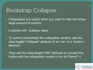
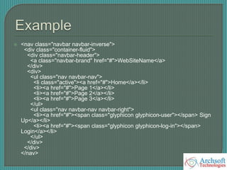
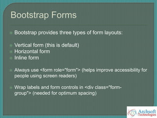
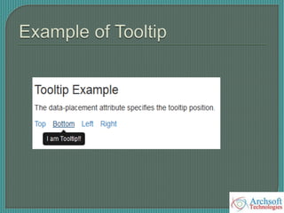
![ <div class="container">
<h3>Tooltip Example</h3>
<p>The data-placement attribute specifies the tooltip position.</p>
<ul class="list-inline">
<li><a href="#" data-toggle="tooltip" data-placement="top" title="I am
Tooltip!!">Top</a></li>
<li><a href="#" data-toggle="tooltip" data-placement="bottom" title="I am
Tooltip!!">Bottom</a></li>
</ul>
</div>
<!---jQuery----->
<script>
$(document).ready(function(){
$('[data-toggle="tooltip"]').tooltip();
});
</script>](https://image.slidesharecdn.com/bootstrap-150925184742-lva1-app6891/85/Bootstrap-PPT-by-Mukesh-96-320.jpg)
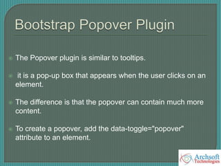
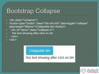
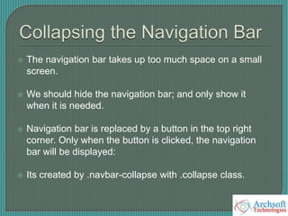
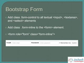
![< ---jQuery--->
<script>
$(document).ready(function(){
$('[data-toggle="popover"]').popover();
});](https://image.slidesharecdn.com/bootstrap-150925184742-lva1-app6891/85/Bootstrap-PPT-by-Mukesh-100-320.jpg)


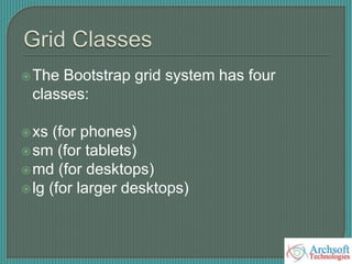
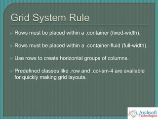
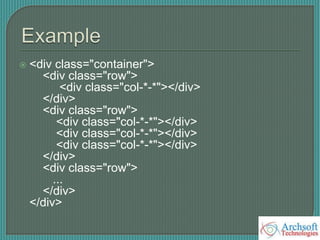
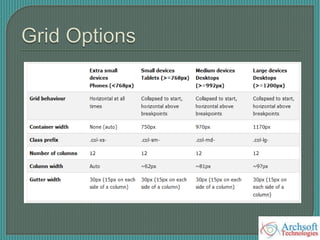
The document provides an overview of Bootstrap, including: - Bootstrap is an open-source HTML, CSS, and JS framework for developing responsive mobile-first websites and web apps. - It contains utilities for typography, forms, buttons, navigation, and other interface components, as well as optional JavaScript extensions. - The document describes various Bootstrap components like grids, navigation, buttons, forms, images, alerts, progress bars, and panels. It provides code examples for how to implement these components.


![Bootstrap [part 1]](https://cdn.slidesharecdn.com/ss_thumbnails/bootstrappart-11-170208154053-thumbnail.jpg?width=640&height=640&fit=bounds)


