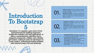
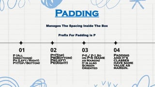
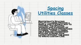
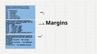
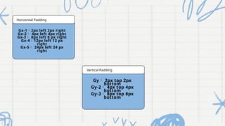
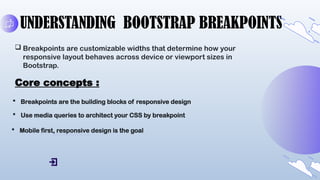
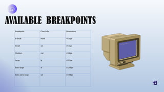
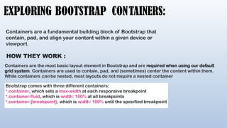
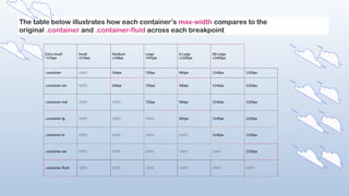
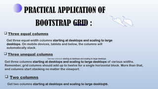
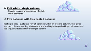
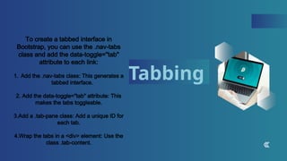
The document is a presentation on Bootstrap 5, a popular front-end framework for building responsive websites with features such as a mobile-first design, a flexible grid system, and customizable components. Key topics covered include utility classes for spacing, breakpoints for responsive design, and practical applications of Bootstrap's grid and navigation elements. The presentation provides a detailed explanation of Bootstrap's functionalities, including spacing utilities, containers, and interactive components like carousels and accordions.


![Bootstrap [part 1]](https://cdn.slidesharecdn.com/ss_thumbnails/bootstrappart-11-170208154053-thumbnail.jpg?width=640&height=640&fit=bounds)


