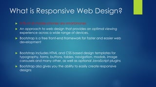
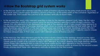
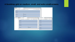
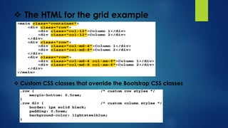
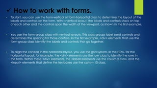
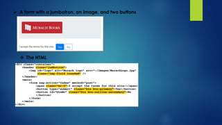
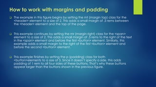
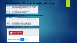
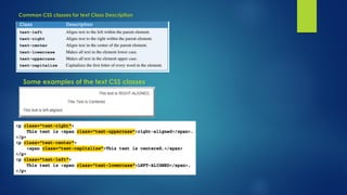
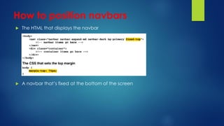
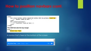
Responsive Design
and Bootstrap
Chapter 3
By : Eng. Mahmoud Hassouna
Email : M.hassuna2@gmail.com
State of Today’s Web
Description
• A web app should adapt to every screen
size. This is called responsive web design.
• You can use the open-source Bootstrap library to implement
a responsive web design with your ASP.NET Core MVC apps.
What is Responsive Web Design?
 51% of US mobile phones are smartphones
 An approach to web design that provides an optimal viewing
experience across a wide range of devices.
 Bootstrap is a free front-end framework for faster and easier web
development
 Bootstrap includes HTML and CSS based design templates for
typography, forms, buttons, tables, navigation, modals, image
carousels and many other, as well as optional JavaScript plugins
 Bootstrap also gives you the ability to easily create responsive
designs
Elements of RWD
Fluid Grid
Resizable Images
Media Queries
Containers
 Bootstrap requires a containing element to wrap site contents and
house our grid system.
 You may choose one of two containers to use in your projects. Note
that, due to padding and more, neither container is nestable.
The dialog boxes for adding client-side libraries
How to add the Bootstrap and jQuery libraries to a web app
1. Start Visual Studio and open a project. In the Solution Explorer, expand the
2. wwwroot/lib folder and delete any old Bootstrap or jQuery libraries.
3. In the Solution Explorer, right-click on the project name and select the
4. Add Client-Side Library item.
5. In the dialog box that appears, type “jquery@”, select “3.3.1” from the list
that
6. appears, and click the Install button.
7. Repeat steps 2 and 3 for the library named “twitter-bootstrap@4.3.1”, but
change
8. the target location to “www/lib/bootstrap”. Repeat steps 2 and 3 for the
library named “popper.js@1.14.7”.
9. Repeat steps 2 and 3 for the library named “jquery-validate@1.19.0”.
10. Repeat steps 2 and 3 for the library named “jquery-validation-
unobtrusive@3.2.11”.
11. In the Solution Explorer, expand the wwwroot/lib folder and view the libraries
12.that have been installed. If you didn’t already do it in step 4, rename the
twitter-
13.bootstrap folder to bootstrap.
Description
• You can use the Library Manager, also known as
LibMan, to add client-sidelibraries such as
Bootstrap and jQuery to a project.
• The MVC template that you learned about in the
previous chapter includes a version of Bootstrap
by default. However, this version of Bootstrap
might bedifferent than the version presented in this
chapter.
The libman.json file that’s created when you add a client-side library
Description
• To manage client-side libraries, you can open the libman.json file and edit it to
specify the correct versions and locations for your client-side libraries.
• To update all client-side libraries so they match the libman.json file, you can right-
click on the libman.json file and select the Restore Client-Side Libraries item.
• To remove all client-side libraries, you can right-click on the libman.json file and
select the Clean Client-Side Libraries item.
How to use a Razor layout to enable client-side
libraries
 An extra directory that may be included by the MVC template
<link rel="stylesheet"href="~/lib/bootstrap/dist/css/bootstrap.min.css" />
The URL for the Bootstrap documentation
Valid class values
Valid size values
How the Bootstrap grid system works.
 In the first row, each <div> element specifies a width of twelve columns for the extra small phone size (none).
As a result, each column spans all twelve columns of the row, or the entire width of the container, regardless of
the screen size. That causes the columns to be stacked vertically as shown here.
 In the second row, each <div> element specifies a class for the desktop viewport (md). Here, the first <div>
element specifies a width of four column sand the second element specifies a width of eight columns. This
causes the <div>elements to be displayed side by side at the desktop width. It also causes these elements to
be displayed side by side at the large desktop width, since no classes are specified for that width (lg). In that
case, Bootstrap uses the width of the next smallest screen size (md). By contrast, Bootstrap stacks the <div>
elements at the tablet (sm) and phone (none) sizes. That’s because this code doesn’t specify column classes
for these viewport sizes. In that case, each <div> element spans all twelve columns.
 In the third row, the <div> elements specify the same column classes for the desktop viewport as the <div>
elements in the second row. In addition, they’re assigned column classes for the tablet (sm) viewport. These
classes specify a width of six columns for each <div> element. As a result, desktop and large desktop devices
display these <div> elements side by side at the same widths as the <div> elements in the second row.
However, tablets display these <div>elements side by side but at equal widths as shown by the second screen.
Finally, phones stack these <div> elements vertically as shown by the third screen.
A Bootstrap grid on medium, small, and extra small screens.
 The HTML for the grid example
 Custom CSS classes that override the Bootstrap CSS classes
 How to work with forms.
• To start, you can use the form-vertical or form-horizontal class to determine the layout of the
labels and controls on the form. With a vertical layout, the labels and controls stack on top
of each other and the controls span the width of the viewport, as shown in the first example.
• You use the form-group class with vertical layouts. This class groups label sand controls and
determines the spacing for those controls. In the first example, <div> elements that use the
form-group class identify the labels and controls that go together.
• To align the controls in the horizontal layout, you use the grid system. In the HTML for the
horizontal layout, for example, the <div> elements use the row class to identify the rows in
the form. Within these <div> elements, the <label>elements use the col-sm-2 class, and the
<input> elements that define the textboxes use the col-sm-10 class.
Some Bootstrap CSS classes for working with forms.
A form with two text boxes in vertical layout
The HTML for the form
A form with two text boxes in horizontal layout
The HTML for the form
How to work with buttons, images, and jumbotrons.
 In addition, this figure shows how to create a Bootstrap component knownas a
jumbotron. This component uses a large grey box with rounded corners
tohighlight content. In this figure, the example uses the jumbotron to display an
image. However, it can also be used to display textual messages.
 Within the <header> element, the HTML uses two additional classes to stylean
image. First, the img-fluid class causes the size of the image to be adjustedas the
size of the viewport changes.
 Within the <form> element, the example in the figure uses the mr-2 class inthe
<span> element to increase the right margin as described in the next figure.
Then, it uses some of the button classes to style the Yes and No buttons. Thebtn
class provides the basic size and rounded corners.
 Some of the Bootstrap CSS classes for working with buttons.
 Some of the Bootstrap CSS classes for working with imagesClass
Description
 A Bootstrap CSS class for creating a jumbotron
 A form with a jumbotron, an image, and two buttons
 The HTML
How to work with margins and padding
 The example in this figure begins by setting the mt (margin top) class for the
<header> element to a size of 2. This adds a small margin of .5 rems between
the <header> element and the top of the page.
 This example continues by setting the mr (margin right) class for the <span>
element to a size of 2. This adds a small margin of .5 rems to the right of the text
in the <span> element and before the first <button> element. Similarly, this
example adds a small margin to the right of the first <button> element and
before the second <button> element.
 This example finishes by setting the p (padding) class for both
<button>elements to a size of 3. Since it doesn’t specify a side, this adds
padding of 1 rem to all four sides of these buttons. That’s why these buttons
appear larger than the buttons shown in the previous figure.
 Some Bootstrap CSS classes for working with margins
 Some Bootstrap CSS classes for working with padding
 Some elements that use margins and padding
The HTML
 <div class="container">
 <header class="jumbotron mt-2">
 <img id="logo" alt="Murach logo" src="~/images/MurachLogo.jpg"
 class="img-fluid rounded" />
 </header>
 <main>
 <form asp-action="Index" method="post">
 <span class="mr-2">I accept the terms for this site:</span>
 <button type="submit"
 class="btn btn-primary p-3 mr-2">Yes</button>
 <button id="btnNo"
 class="btn btn-outline-secondary p-3">No</button>
 </form>
 </main>
 </div>
How to align and capitalize text
 The table in figure 3-12 shows some of the Bootstrap CSS classes for working with text.
The classes shown here consist of alignment classes and transformation classes.
 The alignment classes control where the text of an element displays on the page
relative to the element that contains it. For instance, assume the <p> elements in the
example below the table are coded within a <div> element that spans six Bootstrap
columns. Then, the first <p> element is aligned at the right side of the <div> element,
the second <p> element is centered, and the third <p> element is aligned at the left
side.
 The transformation classes control how the text of an element is capitalized. For
instance, the text in the first <span> element displays in all uppercase letters, even
though the text in the HTML is in lowercase letters. Similarly, the text in the second
<span> element displays with the first letter of each word capitalized, and the text in
the third <span> element displays in all lowercase letters.
Common CSS classes for text Class Description
Some examples of the text CSS classes
 How to align and capitalize text
The table in figure 3-12 shows some of the Bootstrap CSS classes for
working with text. The classes shown here consist of alignment classes and
transformation classes.
The alignment classes control where the text of an element displays on
the page relative to the element that contains it. For instance, assume the <p>
elements in the example below the table are coded within a <div> element that
spans six Bootstrap columns. Then, the first <p> element is aligned at the right
side of the <div> element, the second <p> element is centered, and the third <p>
element is aligned at the left side.
The transformation classes control how the text of an element is capitalized.
For instance, the text in the first <span> element displays in all uppercase letters,
even though the text in the HTML is in lowercase letters. Similarly, the text in
the second <span> element displays with the first letter of each word capitalized,
and the text in the third <span> element displays in all lowercase letters.
 More skills for Bootstrap components
Up until now, this chapter has focused on showing how to apply Bootstrap
CSS classes to standard HTML elements. However, Bootstrap also provides
its own components. For example, the jumbotron class presented earlier in this
chapter defines a component. This component uses predefined HTML
elements
and CSS classes to create a user interface element. Now, you’ll learn how to
use
other Bootstrap components such as button groups, icons, badges,
breadcrumbs,
and alerts.
 Common CSS classes for creating button groups
 A basic button group
 A toolbar with two button groups
How to work with icons and badges
 you can add an icon to a button or link to indicate its purpose.
 you can use the free icons available from Font Awesome with the solid style.
 The easiest way to enable the icons that are available from Font Awesome is to include a
<link> element that links to the CSS file from the Font Awesome website
The URL for the Font Awesome website
 http”//fonttawesome.com/
 A typical <link> element that enables Font Awesome icons
 A button group that includes icons for both of its buttons
 A button with a badge
 A button with an icon and a badge
 CSS classes and an HTML5 data attribute for creating button dropdowns
 A button dropdown
Description
 You can use the classes and attribute shown above to create a button
dropdown. When you click on a button dropdown, it displays a dropdown
menu.
 To create a button dropdown, you must code a button for the button and a
dropdown menu that includes the items for the menu.
 A button dropdown needs the Popper.js library to work.
 To make the dropdown menu work with assistive technologies, you can
include the
 aria- attributes shown in this figure. For this to work, the dropdown menu can
onlycontain menu items, checkbox menu items, radio button menu items,
radio button groups, and submenus.
How to work with list groups
• Common CSS classes for creating list groups
• A basic list group
How to work with list groups cont.
 Another basic list group with an active item
 Description
• The CSS classes for list groups let you display a list of items
such as links, buttons,and list items. You can also nest a list
group within another list group.
How to work with alerts and
breadcrumbs
 Common CSS classes and an HTML5 data attribute for creating alerts
 A dismissible alert with a link
How to work with alerts and
breadcrumbs cont.
 Common CSS classes for creating breadcrumbs
 A breadcrumb with three segments
Description
 • Alerts let you provide context feedback in your app.
 • Breadcrumbs display navigation links that are relative to the user’s
current location.
 in this figure. Here, the <a> element contains text of “Cart” and a
badge with the number 2.
 Here, the content of the badge is coded in a <span> element that
uses the badge and badge-primary classes.
 As a result, the badge is blue with white text.
 In addition, the badge collapses so it’s hidden if it doesn’t contain
any text.
 This is common when you use code to set the content of a badge
when an app is running.
Description cont.
 The third example shows that you can combine icons and badges
within a single element, such as a link that’s styled as a button.
 Here, the first <span> element displays the Cart icon, and the
second <span> element displays the badge that indicates how
many items are in the cart.
 Between these <span> elements, the HTML specifies text of “Cart”
with a nonbreaking space before and after
nav links
 The same nav links styled as pills
 A more verbose way of coding the same nav links
How to create navbars
 Common CSS classes and HTML5 data attributes for creating
navbars
 A navbar expanded on a wide screen and collapsed on a small
screen
How to position navbars
 More CSS classes for positioning navbars
 A navbar that’s fixed at the top of the screen
How to position navbars
 The HTML that displays the navbar
 A navbar that’s fixed at the bottom of the screen
How to position navbars cont.
A navbar that’s fixed at the bottom of the screen
Perspective
 Now that you’ve completed this chapter, you know the right way to use
the content and structure of a page, using Bootstrap for responsive web
design, and using a custom CSS style sheet whenever necessary. That separates
theBootstrap in an ASP.NET Core MVC web app. That means using HTML for
content and structure of each page from its formatting. And that makes it
easier to create and maintain a mobile-friendly web app.
Of course, there’s a lot more to Bootstrap than what’s presented in this
chapter. That includes more classes and components, as well as best practices
for making Bootstrap accessible. Fortunately, the documentation for Bootstrap
is excellent. As a result, if you need to learn more about Bootstrap, you can
start by checking out the official Bootstrap documentation.
Terms
 responsive web design
 framework
 Bootstrap
 Library Manager
 LibMan
 minified
 viewport
 meta tag
 boxed layout
 full width layout
 Bootstrap CSS classes
 Bootstrap components
Terms cont.
 rem unit
 jumbotron
 button group
 icon
 badge
 button dropdown
 list group
 alert
 breadcrumbs
 nav
 navbar
Summary
 Responsive web design helps you create web apps that look good and are easy
to use on all screen sizes.
 One way to create a responsive web design is to use a framework like Bootstrap,
which uses CSS and JavaScript to make your web pages automatically adjust to
different screen sizes.
 With Visual Studio, you can use the Library Manager tool, also known as LibMan,
to add client-side libraries such as Bootstrap and jQuery to a project.
 A minified version of a CSS or JavaScript library has removed unnecessary
characters such as spaces and indentation. This improves load time but makes it
more difficult for humans to read.
Summary cont.
 The viewport is the part of the page that is visible to viewers. The
viewport meta tag controls the width of the viewport.
 Bootstrap uses a grid system based on containers, rows, and columns.
 In a boxed layout, a container is centered in the screen and has a
specific width in pixels based on the viewport’s width. In a full width
layout, a container is always the same width as the viewport.
 Bootstrap CSS classes let you style HTML elements such as buttons,
images, and tables.
 Bootstrap components let you create user interface elements such as
jumbotrons, button groups, and navbars.
Summary cont.
 Bootstrap CSS classes often use rem units for sizing. A rem unit is similar to the more
traditional em unit, which is commonly used in CSS.
 A jumbotron displays a large grey box with rounded corners to highlight content.
 A button group lets you display a group of buttons.
 An icon is a symbol that you can use to decorate or add meaning to an element.
 A badge provides for highlighting text within a component.
 A button dropdown is a button that displays a dropdown menu when it’s clicked.
Summary cont.
 A list group displays a list of items such as list items, links, and buttons.
 Alerts let you provide contextual feedback in your app.
 Breadcrumbs display navigation links for the user’s current location.
 A nav component creates a simple menu bar.
 A navbar component can be used to create a responsive menu bar that collapses
to a dropdown menu on narrower viewports.
The End
created by Farah Habbob and Heba

Responsive Design and Bootstrap

  • 1.
    Responsive Design and Bootstrap Chapter3 By : Eng. Mahmoud Hassouna Email : M.hassuna2@gmail.com
  • 2.
    State of Today’sWeb Description • A web app should adapt to every screen size. This is called responsive web design. • You can use the open-source Bootstrap library to implement a responsive web design with your ASP.NET Core MVC apps.
  • 3.
    What is ResponsiveWeb Design?  51% of US mobile phones are smartphones  An approach to web design that provides an optimal viewing experience across a wide range of devices.  Bootstrap is a free front-end framework for faster and easier web development  Bootstrap includes HTML and CSS based design templates for typography, forms, buttons, tables, navigation, modals, image carousels and many other, as well as optional JavaScript plugins  Bootstrap also gives you the ability to easily create responsive designs
  • 4.
    Elements of RWD FluidGrid Resizable Images Media Queries
  • 5.
    Containers  Bootstrap requiresa containing element to wrap site contents and house our grid system.  You may choose one of two containers to use in your projects. Note that, due to padding and more, neither container is nestable.
  • 6.
    The dialog boxesfor adding client-side libraries How to add the Bootstrap and jQuery libraries to a web app 1. Start Visual Studio and open a project. In the Solution Explorer, expand the 2. wwwroot/lib folder and delete any old Bootstrap or jQuery libraries. 3. In the Solution Explorer, right-click on the project name and select the 4. Add Client-Side Library item. 5. In the dialog box that appears, type “jquery@”, select “3.3.1” from the list that 6. appears, and click the Install button. 7. Repeat steps 2 and 3 for the library named “twitter-bootstrap@4.3.1”, but change 8. the target location to “www/lib/bootstrap”. Repeat steps 2 and 3 for the library named “popper.js@1.14.7”. 9. Repeat steps 2 and 3 for the library named “jquery-validate@1.19.0”. 10. Repeat steps 2 and 3 for the library named “jquery-validation- unobtrusive@3.2.11”. 11. In the Solution Explorer, expand the wwwroot/lib folder and view the libraries 12.that have been installed. If you didn’t already do it in step 4, rename the twitter- 13.bootstrap folder to bootstrap. Description • You can use the Library Manager, also known as LibMan, to add client-sidelibraries such as Bootstrap and jQuery to a project. • The MVC template that you learned about in the previous chapter includes a version of Bootstrap by default. However, this version of Bootstrap might bedifferent than the version presented in this chapter.
  • 7.
    The libman.json filethat’s created when you add a client-side library Description • To manage client-side libraries, you can open the libman.json file and edit it to specify the correct versions and locations for your client-side libraries. • To update all client-side libraries so they match the libman.json file, you can right- click on the libman.json file and select the Restore Client-Side Libraries item. • To remove all client-side libraries, you can right-click on the libman.json file and select the Clean Client-Side Libraries item.
  • 8.
    How to usea Razor layout to enable client-side libraries  An extra directory that may be included by the MVC template <link rel="stylesheet"href="~/lib/bootstrap/dist/css/bootstrap.min.css" />
  • 9.
    The URL forthe Bootstrap documentation Valid class values Valid size values
  • 10.
    How the Bootstrapgrid system works.  In the first row, each <div> element specifies a width of twelve columns for the extra small phone size (none). As a result, each column spans all twelve columns of the row, or the entire width of the container, regardless of the screen size. That causes the columns to be stacked vertically as shown here.  In the second row, each <div> element specifies a class for the desktop viewport (md). Here, the first <div> element specifies a width of four column sand the second element specifies a width of eight columns. This causes the <div>elements to be displayed side by side at the desktop width. It also causes these elements to be displayed side by side at the large desktop width, since no classes are specified for that width (lg). In that case, Bootstrap uses the width of the next smallest screen size (md). By contrast, Bootstrap stacks the <div> elements at the tablet (sm) and phone (none) sizes. That’s because this code doesn’t specify column classes for these viewport sizes. In that case, each <div> element spans all twelve columns.  In the third row, the <div> elements specify the same column classes for the desktop viewport as the <div> elements in the second row. In addition, they’re assigned column classes for the tablet (sm) viewport. These classes specify a width of six columns for each <div> element. As a result, desktop and large desktop devices display these <div> elements side by side at the same widths as the <div> elements in the second row. However, tablets display these <div>elements side by side but at equal widths as shown by the second screen. Finally, phones stack these <div> elements vertically as shown by the third screen.
  • 11.
    A Bootstrap gridon medium, small, and extra small screens.
  • 12.
     The HTMLfor the grid example  Custom CSS classes that override the Bootstrap CSS classes
  • 13.
     How towork with forms. • To start, you can use the form-vertical or form-horizontal class to determine the layout of the labels and controls on the form. With a vertical layout, the labels and controls stack on top of each other and the controls span the width of the viewport, as shown in the first example. • You use the form-group class with vertical layouts. This class groups label sand controls and determines the spacing for those controls. In the first example, <div> elements that use the form-group class identify the labels and controls that go together. • To align the controls in the horizontal layout, you use the grid system. In the HTML for the horizontal layout, for example, the <div> elements use the row class to identify the rows in the form. Within these <div> elements, the <label>elements use the col-sm-2 class, and the <input> elements that define the textboxes use the col-sm-10 class.
  • 14.
    Some Bootstrap CSSclasses for working with forms. A form with two text boxes in vertical layout The HTML for the form
  • 15.
    A form withtwo text boxes in horizontal layout The HTML for the form
  • 16.
    How to workwith buttons, images, and jumbotrons.  In addition, this figure shows how to create a Bootstrap component knownas a jumbotron. This component uses a large grey box with rounded corners tohighlight content. In this figure, the example uses the jumbotron to display an image. However, it can also be used to display textual messages.  Within the <header> element, the HTML uses two additional classes to stylean image. First, the img-fluid class causes the size of the image to be adjustedas the size of the viewport changes.  Within the <form> element, the example in the figure uses the mr-2 class inthe <span> element to increase the right margin as described in the next figure. Then, it uses some of the button classes to style the Yes and No buttons. Thebtn class provides the basic size and rounded corners.
  • 17.
     Some ofthe Bootstrap CSS classes for working with buttons.  Some of the Bootstrap CSS classes for working with imagesClass Description  A Bootstrap CSS class for creating a jumbotron
  • 18.
     A formwith a jumbotron, an image, and two buttons  The HTML
  • 19.
    How to workwith margins and padding  The example in this figure begins by setting the mt (margin top) class for the <header> element to a size of 2. This adds a small margin of .5 rems between the <header> element and the top of the page.  This example continues by setting the mr (margin right) class for the <span> element to a size of 2. This adds a small margin of .5 rems to the right of the text in the <span> element and before the first <button> element. Similarly, this example adds a small margin to the right of the first <button> element and before the second <button> element.  This example finishes by setting the p (padding) class for both <button>elements to a size of 3. Since it doesn’t specify a side, this adds padding of 1 rem to all four sides of these buttons. That’s why these buttons appear larger than the buttons shown in the previous figure.
  • 20.
     Some BootstrapCSS classes for working with margins  Some Bootstrap CSS classes for working with padding  Some elements that use margins and padding
  • 21.
    The HTML  <divclass="container">  <header class="jumbotron mt-2">  <img id="logo" alt="Murach logo" src="~/images/MurachLogo.jpg"  class="img-fluid rounded" />  </header>  <main>  <form asp-action="Index" method="post">  <span class="mr-2">I accept the terms for this site:</span>  <button type="submit"  class="btn btn-primary p-3 mr-2">Yes</button>  <button id="btnNo"  class="btn btn-outline-secondary p-3">No</button>  </form>  </main>  </div>
  • 22.
    How to alignand capitalize text  The table in figure 3-12 shows some of the Bootstrap CSS classes for working with text. The classes shown here consist of alignment classes and transformation classes.  The alignment classes control where the text of an element displays on the page relative to the element that contains it. For instance, assume the <p> elements in the example below the table are coded within a <div> element that spans six Bootstrap columns. Then, the first <p> element is aligned at the right side of the <div> element, the second <p> element is centered, and the third <p> element is aligned at the left side.  The transformation classes control how the text of an element is capitalized. For instance, the text in the first <span> element displays in all uppercase letters, even though the text in the HTML is in lowercase letters. Similarly, the text in the second <span> element displays with the first letter of each word capitalized, and the text in the third <span> element displays in all lowercase letters.
  • 23.
    Common CSS classesfor text Class Description Some examples of the text CSS classes
  • 24.
     How toalign and capitalize text The table in figure 3-12 shows some of the Bootstrap CSS classes for working with text. The classes shown here consist of alignment classes and transformation classes. The alignment classes control where the text of an element displays on the page relative to the element that contains it. For instance, assume the <p> elements in the example below the table are coded within a <div> element that spans six Bootstrap columns. Then, the first <p> element is aligned at the right side of the <div> element, the second <p> element is centered, and the third <p> element is aligned at the left side. The transformation classes control how the text of an element is capitalized. For instance, the text in the first <span> element displays in all uppercase letters, even though the text in the HTML is in lowercase letters. Similarly, the text in the second <span> element displays with the first letter of each word capitalized, and the text in the third <span> element displays in all lowercase letters.
  • 25.
     More skillsfor Bootstrap components Up until now, this chapter has focused on showing how to apply Bootstrap CSS classes to standard HTML elements. However, Bootstrap also provides its own components. For example, the jumbotron class presented earlier in this chapter defines a component. This component uses predefined HTML elements and CSS classes to create a user interface element. Now, you’ll learn how to use other Bootstrap components such as button groups, icons, badges, breadcrumbs, and alerts.
  • 26.
     Common CSSclasses for creating button groups  A basic button group
  • 27.
     A toolbarwith two button groups
  • 28.
    How to workwith icons and badges  you can add an icon to a button or link to indicate its purpose.  you can use the free icons available from Font Awesome with the solid style.  The easiest way to enable the icons that are available from Font Awesome is to include a <link> element that links to the CSS file from the Font Awesome website
  • 29.
    The URL forthe Font Awesome website  http”//fonttawesome.com/  A typical <link> element that enables Font Awesome icons  A button group that includes icons for both of its buttons
  • 30.
     A buttonwith a badge  A button with an icon and a badge
  • 31.
     CSS classesand an HTML5 data attribute for creating button dropdowns  A button dropdown
  • 32.
    Description  You canuse the classes and attribute shown above to create a button dropdown. When you click on a button dropdown, it displays a dropdown menu.  To create a button dropdown, you must code a button for the button and a dropdown menu that includes the items for the menu.  A button dropdown needs the Popper.js library to work.  To make the dropdown menu work with assistive technologies, you can include the  aria- attributes shown in this figure. For this to work, the dropdown menu can onlycontain menu items, checkbox menu items, radio button menu items, radio button groups, and submenus.
  • 33.
    How to workwith list groups • Common CSS classes for creating list groups • A basic list group
  • 34.
    How to workwith list groups cont.  Another basic list group with an active item  Description • The CSS classes for list groups let you display a list of items such as links, buttons,and list items. You can also nest a list group within another list group.
  • 35.
    How to workwith alerts and breadcrumbs  Common CSS classes and an HTML5 data attribute for creating alerts  A dismissible alert with a link
  • 36.
    How to workwith alerts and breadcrumbs cont.  Common CSS classes for creating breadcrumbs  A breadcrumb with three segments
  • 37.
    Description  • Alertslet you provide context feedback in your app.  • Breadcrumbs display navigation links that are relative to the user’s current location.  in this figure. Here, the <a> element contains text of “Cart” and a badge with the number 2.  Here, the content of the badge is coded in a <span> element that uses the badge and badge-primary classes.  As a result, the badge is blue with white text.  In addition, the badge collapses so it’s hidden if it doesn’t contain any text.  This is common when you use code to set the content of a badge when an app is running.
  • 38.
    Description cont.  Thethird example shows that you can combine icons and badges within a single element, such as a link that’s styled as a button.  Here, the first <span> element displays the Cart icon, and the second <span> element displays the badge that indicates how many items are in the cart.  Between these <span> elements, the HTML specifies text of “Cart” with a nonbreaking space before and after
  • 39.
    nav links  Thesame nav links styled as pills  A more verbose way of coding the same nav links
  • 40.
    How to createnavbars  Common CSS classes and HTML5 data attributes for creating navbars  A navbar expanded on a wide screen and collapsed on a small screen
  • 41.
    How to positionnavbars  More CSS classes for positioning navbars  A navbar that’s fixed at the top of the screen
  • 42.
    How to positionnavbars  The HTML that displays the navbar  A navbar that’s fixed at the bottom of the screen
  • 43.
    How to positionnavbars cont. A navbar that’s fixed at the bottom of the screen
  • 44.
    Perspective  Now thatyou’ve completed this chapter, you know the right way to use the content and structure of a page, using Bootstrap for responsive web design, and using a custom CSS style sheet whenever necessary. That separates theBootstrap in an ASP.NET Core MVC web app. That means using HTML for content and structure of each page from its formatting. And that makes it easier to create and maintain a mobile-friendly web app. Of course, there’s a lot more to Bootstrap than what’s presented in this chapter. That includes more classes and components, as well as best practices for making Bootstrap accessible. Fortunately, the documentation for Bootstrap is excellent. As a result, if you need to learn more about Bootstrap, you can start by checking out the official Bootstrap documentation.
  • 45.
    Terms  responsive webdesign  framework  Bootstrap  Library Manager  LibMan  minified  viewport  meta tag  boxed layout  full width layout  Bootstrap CSS classes  Bootstrap components
  • 46.
    Terms cont.  remunit  jumbotron  button group  icon  badge  button dropdown  list group  alert  breadcrumbs  nav  navbar
  • 47.
    Summary  Responsive webdesign helps you create web apps that look good and are easy to use on all screen sizes.  One way to create a responsive web design is to use a framework like Bootstrap, which uses CSS and JavaScript to make your web pages automatically adjust to different screen sizes.  With Visual Studio, you can use the Library Manager tool, also known as LibMan, to add client-side libraries such as Bootstrap and jQuery to a project.  A minified version of a CSS or JavaScript library has removed unnecessary characters such as spaces and indentation. This improves load time but makes it more difficult for humans to read.
  • 48.
    Summary cont.  Theviewport is the part of the page that is visible to viewers. The viewport meta tag controls the width of the viewport.  Bootstrap uses a grid system based on containers, rows, and columns.  In a boxed layout, a container is centered in the screen and has a specific width in pixels based on the viewport’s width. In a full width layout, a container is always the same width as the viewport.  Bootstrap CSS classes let you style HTML elements such as buttons, images, and tables.  Bootstrap components let you create user interface elements such as jumbotrons, button groups, and navbars.
  • 49.
    Summary cont.  BootstrapCSS classes often use rem units for sizing. A rem unit is similar to the more traditional em unit, which is commonly used in CSS.  A jumbotron displays a large grey box with rounded corners to highlight content.  A button group lets you display a group of buttons.  An icon is a symbol that you can use to decorate or add meaning to an element.  A badge provides for highlighting text within a component.  A button dropdown is a button that displays a dropdown menu when it’s clicked.
  • 50.
    Summary cont.  Alist group displays a list of items such as list items, links, and buttons.  Alerts let you provide contextual feedback in your app.  Breadcrumbs display navigation links for the user’s current location.  A nav component creates a simple menu bar.  A navbar component can be used to create a responsive menu bar that collapses to a dropdown menu on narrower viewports.
  • 51.
    The End created byFarah Habbob and Heba