Downloaded 83 times

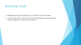
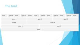


Bootstrap is a free front-end framework for building responsive, mobile-first websites. It includes HTML and CSS templates for common elements like typography, forms, buttons, navigation, tables, images and more. Bootstrap also utilizes a responsive 12-column grid system and is compatible with all modern browsers. Websites built with Bootstrap are automatically responsive on devices ranging from small phones to large desktops.


![5G Explained! A High Level Overview [Introduction]](https://cdn.slidesharecdn.com/ss_thumbnails/5gexplainedahighleveloverview-260119165306-cc137a3e-thumbnail.jpg?width=640&height=640&fit=bounds)


