This document discusses how the design of various media products - a music video, magazine article, digital packaging - were coordinated to present a cohesive image and message about an artist named Maia. Research including a mood board and focus group informed design decisions like using pastel colors, natural settings, and avoiding overly sexualized imagery. Locations, lighting, and color palette were kept consistent across all products to tie them together visually and convey Maia as a natural, inspirational figure. Feedback ensured the designs effectively communicated the folk/pop genre and would appeal to the target teenage audience.
A thank you note to a year that has passed. Appreciating all the achievements and all the success. And most importantly being grateful to my family and friends that were around.
In our recent webinar at Junxion Strategy we share insights about how the right-sized approach to materiality will help your strategy and reporting efforts start on the right foot, and practical approaches to brand development that tie together your inspiring vision for change, your business strategy, and accountability for your social performance. Whether your business is considering next steps, or first steps, in your journey towards socially responsible corporate citizenship, these are two essential practices to master if you want to "walk the talk" with confidence.
Михайлова Е.В. Особенности PR-сопровождения вывода на рынок ТИКОprasu1995
Опубликовано в сборнике: PR и реклама в изменяющемся мире: Региональный аспект [Текст] : сборник статей/ под ред. М.В. Гундарина, А. Г. Сидоровой, Ю. В. Явинской. – Вып. 10. – Барнаул: Изд-во Алт. ун-та, 2012.
Плахин В.Т. Имя как «очаг» рекламного семиозисаprasu1995
Опубликовано в сборнике: PR и реклама в изменяющемся мире: Региональный аспект [Текст] : сборник статей/ под ред. М.В. Гундарина, А. Г. Сидоровой, Ю. В. Явинской. – Вып. 10. – Барнаул: Изд-во Алт. ун-та, 2012.
The Art Pastor's Guide to Sabbath | Steve ThomasonSteve Thomason
What is the purpose of the Sabbath Law in the Torah. It is interesting to compare how the context of the law shifts from Exodus to Deuteronomy. Who gets to rest, and why?
How to Make a Field invisible in Odoo 17Celine George
It is possible to hide or invisible some fields in odoo. Commonly using “invisible” attribute in the field definition to invisible the fields. This slide will show how to make a field invisible in odoo 17.
Instructions for Submissions thorugh G- Classroom.pptxJheel Barad
This presentation provides a briefing on how to upload submissions and documents in Google Classroom. It was prepared as part of an orientation for new Sainik School in-service teacher trainees. As a training officer, my goal is to ensure that you are comfortable and proficient with this essential tool for managing assignments and fostering student engagement.
Read| The latest issue of The Challenger is here! We are thrilled to announce that our school paper has qualified for the NATIONAL SCHOOLS PRESS CONFERENCE (NSPC) 2024. Thank you for your unwavering support and trust. Dive into the stories that made us stand out!
Synthetic Fiber Construction in lab .pptxPavel ( NSTU)
Synthetic fiber production is a fascinating and complex field that blends chemistry, engineering, and environmental science. By understanding these aspects, students can gain a comprehensive view of synthetic fiber production, its impact on society and the environment, and the potential for future innovations. Synthetic fibers play a crucial role in modern society, impacting various aspects of daily life, industry, and the environment. ynthetic fibers are integral to modern life, offering a range of benefits from cost-effectiveness and versatility to innovative applications and performance characteristics. While they pose environmental challenges, ongoing research and development aim to create more sustainable and eco-friendly alternatives. Understanding the importance of synthetic fibers helps in appreciating their role in the economy, industry, and daily life, while also emphasizing the need for sustainable practices and innovation.
How to Split Bills in the Odoo 17 POS ModuleCeline George
Bills have a main role in point of sale procedure. It will help to track sales, handling payments and giving receipts to customers. Bill splitting also has an important role in POS. For example, If some friends come together for dinner and if they want to divide the bill then it is possible by POS bill splitting. This slide will show how to split bills in odoo 17 POS.
Students, digital devices and success - Andreas Schleicher - 27 May 2024..pptxEduSkills OECD
Andreas Schleicher presents at the OECD webinar ‘Digital devices in schools: detrimental distraction or secret to success?’ on 27 May 2024. The presentation was based on findings from PISA 2022 results and the webinar helped launch the PISA in Focus ‘Managing screen time: How to protect and equip students against distraction’ https://www.oecd-ilibrary.org/education/managing-screen-time_7c225af4-en and the OECD Education Policy Perspective ‘Students, digital devices and success’ can be found here - https://oe.cd/il/5yV
The Indian economy is classified into different sectors to simplify the analysis and understanding of economic activities. For Class 10, it's essential to grasp the sectors of the Indian economy, understand their characteristics, and recognize their importance. This guide will provide detailed notes on the Sectors of the Indian Economy Class 10, using specific long-tail keywords to enhance comprehension.
For more information, visit-www.vavaclasses.com
This is a presentation by Dada Robert in a Your Skill Boost masterclass organised by the Excellence Foundation for South Sudan (EFSS) on Saturday, the 25th and Sunday, the 26th of May 2024.
He discussed the concept of quality improvement, emphasizing its applicability to various aspects of life, including personal, project, and program improvements. He defined quality as doing the right thing at the right time in the right way to achieve the best possible results and discussed the concept of the "gap" between what we know and what we do, and how this gap represents the areas we need to improve. He explained the scientific approach to quality improvement, which involves systematic performance analysis, testing and learning, and implementing change ideas. He also highlighted the importance of client focus and a team approach to quality improvement.
2024.06.01 Introducing a competency framework for languag learning materials ...Sandy Millin
http://sandymillin.wordpress.com/iateflwebinar2024
Published classroom materials form the basis of syllabuses, drive teacher professional development, and have a potentially huge influence on learners, teachers and education systems. All teachers also create their own materials, whether a few sentences on a blackboard, a highly-structured fully-realised online course, or anything in between. Despite this, the knowledge and skills needed to create effective language learning materials are rarely part of teacher training, and are mostly learnt by trial and error.
Knowledge and skills frameworks, generally called competency frameworks, for ELT teachers, trainers and managers have existed for a few years now. However, until I created one for my MA dissertation, there wasn’t one drawing together what we need to know and do to be able to effectively produce language learning materials.
This webinar will introduce you to my framework, highlighting the key competencies I identified from my research. It will also show how anybody involved in language teaching (any language, not just English!), teacher training, managing schools or developing language learning materials can benefit from using the framework.
AT - How effective is the combination of your main product and ancillary tasks?
1. How effective is the combination of your main product and ancillary tasks ?
When I looked at the combination of your main product and ancillary task I never looked at
them as 3 separate products but as one media packages. This meant that when I designed
the individual parts I looked at what I had already planned to create, giving me a strong
house style and a good idea of the use of what I needed to create in order to make a
convincing media product (s).
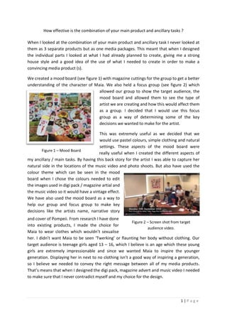
We created a mood board (see figure 1) with magazine cuttings for the group to get a better
understanding of the character of Maia. We also held a focus group (see figure 2) which
allowed our group to show the target audience, the
mood board and allowed them to see the type of
artist we are creating and how this would affect them
as a group. I decided that I would use this focus
group as a way of determining some of the key
decisions we wanted to make for the artist.
This was extremely useful as we decided that we
would use pastel colours, simple clothing and natural
settings. These aspects of the mood board were
Figure 1 – Mood Board
really useful when I created the different aspects of
my ancillary / main tasks. By having this back story for the artist I was able to capture her
natural side in the locations of the music video and photo shoots. But also have used the
colour theme which can be seen in the mood
board when I chose the colours needed to edit
the images used in digi pack / magazine artial and
the music video so it would have a vintage effect.
We have also used the mood board as a way to
help our group and focus group to make key
decisions like the artists name, narrative story
and cover of Pompeii. From research I have done
Figure 2 – Screen shot from target
into existing products, I made the choice for
audience video.
Maia to wear clothes which wouldn’t sexualise
her. I didn’t want Maia to be seen ‘Twerking’ or flaunting her body without clothing. Our
target audience is teenage girls aged 13 – 16, which I believe is an age which these young
girls are extremely impressionable and since we wanted Maia to inspire the younger
generation. Displaying her in next to no clothing isn’t a good way of inspiring a generation,
so I believe we needed to convey the right message between all of my media products.
That’s means that when I designed the digi pack, magazine advert and music video I needed
to make sure that I never contradict myself and my choice for the design.
1|Page
2. Also, I think that the main theme that runs through my product is the use of colour. I have
edited the both ancillary tasks so that they are eye catching but also exaggerated some of
the colours which were all ready in the image. I chose to use white text as this stands out
really well from the coloured background. I have also added a slight glow around some of
the text to give the impact of a 3D effect.
However, the images I have taken for the Digi pack and magazine advert were all taken on
location when we filmed the music video. So all of these are relatable to the other parts of
the media product as a whole. These locations we decided to film
and photograph our artist, match the images we have planned
when created the mood board and planned the locations on
pinntrest and the mood board we have created for the
project. I have also made sure that we used natural
lighting for these photos and the video footage so that
they it gives the idea that she been altered or changed
in post production but is this natural girl who you can
look up to. I wanted Maia to come across to the
audience as something real that they could look up to or aspire to be and didn’t want her to
come across as a fake artist which you see in the media nowadays. These artists have been
airbrushed or altered to please the record labels. The magazine advert and digi pack have
been edited in the same way so that there is a clear house style between these. Even
members of the target audience said that “You would know that they all link even if you
haven’t seen the other media products, because of the use of colour and style used in the
images”.
Furthermore, I have chosen to use the same text throughout all of the 3 products, and have
made sure that when I picked the text that it was suitable to the purpose of the product. I
have had to make sure that this follows the current conventions of the product but also that
it fits in with the house style I am trying to crate for the artist. The use of the same text
shows that the other products are extremely relatable to the target audience. As a member
of the public would see the image or the text in a magazine advert then go into the shop …
see the same text and similar images on the cover of a CD then want to buy this.
In addition, we had to think about the way the genre of music is
communicated to the audience through the use imagery, style, form
and composition. To do this I had researched existing products which
were taken from the genre of folk / acoustic pop. I looked at the likes
of Taylor Swift and Rihanna (See Figure 3). There Digi packs and
Magazine adverts have shown me that by using colour and location
you can convey a message of the music by this. Since I have chosen to
use vibrant colours, I think this links to pop industry as they always
use vibrant colours which would be eye catching to the target
Figure 3 – Rihanna
Poster
2|Page
3. audience. I have tried to reciprocate this when I have the designed my own digi pack and
magazine advert.
Another example of how I have used feedback to adapt a design to make it more
streamlined was the CD design I have made for my digi pack. I started out with my draft
design (see figure 4) which I created as during the research and planning stage of my project
I found that when looking at digi packs, the CD’s always had a plain design on the disk. So I
decided that I would follow this convention.
Figure 4 – Draft Design
Figure 5 – Final Design
However I thought that the design was a bit boring and didn’t think it suited the artist at all.
So I decided that I would speak to my target audience and teachers about whether they
thought the design was like the real media products in the shops. When I asked a member
of my target audience they said “it’s plain boring and needs to be more eye catching if you
want people to see it in the shops”. My teacher suggested that I should include the colour
scheme that that I have used on the front/back covers, this might make the design more
interesting, however I do think that the use of the lyrics on the CD is very good and looks
effective. So from this feedback I was able to create a more eye catching design which I
think fits in better with the colour scheme, house style and package of the media product. I
have tried to create a design which is plain and simple but eye catching to the target
audience. Not only have that but created something which links to the main product via the
use of lyrics, colour and style.
Finally I think that the representation of my artist is extremely strong throughout the
ancillary tasks and main task. As we haven’t filmed her in next to no clothing and then
photographed her (for the digi pack and magazine article) in loads of clothing. We have
chose to have constant clothing which again shows again how the main task and ancillary
tasks are similar in design. In the music video we had our artist give very mature expressions
which I think were suitable to the target audience, this is apparent in all of the media
products as I believe that in the photographs she takes on an interesting, mature look which
would make people look up to her.
3|Page