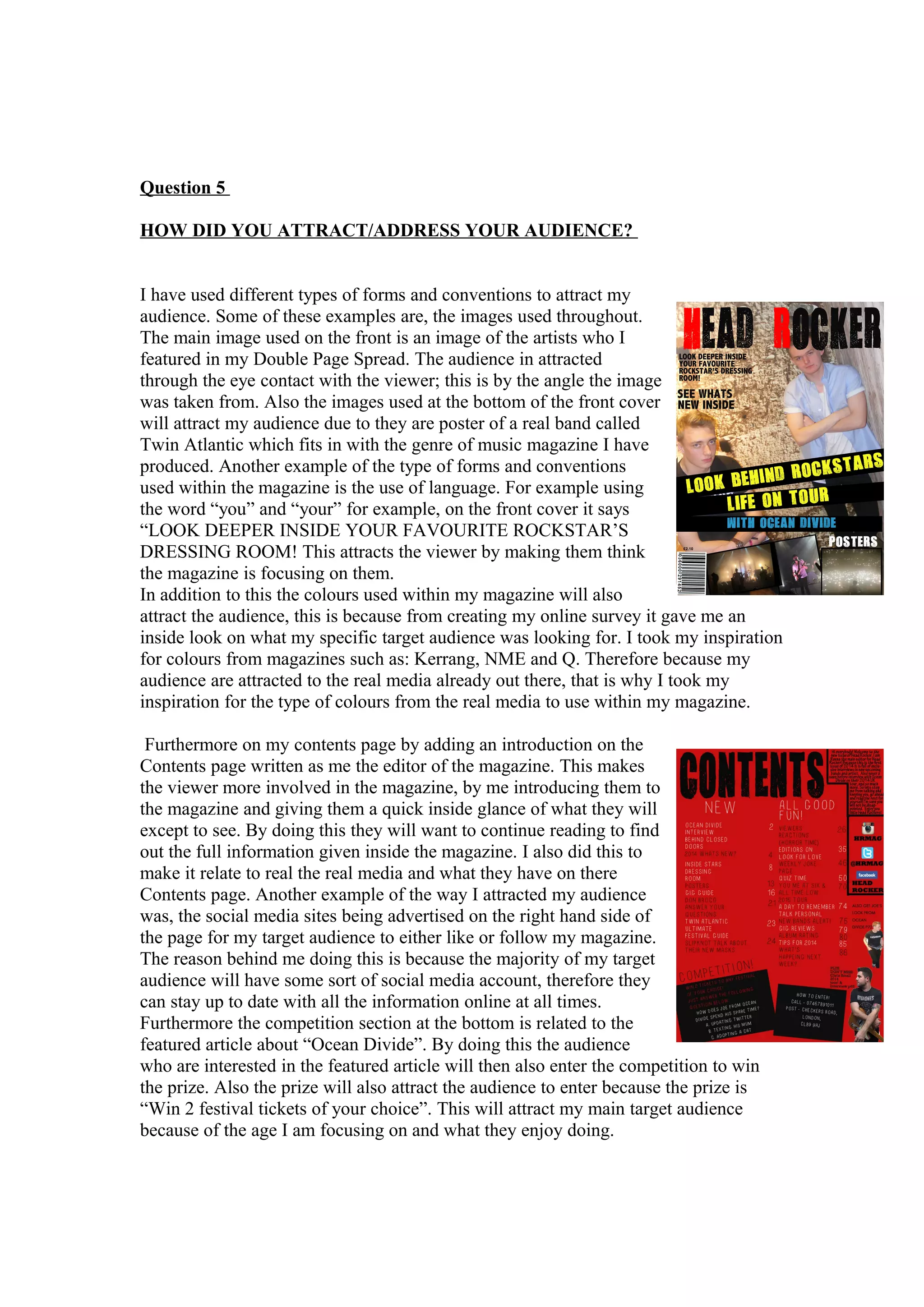
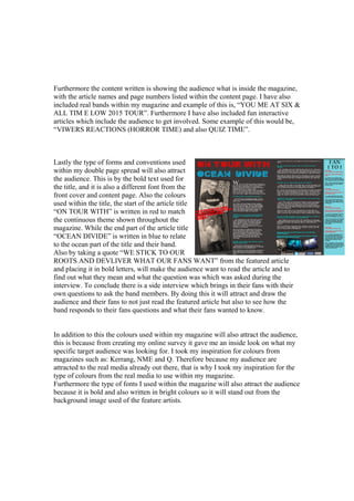
Question 5
HOW DID YOU ATTRACT/ADDRESS YOUR AUDIENCE?
I have used different types of forms and conventions to attract my
audience. Some of these examples are, the images used throughout.
The main image used on the front is an image of the artists who I
featured in my Double Page Spread. The audience in attracted
through the eye contact with the viewer; this is by the angle the image
was taken from. Also the images used at the bottom of the front cover
will attract my audience due to they are poster of a real band called
Twin Atlantic which fits in with the genre of music magazine I have
produced. Another example of the type of forms and conventions
used within the magazine is the use of language. For example using
the word “you” and “your” for example, on the front cover it says
“LOOK DEEPER INSIDE YOUR FAVOURITE ROCKSTAR’S
DRESSING ROOM! This attracts the viewer by making them think
the magazine is focusing on them.
In addition to this the colours used within my magazine will also
attract the audience, this is because from creating my online survey it gave me an
inside look on what my specific target audience was looking for. I took my inspiration
for colours from magazines such as: Kerrang, NME and Q. Therefore because my
audience are attracted to the real media already out there, that is why I took my
inspiration for the type of colours from the real media to use within my magazine.
Furthermore on my contents page by adding an introduction on the
Contents page written as me the editor of the magazine. This makes
the viewer more involved in the magazine, by me introducing them to
the magazine and giving them a quick inside glance of what they will
except to see. By doing this they will want to continue reading to find
out the full information given inside the magazine. I also did this to
make it relate to real the real media and what they have on there
Contents page. Another example of the way I attracted my audience
was, the social media sites being advertised on the right hand side of
the page for my target audience to either like or follow my magazine.
The reason behind me doing this is because the majority of my target
audience will have some sort of social media account, therefore they
can stay up to date with all the information online at all times.
Furthermore the competition section at the bottom is related to the
featured article about “Ocean Divide”. By doing this the audience
who are interested in the featured article will then also enter the competition to win
the prize. Also the prize will also attract the audience to enter because the prize is
“Win 2 festival tickets of your choice”. This will attract my main target audience
because of the age I am focusing on and what they enjoy doing.
Furthermore the content written is showing the audience what is inside the magazine,
with the article names and page numbers listed within the content page. I have also
included real bands within my magazine and example of this is, “YOU ME AT SIX &
ALL TIM E LOW 2015 TOUR”. Furthermore I have also included fun interactive
articles which include the audience to get involved. Some example of this would be,
“VIWERS REACTIONS (HORROR TIME) and also QUIZ TIME”.
Lastly the type of forms and conventions used
within my double page spread will also attract
the audience. This is by the bold text used for
the title, and it is also a different font from the
front cover and content page. Also the colours
used within the title, the start of the article title
“ON TOUR WITH” is written in red to match
the continuous theme shown throughout the
magazine. While the end part of the article title
“OCEAN DIVIDE” is written in blue to relate
to the ocean part of the title and their band.
Also by taking a quote “WE STICK TO OUR
ROOTS AND DEVLIVER WHAT OUR FANS WANT” from the featured article
and placing it in bold letters, will make the audience want to read the article and to
find out what they mean and what the question was which was asked during the
interview. To conclude there is a side interview which brings in their fans with their
own questions to ask the band members. By doing this it will attract and draw the
audience and their fans to not just read the featured article but also to see how the
band responds to their fans questions and what their fans wanted to know.
In addition to this the colours used within my magazine will also attract the audience,
this is because from creating my online survey it gave me an inside look on what my
specific target audience was looking for. I took my inspiration for colours from
magazines such as: Kerrang, NME and Q. Therefore because my audience are
attracted to the real media already out there, that is why I took my inspiration for the
type of colours from the real media to use within my magazine.
Furthermore the type of fonts I used within the magazine will also attract the audience
because it is bold and also written in bright colours so it will stand out from the
background image used of the feature artists.

Question 5.doc new

  • 1.
    Question 5 HOW DIDYOU ATTRACT/ADDRESS YOUR AUDIENCE? I have used different types of forms and conventions to attract my audience. Some of these examples are, the images used throughout. The main image used on the front is an image of the artists who I featured in my Double Page Spread. The audience in attracted through the eye contact with the viewer; this is by the angle the image was taken from. Also the images used at the bottom of the front cover will attract my audience due to they are poster of a real band called Twin Atlantic which fits in with the genre of music magazine I have produced. Another example of the type of forms and conventions used within the magazine is the use of language. For example using the word “you” and “your” for example, on the front cover it says “LOOK DEEPER INSIDE YOUR FAVOURITE ROCKSTAR’S DRESSING ROOM! This attracts the viewer by making them think the magazine is focusing on them. In addition to this the colours used within my magazine will also attract the audience, this is because from creating my online survey it gave me an inside look on what my specific target audience was looking for. I took my inspiration for colours from magazines such as: Kerrang, NME and Q. Therefore because my audience are attracted to the real media already out there, that is why I took my inspiration for the type of colours from the real media to use within my magazine. Furthermore on my contents page by adding an introduction on the Contents page written as me the editor of the magazine. This makes the viewer more involved in the magazine, by me introducing them to the magazine and giving them a quick inside glance of what they will except to see. By doing this they will want to continue reading to find out the full information given inside the magazine. I also did this to make it relate to real the real media and what they have on there Contents page. Another example of the way I attracted my audience was, the social media sites being advertised on the right hand side of the page for my target audience to either like or follow my magazine. The reason behind me doing this is because the majority of my target audience will have some sort of social media account, therefore they can stay up to date with all the information online at all times. Furthermore the competition section at the bottom is related to the featured article about “Ocean Divide”. By doing this the audience who are interested in the featured article will then also enter the competition to win the prize. Also the prize will also attract the audience to enter because the prize is “Win 2 festival tickets of your choice”. This will attract my main target audience because of the age I am focusing on and what they enjoy doing.
  • 2.
    Furthermore the contentwritten is showing the audience what is inside the magazine, with the article names and page numbers listed within the content page. I have also included real bands within my magazine and example of this is, “YOU ME AT SIX & ALL TIM E LOW 2015 TOUR”. Furthermore I have also included fun interactive articles which include the audience to get involved. Some example of this would be, “VIWERS REACTIONS (HORROR TIME) and also QUIZ TIME”. Lastly the type of forms and conventions used within my double page spread will also attract the audience. This is by the bold text used for the title, and it is also a different font from the front cover and content page. Also the colours used within the title, the start of the article title “ON TOUR WITH” is written in red to match the continuous theme shown throughout the magazine. While the end part of the article title “OCEAN DIVIDE” is written in blue to relate to the ocean part of the title and their band. Also by taking a quote “WE STICK TO OUR ROOTS AND DEVLIVER WHAT OUR FANS WANT” from the featured article and placing it in bold letters, will make the audience want to read the article and to find out what they mean and what the question was which was asked during the interview. To conclude there is a side interview which brings in their fans with their own questions to ask the band members. By doing this it will attract and draw the audience and their fans to not just read the featured article but also to see how the band responds to their fans questions and what their fans wanted to know. In addition to this the colours used within my magazine will also attract the audience, this is because from creating my online survey it gave me an inside look on what my specific target audience was looking for. I took my inspiration for colours from magazines such as: Kerrang, NME and Q. Therefore because my audience are attracted to the real media already out there, that is why I took my inspiration for the type of colours from the real media to use within my magazine. Furthermore the type of fonts I used within the magazine will also attract the audience because it is bold and also written in bright colours so it will stand out from the background image used of the feature artists.