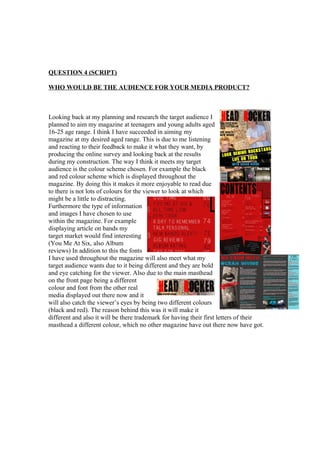
QUESTION 4 (SCRIPT)
WHO WOULD BE THE AUDIENCE FOR YOUR MEDIA PRODUCT?
Looking back at my planning and research the target audience I
planned to aim my magazine at teenagers and young adults aged
16-25 age range. I think I have succeeded in aiming my
magazine at my desired aged range. This is due to me listening
and reacting to their feedback to make it what they want, by
producing the online survey and looking back at the results
during my construction. The way I think it meets my target
audience is the colour scheme chosen. For example the black
and red colour scheme which is displayed throughout the
magazine. By doing this it makes it more enjoyable to read due
to there is not lots of colours for the viewer to look at which
might be a little to distracting.
Furthermore the type of information
and images I have chosen to use
within the magazine. For example
displaying article on bands my
target market would find interesting
(You Me At Six, also Album
reviews) In addition to this the fonts
I have used throughout the magazine will also meet what my
target audience wants due to it being different and they are bold
and eye catching for the viewer. Also due to the main masthead
on the front page being a different
colour and font from the other real
media displayed out there now and it
will also catch the viewer’s eyes by being two different colours
(black and red). The reason behind this was it will make it
different and also it will be there trademark for having their first letters of their
masthead a different colour, which no other magazine have out there now have got.

Question 4

  • 1.
    QUESTION 4 (SCRIPT) WHOWOULD BE THE AUDIENCE FOR YOUR MEDIA PRODUCT? Looking back at my planning and research the target audience I planned to aim my magazine at teenagers and young adults aged 16-25 age range. I think I have succeeded in aiming my magazine at my desired aged range. This is due to me listening and reacting to their feedback to make it what they want, by producing the online survey and looking back at the results during my construction. The way I think it meets my target audience is the colour scheme chosen. For example the black and red colour scheme which is displayed throughout the magazine. By doing this it makes it more enjoyable to read due to there is not lots of colours for the viewer to look at which might be a little to distracting. Furthermore the type of information and images I have chosen to use within the magazine. For example displaying article on bands my target market would find interesting (You Me At Six, also Album reviews) In addition to this the fonts I have used throughout the magazine will also meet what my target audience wants due to it being different and they are bold and eye catching for the viewer. Also due to the main masthead on the front page being a different colour and font from the other real media displayed out there now and it will also catch the viewer’s eyes by being two different colours (black and red). The reason behind this was it will make it different and also it will be there trademark for having their first letters of their masthead a different colour, which no other magazine have out there now have got.