The document discusses a magazine cover created to represent teenagers in a positive light. The cover features a model who is not extremely thin, wearing modest clothing. The intention was to break stereotypes and show a healthy, trendy look. The cover lines focus on topics of interest to teenagers. Photographs and editing were used to portray the model in a calm, happy way and add positivity. The overall goal of representing teenagers positively was fulfilled through these design choices.
2137ad Merindol Colony Interiors where refugee try to build a seemengly norm...luforfor
This are the interiors of the Merindol Colony in 2137ad after the Climate Change Collapse and the Apocalipse Wars. Merindol is a small Colony in the Italian Alps where there are around 4000 humans. The Colony values mainly around meritocracy and selection by effort.
thGAP - BAbyss in Moderno!! Transgenic Human Germline Alternatives ProjectMarc Dusseiller Dusjagr
thGAP - Transgenic Human Germline Alternatives Project, presents an evening of input lectures, discussions and a performative workshop on artistic interventions for future scenarios of human genetic and inheritable modifications.
To begin our lecturers, Marc Dusseiller aka "dusjagr" and Rodrigo Martin Iglesias, will give an overview of their transdisciplinary practices, including the history of hackteria, a global network for sharing knowledge to involve artists in hands-on and Do-It-With-Others (DIWO) working with the lifesciences, and reflections on future scenarios from the 8-bit computer games of the 80ies to current real-world endeavous of genetically modifiying the human species.
We will then follow up with discussions and hands-on experiments on working with embryos, ovums, gametes, genetic materials from code to slime, in a creative and playful workshop setup, where all paticipant can collaborate on artistic interventions into the germline of a post-human future.
The Legacy of Breton In A New Age by Master Terrance LindallBBaez1
Brave Destiny 2003 for the Future for Technocratic Surrealmageddon Destiny for Andre Breton Legacy in Agenda 21 Technocratic Great Reset for Prison Planet Earth Galactica! The Prophecy of the Surreal Blasphemous Desires from the Paradise Lost Governments!
Explore the multifaceted world of Muntadher Saleh, an Iraqi polymath renowned for his expertise in visual art, writing, design, and pharmacy. This SlideShare delves into his innovative contributions across various disciplines, showcasing his unique ability to blend traditional themes with modern aesthetics. Learn about his impactful artworks, thought-provoking literary pieces, and his vision as a Neo-Pop artist dedicated to raising awareness about Iraq's cultural heritage. Discover why Muntadher Saleh is celebrated as "The Last Polymath" and how his multidisciplinary talents continue to inspire and influence.
2137ad - Characters that live in Merindol and are at the center of main storiesluforfor
Kurgan is a russian expatriate that is secretly in love with Sonia Contado. Henry is a british soldier that took refuge in Merindol Colony in 2137ad. He is the lover of Sonia Contado.
2137ad - Characters that live in Merindol and are at the center of main stories
Final powerpoint
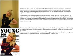
1. The Magazine Cover number one has been created with the intention to represent teenagers in a warmer and
positive atmosphere. The reason for that was to persuade the readers that teenagers can be positive happy
people. Most adults associate teenagers with drugs, depression and self harm which might be adults feel very
negative towards the teenagers these days.
This photograph fulfils my intentions because I decided to choose a model who is not a size zero because it felt
appropriate to show a nice healthy looking girl on a magazine cover, rather than a really slim girl, because it felt
inappropriate to follow a stereotype of modelling and create another magazine cover with the same stereotypical
model on the front of it. I wanted to present this model in a very positive light, the clothes aren’t showing anything
off, but still very trendy.
This image shows a finished product which is a magazine cover with a finished photograph I’ve taken. Considering
the magazine was going to represent teenagers I’ve decided to call my magazine ‘Young’, this fulfils the theme of
my magazine.
The cover lines have been created to fulfil the theme of the magazine to, by that I mean: Everything teenagers are
interested in such as shopping or discount or things teenagers are struggling with.
2. The image on the left hand side corner has been taken for the product of representing teenagers in a positive way.
How did I manage to fulfil my intentions? That’s really easy, I decided to take photograph of this model who is first
and most important of not looking like she’s starving herself, this is the first thing that’s going to show the audience
and represent teenagers in a positive way. The model is wearing white dress, white is the colour representing
purity which I thought to be the good way to represent teenagers in a positive way.
The pose she’s standing in represents the positive manner as well, it takes away the negative stereotype of the way
teenagers are represented into this entire new view of a calm happy looking girl posing for the teenage magazine.
The image on the left hand side corner is a finished magazine cover with the finished edited photograph. The way
I’ve edited the photograph it self fulfils most of my intentions. The photograph before editing definitely was missing
the correct light, but that was changed easily using Photoshop the tool called Brightness and Contrast this added a
bit more positivity into the magazine cover it self. It doesn’t look as dull and yellowish. The cover lines match the
theme of the magazine cover and yet again fulfil the magazines intentions, why? Because all the cover lines match
the interests of teenagers.
3. This image fulfils my intentions which are to represent teenagers in a positive way. The way this image fulfils my
intentions is the way the model is represented in a photograph that I have taken. For this product all I thought
would be a good idea to do is just dress and style my model in clothes that are looking positive, bright colours
are essential, it’s just more eye catching. Therefore catches the audiences attention which is really important
when wanting to break through a stereotype which has been there for a long time. Although it’s difficult to
completely break thought a stereotype I really tried to represent the model in a positive manner. My idea was
to take a photograph of my model smiling looking relaxed , I didn’t want him to look at the camera it would feel
like he’s really pretending to be happy. When he’s looking down but still smiling it created the illusion of him
really being happy like as if I’ve taken the photograph of a random person, I really like this concept I think that it
makes the idea more creative and fulfils my intentions at it’s very best level.
The image on the left hand side corner is a finished product of a magazine cover with a fully finished edited
photograph which I have taken. The idea for the title has been invented when I was thinking about what sort of
a title I should give for my magazine covers to fulfil my intentions about the theme of the magazine. Young seem
appropriate because as the name describes it’s about the people who are young.
The magazine cover has got everything a real magazine does have: cover lines, mast head the headline, the
barcode and a date of the release. I truly believe that I managed to fulfil my intentions about this magazine
cover and the photograph.
4. How does this photograph fulfils my intentions? First of all I wanted to take a photograph that managed to fulfil the
intention of creating a positive stereotype of teenagers. The photograph represents a young male he looks
definitely like a person who is taking care of himself, he’s wearing clean clothes, his hair are clean. The photograph
has definitely managed to fulfil my intentions because it’s not like other photographs that you would usually see in
a teenage magazine with a photograph of some teenager going crazy, I told my model to look very calm and
relaxed he’s slightly smiling so that he doesn’t create an impression of being sad or depressed. I believe that I
managed to fulfil my intentions.
The image of the left hand side corner shows a finished product. How does this finished cover fulfils my intentions?
This magazine cover Managed to fulfil my intentions because it includes a positive cover lines which suggest that
teenagers want to learn about responsibility such as ‘Tips on how to save money’.
5. This double page spread fulfils my intentions because for example the pose she’s standing in and the way the focus of the camera is directly
concentrated on her the rest of the background is out of focus which creates a depth of field, it basically creates more depth the girl in a photograph
stands out from the rest of the photograph. I’ve decided to play with Photoshop and present the same photograph but with different effects used on
them, I think that it makes the entire double page spread more interesting and creative also the layout of those four photographs on a double page
spread is very interesting , I think that this is a good photograph for the fashion spread, the lightning is pretty dull but that can be changed using
Photoshop. Another thing that I like about this photograph is the background which really goes well with the theme of the photograph. The outfit is
shown very clearly in this photograph the dress and the cardigan. the reason for choosing this particular location which is Sankey Valley is because I
believe that nature is a part of the theme which for this photograph is freedom and strength. How else does this product fulfils my intentions? Because
it’s a double page spread for the fashion magazine. I’ve added the prices of the clothes that she’s wearing in a photograph on the left hand side corner,
the title which matches the theme of the entire product which is why I believe I have fulfilled my intentions about this double page spread.
6. How does this product fulfils my intentions? First of all I’ve decided to choose this photograph because I like the overall structure of this photograph the
colours are bright, I thought it would be very interesting to represent freedom and strength by joining two representatives of freedom and strength and
creating a complete different representative of the theme which is usually represented in a completely different way for example military jacket and pink
scarf. My ideas were very straight forward I wanted to take a unique photograph which would be a good quality product for example what I managed to
achieve in this photograph is definitely the depth of field. The fact that the photograph has got a lot of depth it really makes the photograph standout in
fact in makes the model really standout, she is the point of concentration, the colours in the photograph are really bright that’s why I think it makes the
entire photograph more interesting and catches attention. Using Photoshop I’ve managed to really brighten the colours up as well as raising brightness
and contrast. The overview of the product makes me believe that I managed to fulfil my intentions, I’ve have done everything I wanted when it comes to
the developing ideas and the post production which involved editing in photoshop.
7. How did I managed to fulfil my intention for this double page spread? My ideas for this particular photograph were to develop a good idea which was
to represent freedom and strength in an unusual way that’s why I’ve decided to make a necklace which was going to include some cards with key
words that represent Freedom and Strength I thought that would be an unusual way to represent the theme of my double page spread. Other ideas for
this product were to also make her look unusual by that I mean certain clothing since it is a fashion spreads make-up or even her pose. When I’ve been
taking the photographs I told my model to make her self look relaxed and not look into the camera in my opinion the best photographs taken are the
spontaneous ones, the ones which you can’t tell have been posed . I think that the overall structure of the photograph is really interesting she looks
quite mysterious and unusual, especially the cardigan that she’s wearing. I wanted my model to standout from the rest of the background that’s why I
have chosen the black and white clothing which would standout from the green-yellow background of woods. When taking the photographs I have
planned certain camera shots such as a medium close-up and a long shot. Why? Medium close-up shot was taken to show a bit more detail in the
photograph such as her facial expressions which conveys the meaning , long shot to show off the clothing. I believe that I have fulfilled my intentions
for this photographs.
8. Freedom and Strength this is the theme that I have chosen for my double page spreads. How did I manage to fulfil my intentions when it comes to
representing freedom and strength? I had many ideas about this product first of all the most important thing about this double page spread was the location
of the photo shoot which was golden square, it was also very important to catch the good moment to take the photograph to maintain the theme of the
photograph all though it was really hard to do because you can’t control other people in the photograph ;. The idea was to represent freedom and strength by
walking in completely opposite direction as everyone else it basically means that she’s stronger than everyone else because she’s going in a different direction
she’s not going to follow the crowd. I do realize that it was a really hard idea to fulfil especially when it not a professional photo shoot but I wanted to take
the risk al though I might have not fulfilled my intentions completely I’ve still managed to get some really good photographs which yet still convey a good
meaning of freedom and strength.