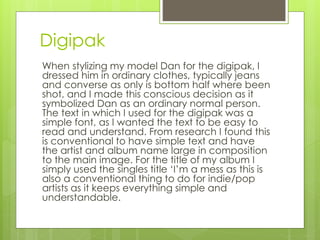
The document discusses the design and styling choices made for a digipak, album, and accompanying promotional materials for an indie/pop artist. For the digipak, the artist is shown from the waist down in ordinary clothes to portray him as a normal person. The album title and text are kept simple for readability. Red is used as the main color to appeal to pop fans in addition to indie fans. Continuity across products is achieved through consistent use of the color scheme, effects like changing opacity, and focusing on red roses as the central visual. The music video also uses codes and conventions with a linear narrative and underlying themes connected to the lyrics.