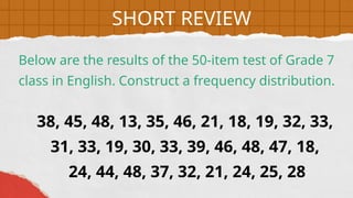
38, 45, 48,13, 35, 46, 21, 18, 19, 32, 33,
31, 33, 19, 30, 33, 39, 46, 48, 47, 18,
24, 44, 48, 37, 32, 21, 24, 25, 28
Below are the results of the 50-item test of Grade 7
class in English. Construct a frequency distribution.
SHORT REVIEW
6.
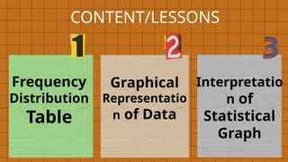
1. Why dowe need to use graphs in
presenting a set of data?
Guide Questions:
LESSON PURPOSE
2. How do we choose the best type of
graph suited to present a set of
data?
7.
Statistical Graphs orCharts
are visual representations of statistical
data. These graphs are utilized to
illustrate a data set, making it simpler to
understand and interpret the
information.
UNLOCKING CONTENT AREA
VOCABULARY
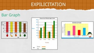
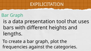
is a datapresentation tool that uses
bars with different heights and
lengths.
Bar Graph
EXPILICITATION
To create a bar graph, plot the
frequencies against the categories.
11.
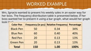
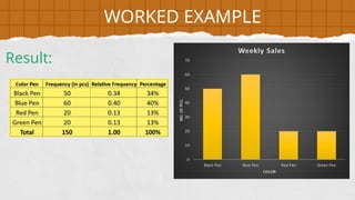
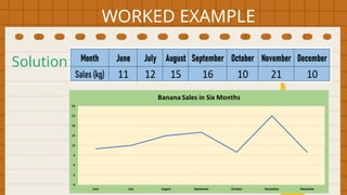
Mrs. Ignacio wantedto present his weekly sales in an easier way for
her boss. The frequency distribution table is presented below. If her
boss wanted her to present it using a bar graph, what would her graph
look like?
WORKED EXAMPLE
12.
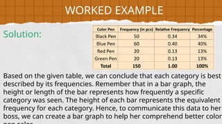
Based on thegiven table, we can conclude that each category is best
described by its frequencies. Remember that in a bar graph, the
height or length of the bar represents how frequently a specific
category was seen. The height of each bar represents the equivalent
frequency for each category. Hence, to communicate this data to her
boss, we can create a bar graph to help her comprehend better color
WORKED EXAMPLE
Solution:
13.
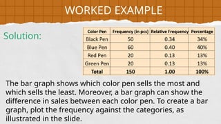
The bar graphshows which color pen sells the most and
which sells the least. Moreover, a bar graph can show the
difference in sales between each color pen. To create a bar
graph, plot the frequency against the categories, as
illustrated in the slide.
WORKED EXAMPLE
Solution:
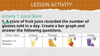
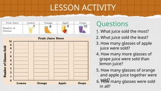
1. A storeof fruit juice recorded the number of
glasses sold in a day. Create a bar graph and
answer the following questions.
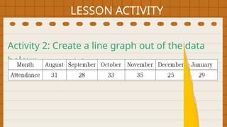
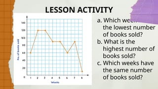
LESSON ACTIVITY
Activity 1: Juice Store
Sales!
17.
LESSON ACTIVITY
1. Whatjuice sold the most?
2. What juice sold the least?
3. How many glasses of apple
juice were sold?
4. How many more glasses of
grape juice were sold than
lemon juice?
5. How many glasses of orange
and apple juice together were
sold?
6. How many glasses were sold
in all?
Questions
:
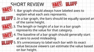
1. Bar graphshould always have labeled axes to
explain what each axis represents.
2. In a bar graph, the bars should be equally spaced an
of the same height.
3. The length or height of a bar in a bar graph
represents the value for that category.
SHORT REVIEW
5. It’s unnecessary to label each bar with its exact
value because viewers can estimate the value based
on bar height.
4. The baseline of a bar graph should generally start
at zero to avoid misleading
EXPLICITATION
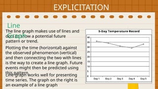
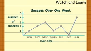
The line graphmakes use of lines and
dots to show a potential future
pattern or trend.
Plotting the time (horizontal) against
the observed phenomenon (vertical)
and then connecting the two with lines
is the way to create a line graph. Future
events might then be predicted using
this pattern.
Line graph works well for presenting
time series. The graph on the right is
an example of a line graph
Line
Graph
22.
WORKED EXAMPLE
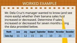
Mr. DelaCruz's manager wanted to know (and see
more easily) whether their banana sales had
increased or decreased. Determine if sales
increased or decreased for seven months using
the data provided below.
23.
WORKED EXAMPLE
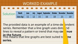
The provideddata is an example of a time-dependent
series. Remember that a line graph uses dots and
lines to reveal a pattern or trend that may continue
in the future.
Solution:
This means that line graphs are best suited to time
series.
24.
WORKED EXAMPLE
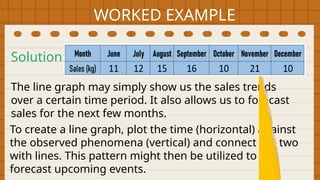
The linegraph may simply show us the sales trends
over a certain time period. It also allows us to forecast
sales for the next few months.
Solution:
To create a line graph, plot the time (horizontal) against
the observed phenomena (vertical) and connect the two
with lines. This pattern might then be utilized to
forecast upcoming events.
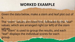
EXPLICITATION
Stem and LeafPlot is a unique
table in which each data value is
divided into a "stem" (the first digit
or digits) and a "leaf" (typically the
last digit).
30.
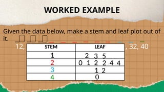
WORKED EXAMPLE
Given thedata below, make a stem and leaf plot out of
it.
12, 13, 15, 20, 21, 22, 22, 24, 24, 31, 32, 40
The "stem" values are listed first, followed by the "leaf"
values, which are arranged right (or left) of the stem
values.
The "stem" is used to group the results, and each
"leaf" displays the individual scores for each
group.
31.
WORKED EXAMPLE
Given thedata below, make a stem and leaf plot out of
it.
12, 13, 15, 20, 21, 22, 22, 24, 24, 31, 32, 40
STEM LEAF
1
2
3
4
2 3 5
0 1 2 2 4 4
1 2
0
32.
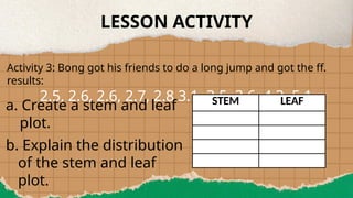
LESSON ACTIVITY
Activity 3:Bong got his friends to do a long jump and got the ff.
results:
2.5, 2.6, 2.6, 2.7, 2.8 3.1, 3.5, 3.6, 4.3, 5.1
a. Create a stem and leaf
plot.
b. Explain the distribution
of the stem and leaf
plot.
STEM LEAF
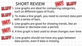
1. Line graphsare ideal for comparing categories,
such as different types of fruits.
2. To make a line graph, you need to connect data poin
with a series of bars.
3. Line graphs are good for showing trends, like an
increase or decrease over a period.
SHORT REVIEW
5. Line graphs should not have any gaps between
data points, even if data is missing.
4. A line graph is best used to show changes over time
35.
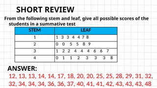
From the followingstem and leaf, give all possible scores of the
students in a summative test
SHORT REVIEW
STEM LEAF
1 1 3 3 4 4 7 8
2 0 0 5 5 8 9
3 1 2 2 4 4 4 6 6 7
4 0 1 1 2 3 3 3 8
12, 13, 13, 14, 14, 17, 18, 20, 20, 25, 25, 28, 29, 31, 32,
32, 34, 34, 34, 36, 36, 37, 40, 41, 41, 42, 43, 43, 43, 48
ANSWER:
Statistical
Graph
is one ofthe most significant components
of data presentation and analysis to
expose structure and trends.
Moreover, statistical graphs enable data to
be displayed in various visual formats.
In this lesson, you will learn to recognize
the key elements of a statistical graph and
how to interpret the data presented within
it.
EXPLICITATION
38.
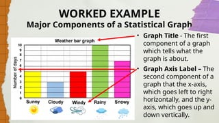
WORKED EXAMPLE
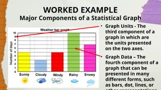
• GraphTitle - The first
component of a graph
which tells what the
graph is about.
• Graph Axis Label – The
second component of a
graph that the x-axis,
which goes left to right
horizontally, and the y-
axis, which goes up and
down vertically.
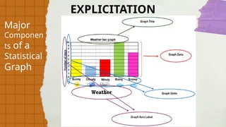
Major Components of a Statistical Graph
39.
WORKED EXAMPLE
• GraphUnits - The
third component of a
graph in which are
the units presented
on the two axes.
• Graph Data – The
fourth component of a
graph that can be
presented in many
different forms, such
as bars, dot, lines, or
Major Components of a Statistical Graph
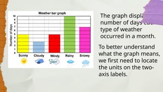
The graph displaysthe
number of days each
type of weather
occurred in a month.
To better understand
what the graph means,
we first need to locate
the units on the two-
axis labels.
42.
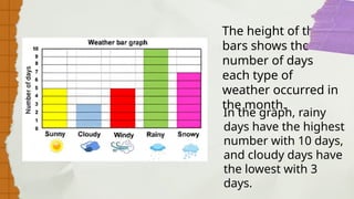
The height ofthe
bars shows the
number of days
each type of
weather occurred in
the month.
In the graph, rainy
days have the highest
number with 10 days,
and cloudy days have
the lowest with 3
days.
43.
WORKED EXAMPLE
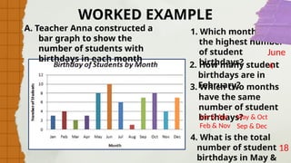
1. Whichmonth has
the highest number
of student
birthdays?
2. How many student
birthdays are in
February?
3. Which two months
have the same
number of student
birthdays?
4. What is the total
number of student
birthdays in May &
June
4
Jan & Apr May & Oct
Sep & Dec
18
Feb & Nov
A. Teacher Anna constructed a
bar graph to show the
number of students with
birthdays in each month
44.
WORKED EXAMPLE
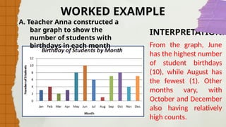
A. TeacherAnna constructed a
bar graph to show the
number of students with
birthdays in each month
INTERPRETATION:
From the graph, June
has the highest number
of student birthdays
(10), while August has
the fewest (1). Other
months vary, with
October and December
also having relatively
high counts.
45.
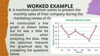
B. A machinesalesman wants to present the
monthly sales of their company during the
marketing review of their company.
WORKED EXAMPLE
He constructed a line
graph as shown below
but he was a little bit
confused when
analyzing the data. Help
the salesman interpret
the graphical data by
answering the questions
below.
46.
WORKED EXAMPLE
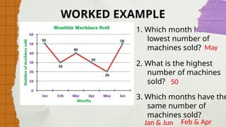
1. Whichmonth has the
lowest number of
machines sold?
2. What is the highest
number of machines
sold?
3. Which months have the
same number of
machines sold?
May
50
Jan & Jun Feb & Apr
47.
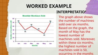
The graph aboveshows
the number of machines
sold over six months.
Based on the graph, the
month of May has the
lowest number of
machines sold. Moreover,
within these six months,
the highest number of
machines sold is 50,
occurring in the months
INTERPRETATION:
WORKED EXAMPLE
48.
Activity 4: Letthe learners answer the following
activities.
LESSON ACTIVITY
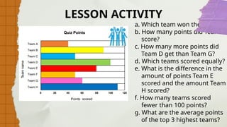
1. Eight teams joined
a quiz competition.
Their final scores
are shown below.
Study the graph,
answer the
questions, and
write a short
interpretation.
49.
LESSON ACTIVITY
a. Whichteam won the contest?
b. How many points did Team F
score?
c. How many more points did
Team D get than Team G?
d. Which teams scored equally?
e. What is the difference in the
amount of points Team E
scored and the amount Team
H scored?
f. How many teams scored
fewer than 100 points?
g. What are the average points
of the top 3 highest teams?
Activity 4: Letthe learners answer the following
activities.
LESSON ACTIVITY
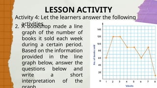
2. A bookshop made a line
graph of the number of
books it sold each week
during a certain period.
Based on the information
provided in the line
graph below, answer the
questions below and
write a short
interpretation of the
52.
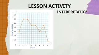
LESSON ACTIVITY
a. Whichweek has
the lowest number
of books sold?
b. What is the
highest number of
books sold?
c. Which weeks have
the same number
of books sold?
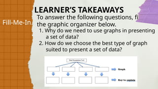
Fill-Me-In.
To answer thefollowing questions, fill in
the graphic organizer below.
1. Why do we need to use graphs in presenting
a set of data?
2. How do we choose the best type of graph
suited to present a set of data?
LEARNER’S TAKEAWAYS
FORMATIVE
ASSESSMEN
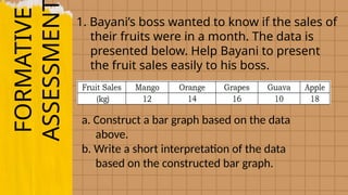
1. Bayani’s bosswanted to know if the sales of
their fruits were in a month. The data is
presented below. Help Bayani to present
the fruit sales easily to his boss.
a. Construct a bar graph based on the data
above.
b. Write a short interpretation of the data
based on the constructed bar graph.
57.
FORMATIVE
ASSESSMEN
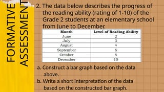
2. The databelow describes the progress of
the reading ability (rating of 1-10) of the
Grade 2 students at an elementary school
from June to December.
a. Construct a bar graph based on the data
above.
b. Write a short interpretation of the data
based on the constructed bar graph.
58.
FORMATIVE
ASSESSMEN
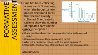
3. Gina hasbeen collecting
anime cards. Sometimes,
when she bought a new
packet, she found cards
that she had already
collected. She created a
table to show the number
of repeated cards in the
packs she opened.
QUESTIONS:
a. How many times has a card been repeated twice in the opened
packs?
b. How many times are there no repeated cards?
c. What is the number of repeats with the same frequency?
d. What is the least number of times that a card has been repeated?
INTERPRETATION: