Download as PDF, PPTX


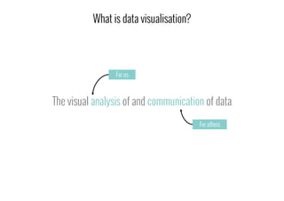
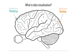
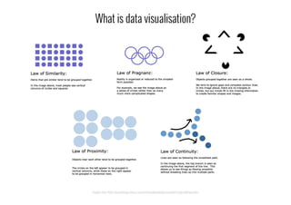
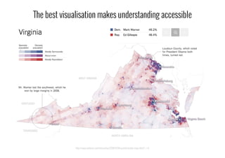
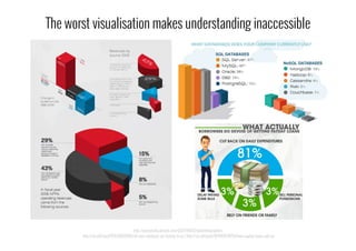
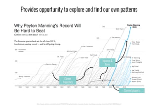
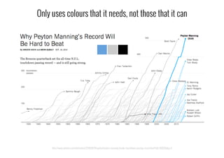
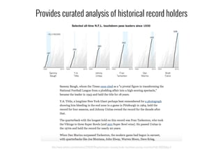
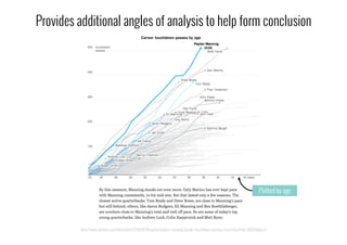


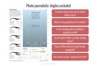
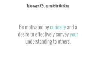

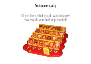
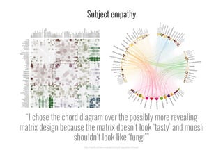


This document discusses the importance of data visualization and provides guidance on effective approaches. It makes the following key points: 1. Data visualization is the visual communication of data to help understand patterns and insights. It is a relevant skill for sharing information visually. 2. Effective data visualization adds value by making information accessible and enabling exploration. Examples should be curated to guide analysis and understanding. 3. Creating impactful data visualizations requires considering context, embracing journalistic curiosity to find stories, and using imagination to empathize with audiences.