Downloaded 151 times

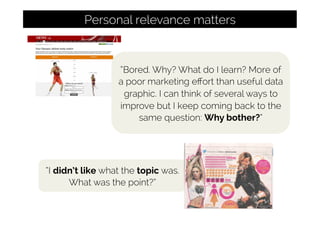

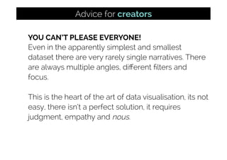
![“Isn’t [sic] Asylum Seekers
on the up in 2014?”
Changing beliefs, opinions, prejudices is hard](https://image.slidesharecdn.com/andykirk-tableau20152-150925071529-lva1-app6892/85/Data-Visualisation-Literacy-Learning-to-See-31-320.jpg)
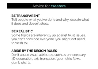


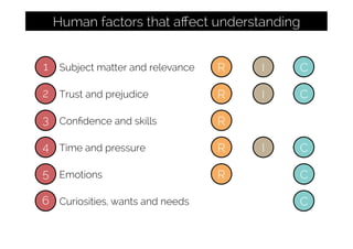

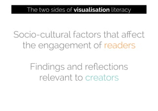
This document discusses factors that influence the consumption and creation of effective data visualizations. It explores both sides of visualization literacy - reading/consuming visualizations and creating them. Key factors discussed for consumption include subject matter/relevance, trust/prejudice, skills/confidence, time/pressure, and emotions. For creation, the document advises defining audiences, being transparent about methods, offering guidance for complex charts, fitting the purpose/setting, and having conviction while avoiding overload. The goal is to better understand how the general public engages with visualizations and help both everyday people and professionals improve visualization literacy.


