An Overview of Infographics
•Download as PPT, PDF•
5 likes•5,275 views

Webinar slides from Wed. Nov. 14, 2012

Recommended
More Related Content
What's hot
What's hot (20)
Viewers also liked
Similar to An Overview of Infographics
Similar to An Overview of Infographics (20)
An Overview of Infographics
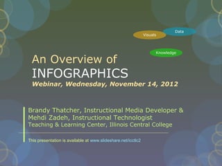
- 1. Data Visuals Knowledge An Overview of INFOGRAPHICS Webinar, Wednesday, November 14, 2012 Brandy Thatcher, Instructional Media Developer & Mehdi Zadeh, Instructional Technologist Teaching & Learning Center, Illinois Central College This presentation is available at www.slideshare.net/icctlc2
- 2. WHAT IS AN INFOGRAPHIC •Data visualizations that present complex information quickly and clearly. •Visual representation of data, information, and/or knowledge • Visual elements - colors, graphics, icons, signs, maps, etc. • Content elements – text, facts, statistics, time frames, references • Knowledge – the facts and conclusion to convey the overall message or story
- 3. Infographics as a Creative Assessment Watch the video by Kathy Shrock http://vimeo.com/25328216# A great overview and visual introduction to Infographics
- 4. Introduction to Infographics •How does it work? • Utilizing available data, information, and/or knowledge the designer will create a visual representation. •Who’s doing it? • Almost everyone - companies, educational institutions, non- profits, etc.
- 5. Introduction to Infographics •Why is it significant? • Conveys visual representation of relevant data • Engages audience •What are the downsides? • Data can be skewed and/or have a margin of error which would make the data irrelevant. Data is constantly changing on a daily basis, so the information presented could be outdated.
- 6. Introduction to Infographics • Where is it going? • More and more tools are emerging to support the user to create infographics easier and quicker • What are the implications for teaching and learning? • Capture the students attention with relevant data with visual graphics. This can be a way to have learning occur since in today’s world we are presented with information in “bytes”
- 8. INFOGRAPHICS Good Example A Modern History of Human Communication: http:// googlemobile.blogspot.com/2010/06/google-voice-for-everyone.html
- 9. Evaluating Infographics • Not all infographics are good or accurate • Just like you validate a website, you should validate an infographic before using it A Few Good Question to Ask: 1. Is it legible? Can you read it and make sense of it? 2. Can you sum up the point or message in two sentences or less? 3. Does it have a clear and meaningful title? 4. Are there spelling or grammar errors? (if there are errors, chances are there are errors in the data) 5. Who is the author? Is there any credit or information to identify the author as reputable? 6. Are there sources for the data? Visit the sources? Are they valid websites/sources? 7. Color and graphics? Are they legible and easy to read?
- 10. Characteristics of an Effective Infographic Usefulness Legibility Design Aesthetics Easy to Easy to read Graphics should reflect easy to follow understand purpose and audience Clear purpose Color scheme should not Graphics are good quality, Overall design hinder ability to read not distracting and consistent facilitates understanding Reliable data Graphs/diagrams labeled Space used effectively (no hierarchy/organization (sources cited) appropriately excess clutter) of data Informative – Font choice, size and color Appropriate use contrast and viewer learns used to make legible color something *based on University of Mary Washington, Infographics Blog http://infographics2011.umwblogs.org/2011/11/16/rubric-for-effective-infographics/
- 11. Evaluating Infographics Poor Infographics •“Ending the Infographic Plague” by Megan McArdle: http://www.theatlantic.com/business/archive/2011/12/ending-the-info / •Anyone can create an infographic and put it on the web •Evaluate your infographics carefully before using them A Few Red Flags: • made by random sites without particularly obvious connection to the subject matter • Examine the sources and sites the infographics are made by – if the site is only advertising, poor reputation or contains little or no content • Source for data very few or an overwhelming number and are typed very small or worse no sources at all – check the sources • Infographic appears threatening or to cause fear or terror
- 14. Using Infographics in Your Course • Supplement lecture • In class discussion starter • Students can make predictions or conclusions based on trend or data • Have students evaluate an infographic using a rubric • http://kathyschrock.net/pdf/Schrock_infographic_rubric.pdf • Insert in discussion board to start a discussion. • Assign students to research and share or present on an infographic, either in class or through discussion board/blog entry. • Group infographic presentation
- 15. 8 SOURCES FOR FINDING INFOGRAPHICS 1. http://visual.ly/ 2. http://infographixdirectory.com/ 3. http://www.mashable.com/follow/topics/mashable-infographics/ 4. http://www.infographicsarchive.com/ 5. http://www.thinkwithgoogle.com/insights/library/infographics/ 6. http://pewinternet.org/Data-Tools/Get-the-Latest-Statistics/Infogra 7. http://www.educause.edu/library/infographics 8. http://davidwarlick.com/graphicaday/
- 16. Creating Infographics 1. Gather your data You need some hard numbers! Use more than one valid resource 1. Determine your purpose 2. Plan your infographic. Create a sketch, outline or flow chart 1. Start laying out your plan with software or an online tool Gather and determine graphics, clip-art, photos 1. Evaluate your data and determine the best way to get it in a visual Pie chart, diagram, bar chart? Cite your data in a sources section 1. Apply a color scheme & choose fonts 2. Step back and evaluate it, get feedback and edit
- 17. Creating Your Own Infographics 2 Methods 1.Build entirely online with infographic website • Advantages: easy, quicker, graphics and creation tools provided for you, publish and share • Disadvantages: limited data input, limited template and design choices, may not be high-res for printing, maybe restricted to their website 1.Use image editing software to build it, then host it online • Advantages: more design freedom, build it high-res for print, use it/output it many formats, host it online easily • Disadvantages: more work, requires a little knowledge of image editing/design principles, find sources for hosting/sharing
- 18. Tools for Creating Infographics on the Web 1. http://visual.ly/ limited – choose from template and can not insert own data, must use data from twitter or facebook • *good choice for hosting infographic, can upload your own and give it meta-date and get url and embed code for sharing 1. http://www.easel.ly/ my favorite – easy to use. Choose from 15 themes or a blank art board.
- 24. Great Technology Seminar Infographic • Great Technology Seminar 2012 • Envisioning the Future of Education Technology at ICC Session • Participants were divided into four groups • Participants were asked to develop a SWOT analysis for Illinois Central College • Based on the ECAR 2011 National Study of Undergraduate Students and Information Technology Infographic • http:// www-cdn.educause.edu/visuals/shared/ECAR/StudentHub/fullInfo
- 25. GTS Infographic Easel.ly created by Brandy Thatcher https:// s3.amazonaws.com/easel.ly/all_easels/41319/GTS2012_Students_Tech/image.jpg http://visual.ly/student-technology-icc
- 26. Tools for Creating Your Own Infographic • Image Editors • PowerPoint or Publisher – set page layout settings for single slide to rectangular portrait shape – save as .jpg when done, upload to visual.ly or other host • Photoshop is great because of layers (learning curve) • Free Software: • Paint.Net www.getpaint.net/ – careful to click Pain.NET v3.5.10 link in upper right (lots of extra ads to download junk on page) • Gimp http://www.gimp.org/ – free image editing software • Inkscape http://inkscape.org/– vector, drawing, layers • Free Online Image Editors: • Photoshop Express http://www.photoshop.com/ • Pixlr http://pixlr.com/ • Sumopaint http://www.sumopaint.com/start/ • There are also a ton of apps in both the Apple and Android store for image editing.
- 27. GTS Infographic Publisher/GIMP created by Mehdi Zadeh http:// visual.ly/swot-analysis-student-technology-icc
- 29. Tools to Create Graphics • Online Tools to Create Graphs • http://www.gliffy.com/ - create free diagrams https://cacoo.com/ - create online diagrams, save out as .png • http://creately.com/ - create free online diagrams • Image, Icon & Graphic Sources • http://www.iconarchive.com/ - free sets of quality clip art • http://thenounproject.com/ - free symbols • http://pixabay.com/ - public domain photos • http://www.tagxedo.com/ - create word clouds based on several options, save as image
- 30. Copyright • Be aware of copyright, when you are creating infographics • Cite your sources for data • 5 Tips for Sourcing you Infographics: http ://columnfivemedia.com/5-rules-sources-infographics/ • Creative Commons: http://creativecommons.org/ • http://search.creativecommons.org/ • Use images that appropriately licensed for projects • Don’t just pull any image off of the web
- 31. Student Infographic Assignment • Discuss an infographic • Evaluate an infographic • Create an infographic • http://edu.glogster.com/ • A Rubric for Assessing Information Literacy in Infographics (from Loyola University, New Orleans) http://connect.ala.org/files/Rubric%20for %20Assessing%20Information %20Literacy%20in%20Infographics.pdf
- 32. The Next Big Thing… • Interactive Infographics • http://www.dipity.com/ (create an interactive online timeline) • http:// www.tableausoftware.com/public/community (live metric tracking) • http://news.bbc.co.uk/2/hi/in_depth/interactives • Video Infographics • http://www.coolinfographics.com/blog/tag/video • The Elements: http://youtu.be/d0zION8xjbM • Format: A Brief History of Data Storage http:// vimeo.com/9602282 • How Did We Get to 7 Billion: http:// youtu.be/VcSX4ytEfcE
- 33. WEBINAR REFERENCES • http://www.schrockguide.net/infographics-as-an-assessment.html • http://theasideblog.blogspot.com/2012/10/teaching-with-infographics.html • http://www.queness.com/post/9942/how-to-design-your-own-infographics • http://mediaspecialistsguide.blogspot.com/p/infographics.html#.UI68YsXA8sd • http://davidwarlick.com/wiki/pmwiki.php?n=Main.MakingNumbersTellTheirStory • http://www.teachersfirst.com/iste/infographics/resources.cfm • http://www.techchef4u.com/?tag=infographics-as-a-creative-assessment • http://infographics2011.umwblogs.org/ • http:// www.fastcodesign.com/1670019/10-steps-to-designing-an-amazing-infographic • http ://dailytekk.com/2012/02/27/over-100-incredible-infographic-tools-and-resources/ • http://blog.visual.ly/source-code-the-5-rules-of-researching-and-sourcing- infographics/ • http://columnfivemedia.com/5-rules-sources-infographics/ • http://learning.blogs.nytimes.com/2010/08/23/teaching-with-infographics-places-to- start/
- 34. An Overview of INFOGRAPHICS Webinar, Wednesday, November 14, 2012 Brandy Thatcher, Instructional Media Developer: bthatcher@icc.edu Twitter: @bthat Mehdi Zadeh, Instructional Technologist: Mehdi.Zadeh@icc.edu Teaching & Learning Center, Illinois Central College: tlc@icc.edu Twitter: @icctlc
Editor's Notes
- This graph circulated fairly widely for a while. The design of the food pyramid changed recently, in part because the visual characteristics of the old pyramid did not correspond well to the numerical recommendations. The new designer makes the same mistake but disdains “misleading” in favor of “mind-bogglingly dishonest.” The bottom tier of the left-hand pyramid takes up far more than 73.80% of the pyramid’s area, and the 3-D diagram enhances that distortion even further. Want a fun party game? Hide the numbers and ask your friends to guess what they are! Where’s the data sources?
- The flashy background and bright colors must have distracted this graph’s creator from the fact that it’s useless. Think the graph is describing crime rates? Think again. It actually describes the percentage change in violent crime rates. New York at 20% of its 1990 crime rate could still be more violent than Philadelphia at over 100% of its 1990 crime rate. If you want to know how dangerous these cities really are, you’ll have to look elsewhere.
- Supplement a lecture – you can copy the infographic and make a thumbnail view on your slide – then link to the full infographic on the web – demo it from the web so that it is easy to read and you can view the detail
- Before you get started on your own infographic spend some time looking at other infographics and become familiar with different ways to display data. If your purpose is data/fact drive – give the facts – avoid putting your opinion or bias into the design. If you want it to be subjective or persuasive – make that obvious in your design. Organize your data and numbers first – choose your sources first – reliable quality sources – hard numbers – avoid subjective or opinion-based data. The Power of the Three-Color Palette The use (or misuse) of color can make or break your infographic. With all of the data that goes into an infographic, it’s critical that the reader’s eye easily flows down the page. Therefore, you need to select a palette that doesn’t attack the senses. This article from Smashing Magazine offers a helpful solution: stick to the rule of three, specifically three primary colors. One color (usually the lightest) should be used as the background and the other two should be used to break up the sections. Importantly, do this before you start designing, because it will help you determine how to visualize the various elements. From http://www.desantisbreindel.com/7-must-read-articles-for-developing-killer-infographics/ Kathy’s step by step handout is what some of my suggestions for creating your infogrpahics are based on, be sure to have a look at it Kathy Schrock’s Guide to Infographics: http://www.schrockguide.net/uploads/3/9/2/2/392267/infographic_steps.jpg Consider using the inverted pyramid style for your infographic – put the largest most important message the foundation of your infographic at the top and work your way down through the details. The inverted pyramid puts the most newsworthy information at the top, and then the remaining information follows in order of importance, with the least important at the bottom.
- Visual.ly – choose one of the template infographics to customize – data from twitter or facebook – post it on visually – share on your facebook or twitter account
- Best use of visual.ly – upload your infographic to it – choose static and upload a jpg, jpeg, gif or png – jpg will give you the best quality – fill out the description info and then you’ll get a url and embed code for your infographic – get it seen – visual.ly is high traffic – easily share it with others
- When you arrive at easel.ly you can sign up for a free account. You will see a section for “my visuals” once you are logged in at the top and below that is the public visuals gallery of infographics created on easelly that have been made public. You have the option with each infographic you create to choose “public” or “private.” There is a view/share link below each of your infographics or you can double-click your infographic to go to edit mode. To start a new infographic was a little confusing, you double-click on the one you have and that takes you into the editor. You can click clear to clear the canvas and then you start building again, you click save and name it something else, then both infographics are available in this window under my visuals the next you log in.
- This the work mode view of creating an online infographic in easel.ly. I have the layout grid turned on to help with placement. The Vheme is where you choose a template design to work with. Then it can be completely edited. You can also start from scratch with a blank board. You can click each of the button across the top to choose from their library of different objects, backgrounds, shapes, text boxes. The text font, size and color can be customized. You select your item from the ribbon at the top and drag it on to your work area.
- You also have the option to upload any of your own options. This could be image files of diagrams or charts created with other online tools.
- As you saw in the previous slides of easel.ly, I have an infographic built. We recently had a two day technology seminar at ICC for faculty and one of our session was based on an infographic created from the results of the ECAR 2011 study of undergrad students and information technology
- http://vimeo.com/37781587 - video overview of easl.ly (1:40)
- Address
- Respect copyright with your data sets – make sure you cite them
- Noun project – realize some are free and other cost money http://www.gliffy.com/examples/
- This rubric created by two staff at Loyola provides criteria for grading a student created infographic.
- Image from http://www.bbc.co.uk/news/world-us+canada-10649080
- Our Sources for the Webinar