Presentation slides:Telling Stories with Data
Geoff McGhee is the Creative Director of Media and Communications and a former John S. Knight Journalism fellow at Stanford University.
Joy Mountford at BayCHI: Visualizations of Our Collective LivesBayCHI
The lines between art, design, and information are dissolving as we experience new places and objects. Consider, for example, the organic flow of air traffic over North America at daybreak, the bursts of search query memes spreading around the globe, and the pointillist surge of mobile phone usage on New Year's Eve. Using the new techniques of generative data visualization, a new generation of artist/designers/engineer/scientists are creating gorgeous, dynamic experiences driven by massive sets of data about our own lives. Their work comes to life in architectural spaces, on walls of wood and metal and light and shimmering glass clouds suspended overhead. Of course it must be touched to be appreciated and engaged with, simple gestures launch a thousand images and possibilities. Many of these projects have received international recognition. They are primarily 3D applications that can run in real time, but really can only be appreciated by watching them, as movies. These data movies aim to make information easier to understand while being enjoyable to watch. Surprising insights surface through looking at our 'data life' in new ways, and may compel us to design in different, even better ways.
Exploring Community Engagement with OpenTreeMapAzavea
On Tuesday, June 12, we hosted "Exploring Community Engagement with OpenTreeMap," a webinar that provided an introduction to the public engagement features in OpenTreeMap, the open source system for collaborative tree inventory. Kelaine Vargas from Urban Forest Map and Phil Silva from TreeKIT joined us to discuss their experiences with community urban forestry initiatives, particularly in terms of the accuracy of citizen generated data and encouraging long-term engagement in tree care.
Visualizacion de la Infomación. De los datos al conocimiento.Ignasi Alcalde
La visualización de la información es un disciplina realmente fascinante cuyo interés no ha hecho más que despegar. Si por ejemplo buscamos infographics o data visualization en internet podremos comprobar que el interés crece día a día. Mires donde mires hay información visual que reclama tu atención. La comunicación efectiva e inmediata a través de una simple y fácil visualización prima frente a largos textos de compleja asimilación. Pero… ¿Qué es realmente la visualización de la información? En tus manos tienes una obra práctica que te ayudará a introducirte en la visualización de la información, el proceso de trabajo con datos y las herramientas más comunes.
http://www.editorialuoc.cat/visualizacindelainformacin-p-1674.html?cPath=1
Business intelligence data analytics-visualizationMuthu Natarajan
Business Intelligence, Cloud Computing, Data Analytics, Data Scrubbing, Data Mining, Big Data & Intelligence, How to use Data into Information, Decision Based, Methods for Business Intelligence, Advanced Analytics, OLAP, Multidimensional Data, Data Visualization.
Nueva introducción de DataLab Community del 2017. Somos una comunidad abierta de Ciencia de Datos. Generamos colaboración entre profesionales y aprendices, compartiendo conocimientos, desarrollando habilidades y vinculando para impulsar la Ciencia de Datos.
Design activity framework for visualization designDominika Mazur
An important aspect in visualization design is the connection between what a designer does and the decisions the designer makes. Existing design process models, however, do not explicitly link back to models for visualization design decisions. We bridge this gap by introducing the design activity framework, a process model that explicitly connects to the nested model, a well-known visualization design decision model. The framework includes four overlapping activities that characterize the design process, with each activity explicating outcomes related to the nested model. Additionally, we describe and characterize a list of exemplar methods and how they overlap among these activities. The design activity framework is the result of reflective discussions from a collaboration on a visualization redesign project, the details of which we describe to ground the framework in a real-world design process. Lastly, from this redesign project we provide several research outcomes in the domain of cybersecurity, including an extended data abstraction and rich opportunities for future visualization research.
Visual analytics: poniendo en valor el dato a través de la visualizaciónAlex Rayón Jerez
Sesión de Visual Analytics impartida en Diciembre de 2015 en el marco del Programa de Big Data y Business Intelligence de la Universidad de Deusto (detalle aquí http://bit.ly/1PhIVgJ).
Ciclo de vida del dato en ambientes de Business IntelligenceAlex Rayón Jerez
Taller práctico "Ciclo de vida del dato en ambientes de Business Intelligence" como primer paso a la capacitación de una organización para la explotación de los datos para aumentar la inteligencia de negocios.
Frontend Architecture and Data VisualizationAltocloud
Frontend Architecture and Data Visualization at Altocloud. Altocloud connects your business with the right customers at the right time in their journey – improving conversions and enhancing customer experience.
Construyendo un panel de visualización de indicadores claveAlex Rayón Jerez
Taller práctico "Construyendo un panel de visualización de indicadores clave" como tercer paso a la capacitación de una organización para la explotación de los datos para aumentar la inteligencia de negocios.
Presentación realizada por Datalytics con motivo del desayuno de trabajo realizado el 18 de Diciembre 2012, donse se hace un repaso de las novedades que ofreció Pentaho en el año en materia de visualización de datos.
For Beyond the Black Box, University of Edinburgh, February 2017
As the datasets used by humanists become ever larger and more readily accessible, the ability to render and interpret overwhelmingly large amounts of information in graphically literate ways has become an increasingly important part of the researcher’s skillset. In this workshop, participants will be introduced to the core principles of scholarly data visualisation and shown how to use a variety of visualisation tools.
Visualisations may sound like the opposite of a black box, as they display the data provided. However, aside from 'truthiness' of things on a screen, lots of invisible algorithmic decisions affect what appears on the screen. Data used in visualisations is increasingly generated algorithmically rather than manually. What choices is software making for you, and whose world view do they reflect? Algorithms are choices - if you can't read the source code or access the learned model, how can you understand them?
Introduction to information visualisation for humanities PhDsMia
Training workshop for the CHASE Arts and Humanities in the Digital Age programme. (
This session will give you an overview of a variety of techniques and tools available for data visualisation and analysis in the humanities. You will learn about common types of visualisations and the role of exploratory and explanatory visualisations, explore examples of scholarly visualisations, try some visualisation tools, and know where to find further information about analysing and building data visualisations.
"Big Data" is term heard more and more in industry – but what does it really mean? There is a vagueness to the term reminiscent of that experienced in the early days of cloud computing. This has led to a number of implications for various industries and enterprises. These range from identifying the actual skills needed to recruit talent to articulating the requirements of a "big data" project. Secondary implications include difficulties in finding solutions that are appropriate to the problems at hand – versus solutions looking for problems. This presentation will take a look at Big Data and offer the audience with some considerations they may use immediately to assess the use of analytics in solving their problems.
The talk begins with an idea of how big "Big Data" can be. This leads to an appreciation of how important "Management Questions" are to assessing analytic needs. The fields of data and analysis have become extremely important and impact nearly all facets of life and business. During the talk we will look at the two pillars of Big Data – Data Warehousing and Predictive Analytics. Then we will explore the open source tools and datasets available to NATO action officers to work in this domain. Use cases relevant to NATO will be explored with the purpose of show where analytics lies hidden within many of the day-to-day problems of enterprises. The presentation will close with a look at the future. Advances in the area of semantic technologies continue. The much acclaimed consultants at Gartner listed Big Data and Semantic Technologies as the first- and third-ranked top technology trends to modernize information management in the coming decade. They note there is an incredible value "locked inside all this ungoverned and underused information." HQ SACT can leverage this powerful analytic approach to capture requirement trends when establishing acquisition strategies, monitor Priority Shortfall Areas, prepare solicitations, and retrieve meaningful data from archives.
EASY TUTORIAL OF HOW TO USE CAPCUT BY: FEBLESS HERNANEFebless Hernane
CapCut is an easy-to-use video editing app perfect for beginners. To start, download and open CapCut on your phone. Tap "New Project" and select the videos or photos you want to edit. You can trim clips by dragging the edges, add text by tapping "Text," and include music by selecting "Audio." Enhance your video with filters and effects from the "Effects" menu. When you're happy with your video, tap the export button to save and share it. CapCut makes video editing simple and fun for everyone!
Hello everyone! I am thrilled to present my latest portfolio on LinkedIn, marking the culmination of my architectural journey thus far. Over the span of five years, I've been fortunate to acquire a wealth of knowledge under the guidance of esteemed professors and industry mentors. From rigorous academic pursuits to practical engagements, each experience has contributed to my growth and refinement as an architecture student. This portfolio not only showcases my projects but also underscores my attention to detail and to innovative architecture as a profession.
Technoblade The Legacy of a Minecraft Legend.Techno Merch
Technoblade, born Alex on June 1, 1999, was a legendary Minecraft YouTuber known for his sharp wit and exceptional PvP skills. Starting his channel in 2013, he gained nearly 11 million subscribers. His private battle with metastatic sarcoma ended in June 2022, but his enduring legacy continues to inspire millions.
Connect Conference 2022: Passive House - Economic and Environmental Solution...TE Studio
Passive House: The Economic and Environmental Solution for Sustainable Real Estate. Lecture by Tim Eian of TE Studio Passive House Design in November 2022 in Minneapolis.
- The Built Environment
- Let's imagine the perfect building
- The Passive House standard
- Why Passive House targets
- Clean Energy Plans?!
- How does Passive House compare and fit in?
- The business case for Passive House real estate
- Tools to quantify the value of Passive House
- What can I do?
- Resources
Maximize Your Content with Beautiful Assets : Content & Asset for Landing Page pmgdscunsri
Figma is a cloud-based design tool widely used by designers for prototyping, UI/UX design, and real-time collaboration. With features such as precision pen tools, grid system, and reusable components, Figma makes it easy for teams to work together on design projects. Its flexibility and accessibility make Figma a top choice in the digital age.
Expert Accessory Dwelling Unit (ADU) Drafting ServicesResDraft
Whether you’re looking to create a guest house, a rental unit, or a private retreat, our experienced team will design a space that complements your existing home and maximizes your investment. We provide personalized, comprehensive expert accessory dwelling unit (ADU)drafting solutions tailored to your needs, ensuring a seamless process from concept to completion.
Expert Accessory Dwelling Unit (ADU) Drafting Services
Gmcghee bayvis meetup_111027
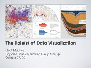
1. The Role(s) of Data Visualization
Geoff McGhee
Bay Area Data Visualization Group Meetup
October 27, 2011
2. Dealing with Data
Explosion of Electronic Information
• 2003 estimate: 5 exabytes/day* new info
• Open government/transparency movements
• E-commerce, electronic record-keeping
• Digitization of media (photos, music, books...)
• Remote sensors, RFID tags, POS systems
• Plummeting Cost of Storage
• Data formats (XML, JSON, RDF… ), APIs
• Social media
* Exabyte = 1 million terabytes
3. Dealing with Data
The Promise of Data Visualization
Using the Eye-Brain Connection
• Bypass language centers, go direct to
the visual cortex
• Leverage ability to recognize patterns,
visual sense-making
• Powerful graphics chips enable
animation, live data processing possible
Map of New Brainland
by Unit Seven via Flickr
5. Roles of Data Visualization
Visualizing New Information
• Data that reveals previously unknown
insights into patterns of life
• Visualization as a way to “throw things
on the wall” and examine
Google N-Gram Viewer • Things that used to be unknown,
unknowable, or impractical to know
• Less about visualization than the data
7. Visualizing New Mirror
Visualization as Information
“Tourists vs. Locals,” Eric Fischer, (2010)
http://www.flickr.com/photos/walkingsf/sets/72157624209158632/
8. Visualizing New Mirror
Visualization as Information
“Tourists vs. Locals,” Eric Fischer, (2010)
http://www.flickr.com/photos/walkingsf/sets/72157624209158632/
9. Visualizing New Mirror
Visualization as Information
“Tourists vs. Locals,” Eric Fischer, (2010)
http://www.flickr.com/photos/walkingsf/sets/72157624209158632/
10. Visualization as Mirror
Visualizing New Remix
Information
“Flickr Flow,” Fernanda Viégas and Martin Wattenberg (2009)
http://hint.fm/projects/flickr/
12. Visualization as Mirror
The Biggest Lies in Online Dating, OK Cupid (2010)
http://blog.okcupid.com/index.php/the-biggest-lies-in-online-dating/
13. Roles of Data Visualization
Visualizing New Information
• Can be interactive– frequently not
• “Throw it on the wall”
• Maybe best seen as a “first pass,” a
very mature but exploratory vis
Google N-Gram Viewer
• Story comes later – maybe even
because of the visualization
15. Roles of Data Visualization
Remix: The Familiar Through a New Lens
• Innovations in graphic display can
change how we experience an idea
• Less about data than the visualization
• “Now I see it”
17. Visualization as Remix
“If San Francisco Crime Was Elevation,” Doug McCune (2010)
http://dougmccune.com/blog/2010/06/05/if-san-francisco-crime-was-elevation/
21. Visualization as Remix
“Map of the Market,” Martin Wattenberg/Smart Money (1998)
http://www.smartmoney.com/map-of-the-market/
22. Visualization as Remix
The New York Times (2009)
http://www.nytimes.com/interactive/2009/11/06/business/economy/unemployment-lines.html
23. Visualization as Remix
The New York Times (2009)
http://www.nytimes.com/interactive/2009/11/06/business/economy/unemployment-lines.html
24. Visualization as Remix
The New York Times (2009)
http://www.nytimes.com/interactive/2009/11/06/business/economy/unemployment-lines.html
25. Roles of Data Visualization
Remix: The Familiar Through a New Lens
• Can be about storytelling, but more likely:
the visual format brings out something
new from existing knowledge
• Some of the most artful and striking
visualizations come from this category
• Can take more aesthetic risks
27. Roles of Data Visualization
Investigation and Advocacy
• Both an analytical and communications
format
• Data mining and analysis help uncover
important trends, stories
• Persuasiveness of graphic forms can be
used for transparency or persuasion
28. Visualization for Investigation or Advocacy
and Advocacy
The Washington Post (2010)
http://projects.washingtonpost.com/top-secret-america/map/
29. Visualization for Investigation or Advocacy
and Advocacy
“What They Know,” The Wall Street Journal (2010)
http://blogs.wsj.com/wtk/
30. Visualization for Investigation or Advocacy
and Advocacy
The New York Times (2010)
http://www.nytimes.com/interactive/2010/07/11/nyregion/20100711-stop-and-frisk.html
31. or Advocacy
Visualization for Investigation and Advocacy
The Sunlight Foundation
http://influenceexplorer.com/organization/att-inc/d473e580c5684a658b754eb97566cb05?cycle=2010v
32. or Advocacy
Visualization for Investigation and Advocacy
The Sunlight Foundation
http://influenceexplorer.com/organization/att-inc/d473e580c5684a658b754eb97566cb05?cycle=2010v
33. Visualization for Investigation or Advocacy
and Advocacy
“SourceMap,” MIT (2009)
http://www.sourcemap.org/object/tesla-roadster
35. Visualization for Investigation or Advocacy
and Advocacy
Economic Policy Institute (2010)
http://www.stateofworkingamerica.org/pages/interactive#/?start=1917&end=1918
36. Visualization for Investigation or Advocacy
and Advocacy
“Remapping the Debate” Anti-Discrimination Center, (2011)
http://remappingdebate.org/
37. Visualization for Investigation or Advocacy
and Advocacy
“Remapping the Debate” Anti-Discrimination Center, (2011)
http://remappingdebate.org/
38. Visualization for Investigation or Advocacy
and Advocacy
“Remapping the Debate” Anti-Discrimination Center, (2011)
http://remappingdebate.org/
39. Roles of Data Visualization
Investigation and Advocacy
• Storytelling is key
• Ideally about transparency and
comprehensiveness (ie whole data set)
• But also about guiding viewer to most
salient points to your argument
• Interactivity: linear story supplemented
by nonlinear reference
40. Roles of Data Visualization
Environment for Exploration
• Tool for individual or collective exploration
• Can show same data in multiple
dimensions, like time/space
• Search, filter, drill down to details
Analyzing OCR Quality of Newspapers
• Ideally, mark and share discoveries
within the tool
41. Environment as Mirror
Visualization for Exploration
“Mapping America: Every City, Every Block,” The New York Times (2010)
http://projects.nytimes.com/census/2010/explorer
42. Environment as Mirror
Visualization for Exploration
“Assessing Digitization Quality,” Bill Lane Center for the American West/
University of North Texas (2011)
http://mappingtexts.org
43. Environment as Mirror
Visualization for Exploration
“Mapping the Republic of Letters,”
Stanford University (2009-Present)
https://republicofletters.stanford.edu/