Download to read offline
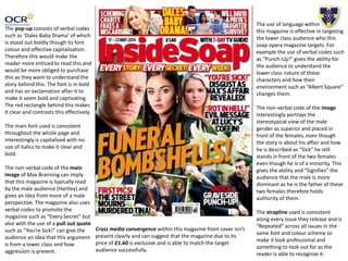

This document analyzes the cover of a soap opera magazine called Inside Soap. It discusses various design elements and techniques used on the cover to appeal to readers. These include the use of bold colors, fonts and imagery to draw attention to headlines and stories. Captions and pull quotes are also analyzed for how they intrigue readers with emotive language and references to drama and scandal. The target audience of the lower class is considered through the choice of stories, language and characters featured. Cross-promotion to other media is also mentioned. In conclusion, the document discusses techniques that will be repeated in their own magazine cover design, such as bold fonts, shocking language and an attention-grabbing main image.